


Houzz Tour: Builder's Beige Gets a Makeover
Home goes from boring to lively with color, furniture and textures to fit a family's personality
Becky Harris
November 24, 2011
Houzz Contributor. Hi there! I live in a 1940s cottage in Atlanta that I'll describe as "collected."
I got into design via Landscape Architecture, which I studied at the University of Virginia.
Houzz Contributor. Hi there! I live in a 1940s cottage in Atlanta that I'll describe... More
This 5-year-old home in Toronto was in pretty boring shape when its owners hired interior designer Shirley Meisels. "Although relatively new, it was pretty basic in terms of finishes ... and it was builder's beige," she says. The home lacked moldings, pot lights, interesting hardware and character in general.
"The clients wanted a family-friendly home that was as vibrant as they are; a happy place that both functioned well for their busy lifestyles and felt warm and inviting. They wanted character and color with great attention to detail," Meisels says. The family also frequently hosts out-of-town guests and loves to entertain. "This is definitely the party house – every holiday and every long weekend this house is overflowing with people!" she says.
Houzz at a Glance
Who Lives Here: Duke, Cathy and their two children
Location: Toronto, Ontario
Size: This is a two-story, four-bedroom home with an in-law suite in the basement. In all there are five bathrooms.
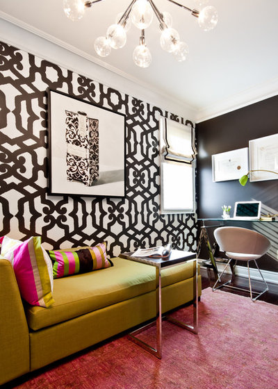
In spite of three chocolate brown walls and a chocolate brown door, this room remains surprisingly light and bright. "This room happens to be southern facing and so gets lots of light," Meisels says. "The bold wallpaper and bright furnishings also help lift the room from dark and dreary to bright and cheerful despite such dark walls."
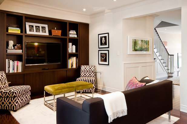
In this media room, built-ins help keep the television from dominating and add symmetry. They also hide unsightly elements. "Built-ins can be a great way to hide bulkheads, mechanical shafts and all sorts of necessary but unattractive structural elements," Meisels says. "The column on the left hides a plumbing shaft while the column on the right is a functioning cabinet."
The room strikes the perfect balance between masculine and feminine. "Whenever I create a room I tend to start from big to small," Meisels says. "I’m practical, so the larger furnishings/investment pieces that I buy are almost always super-clean and neutral. The 'no frills' nature of these items tend to feel more masculine."
As for the feminine? "I like to have more fun with pattern and color with smaller furnishings, like the lime green ottomans and bold occasional chairs. Here’s where the whimsy comes into play and the more feminine touches," she says.
Chairs: Mitchell Gold
Theatre sofa: Design Within Reach
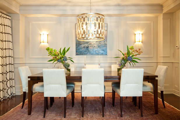
The dining room retains a clean and contemporary feeling, while the moldings and trimwork Meisels designed lend a traditional feel. "This room was a blank canvas with bare walls and really no room for a sideboard," she says. "I decided to dress the walls to add interest and warm the space up. The moldings also helped to make otherwise unattractive bulkheads look like an architectural feature."
Chairs and sconces: Barbara Barry
Drapery fabric: Riad from Kravet
Chairs and sconces: Barbara Barry
Drapery fabric: Riad from Kravet
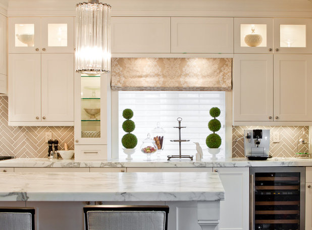
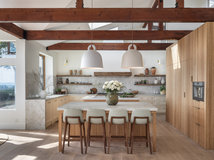
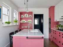
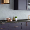
The family is very busy and the kitchen is the hub of the household. "We wanted the kitchen to be functional with as much storage as possible without feeling overwhelming," Meisels says. "We were looking for light and airy, and running the cabinets right up to the ceiling utilized every square inch of storage while also creating the illusion of height. The glass cabinets are primarily for decorative display and break up the heaviness of all of the cabinetry. The reflection of glass adds a bit of sparkle as well."
As for the backsplash: Why herringbone? "Everyone loves the herringbone!" Meisels says. "There seemed to be so much going on in this kitchen with the huge marble island and marble Sarinnen table (in the breakfast nook), so I was reluctant to use stone for the backsplash as well. A kitchen like this demanded a luxurious finish, so I used a simple tile but installed it in a sophisticated and interesting pattern."
As for the backsplash: Why herringbone? "Everyone loves the herringbone!" Meisels says. "There seemed to be so much going on in this kitchen with the huge marble island and marble Sarinnen table (in the breakfast nook), so I was reluctant to use stone for the backsplash as well. A kitchen like this demanded a luxurious finish, so I used a simple tile but installed it in a sophisticated and interesting pattern."
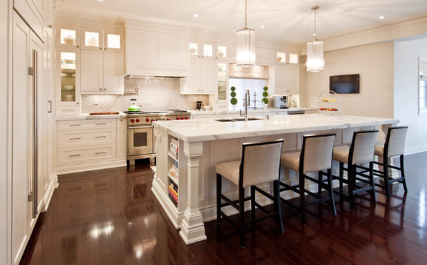
In this image you can see how the display cabinets punctuate the room with light.
Tip: When deciding on an island size, tape it off on the floor and experiment. "A great deal of time was spent debating the size and function of this island," Meisels says. "We taped off the floor several times, taking great care in measuring the distance from all of the appliances, walls, etcetera. I had the homeowner walk from imaginary fridge to stove to sink just to make sure the 11-foot-long island wouldn’t feel too overwhelming for her."
The marble-topped island turned out just right. It has plenty of storage for garbage, recycling, food containers and cookbooks. It also contains a sink, dishwasher and microwave. Out of season kitchenware is stored on the stool side.
Pendants: Robert Abbey
Marble: Statuario
Stools: Custom-made with Sunbrella fabric from Robert Allen
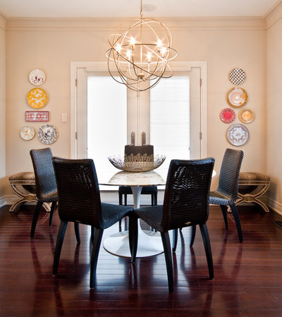
This breakfast nook is at the end of the kitchen and opens to a deck overlooking the beautifully landscaped yard. "The room is square, so it made most sense to use a round table both for proportion and flow to the outdoors," Meisels says.
Tip: When dressing walls, think beyond framed artwork or photos. "Walls can be tricky to dress in an interesting way. The default is always to use art or family photos ... but I find that so dull and flat when used over and over again in every room," Meisels says. As an alternative, she creates a rhythm throughout a home using sconces, wallpaper, trim and other sculptural elements. "Because the room was a kitchen, I chose plates to add a touch of casual fun and color and also to echo round the shape of the table," Meisels says.
How to create a plate composition: "I had such a good time pulling the plate collection together!" she says. I simply went to a china shop, picked a bunch of my favorites, laid them all out on the floor and started to mix and match. Anything that stood out as being too odd I eliminated while being mindful not to chose them all from the same designer. There is a common thread between all of the plates and platters, either through color or pattern. I also used a variety of sizes and shapes to keep the collection interesting."
Table: Saarinen Tulip Table by Knoll
Chandelier: Robert Abby
Bowl: Crate and Barrel
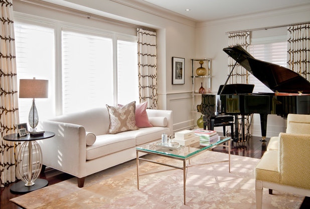
Usually, we assume furniture is planned around a baby grand piano, but in this case, the homeowners decided they wanted to add one after all of the furniture had been purchased. "Luckily I tend not to overstuff a space with furniture so we had enough room to play and shift things around," Meisels says. "The only thing that was replaced was the original coffee table, which was larger and bulkier. I went with a glass coffee table instead to give the room some breathing space."
Drapery fabric: Riad by Kravet
Sofa: Celia by Mitchell Gold
Wool and silk rug: The Rug Company
Drapery fabric: Riad by Kravet
Sofa: Celia by Mitchell Gold
Wool and silk rug: The Rug Company
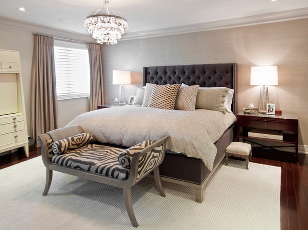
The master bedroom is serene and beautiful. "Master bedrooms are for rest and relaxation, so I chose fabrics, colors and textures to embody that feel," Meisels says. "Shades of grays and silvery taupes are both sophisticated and soothing."
Tip: Inexact color and texture matches make things more interesting. "I am not into finding an exact match; as long as the colors and textures are in the right ballpark I’ll throw them together," Meisels says. "My gray woods are close, but are not the same, the drapes are a shade of the grasscloth, the zebra print is charcoal, the bed frame is more of a blue/gray and so on. This layering of shades and textures that are close but not perfect for me adds warmth and interest."
Bed frame: Micheal Weiss
Nightstands: Bolier
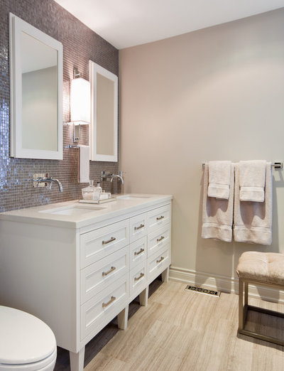
The color palette from the master bedroom continues into the master bath. "I wanted both rooms to feel unified so I carried the soft silver gray palette right through to the en suite," Meisels says.
An unexpected mix of materials adds light to this relatively small master bathroom, reflecting the natural light from two windows opposite the vanity. "I wanted to make up for what this room lacked in size with exceptional finishes. Thus the choice to tile the entire vanity wall with Vero glass mosaic. These add texture, sparkle and really emphasizes the vanity creating a wonderful focal wall." The tiles also pick up the dark grey veining of the limestone used on the floor and shower walls.
A vanity atop legs also adds openness to the room. "I love vanities that feel like furniture; they feel so much more elegant, especially in powder rooms and master baths," she says.
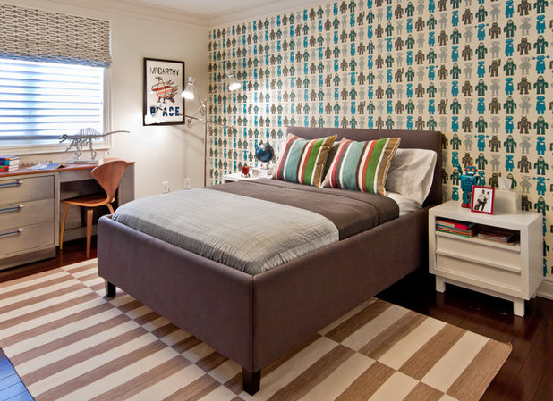
Tip: Mix grown-up pieces into a child's bedroom. This bedroom was designed for the couple's 3-year-old son. "I am not a fan of 'themed' rooms for children. Having one myself, I know how quickly their interests can change," Meisels says. "Rather, I like to integrate very adult elements into the design of a child's room, like the upholstered custom-made bed, with fun patterns, colors and shapes. We chose robot wallpaper, but stopped short of a robot rug and robot bedding. I think the mix of a little of this and a little of that ultimately will last longer as the child grows."
Desk: Vintage
Bedding: IKEA and West Elm (throw and cushions are custom)
Rug: Madeline Weinrib
Nightstands: Crate and Barrel
Desk: Vintage
Bedding: IKEA and West Elm (throw and cushions are custom)
Rug: Madeline Weinrib
Nightstands: Crate and Barrel
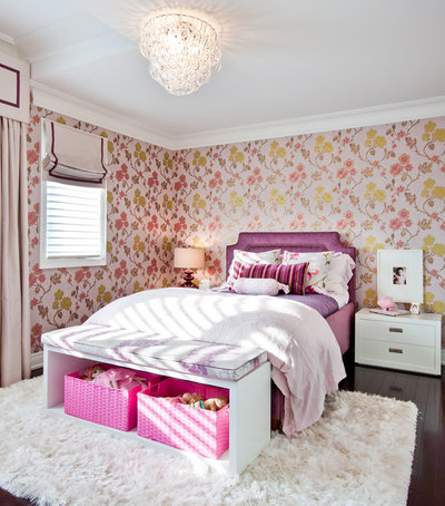
Tip: Involve young children in design decisions. Meisels designed this room for the couple's 5-year-old daughter. "I do like to involve the little ones in the design of their rooms; they love having a voice in the decision making. Of course I’m a design control freak so I’d never ask 'what do you want for your room?' Instead, I present three choices that both the parent and myself have already decided on – it’s a negotiation where all parties involved walk away happy!"
Bed: Custom
Nightstands and bench: Crate and Barrel
Wallpaper: Sanssouci from Designers Guild
Bed: Custom
Nightstands and bench: Crate and Barrel
Wallpaper: Sanssouci from Designers Guild
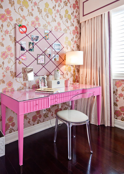
Remember that last-minute baby grand in the living room? This vanity/desk was originally purchased for the living room but lost its intended spot to the piano. "Dare I say it? I sprayed a Barbara Barry dressing table bubble gum pink!" Meisels says. "I put a glass topper on it to protect the surface and one day it will make a great desk for homework."
This kind of versatility and problem-solving are what make a designer great.
More:
6 Favorite Family-Friendly Homes
Houzz Tour: Family Home Gets New Soft-Modern Style
Houzz Tour: Traditional With Contemporary Shine
This kind of versatility and problem-solving are what make a designer great.
More:
6 Favorite Family-Friendly Homes
Houzz Tour: Family Home Gets New Soft-Modern Style
Houzz Tour: Traditional With Contemporary Shine


Scott Davidson founded Davidson Builders in 1998. Scott graduated from Michigan State with a BS in Construction... Read More
What are you working on?

Related Products


The Columbus based, Daniel Russo Home Team, recognizes the importance a well-thought-out interior design. The... Read More
Related Stories
Contemporary Homes
Houzz Tour: Boston Pied-à-Terre Designed for Evenings
By Becky Harris
A designer found on Houzz infuses a condo with a sultry vibe inspired by supper clubs and luxe boutique hotels
Full Story
Guesthouses
Houzz Tour: Light-Filled 704-Square-Foot Modern Cottage
By Becky Harris
An architect and a designer create a light and airy feel, cozied up by layers of textures
Full Story
Outbuildings
Family Gatherings in Argentina Inspire a Pavilion and Guesthouse
By Becky Harris
A new yard adds room for hosting, swimming and bringing part of one homeowner’s culture to her family’s Seattle home
Full Story
Transitional Homes
Houzz Tour: Organic Style on an Avocado Ranch
By Becky Harris
A designer uses a soft neutral palette, handmade tile and reclaimed wood to update a 1980s contemporary home
Full Story
Transitional Homes
Houzz Tour: Elegant, Earthy Ranch House for an Empty-Nest Couple
Design styles, warm neutral colors and special details blend in a Minnesota ranch-style house with a finished basement
Full Story
Contemporary Homes
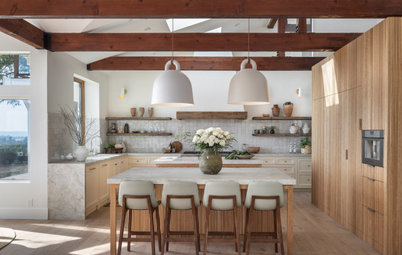
Houzz Tour: Colorado Forever Home Is a Family Affair
By Becky Harris
The mountain home was designed for gatherings and to make the most of views of Pikes Peak and surroundings
Full Story
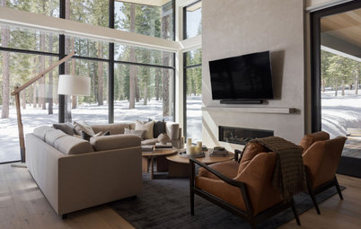
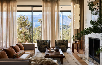
Contemporary Homes
Houzz Tour: Open and Inviting Mountain Home Near Lake Tahoe
By Becky Harris
A designer creates a warmly minimalist California getaway that can stand up to snow and mud
Full Story
Homes Around the World
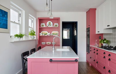
Houzz Tour: Period Home Gains Color and Character
By Kate Burt
Before-and-after photos show how a bold palette and restored features bring warmth and personality to this English house
Full Story
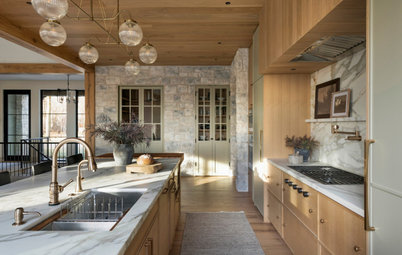
Modern Homes
Houzz Tour: New Home Gets a Midcentury Modern Makeover
By Julie Sheer
A designer in Boston reworks the kitchen and primary suite and adds style with furnishings, lighting and more
Full Story

Barn Homes
Houzz Tour: Old Barns Become an Airy, Modern-Rustic Home
A barn home in Devon, England, sits lightly on the land and offers simple, relaxing spaces for an extended family
Full Story
Colours in the boy's room were a fail. Rug beneath the dining room table was too short.