


Kitchen of the Week: Family Time and ‘Pheasantries’
A custom mosaic tile mural makes a knockout centerpiece in this traditional kitchen with copper and blue accents

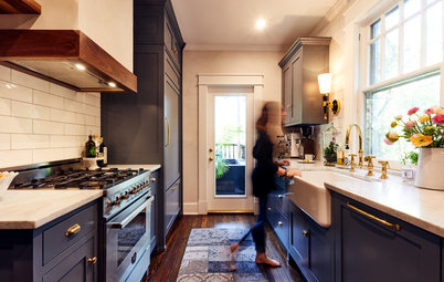
Style. The home is a Tudor-style house built in the early 20th century, so traditional elements suited its style. The inspiration for the color and material palettes started with this La Cornue range. “My clients are enthusiastic cooks who love to entertain with themed dinner parties and cook family dinners, so they decided they wanted this special range,” Stephens says.
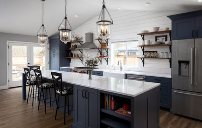
Range. They chose cobalt blue with unlacquered copper metal trimmings, which inspired the color palette for the entire kitchen. The range is 48 inches wide and has two ovens.
Mosaic mural. To make the range the star it deserved to be, Stephens came up with a neutral white-and-gray color palette for the rest of the kitchen, but she added a special custom touch to help accentuate it overhead.
“My clients love pheasants, in particular ring-necked pheasants,” the designer says. So they met with mosaic artist Anne Oshman, who made a special mosaic tile mural for them. It features three pheasants in the snow.
Range: Le Château 120, Château series, La Cornue
Take a gander at the work Oshman put into this mural, which she calls Exchanging Pheasantries. She worked from a photo of pheasants that live in the area, enlarging the photo and then laying out the tiles on top of it.
“So much went into it,” Stephens says. “For example, she used iridescent glass pieces to make the feathers glimmer in certain places.” Everyone enjoyed the trips back and forth to Oshman’s studio to check on her progress as the piece came together.
“So much went into it,” Stephens says. “For example, she used iridescent glass pieces to make the feathers glimmer in certain places.” Everyone enjoyed the trips back and forth to Oshman’s studio to check on her progress as the piece came together.
Range needs. The range area maximizes function. Pullout lower cabinets flank the stove. One side keeps necessary utensils close at hand.
Kitchen Confidential: Amp Up Your Storage With Pullouts
Kitchen Confidential: Amp Up Your Storage With Pullouts
The other side houses the herbs and spices.
Hardware. Stephens offers a tip on choosing hardware. “It’s good to choose a line that has different sizes, as a standard 5-inch pull can look lost on a wide drawer and not function well,” she says. She chose a line that offered the same style of pulls in a range of widths. It has a traditional silhouette and an oil-rubbed bronze finish. “The coppery tones that show through on oil-rubbed bronze play off the copper on the range,” she says.
Custom cabinetry: Tracey Stephens Interior Design; pullout accessories: Rev-A-Shelf; cabinet hardware: reeded drawer pull in Umbrio, House of Antique Hardware
Range hood. The range hood surround is traditional but has a heavy-duty modern exhaust vent system inside. A makeup air system is activated when the vent goes on to bring in fresh air. “More and more code officials are requiring systems like this,” she says.
Backsplash. The backsplash is a glazed brick tile. “It has a really nice texture to it,” Stephens says.
Range hood: Stanisci Design & Manufacturing; backsplash tile: glazed thin brick in Snow, 2½ by 8 inches, Fireclay Tile
Backsplash. The backsplash is a glazed brick tile. “It has a really nice texture to it,” Stephens says.
Range hood: Stanisci Design & Manufacturing; backsplash tile: glazed thin brick in Snow, 2½ by 8 inches, Fireclay Tile
Before. One of the clients’ top priorities was to have a large sink underneath a window. The existing window was too high for her to see out when she stood at the sink. The new window and sink placement drove a lot of the layout decisions.
Sink window. Stephens played around with a few ideas before landing on a large fixed window over the sink (other windows in the kitchen open). How it would fit in with the exterior architecture and the logistics of construction went into the decision. She placed it in a way that left 10 inches between the edge of the window and the sink for flowers and herbs. The countertop extends to the sill for a seamless look.
Glass cabinet doors flank the window. Stephens recommends plain glass (that is, no panes) for this type of use because the shelving inside provides the lines. “Dividers will almost never line up right with the shelves, and then all of the lines become too busy,” she says.
Traditional details. Because the house is over 100 years old and in a Tudor style, Stephens stuck with traditional details like the dentil molding at the ceiling, the cabinetry’s beaded trim, the feet beneath the sink cabinets, and the hardware. “The cabinetry is very traditional but not overly fussy,” she says.
Stephens notes that the dentil molding came as raw wood and required a laborious, meticulous paint job. “They had to get in there with a tiny paintbrush that was about the size of a Q-tip,” she says. She warns that this kind of paint job will require a surcharge. In this case, the dentil molding is an original detail in other parts of the home, so using it here created continuity.
Fluted-front sink: via Tracey Stephens Interior Design; faucet: Artesso collection in Venetian Bronze with SmartTouch hands-free operation, Brizo; pendant light: Everly collection, Kichler
More pullouts flank the sink. This one houses the cutting boards and can hold baking sheets.
Dishwasher. Although Stephens usually likes to place a dishwasher right next to a sink, her clients were used to having it off to the side, as it is here. Having the large sink under the window flanked by custom pullouts and symmetrical cabinetry was more important to them.
Refrigerator and freezers. Between the refrigerator, far left, and the dishwasher are freezer drawers. The adjacent fridge has no freezer. “They have a large freezer in the basement, so these drawers are for ice cubes, ice cream, snacks and items they use daily,” Stephens says. The double-hung window in the photo is the same window you saw in the first photo; the designer had the low sill moved up so that it could accommodate lower cabinets beneath it.
Countertops. Although Stephens often steers her clients away from marble because of its tendency to stain, these clients wanted it and knew they could live with the inevitable dings and stains that give it patina. As for the sealer, Stephens’ marble installer recommended one he thought was best, but it contained formaldehyde, so she tested his against her preferred nontoxic water-based sealer. Hers stood up better to the red wine, lemon and oils they threw at it.
Countertops: Zebrino Fantasy marble; marble sealer: Sealer’s Choice Gold, Aqua Mix; 36-inch refrigerator and 30-inch undercounter freezer drawers with ice maker: Sub-Zero; find a refrigerator
Floor plan (before). The kitchen, left, was separated from the large butler’s pantry, right, by a wall. The family had a table in the butler’s pantry and ate most meals in there.
Floor plan (after). “They were so used to eating in there that taking down this wall [behind the refrigerator] was a tough sell,” Stephens says. “But they decided to open it up.” She kept their kitchen table in about the same spot.
Before. If you peek through the doorway on the left, you can see the existing butler’s pantry.
Peninsula. Now, between the eat-in area and the rest of the kitchen, a peninsula houses the microwave-convection oven, toaster oven and warming drawer. The countertop is in the right spot for laying out food for casual meals.
“The warming drawer is great for meals when they are all busy with their different schedules,” Stephens says.
Banquette. “They wanted to be able to seat six, so a banquette was the best way to accommodate that and leave enough circulation open around the table,” Stephens says. She custom-ordered the table’s urn-shaped pedestal and then added a top in the same marble as the countertops.
The solid blue fabric is faux leather that is durable and washable. The patterned chinoiserie fabric depicts different scenes. Stephens worked with her workroom to pick out different scenes for the back of each chair. She then had that fabric treated with a nontoxic water-based fabric protector.
Seat fabric: Izit Leather Junior in Oceanic, Willow Tex; back fabric: Pagoda River in indigo, Sanderson
Chandelier. Waiting for the chandelier required a lot of patience. After the four months it took to custom-design the colors and glazes on the leaves and fruits, the large crate it was shipped in got lost somewhere between France and U.S. Customs. It was last tracked to a plane headed for Tel Aviv and has never been recovered, so they had to wait three more months for a second one to be made in France and shipped. It was worth the wait.
Custom chandelier: Art & Floritude; chairs: Lorts Furniture via White House Luxe
Custom chandelier: Art & Floritude; chairs: Lorts Furniture via White House Luxe
Floor. In this photo, you can see that the kitchen, while large, is relatively narrow. Because the room is above an unheated garage and was cold and drafty, the clients opted for radiant underfloor heating. (During construction, they also improved the wall and floor insulation.) The flooring is natural graphite slate, specially cut into a herringbone pattern and sealed. The reason for custom cutting was to create the right size for the scale of the room — it needed to have enough of a repeat across the width of the room without being too busy.
Stephens warns that a herringbone pattern usually requires a surcharge from the tile installer because it takes more time and requires them to be rather finicky. “The result is so beautiful though,” she says.
Floor tile: Wayne Tile; browse slate tile
Stephens warns that a herringbone pattern usually requires a surcharge from the tile installer because it takes more time and requires them to be rather finicky. “The result is so beautiful though,” she says.
Floor tile: Wayne Tile; browse slate tile
Butler’s pantry cabinets. These leaded-glass upper cabinets are original to the house. “My clients have lots of beautiful china that they like to use and display,” Stephens says. She plucked the orange hue she used inside from the pheasant mosaic for a powerful contrast with the blue.
The lower cabinets were in bad shape, so she had them replaced with cabinetry that matched the rest of the kitchen cabinets. She used the same marble from the kitchen countertops on the counter and backsplash here.
Cabinet interior paint: Pumpkin
Cream, Benjamin Moore
The lower cabinets were in bad shape, so she had them replaced with cabinetry that matched the rest of the kitchen cabinets. She used the same marble from the kitchen countertops on the counter and backsplash here.
Cabinet interior paint: Pumpkin
Cream, Benjamin Moore
Casework. The cabinetmaker also altered the cabinet to the right. Only the glass-front portion used to exist here, and it hung off the wall in an odd way. So Stephens had him add a cabinet to the bottom and a display area on top, again backed in orange.
Must-haves. The clients wanted to have a TV in here and room for their extensive cookbook collection. The cabinetmaker made the bookshelf for both. In addition to serving as a favorite space to eat dinner together, this area is also a favorite hangout and homework spot. Stephens had USB ports installed along the bottom of the banquette for charging devices.
Paint: Blue Nova (walls) and Decorator’s White (cabinets), Benjamin Moore; carpentry: Fine Custom Carpentry
Window treatments. For the window treatments, she helped her clients find a fabric that would complement the chinoiserie pattern on the chairs. Then she had her workroom create custom scalloped edges that outline the pattern’s motif. Also worth noting is the braided trim detail at the top of the valance.
Takeaways
Contractor: European Craftsman
Painting and staining: Mulligan & Phillips
More
See other Kitchens of the Week
Find a kitchen designer
Takeaways
- If you want one element like a special colorful range to be the star, use a neutral color palette elsewhere to complement it.
- Keep continuity throughout an older house through millwork details like moldings.
- Check with your designer about fine details that will require surcharges before making decisions.
- Be informed about the durability of your countertop choices and then decide if you can live with stains and dings before choosing.
- Take note of the newer appliance options like freezer and warming drawers.
- If you have beautiful old built-ins, see if you can salvage them. In the butler’s pantry, these homeowners saved the lovely leaded glass portions while adding better function with new cabinetry underneath.
Contractor: European Craftsman
Painting and staining: Mulligan & Phillips
More
See other Kitchens of the Week
Find a kitchen designer


Kitchen at a Glance
Who lives here: A family with two children still at home and two out of the nest
Location: Montclair, New Jersey
Size: 340 square feet (32 square meters)
Designer: Tracey Stephens
Before. A fire prompted this renovation. After dropping off her kids at school, one of the homeowners returned to find firefighters inside the house. One of the kids had left a pizza box on top of the stove, and apparently one of the dogs inadvertently turned on a burner when jumping up to try to get a slice. Luckily for the homeowners, the firefighters’ quick response left only smoke damage and a ruined range. (The range used to be where the garbage can is in this “before” photo).
When they called interior designer Tracey Stephens, they were on the fence about whether to just get a new range, do a light makeover or launch a complete renovation. She gave them a proposal for each, and they called her the next day to say that they had decided to go for a complete renovation. And they really went for it — this renovation was extensive.