


A Table for 2 and More Storage in an Empty Nesters’ Kitchen
With their children out of the house, these Marylanders have created a kitchen that fits their new lifestyle

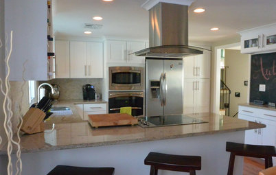
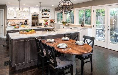
This kitchen renovation benefited from the clear vision of a well-traveled couple, whose many hotel stays across the world influenced the room’s design. Good hotels stake their reputation on that sweet spot where functionality meets aesthetics, and these Maryland empty nesters wanted to strike that balance in their new kitchen. They worked with designer Samantha Klickna and Melissa Cooley to map out a space that would maximize every square inch of its existing footprint without knocking down a single wall.
The designers and homeowners agree that their favorite design flourish is the glass tile backsplash from Architectural Ceramics. Designer Samantha Klickna says she loves the combination of materials and how the backsplash provides some depth and ties in the two different cabinet colors. “It really makes the space,” she says.
The designer replaced a large range hood with a low-profile model whose thin line of stainless steel contributes to a clean cabinet-backsplash connection. The glass cabinets amplify the wow factor the clients craved, as it reintroduces the backsplash tile’s curves in a subtle way. Lights in the cabinet add ambiance along with the complementary pendants.
The designer replaced a large range hood with a low-profile model whose thin line of stainless steel contributes to a clean cabinet-backsplash connection. The glass cabinets amplify the wow factor the clients craved, as it reintroduces the backsplash tile’s curves in a subtle way. Lights in the cabinet add ambiance along with the complementary pendants.
An array of custom cabinets from Crystal Cabinets were fabricated with two finishes: a white up top and a mushroom color below. The woman of the house loves green, and the adjacent TV room and dining spaces are replete with green accents that work well with the earthy undertones of the lower cabinetry and island. The color blends almost perfectly with the Blanco Silgranit sink, a stone composite product favored by the designers for its durability, low maintenance and wide range of color options.
Instead of putting an oven right under the cooktop, they flanked the stove with two ovens and a bank of drawers — including a microwave drawer — in between. This decision created a pleasing symmetry that mirrors the layout of the upper cabinets. Also on either side of the stove are cabinets atop the countertop that hide the smoothie machine and coffeepot.
With outlets installed in the bottom of the glass cabinets, and bifold doors that allow small appliances to be pulled out and stowed away easily, the clients never have to face a mess of cords on the counter.
Find glass pendant lights
With outlets installed in the bottom of the glass cabinets, and bifold doors that allow small appliances to be pulled out and stowed away easily, the clients never have to face a mess of cords on the counter.
Find glass pendant lights
Sometimes what’s right for others isn’t what’s right for you. With their three children grown out of the house with families of their own, the couple didn’t need a giant refrigerator. But they did need a lot of storage for their large collection of dishware. So Klickna and Cooley added a smaller built-in fridge, which they hid behind a sleek white paneled door, and bordered it with enough storage to give everything from teacups to small appliances its own proper home.
The designers kept the homeowners’ beloved colorful window valance in play to coordinate with decor in the adjacent living area. The island’s footprint didn’t change, but it received a makeover to include a niche for bar stool seating and a decorative leg to dress it up.
More
A Two-Tone Cabinet Scheme Gives Your Kitchen the Best of Both Worlds
Kitchen Confidential: Painted vs. Stained Cabinets
More
A Two-Tone Cabinet Scheme Gives Your Kitchen the Best of Both Worlds
Kitchen Confidential: Painted vs. Stained Cabinets

Kitchen at a Glance
Who lives here: A couple with three grown children
Location: Bethesda, Maryland
Size: 225 square feet (20.9 square meters)
Designers: Melissa Cooley and Samantha Klickna of Case Design
A functional wish list provided a starting point for the project: Among the homeowners’ foremost requirements were two separate work stations for smoothies and coffee, a double oven and a ton of storage. Aesthetically, they wanted to retain the lightness of their existing all-white kitchen but add a wow factor, something to catch their eye when they walk in the room.
Underneath the window bank, the chunky banquette that was a pain to shimmy into had to go. The design team replaced it with a smaller round table and two chairs, just right for a couple.