


7 Bedding Color Palettes for a Refreshing Summer Retreat
These color combinations can bring an invigorating summertime feeling to your bedroom

The summer months are when I tend to crave a light, cool feeling for the bedroom. While this is a common-sense approach for summer fabric weights, it also holds true for seasonal bedding color schemes. Color, after all, creates a mood. Consider these seven palettes to bring a refreshing, invigorating summer mood to your private space.
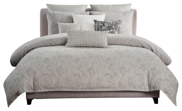
2. Gray and tan. Neutral bedding doesn’t have to be boring. In this inviting, light-filled room, the simple gray-and-white, ticking-style bedding provides a classic anchor for the dramatic light fixture and animal horns overhead. The ottoman picks up the color in the headboard, while the blue pillow on the window seat adds an unexpected pop of color.
Find bedding products
Find bedding products
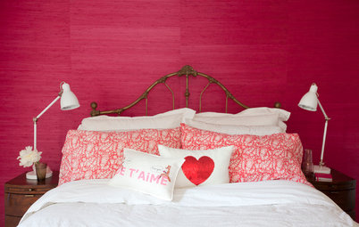
3. Coral and purple. Simple bedding not only repeats the colors in the headboard but also neutralizes its busy pattern. The coral Euro shams and purple accent pillow add color and pattern without overwhelming the room, while the fresh flowers pick up the floral pattern in the headboard. Perfume bottles augment the coral color of the bedding and headboard.
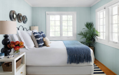
4. Muted blue and gray. Patterned bed pillows in blue, gray, and white create a soothing palette thanks to their muted tones. The Roman shades, throw and teal accent pillow repeat the colors in the patterned pillows, while the white headboard and gray walls reinforce the neutral colors in those same patterned pillows. Rose bouquets add a fresh hit of color to this quiet room.
5. Soft blue and green. The abundance of white fabric mixed with muted blues and greens helps create a stress-free environment in this bedroom. A textural green coverlet, chairs and checked rug repeat the color scheme without adding a busy feel. The white duvet and fabric tied over the headboard and footboard enhance the room’s summertime feeling, while the patterned Euro shams echo the botanical theme of the wallpaper.
6. Fuchsia and blue. A palette of pink and blue might sound fairly calm at first, but the mix of patterns on this bed, combined with a vibrant rug and wallpaper, creates an explosion of color and interest. Somehow, the blend manages to work in a space designed to be calm enough for sleeping.
Note the echo of color around the room: The fuchsia from the duvet is augmented by the area rug, flowers and shelf decor. The blue pillow picks up the wallpaper and wall colors.
Note the echo of color around the room: The fuchsia from the duvet is augmented by the area rug, flowers and shelf decor. The blue pillow picks up the wallpaper and wall colors.
7. Orange and blue. Even though complementary colors like blue and orange grab your attention, the simple white walls, white sheers and a neutral carpet color help tone down the room. The color scheme in this room is quite disciplined; notice how the orange-and-white pillow picks up the orange coverlet, while a blue vase repeats the blue theme of the throw and other pillows. The gold lamp reinforces the brown pillow’s gold color.
More
7 Color Palettes for a Pleasing Entryway
How to Create a Calm and Relaxing Bedroom
Browse bedroom furniture and accessories
More
7 Color Palettes for a Pleasing Entryway
How to Create a Calm and Relaxing Bedroom
Browse bedroom furniture and accessories


Accent items help solidify the palette. In this photo, the tiny giraffe on the windowsill picks up the citrine, the carpeting mimics the light brown in a floral pillow, while the Roman shades repeat the green in the pillow shams.