


New This Week: Designer Secrets for a Well-Styled Vignette
Pros describe what makes these decorative ‘moments’ in homes so special

The phrase “interior design” seems to speak to the overall look of a room, home or building. But many times, well-designed interiors are made up of several small scenes or vignettes that together tell a complete story about the style within the walls. Designers know that the secret to a beautiful room or home is found in these perfectly styled “moments” that occur in corners, small seating areas and narrow views that you see, for example, from the bed when you wake up in the morning. Here, four designers share the magic of styled vignettes.
2. Modern Victorian
Designer: Lynn K. Leonidas
Location: Alameda, California
Homeowners’ request: Remodel a Victorian home, updating the finishes, furnishings and accessories while honoring the original style.
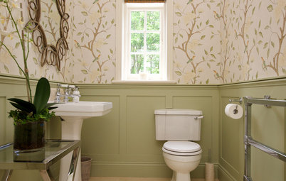
Vignette: “The homeowner wanted the master bedroom to have some historical reference, so for that we used classical toile wallpaper,” designer Lynn Leonidas says. “We were able to create a cozy sitting area for the client to read in the room. We painted the trim black throughout the entire house and refinished the hardwood floors to a lighter stain. The black and white in the toile wallpaper pulls colors from the trim and ceiling. The oversized floor lamp is a statement fixture, and there is a little side table for coffee and books. The balance of these furnishings creates a cozy nook within a larger room.
Designer secret: “Here’s a tip you can take from this room: An easy way to select wallpaper is to find a color in the wallpaper that matches an architectural feature, such as the trim, or vice versa, painting the trim with a color found in the wallpaper,” Leonidas says.
“Uh-oh” moment: “The floor lamp we chose is huge, and we knew it could be overpowering in this room, but we decided to embrace the scale and play it up with unconventional furnishings surrounding it,” Leonidas says. “The acrylic side table and curvy chair add to the playfulness of this idea.”
Also on the team: Thomas J. Story for Sunset magazine (photographer)
Wallpaper: Pheasant Toile in black and white, Thibaut; floor lamp: Juniper, Arteriors, available on Houzz; acrylic side table: Magazine, Modway, available on Houzz; chair: Teddy Bear in beige, Stilnovo, available on Houzz
See more of this home
Designer: Lynn K. Leonidas
Location: Alameda, California
Homeowners’ request: Remodel a Victorian home, updating the finishes, furnishings and accessories while honoring the original style.
Vignette: “The homeowner wanted the master bedroom to have some historical reference, so for that we used classical toile wallpaper,” designer Lynn Leonidas says. “We were able to create a cozy sitting area for the client to read in the room. We painted the trim black throughout the entire house and refinished the hardwood floors to a lighter stain. The black and white in the toile wallpaper pulls colors from the trim and ceiling. The oversized floor lamp is a statement fixture, and there is a little side table for coffee and books. The balance of these furnishings creates a cozy nook within a larger room.
Designer secret: “Here’s a tip you can take from this room: An easy way to select wallpaper is to find a color in the wallpaper that matches an architectural feature, such as the trim, or vice versa, painting the trim with a color found in the wallpaper,” Leonidas says.
“Uh-oh” moment: “The floor lamp we chose is huge, and we knew it could be overpowering in this room, but we decided to embrace the scale and play it up with unconventional furnishings surrounding it,” Leonidas says. “The acrylic side table and curvy chair add to the playfulness of this idea.”
Also on the team: Thomas J. Story for Sunset magazine (photographer)
Wallpaper: Pheasant Toile in black and white, Thibaut; floor lamp: Juniper, Arteriors, available on Houzz; acrylic side table: Magazine, Modway, available on Houzz; chair: Teddy Bear in beige, Stilnovo, available on Houzz
See more of this home
3. Bold
Designer: Abby Rose Interior Designer
Location: Hancock Park neighborhood of Los Angeles
Homeowners’ request: Vivid color and fantasy in a home office. “No neutrals or beiges for this client,” designer Abby Rose says.
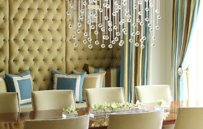
Vignette: “The client had shown me a photo of a room from London that she saw online,” Rose says. “It had these colors, the turquoise and citron yellow. We started with the wallpaper. We had to choose the rest of the colors and patterns to coordinate with the wallpaper, since it was such a prominent statement. I decided to paper only one accent wall, because the paper has so much of a visual story and would have been overpowering on all four walls.
“The fuchsia for the love seat — which is microfiber velvet, so her dogs are welcome to curl up on it — was pulled from the wallpaper. We went for a white fuzzy ottoman coffee table with Lucite legs. I love to mix patterns. The main rule is that they should be different in scale and shapes. For example, the geometric houndstooth of the pillow creates a graphic visual against the romantic shapes in the wallpaper. The gold cage sphere pendant gives the roomy a fairy-tale feeling.”
Designer secret: “Don’t be afraid of patterns on patterns or mixing strong colors,” Rose says. “It can be done successfully. It’s all a matter of balance.”
“Uh-oh” moment: “After we installed the wallpaper, I loved it but worried how I would design the rest of the room without allowing the bold wallpaper to overpower the whole room,” Rose says. “I realized that by doing everything else in strong, vibrant colors and patterns, I could balance the bold wallpaper.”
Also on the team: Eva Sobesky of EIS Studio (architect); Dan Arnold (photographer); ArchiteXture (custom upholstery)
Wallpaper: Cocarde, Christian Lacroix; rug: Jaipur Living; upholstery: custom; pendant: Visual Comfort; mirror and accessories: ArchiteXture
See more of this home
Designer: Abby Rose Interior Designer
Location: Hancock Park neighborhood of Los Angeles
Homeowners’ request: Vivid color and fantasy in a home office. “No neutrals or beiges for this client,” designer Abby Rose says.
Vignette: “The client had shown me a photo of a room from London that she saw online,” Rose says. “It had these colors, the turquoise and citron yellow. We started with the wallpaper. We had to choose the rest of the colors and patterns to coordinate with the wallpaper, since it was such a prominent statement. I decided to paper only one accent wall, because the paper has so much of a visual story and would have been overpowering on all four walls.
“The fuchsia for the love seat — which is microfiber velvet, so her dogs are welcome to curl up on it — was pulled from the wallpaper. We went for a white fuzzy ottoman coffee table with Lucite legs. I love to mix patterns. The main rule is that they should be different in scale and shapes. For example, the geometric houndstooth of the pillow creates a graphic visual against the romantic shapes in the wallpaper. The gold cage sphere pendant gives the roomy a fairy-tale feeling.”
Designer secret: “Don’t be afraid of patterns on patterns or mixing strong colors,” Rose says. “It can be done successfully. It’s all a matter of balance.”
“Uh-oh” moment: “After we installed the wallpaper, I loved it but worried how I would design the rest of the room without allowing the bold wallpaper to overpower the whole room,” Rose says. “I realized that by doing everything else in strong, vibrant colors and patterns, I could balance the bold wallpaper.”
Also on the team: Eva Sobesky of EIS Studio (architect); Dan Arnold (photographer); ArchiteXture (custom upholstery)
Wallpaper: Cocarde, Christian Lacroix; rug: Jaipur Living; upholstery: custom; pendant: Visual Comfort; mirror and accessories: ArchiteXture
See more of this home
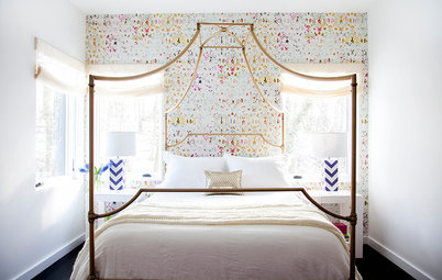
4. Glam
Designers: Michael and Rosa Van Parys of Van Parys Architecture + Design
Location: Westlake Village, California
Homeowners’ request: A master bedroom oasis that would feel tranquil while still having glam accents.
Vignette: “Black and white was the color palette from the get-go,” designer Rosa Van Parys says. “We began adding in gold to accentuate a glam element, and the homeowner loved the idea. The flooring in all the bathrooms is very geometric, so it made sense to add in geometric wallpaper to cohesively tie the house together. Everything was kept light so that the Cole and Son geometric wallpaper could really be the standout feature of the space.”
Other special features: “For the flooring, we stuck with a distressed light oak throughout the residence to ensure the light, bright and airy goal,” she says. “In addition to the walk-in closet storage, we furnished two large nightstands with ample storage to each side of the bed, and the white credenza seen in this photo.”
Also on the team: Grand Construction (contractor); So Cal Luxury Real Estate (developer); Gary Moss (photographer)
Wallpaper: Cole and Son; floor lamp: Kelly Wearstler; chair: Mitchell Gold + Bob Williams; side table: Interlude; credenza: Worlds Away
See more of this home
Related Guides
Decorating 101: How to Start a Decorating Project
Considering Wallpaper? Here’s How to Get Started
More Resources on Houzz
Shop for furniture and accessories
Find interior designers and decorators near you
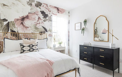
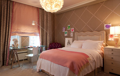


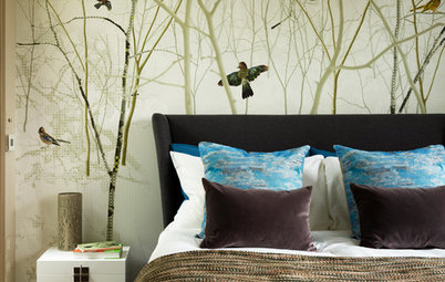


Designer: Lauren Ramirez Styling & Interiors
Location: Austin, Texas
Homeowners’ request: Designer and homeowner Lauren Ramirez needed a functional space to act as a “dumping ground” in the bedroom for her and her husband at the end of the day. “We needed a place to store small items that usually end up cluttering the top of a dresser,” Ramirez says. “It is also the area that we look directly at from the bed, so I wanted it to be beautiful and inspiring.”
Vignette: “My favorite design theme is always black and white with strong graphics,” Ramirez says. “A splash of color and organic materials complement the basics perfectly, so I started with white walls and the strong black dresser. Adding art, pops of peach and orange, and organic elements like the antlers, leaves and wood-plank ceiling gives the space interest and balance.”
Other special features: “It turned into a his-and-hers corner in our bedroom,” Ramirez says. “He gets the small shelf with hooks for his wallet, sunglasses, coins, etc. and for hanging his hat when he takes it off. I get the branch hooks for my necklaces and the jewelry box for my bracelets and earrings.”
Designer secret: “Since this dresser top is very small, I chose to make use of the entire corner and get some items up on the wall rather than overcrowding the top of the dresser,” Ramirez says. “I essentially took a gallery wall and hung items on two intersecting walls, having the art wrap around the corner. There’s no rule that a gallery wall has to be flat.”
“Uh-oh” moment: “This room originally had a popcorn ceiling that I really hated looking at every day,” Ramirez says. “I told my husband that all I wanted for Christmas was to not see popcorn anymore, so we decided that rather than scraping the popcorn off the ceiling in this room, we would cover it with cedar tongue-and-groove planks. We knew scraping popcorn would be a messy and labor-intensive process, so we opted to warm up the space with wood planks that we installed directly on top of the popcorn instead. It made the room feel very cozy and even added a nice cedar scent.”
Also on the team: Molly Winters Culver (photographer)
Dresser: thrift store (Ramirez painted it black and changed out the hardware); black-and-white art: Lauren Ramirez; jewelry box: West Elm; small planter, pink bowl and ring dish: Anthropologie; large glass vase: Cost Plus World Market; antlers: gift; small shelf: thrift store; mirror: bought on a trip to China; art print: Georgia O’Keefe Museum; cedar 5-inch planks: Lowe’s
See more of this home