


Kitchen Design

New This Week: 3 Bright, Light Kitchens That Shy Away From White
With the right colors and materials, you can have a bright kitchen without going to the white side

A lot of homeowners want a light and bright kitchen. Going with white walls and white cabinets will certainly bounce light around, but if you have sufficient natural light to begin with, you don’t have to stick to the monochromatic scheme. The following kitchens show that you can have an eye-opening space with warmer colors and woods.
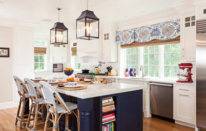
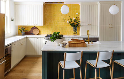
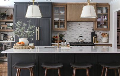
2. Buttoned Up and Bold
Designer: Carly Nemtean of Carriage Lane
Location: Brampton, Ontario, Canada
Size: 650 square feet (60.4 square meters)
Homeowners’ request: Bring coziness and warmth to a spacious kitchen with soaring ceilings.
Color palette: Taupe cabinets; blue island; stone backsplash; white countertop. “We did not want a modern cold palette in the space,” says designer Carly Nemtean. “We went with subtle color changes so that the space played well together, working with the natural elements and tones. White would have been too impersonal.”
Other special features: Strong blue accents and a pitched ceiling. “Our clients’ children are almost off to college, so we wanted to design a space that was more mature for their soon-to-be empty nest,” Nemtean says. “We did so with ornate island details and paneled cabinet doors with rich hardware.”
Designer secret: “Use what you have,” Nemtean says. “Each space is unique to itself. Let the space speak to you, and in turn take advantage of the characteristics it holds. If you work with the space, it will work in turn.”
Also on the team: Itay Joshua of Joshua Design Co. (architecture); Carriage Lane (construction); Alta Moda Millwork (cabinetry); Stone Edge Marble and Granite (countertops); Stephani Buchman (photography)
Backsplash: Olympia Tile; countertops: Caesarstone; light fixtures: Sescolite Creative Lighting; stools: Sunpan
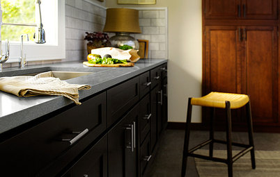
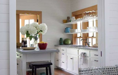
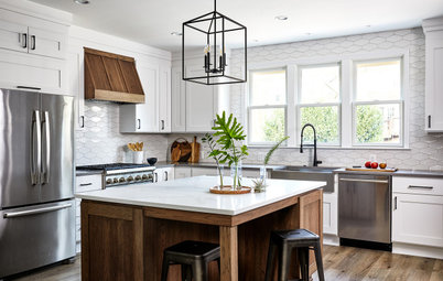
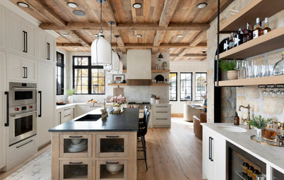
3. Open and Cozy
Designer: Keri Olson of KOR Interior Design
Location: Luck, Wisconsin
Homeowners’ request: Replace a small, dark kitchen with a spacious layout in which two or three people can comfortably cook.
Color palette: Medium-dark main cabinets; warm gray side cabinets; light wood floors; honey-colored wood ceiling; spring-green subway tile backsplash; deep blue window trim and shelves in glass-fronted cabinet. “This palette works because it is so natural that it feels instantly comfortable,” says designer Keri Olson. “They didn’t want a white kitchen because they felt it just wouldn’t stand up well to regular use. They wanted the room to feel open and light without being white. Leaving uppers off the window wall and cladding it with a light tile kept the room open and light bouncing throughout the space.”
Other special features: Butcher block chopping station with nearby prep sink; skylights; custom round butternut wood table that seats four
Why the design works: “The homeowners were hesitant to do stained cabinetry for fear it would get too dark, and yet they wanted a natural organic feel to the space,” Olson says. “I assured [them] that with the additional space from the remodel and the added light from the skylights that we could do a mix of finishes and none of it would be white and yet it would be open and airy, light and bright. The vaulted ceiling and skylights were the unique features that gave us so much leeway with color.”
Designer secret: “This is a very open kitchen,” Olson says. “The cabinetry on either end is a soft gray. To tie them together, I used the same graphic David Hicks wallpaper on the backs of cabinets on both ends. It pulled everything together and repeated the blue of the window trim and the green in the tile. Also, I love to use gray in a kitchen, as stainless steel appliances just disappear.”
Also on the team: Bone Lake Carpenters (contractor); Lars Peterssen and Andrew Edwins of Peterssen/Keller Architecture; Krysandi Kabinets; Troy Thies (photography)
Tile: Ceramic Tileworks; granite: Burgundy Typhoon, Universal Granite; wallcovering: Kravet; light fixture: Troy Lighting; paint: Skipping Stone and Loyalty Blue, Sherwin-Williams
See more of this home
More
Homeowner’s Workbook: How to Remodel Your Kitchen
New This Week: Moody Kitchens to Make You Rethink All-White
Find a kitchen and bath designer near you
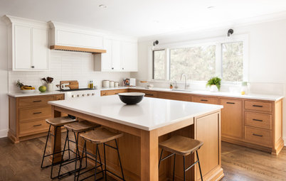
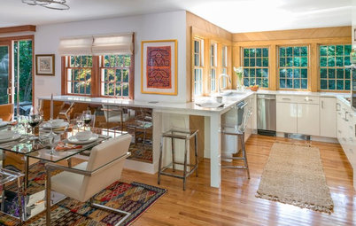
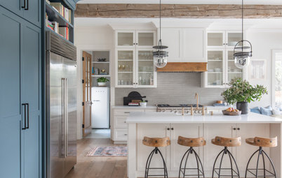


Designers: Jeff DeGraw and Chris DeHaan of DeGraw and DeHaan Architects spearheaded the restoration; the homeowner made all the decorating choices.
Location: Tuxedo Park, New York
Homeowners’ request: Repair and revive a 1912 mansion that had fallen into disrepair. “The kitchen was designed to be as close as possible to the original kitchen when the house was built, while accommodating modern appliances,” says architect Jeff DeGraw.
Color palette: Creamy yellow walls; warm wood cabinetry and window trim; slate and wood countertops. “The colors were chosen to stay true to the palette that would have been found in the original home,” DeGraw says.
Why the design works: “In no way was modern convenience allowed to win over maintaining the original feel of the home,” DeGraw says. “The house feels like it’s never changed from 1912, while being fully updated.”
Designer secret: “Don’t assume you need an island,” DeGraw says. “There’s something charming about a real kitchen table in the actual kitchen.”
“Uh-oh” moment: “You have to give up certain things for a ‘look,’” DeGraw says. “It might be a lack of uppers or surrendering an island, but you say, ‘Gulp,’ go for it and create a space that doesn’t feel like another suburban home. It becomes memorable.”
Also on the team: Teddy Gusciora (builder)
See more of this home