


Kitchen of the Week: Black Was the Only Way to Go
Abundant natural light, texture and contrast make the challenging color a success

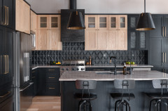
After thorough analysis, interior designer Catlin Stothers knew the best option for this kitchen renovation was unexpected: almost all-black. But she was nervous about selling the idea to her clients. In fact, she’d even mocked up a gray option among her 3-D models as a backup alternative for her presentation. “But the day before I was supposed to present my plans and before I ever even had a chance to mention my idea, my client called me up and said, ‘I’ve been thinking about the kitchen, and I think it really has to be black,’ ” Stothers says. With everyone on the same page, the plans for a sleek, dark kitchen with warm touches was a go.
The decision to go with black was rooted in the process of elimination. The existing kitchen was full of blond wood and had a yellow, very knotty pine ceiling. Stothers knew her clients had a penchant for things sleeker and more minimalist. They knew they didn’t want reclaimed wood because it seemed too obvious in a barn-like house in the country; they preferred more of a juxtaposition. But she knew they didn’t want anything too industrial either.
She also knew she wanted to emphasize the focus on the view and didn’t want surfaces that were too reflective. And she wanted to work with the existing gray concrete floors. “They had a lot of inconsistent wear and tear and mottling, which made them beautiful,” the designer says.
Another factor on black’s side: There was fantastic natural light in the space, which would keep the space bright. “Very few spaces can support a black kitchen, as it can feel too confined and dark,” she says. “But for this house, I kept going back to black — it felt like the right balance, it worked with the concrete and it was such a wow,” Stothers says.
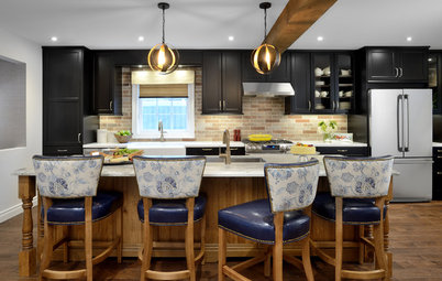
During the early phases of the design process, Stothers kept returning to a sample of a black-stained oak with a matte finish. “I knew we wanted something very matte so there wouldn’t be too much reflection,” she says. While the sample has a striated texture, the grain has a uniform horizontal pattern that’s not too busy.
Cabinets: Mission oak with a reconstituted veneer, Cedan
Cabinets: Mission oak with a reconstituted veneer, Cedan
Stothers did break up the black with a row of blond wood cabinets over the stove. (Note how they’re stepped back from the surrounding black cabinets.) “Adding this contrast makes it feel less dense and heavy — the black did need a break,” she says.
For cooking, there’s an induction stove, a speed oven, a regular oven and a warming drawer.
Appliances: Miele
For cooking, there’s an induction stove, a speed oven, a regular oven and a warming drawer.
Appliances: Miele
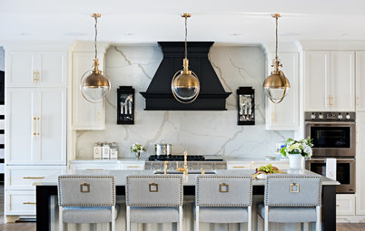
The backsplash and countertops are an Indian slate called Black Wave. “It has an organic and natural movement to it … it can have a lot of white veining, but we didn’t want a piece with too much of that or too much pattern,” Stothers says. “We chose pleasing interesting sections of it and placed them carefully.” The veining patterns are diagonal.
The same stone continues down the waterfall edge of the island. The birch butcher block is a custom piece Stothers designed. It wraps down the side of the countertop for stability and can slide along the island — for instance, over to the sink when food scraps need to be swept into the sink after chopping.
While the space is quite rectilinear, Stothers threw in a few curves for contrast, including the black matte faucet and the frosted glass and brass light fixture over the island. She placed one of the owners’ existing paintings on the far wall for just the right touch of color and texture.
Those knotty yellow ceilings got the boot, replaced with a pine that has minimal knots. Stothers subdued its color by playing around with the stain and adding gray to it. “It makes it more muted and understated and works well with the concrete, the black and the view out the windows,” she says.
To create a pleasing layout, she went for a large island (25 inches by 14 feet) that extends almost the length of the kitchen. The area on one side of the sink houses the dishwasher and the trash and recycling bins. Keeping the other end open allows for counter stools and avoids a blocky, clunky feeling.
Light fixture: Lambert & Fils
Stothers’ secret weapon for keeping the kitchen so clean and sleek is this 70-square-foot walk-in pantry, seen at the right. In addition to food and serveware, it holds a wine refrigerator and espresso bar.
This zoomed-out shot shows how the kitchen fits into the rest of the plan. The continuous concrete floors, gray-tinged pine ceilings and black accents create a cohesive flow throughout the first floor.
Browse more Kitchens of the Week
Browse more Kitchens of the Week


Kitchen at a Glance
Who lives here: A couple of empty nesters and their two big dogs
Location: The Laurentians, Canada, north of Montreal
Size: 226 square feet (21 square meters) plus a 70-square-foot (6.5-square-meter) pantry
Designer: Catlin Stothers
Fun fact: The previous owner of the home was Halle Berry
While Stothers was in the middle of remodeling the couple’s kitchen in their home just outside Montreal, they were looking for a vacation home in the country. When they found this one — set on 60 acres, surrounded by woods and with a view of a lake and close to ski areas — their dreams were realized. The modern, barn-like home had everything they’d ever wanted. So much so that after they spent their first night here, the thought of ever living anywhere else depressed them. So despite having just finished the major kitchen renovation, they sold their main house and moved up here to live full time.
The couple got to know the house and figured out what they wanted by living in it a few months before beginning renovation plans. When they were ready to get started, they gave Stothers a call.
The existing kitchen had a long, narrow galley layout. But the tradeoff was the wall of windows overlooking the woods and the lake, so they opted to keep the same kitchen footprint. “We get four true seasons here and they are all so spectacular that the homeowners cannot pick a favorite,” Stothers says.