


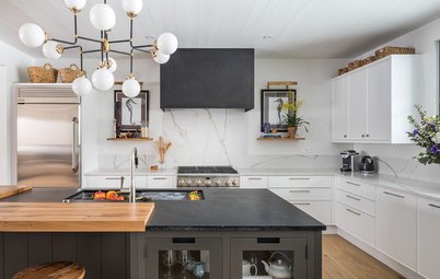
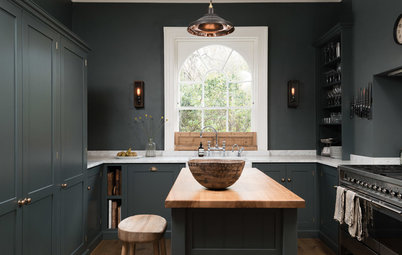
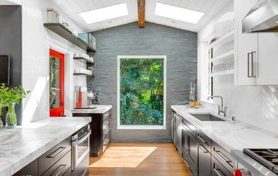
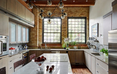
Kitchen of the Week: Doubling the Storage in 170 Square Feet
A designer adds cabinet and counter space while staying within the same footprint

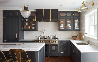
Though she didn’t expand the space one inch, interior designer Renee Gammon managed to double the storage capacity in the kitchen of this semidetached Toronto home. She also significantly increased the amount of valuable counter space. On a budget just shy of $45,000, she gave the kitchen a clean, contemporary and streamlined aesthetic and freshened up the adjacent living and dining areas.
BEFORE: All nice and staged for a real estate listing, the kitchen looks cute, clean and cheerful. But upon closer inspection you can see that the hodgepodge of free-standing pieces don’t provide much storage or work surfaces. “This wall was underutilized and didn’t make sense,” Gammon says.
The designer switched up the layout to make the most of the space. “By moving the refrigerator, oven and microwave to the opposite wall, we were able to tuck everything in neatly, provide more cabinet space, maximize countertop workspace on the other side and keep everything streamlined,” Gammon says. “We even had enough space to tuck in a wine cooler with a coffee station above it.” Outlets for the appliances were added along the wall.
By using budget-friendly and attractive cabinets from Ikea, Gammon was able to splurge on elements like quartz countertops, elegant cabinet hardware and custom details. Using 40-inch-high Ikea cabinetry maximized storage. Gammon then created custom millwork in a stepped fascia design at the top of the cabinetry to meet the ceiling neatly. “I didn’t want to leave a gap, and typical crown molding would have been too busy — this molding keeps the streamlined look we were going for and elevated the look of the Ikea cabinetry,” she says. Another way she elevated the look was by adding cabinet hardware by Richelieu.
By using budget-friendly and attractive cabinets from Ikea, Gammon was able to splurge on elements like quartz countertops, elegant cabinet hardware and custom details. Using 40-inch-high Ikea cabinetry maximized storage. Gammon then created custom millwork in a stepped fascia design at the top of the cabinetry to meet the ceiling neatly. “I didn’t want to leave a gap, and typical crown molding would have been too busy — this molding keeps the streamlined look we were going for and elevated the look of the Ikea cabinetry,” she says. Another way she elevated the look was by adding cabinet hardware by Richelieu.
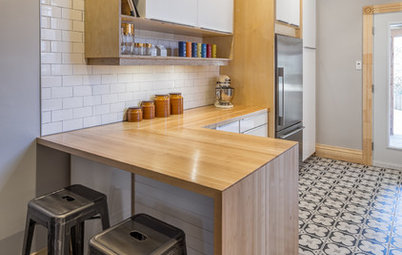
Gammon kept the peninsula layout from the original kitchen but used a cooktop instead of a slide-in. This means the homeowners can take advantage of the space beneath it for deep drawers. The cabinets and drawers are tricked out with bamboo organizers that play nicely off the butcher block shelving and allow for neat and organized storage.
Add storage and style to your kitchen with custom cabinets
Under the sink is a pullout for trash and recycling. “When placing this under a sink, it’s important to plan this ahead of time, as you have to have the sink plumbing installed in a way that provides enough clearance for the bins,” she says.
The faucet continues the unfussy contemporary look. The sink is black granite. The tile edging where the backsplash meets the dining room’s drywall is stainless steel, which keeps the look contemporary.
Faucet: Cucina
With the refrigerator moved across the room, there was room for tall pantry cabinets.
“The kitchen is mostly white and gray, but because of elements like the white penny rounds and gray grout on the backsplash and the white quartz countertops with gray veining, it feels layered and interesting,” Gammon says. “And the blue wall provides a nice complement to the orange accessories and small appliances.”
Tile: Olympia; counters: Arctic Mist, Caesarstone; vent hood: KitchenAid
The designer replaced the small table and chairs and the rolling island with a permanent, hard-working island. “It gave us a lot more room for storage. There are two banks of drawers and cabinets and cookbook shelves on the end,” she says. The shelves on the custom piece are lined in Ikea butcher block.
Blue paint: Colorado Gray, Benjamin Moore; refrigerator and ovens: KitchenAid
Blue paint: Colorado Gray, Benjamin Moore; refrigerator and ovens: KitchenAid
Cornflake the kitty followed the photographer around on photo shoot day.
None of the rooms are very big, so keeping the long, open feel was important. “We wanted to keep the lights over the peninsula minimalist so as not to break up the space with a big visual barrier,” Gammon says. “Then, over the dining table, we chose something that was minimalist but was also sculptural. We didn’t want it to be too stark.” She repurposed the couple’s existing table but added comfortable chairs upholstered in a leather-like vinyl that’s easy to wipe off.
Wall color: Crushed Ice, Sherwin-Williams; pendant lights: Morba; dining table light: ET2
Wall color: Crushed Ice, Sherwin-Williams; pendant lights: Morba; dining table light: ET2
At the far end of the space is the living room. Gammon added the partition wall behind the sectional to create some separation between the living room and the front door. The exposed brick wall is original.
Gammon gave the fireplace a mini makeover by covering the existing surround in white subway tile. “The homeowners already had a great art collection and it was fun to look through and pick out which pieces to hang in here,” she says. “These rooms can handle all of the great color because of the neutral colors we used.”
Work with an artist to create a custom piece for your home
The project was completed in the nick of time. By the time the couple arrived home with their new baby, the team was putting the last finishing touches on their home.
Contractor: True Contractors
Counter fabricator and installer: Broken Down Designs
Painters: Precise Painting
Browse more Kitchens of the Week


Kitchen at a Glance
Who lives here: A couple (who were expecting their first child during the design and construction phase) and their cat, Cornflake
Location: Roncesvalles neighborhood of Toronto
Size: The kitchen is about 170 square feet (16 square meters)
Designer: Two Birds Design
The new kitchen stayed within the same footprint as the original, but a smart new layout maximized the storage and counter space. On the right side of the photo you can see one of the new custom details: shelves in Ikea butcher block that include outlets for a charging station.