


They’re All Here: Paint Colors of the Year for 2017
There’s a bit of a consensus, plus a couple of interesting outliers, among paint companies' top color picks

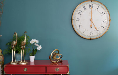
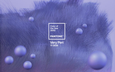
Color-management company Pantone Color Institute recently announced its Color of the Year for 2017, a vibrant spring-green hue called Greenery. If you’re among those who find Greenery a bit too bright to be used in or on your home, take heed. Paint manufacturers have chimed in with their various selections for Color of the Year and, for the most part, it’s a much mellower bunch. Deep grayish blues and purples dominate, but some warm neutrals and bold yellows are also offered up.
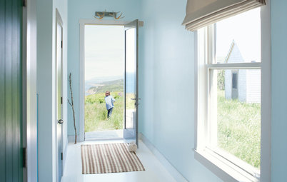
Benjamin Moore’s selection, Shadow, is a deep, dark purple-gray hue that’s quite a shift from its 2016 choice, Simply White. I think it’s a beautiful hue, but it needs to be used with care as it can easily make a space go gloomy. Using it in small doses or in spaces we don’t tend to linger in, such as a stairway, can add a nice dash of drama to a home without bringing everyone down.
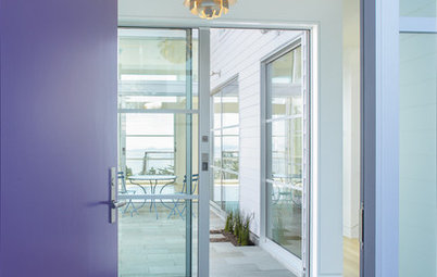
If Shadow is too shady for you, give PPG Paints’ Violet Verbena a look. It’s also a purple-gray hue but one that’s much lighter and brighter. It’s not a pastel but has a soft, soothing vibe nonetheless. I think it’s a terrific color for a bedroom or other space where a peaceful, easy feeling is desired.
For those who prefer strict neutral hues, Kelly-Moore is offering Kettleman as its choice for 2017. It’s a dark gray that has a touch of warmth to it, perfect for those who find true gray too chilly. Like Shadow, it’s a rather dark color, so it needs to be used in small doses or paired with plenty of contrasting light hues.
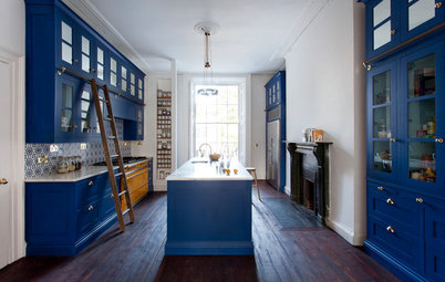
Sherwin-Williams’ choice of Poised Taupe is actually one of my go-to deep neutrals. In my color consulting business I’m seeing a bit of a homeowner revolt against the cool gray hues that have been so popular the last few years, but they aren’t exactly embracing beige again, either. Taupe — essentially a cool medium brown — is the perfect compromise between warm and cool.
A couple of paint companies are promoting a slew of colors for 2017, rather than just one. Behr has chosen 20 hues that are divided into three categories: Comfortable, Composed and Confident. As a lover of bold color, I am most drawn to the Confident palette, shown above. Think about using these saturated colors in smaller doses, such as for an accent wall, in a niche or on the ceiling only, rather than on all four walls in a room.
Valspar has put forth a mix of neutrals and bolder hues with its 12 selections for 2017’s hottest hues. One of my favorites of its neutral offerings, Soft Silver Sage, is shown above.
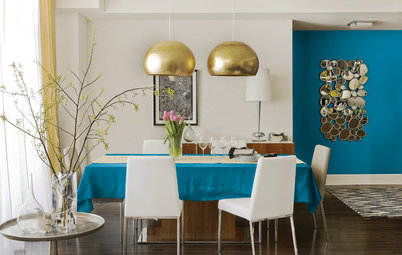
Among Valspar’s bolder color choices, I love the warmth and vibrancy of Here Comes the Sun, shown on the walls above.
Your turn: See anything you like? Which color is your favorite? Tell us in the Comments.
More
World of Design: Where Color Trends Begin
Read more stories about Colors of the Year
Your turn: See anything you like? Which color is your favorite? Tell us in the Comments.
More
World of Design: Where Color Trends Begin
Read more stories about Colors of the Year


Shown here are the various 2017 paint colors of the year, from top to bottom: Shadow, from Benjamin Moore; Violet Verbena, from PPG Paints; Byzantine Blue, from Glidden; Cloudberry, from Olympic; Kettleman, from Kelly-Moore; Poised Taupe, from Sherwin-Williams; and Honey Glow, from Dunn-Edwards.