Get the Lowdown on Low-Contrast Color Schemes
If Goldilocks were an interior designer, she’d find these color combos just right

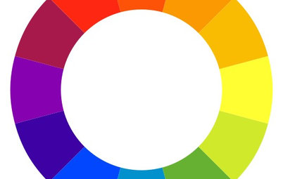
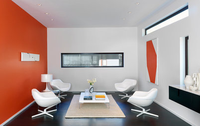
Lovers of minimalist design often employ a monochromatic palette that features one color in the same tones, shades and tints. Those who lean toward bolder, maximalist design often favor high-contrast color schemes that combine polar-opposite colors, such as flat black and hot pink or neon yellow and charcoal gray. Rarely, though, do we speak of low-contrast color schemes, the happy middle ground between the two extremes. Low-contrast color schemes feature different colors that are next to each other on the color wheel. Here are some ways to work a low-contrast color scheme into your home.
Take a spin on the color wheel. For a truly balanced color scheme that’s soothing to live in, combine the shades that sit side by side on the color wheel. Using colors in the same shade or tint will give the impression of a monochromatic scheme, but with a twist.
Earth tones. Earth tones, sunset colors and autumnal shades lend themselves easily to a low-contrast look since we’re used to seeing them in nature. In this San Francisco living room, orange, purple and brown come together to form a dynamic whole.
Find leather barrel chairs
Find leather barrel chairs
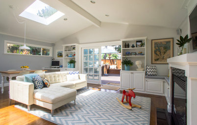
Coastal cool. On the cooler side of the color wheel, colors like blue and green can be combined to create a fresh, coastal vibe. This living room in Rehoboth Beach, Delaware, is a great example of blues and greens working in unison.
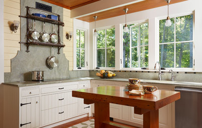
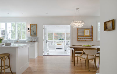
Dark wood. Though perhaps less obvious, pairing dark wood with a dark hue is another form of low-contrast color. We think of wood tones as relative neutrals and use them that way, but if you match them to a paint chip, you’ll find they are indeed colored. Multiple pops of clever color notwithstanding, the bulk of this dining space is a blend of charcoal gray and the large heirloom table’s dark, rich wood.
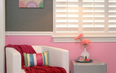
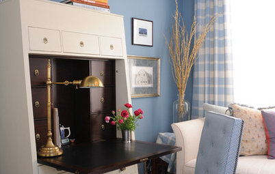
Light wood. The idea works not only with dark wood stains, but also with driftwood and natural timber beams or wood floors. Use your natural elements as a key part of the palette and you may find that a bold color, such as the red walls in this study, seems more sublime.
Ultra low-contrast. Using the same color in a variety of hues, tones and shades lands somewhere between monochromatic and low-contrast, and is known as ultra low-contrast. In this family room, all of the layered shades are variants on gray. While there is some contrast at play here between the black TV and the purple lamp, they are the exceptional pops that give the room life, while the rest of the decor slides along the gray scale.
Curb appeal. These color principles are equally valid on exteriors. The practice of contrasting trim with siding is so entrenched, it’s relatively rare to see a home that moves along the light spectrum instead, but if this stunning Charleston, S.C., home is any indication, the effect is as charming as the city itself.
Take it outside. Likewise, don’t forget that plant life is often colorful. Much like wood, we often let it fade into the background and scarcely consider it as a colorful entity when selecting our furniture and accents. However, if you’re drawn to the low-contrast look for its soothing aspects, start with the greenery and select coordinating tones to create a tranquil outdoor space.
More
Choosing Color: 1 Home Has Fun With 5 Different Color Schemes
Great Color Palettes: 8 Hot Bedroom Color Schemes
More
Choosing Color: 1 Home Has Fun With 5 Different Color Schemes
Great Color Palettes: 8 Hot Bedroom Color Schemes