


Kitchen Design
New This Week: 3 Kitchens Embrace Bright Modern Style
See how different kitchens interpret modern finishes and fixtures to achieve a light and upbeat look

If you’re looking to give your kitchen an airy, no-fuss look, consider going modern. Clean lines, open shelves, symmetry, minimalism, natural light, warm wood, open floor plans — these are the things that define modern style in the kitchen. The following three spaces embrace many, if not all, of these elements, for fresh, cheerful kitchens that you’d want to hang out in even when you weren’t cooking.
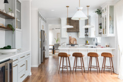
Designer secret: “Less is more,” interior designer Melissa Winn says. “Our decisions were restrained in most areas. And yet the addition of the wood to the back of the island and the asymmetrical wood shelving on the back wall kept the space warm and playful.”
“Uh-oh” moment: “We really wanted the hood to look like a floating box, but once the kitchen was started, it looked like we would need to have a surface-mounted vent, which would mean we’d need to move to a standard hood or have a box that went all the way to the ceiling,” Winn says. “We came up with several designs that made this work, but were underwhelmed by how it ruined the counter-to-ceiling look of the tile and the floating aspect of that back wall. Luckily, in the end, the amazing contractor found a way to recess the vent pipe into the wall.”
Also on the team: Brad Doran of Doran Construction and Design; Enertia Designs (structural engineer); Timeless Kitchens (cabinetmaker); Adam Rouse Photography
See more of this home
Countertops: Neolith in color Phedra; tile: Crater Lake, Fireclay Tile; Normann Copenhagen Form bar stool: Design Public
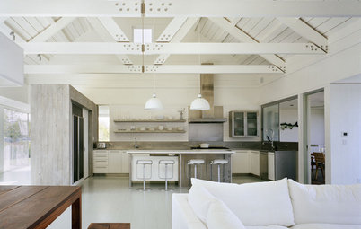
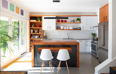
2. Warm and Bright
Designer: Ellen McKenna
Location: Jamestown, Rhode Island
Size: 192 square feet (17.8 square meters); 16 by 12 feet (4.8 by 3.6 meters)
Homeowners’ request: A modern, beachy, light-filled kitchen added on to a 1970s beach house.
Modern features: Cherrywood flat-door cabinets with finger-pull handles for a clean, minimalist look. Simple flat window casings. Floating shelves. Brass pendants. Ash floors stained white. Penny tile backsplash on one wall. Stainless steel backsplash above range.
Why the design works: Lots of perimeter countertop space and good flow around the island make cooking with multiple people possible. The ceiling pitch and beams of the new kitchen addition match those in the existing living and dining room. Designer Ellen McKenna carried the new flooring in the kitchen through to the original house for seamlessness. The new kitchen also opens to an existing deck off the dining room to make traffic flow during parties better.
Designer secret: “Renovations or additions should look like they were a part of the original space,” McKenna says. “It is important to keep the scale of the new space in proportion with the old. Matching the ceiling beams, windows and casings to the existing helped make a continuous flow between old and new.”
“Uh-oh” moment: “I received a call from the contractor when in the framing stage of the project, telling me the door I had specified—not ordered yet—would not fit in the space,” McKenna says. “I got to the site with my drawings—which clearly showed the door would fit—and a tape measure to find out what the problem was. The foundation had been poured 2 feet shorter than the drawings specified. Uh-oh! Back to the drawing board. Thankfully the windows, sliding door and cabinets had not been ordered yet, and I was able to redesign the room, shifting the elements to fit.”
Also on the team: Keith Ronchie (contractor)
Windows and door: Andersen; cabinets: Cabico; Isaac pendant in natural brass: Schoolhouse Electric & Supply Co.; countertops: Corian; penny tile in gray and yellow: Waterworks; sink: Silgranit in white, Blanco; faucet: Concetto, Grohe; range and hood: Wolf; paint: Wickham Gray, Benjamin Moore
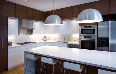
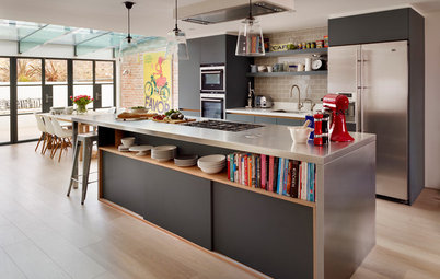
3. Sleek and Symmetrical
Designer: Dean Deville of Deville Custom Homes
Location: Austin, Texas
Size: 205 square feet (19 square meters); 20½ by 10 feet (6.2 by 3 meters)
Homeowners’ request: A symmetrical, well-thought-out space.
Modern features: Clean-lined European-style walnut cabinetry with full overlay. Open shelves. Matte glass tile backsplash in stacked-brick pattern. Transom-style windows. Calacatta quartzite countertops. Blown glass pendant lights.
Why the design works: The idea was to create a space that people would gravitate to, and they do.
Designer secret: “There is a beauty in simplicity,” builder Dean Deville says.
“Uh-oh” moment: “All the shadow details and styles were called out to a specific measurement and were important in the overall look,” Deville says. “In theory it sounds easy, but the application was a little rough. This style of cabinet does not allow for imperfections in design.”
Also on the team: Forsite Studio; Austin Sol Builders; Austin Granite Direct; Chase Daniel (photographer)
See more of this home
More
12 Great Kitchen Styles — Which One’s for You?
The 15 Most Popular Kitchen Storage Ideas on Houzz
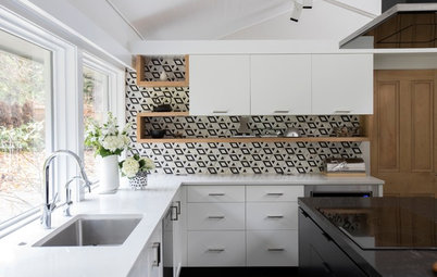
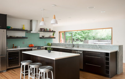


Designers: Melissa Winn (interior designer) and Patrick Perez (architect)
Location: San Francisco
Size: 190 square feet (17.6 square meters)
Homeowners’ request: Relocate the kitchen to the back of the 1940s house to capture more natural light and a connection to the backyard. Add warm, modern style and incorporate light blue ceramic tile the homeowners had seen in a photo.
Modern features: Flat-door, two-tone cabinetry (gray lowers and white uppers and pantry wall). Warm wood for the floating shelves and lower part of the island. Custom-clad white range hood. Neolith (porcelain) countertop. Open, minimalist back wall with pale blue oversize subway tile in a stacked-brick pattern. Hidden fridge and appliance garage. Minimalist hardware on the base cabinets; touch latches on the uppers.