


Choosing Color: See 1 Cute Home in 3 Exterior Paint Palettes
Here’s proof that a little bit of fun color can add a whole lot of flair to your house
Jennifer Ott
October 25, 2016
San Francisco-based architectural color specialist and design writer. Jennifer's work has been featured in many print and online publications. Her recently-published book, "1000 Ideas for Color Schemes," is a beautifully illustrated and easy-to-navigate guide that takes the guesswork out of selecting the perfect color palette for your home or special event. For more information on Jennifer Ott Design, visit http://jenottdesign.com/.
San Francisco-based architectural color specialist and design writer. Jennifer's... More
This article is from our Most Popular stories file.
I’ve done countless exterior color consultations in my professional career, and yet the dramatic change a new color scheme can bring to the outside of a home never ceases to amaze me. As part of a new series on exterior color palettes, we’re taking existing exteriors and, through the use of rendering software, trying out a few color options. Paint color palettes are included here in case you see something you like that you want to re-create on your own abode.
I’ve done countless exterior color consultations in my professional career, and yet the dramatic change a new color scheme can bring to the outside of a home never ceases to amaze me. As part of a new series on exterior color palettes, we’re taking existing exteriors and, through the use of rendering software, trying out a few color options. Paint color palettes are included here in case you see something you like that you want to re-create on your own abode.

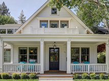
Photo from David Sawyer, Flickr
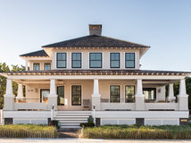
The existing color scheme on this cute little house is quite bold and unusual, but I wanted to see what other options the homeowners had that would still allow their residence to stand out from the pack on the block.
The existing color scheme on this cute little house is quite bold and unusual, but I wanted to see what other options the homeowners had that would still allow their residence to stand out from the pack on the block.

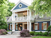
Option 1: Elegant With Playful Purple
I haven’t had any takers on a purple exterior color scheme. Yet. But I personally think it could be a fantastic choice on the exterior of a home.
Typically you want to go for a toned-down color for the siding. That’s because large swaths of a loud shade can easily go garish. The trick when it comes to purple is to pick a hue that veers heavily toward gray, which keeps it closer to the neutral end of the spectrum.
You could select a lighter purple-gray than shown here, but I like the contrast between the darker siding and the bright white at the entry and bay window. A bit of dark gray at the roofline and the front door adds an elegant vibe.
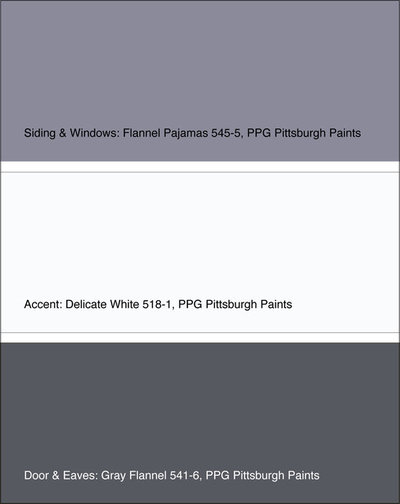
Get the look: Siding and window sashes in Flannel Pajamas, entry and window accents in Delicate White, and door and roof eaves and fascia in Gray Flannel, all from PPG Pittsburgh Paints.
Find a painting professional near you
I haven’t had any takers on a purple exterior color scheme. Yet. But I personally think it could be a fantastic choice on the exterior of a home.
Typically you want to go for a toned-down color for the siding. That’s because large swaths of a loud shade can easily go garish. The trick when it comes to purple is to pick a hue that veers heavily toward gray, which keeps it closer to the neutral end of the spectrum.
You could select a lighter purple-gray than shown here, but I like the contrast between the darker siding and the bright white at the entry and bay window. A bit of dark gray at the roofline and the front door adds an elegant vibe.
Get the look: Siding and window sashes in Flannel Pajamas, entry and window accents in Delicate White, and door and roof eaves and fascia in Gray Flannel, all from PPG Pittsburgh Paints.
Find a painting professional near you
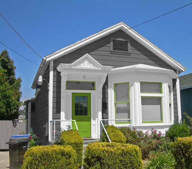
Option 2: Neutral With a Twist
If you favor an eye-catching vibrant door or trim color, then you definitely want to keep the body of the house super neutral.
Of course, neutral doesn’t have to be boring. Here we’re showing a perfectly practical medium gray siding color that then gets a lively boost of leafy green on the front door and window sashes. If green isn’t your favorite, you could easily swap it out for another bold hue since the gray and white play well with just about any color.
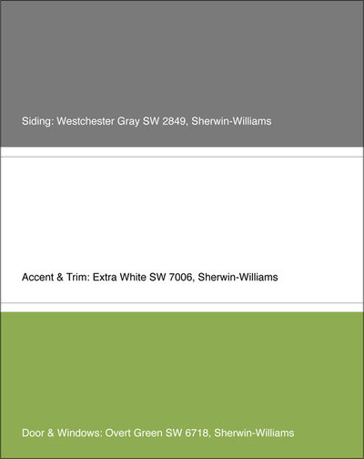
Get the look: Siding in Westchester Gray, accent and trim in Extra White, and door and window sashes in Overt Green, all from Sherwin-Williams.
If you favor an eye-catching vibrant door or trim color, then you definitely want to keep the body of the house super neutral.
Of course, neutral doesn’t have to be boring. Here we’re showing a perfectly practical medium gray siding color that then gets a lively boost of leafy green on the front door and window sashes. If green isn’t your favorite, you could easily swap it out for another bold hue since the gray and white play well with just about any color.
Get the look: Siding in Westchester Gray, accent and trim in Extra White, and door and window sashes in Overt Green, all from Sherwin-Williams.

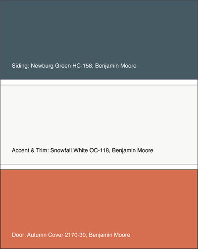
Option 3: Fiery Front on a Cool Backdrop
I wanted to really stretch myself with this last option. The siding is a deep blue-green that gets nice contrast from the crisp white trim.
As much as I love the siding color here, too much of it could appear dreary and gloomy. The liberal dose of white keeps the look fairly light- and fresh-feeling. A feisty orange front door is super welcoming and adds the right amount of vibrancy to the palette.
Get the look: Siding in Newburg Green, accent and trim in Snowfall White, and door in Autumn Cover, all from Benjamin Moore.
Tell us: Which scheme is your favorite? And if you’ve recently repainted your house, please share your color palette!
More
Should My Window Trim Match — or Contrast With — the Sash?
Get more exterior paint palette ideas
Find a painting professional near you


Scott Davidson founded Davidson Builders in 1998. Scott graduated from Michigan State with a BS in Construction... Read More

Related Products


Related Stories
Housekeeping
How to Clean Your Windows and Keep Them Streak-Free
Try these tips, tricks and tools to wash your windows so they’re crystal clear
Full Story
Housekeeping
Choose Your Own Spring Cleaning Plan
Instead of trying to do it all, pick one of these six cleaning approaches that’s right for you now
Full Story
Bathroom Workbook
How to Remodel a Bathroom
Create a vision, make a budget, choose your style and materials, hire the right pros and get the project done
Full Story
Monthly Home Checklists
To-Dos: Your April Home Checklist
Kick spring cleaning into high gear, and troubleshoot cooling and irrigation systems for the warmer months ahead
Full Story
Trending Now
The 10 Most Popular Kitchens So Far in 2024
Get inspired by the warm neutral palettes, ample storage and inviting islands in these most-saved new photos on Houzz
Full Story
Kitchen Backsplashes
Where to Start and Stop Your Backsplash
By tidgboutique
Consider these designer tricks to work around cabinets, windows and other features for a finished look in your kitchen
Full Story
Kitchen Workbook
How to Remodel Your Kitchen
Follow these start-to-finish steps to achieve a successful kitchen remodel
Full Story
Decluttering
10 Decluttering Projects You Can Do in 15 Minutes or Less
Try these ideas to get organized at home one small step at a time
Full Story
Decorating Guides
7 Major Decorating Mistakes and How to Avoid Them
By tidgboutique
Gain confidence to start your interior design project with this advice from a professional designer
Full Story
Working With Pros
6 Reasons to Hire a Home Design Professional
Doing a construction project without an architect, a designer or a design-build pro can be a missed opportunity
Full Story
All are lovely but my favourite is number 3, which is odd - I'm not usually a fan of blue-green but with the orange door it really works. I would avoid adding colour around the windows - it clutters what is otherwise the beautiful architectural feature of a bay window.
I think it is important to understand that color schemes have to work with the architectural style of the house and the context the house is situated in. For example, Number 1 might look good in, say New Orleans, but dreary and dated in a foggy ocean area, or in a forest. Also, wood siding is much more forgiving than stucco. Having said that, I think all the color schemes are cute.
I like the last (teal)blue but door takes over