
Show Scholastic Style With School Bus Yellow
Energize your home with this cheerful shade from childhood

The wheels on the bus go round and round, and so does the cycle of color trends. While 1970s mustard tones have recently popped back up on the chromatic radar, brighter yellows have long been a way to add a jolt of energy to a room. These cheery shades work well in modern, traditional or transitional spaces. Here, we celebrate school bus yellow in all of its sunny, scholastic splendor.
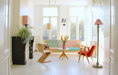
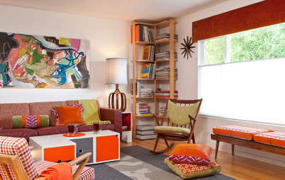
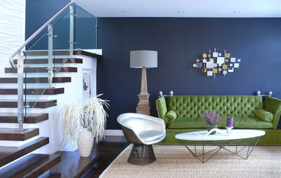
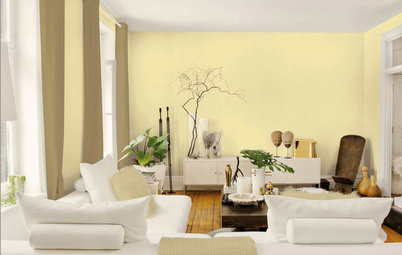
1. Accent all-star. Yellow is rarely used as the primary color in a space, but rather as an accent. Here, the two solid yellow chairs add visual interest to the wood-wrapped space. They’re balanced out by a bowl and small pillows in similar hues. This balance is essential to the harmony of both the layout and the color scheme.
2. Safe and stylish. A pigment called National School Bus Glossy Yellow was developed in 1939 to coat the vehicles charged with transporting children safely to school. It isn’t hard to imagine why such a bright hue was chosen for buses (and road hazard signs, for that matter). The color is easy to spot, rain or shine. It gets the attention of passing motorists who, presumably, will drive with extra caution around a vehicle carrying schoolkids. In the home it makes for an energizing wall color, especially in children’s spaces at homework time, when energy and focus can sometimes wane.
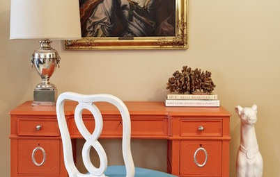
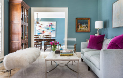
3. Adult-approved. Energizing yellow isn’t just a boon to young students’ productivity; adults can benefit from peppering their home offices with saturated yellows too. When the yellow mixes with other warm tones, like the pink and brick red here, the effect is cozy and cocoon-like.
4. A kitchen classic. It isn’t only because the big yellow bus picks up our grade schoolers in the morning that we associate this color with dawn. Yellows are morning colors and give their best performances in places like kitchens, where we traipse in our pajamas half-asleep in search of caffeine, nutrition and hopefully enough energy to get us through the day.
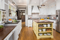
5. The Provençal palette. Europeans have loved yellow for ages. Audrey Hepburn always kept vases of yellow flowers in her homes, and yellow often features prominently in Provençal textiles and kitchen linens. This little farmhouse kitchen borrows European style and a color palette to match, with a countryside influence whose appeal is hard to deny.
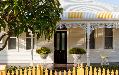
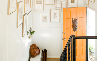
6. A front door’s best friend. Still not feeling energetic after your bowl of Frosted Flakes and third cup of coffee? Paint the interior of your front door bright yellow as a final gesture to perk you up on your way out the door. The window above the door here makes the whole entry glow like the sunrise, and the yellow door coordinates with the adjacent dining area so that the color doesn’t feel like a jarring addition but an integral part of the space.
7. Mixed with antiques. If ever there was a happy hue to liven up antiques, it is yellow. The canary yellow lacquer on these Thonet bentwood chairs is a welcome sight at breakfast and could make a morning person out of anyone. Such a whimsical color mixed with serious traditional antiques makes the space lighthearted, which is the perfect vibe for a casual breakfast setup.
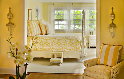
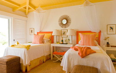
8. Double the fun. The cheerful brightness this space radiates may be a bit too much for a master bedroom, but in a child’s room, the bold yellow and bright aqua add a double dose of energy. A dash of black, as in the bedding trim and shelving here, reinforces the eye-catching color contrast.
9. School-inspired storage. Designer Lisa Lindgren chose public school lockers in school bus yellow to complement the shiny yellow bed frame just barely visible at the bottom left of the photo. Though not everyone thinks to put lockers in kids’ rooms, they are a fun and practical storage solution.
More
Kitchen Color: 7 Sensational Yellow Backsplashes
11 Ways to Add a Splash of Yellow to Your Interior
More
Kitchen Color: 7 Sensational Yellow Backsplashes
11 Ways to Add a Splash of Yellow to Your Interior