


The Hottest New Neutral: Sky Blue
Inject some subtle energy into your neutral palette with a dose of this light blue
tidgboutique
September 21, 2016
Toronto Interior Design Group is a trusted one-stop-shop residential interior design concierge boutique-style firm crafting timeless interiors.
Toronto Interior Design Group is a trusted one-stop-shop residential interior design... More
For years, interior design has been in a color-conservative period, with only the strictest noncolors being considered neutrals — and a cool gray or “greige” being king. However, people lately are rediscovering the joy of adding color to the home with “near neutrals,” versatile colors that can act as neutrals yet still inject some energy into a color scheme.
The hottest of them all? One could argue it’s sky blue. This timeless color has become a trendy yet classic choice for adding life to decor of any style, without clashing with other colors or overloading the senses. If your home is feeling a little ho-hum, maybe sky blue is the new neutral for you.
The hottest of them all? One could argue it’s sky blue. This timeless color has become a trendy yet classic choice for adding life to decor of any style, without clashing with other colors or overloading the senses. If your home is feeling a little ho-hum, maybe sky blue is the new neutral for you.
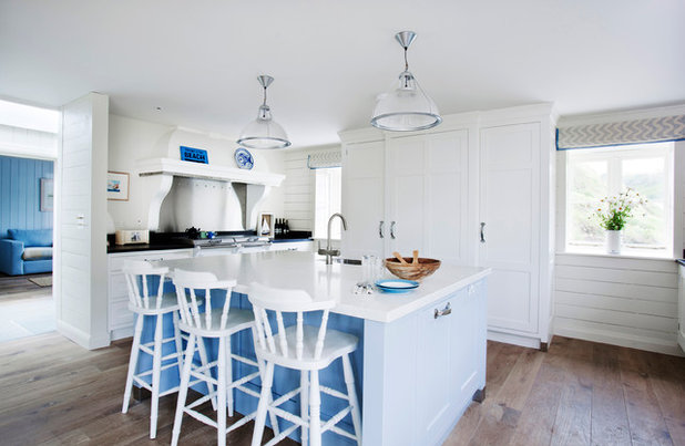
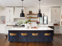
Sky Blue and White
A blue sky with white fluffy clouds is a classically beautiful sight we could stare at all day. One of the reasons sky blue and white are such a powerful pair is that bright blues help white appear extra-white, meaning white cabinetry or porcelain will look simply striking.
Another reason is that the combination looks so natural that the blue can almost go unnoticed. The supersaturated sky blue shown here isn’t overbearing, and the room still ultimately feels like a coveted “white kitchen.”
Blue paint: Cook’s Blue, Farrow & Ball; cabinet paint: Wimborne White, Farrow & Ball
See more eye-catching blue islands
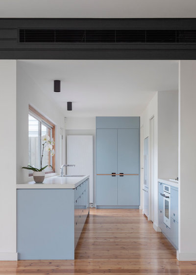
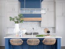
You can add a lot of sky blue to a space and still not feel like a bold hue is taking over. Even this modern kitchen with blue cabinetry feels airy and light.
Try Benjamin Moore’s Breath of Fresh Air for a breezy sky blue that you can almost never use too much of.
See more on using blue in the kitchen
Try Benjamin Moore’s Breath of Fresh Air for a breezy sky blue that you can almost never use too much of.
See more on using blue in the kitchen
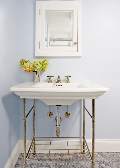
The whitening effect of sky blue is especially noticeable in a bathroom with a classic white sink and tub. The porcelain will pop, as will other accents like baseboards, trim and frosty glass lamp shades.
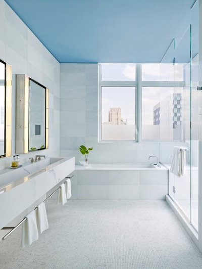
And since it’s sky blue, why not use it overhead? Colored ceilings are a tempting trend that some are wary of trying, but nature has already trained our eyes to expect this color overhead. It feels so natural, in fact, that you might not even immediately notice a blue ceiling when you walk into a room.
It can also be effective for giving a bathroom without windows the feeling of having a skylight, making this a great option for condos and apartments. Plus it’s a very doable one-day DIY project.
Similar blue paint: Respite, Sherwin-Williams
It can also be effective for giving a bathroom without windows the feeling of having a skylight, making this a great option for condos and apartments. Plus it’s a very doable one-day DIY project.
Similar blue paint: Respite, Sherwin-Williams
Sky Blue With Neutrals
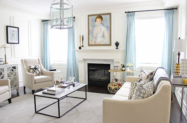
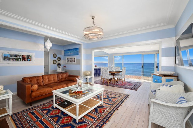
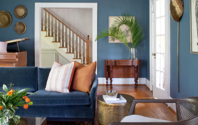
Mixed with a diverse palette of neutral hues (such as taupe and gray), sky blue injects a sense of color without drawing so much attention as to break up the breezy atmosphere. In fact, the way it contrasts with a warm neutral like sandy beige helps bring out the hidden undertones. Notice how the slightly off-white sofas and thin golden barcart pop against the soft blue curtains in this photo. The overall effect is subtle and peaceful but not drab.
Mixed with a diverse palette of neutral hues (such as taupe and gray), sky blue injects a sense of color without drawing so much attention as to break up the breezy atmosphere. In fact, the way it contrasts with a warm neutral like sandy beige helps bring out the hidden undertones. Notice how the slightly off-white sofas and thin golden barcart pop against the soft blue curtains in this photo. The overall effect is subtle and peaceful but not drab.
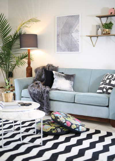
Sky blue also holds up to dramatic modern patterns. Try mixing it with high-contrast black and white and moody grays.
Sky Blue With Bold Color
The real magic of sky blue, however, is in how it can mix with bold hues as well as with quiet neutrals. Like a great pair of jeans, a blue wall can disappear into the background when used with more colorful pieces, so the overall look is color-rich but not clashing.
The real magic of sky blue, however, is in how it can mix with bold hues as well as with quiet neutrals. Like a great pair of jeans, a blue wall can disappear into the background when used with more colorful pieces, so the overall look is color-rich but not clashing.
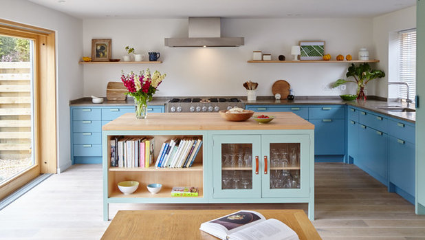
As I’ve written about before, blue is strikingly beautiful as a tone-on-tone look, with contrasting shades coordinating easily even if some have hints of differing undertones. This kitchen eschews super-safe navy for a mix of two bright blues, yet it doesn’t feel loud or busy.
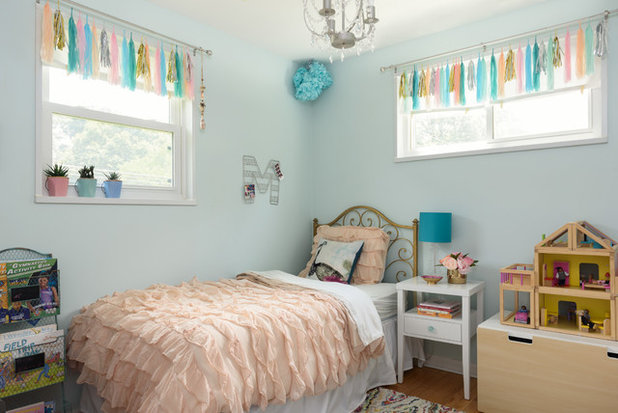
Pair sky blue with a dominant accent color and it lets the hotter hue be the star of the show. Classic decor manuals would insist that blue is a “boy color,” but this child’s bedroom feels dreamy and feminine with blue walls, while letting the pink frills be the first thing you notice.
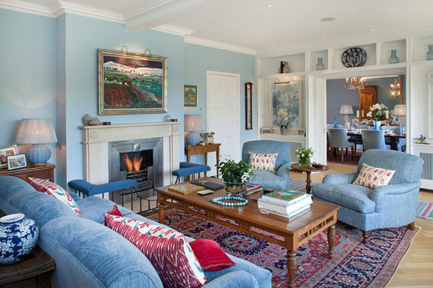
Because blue is a near-neutral rather than a true neutral, it can actually help bridge the gap between the neutrals and the vivid colors in a room, making the entire space feel more harmonious. If this room had neutral walls and upholstery, the Persian-style rug would be a major contrast, but here the many elements keep the eye moving without things feeling overwhelmingly eclectic.
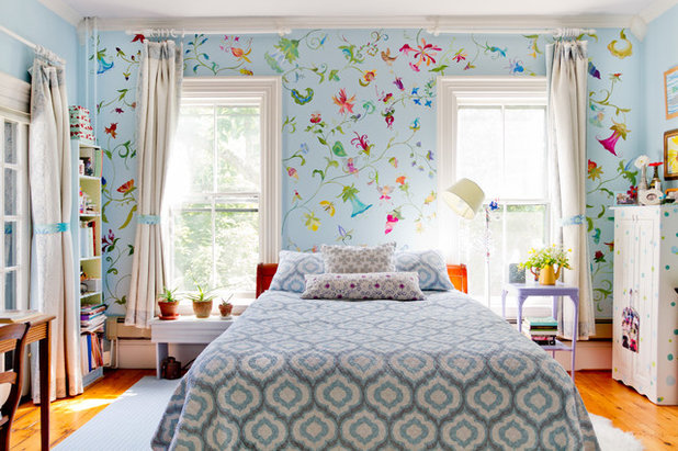
In this cheerful bedroom, a rainbow of colors in the feature wall are tied together by the blue background, which helps the room feel peaceful and balanced. No single color completely stands out, but the blue doesn’t absorb them, either.
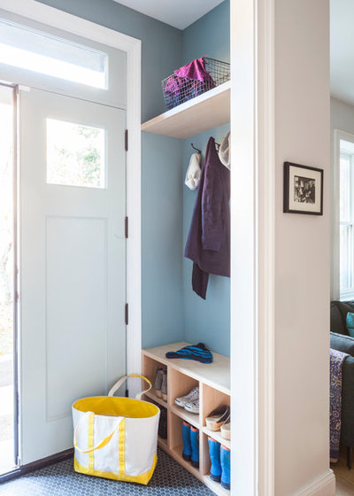
The adaptability of blue makes it a great choice for areas that are sometimes filled in and sometimes empty, such as a coat nook or the back of a shelving unit. The wall can hold its own when the coat hooks are empty, yet the look isn’t overloaded as soon as one or two items are set down.
Sky Blue With Cool Materials
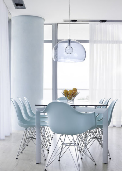
Midcentury modern chairs in cool plastics and funky forms can sometimes come off as a little too cold. Ironically, the natural vibe of a sky blue goes a long way toward making these forms warmer, more welcoming and a little less serious. For a fun twist to any space, try a blue molded Eames chair or some airy blue-tinted glass pendants.
So go ahead, dream of a blue-sky world — and make it happen at home.
More
How to Give Neutral Paint Colors a Subtle Jolt
7 Soothing Spaces: How to Use Color to Create Calm at Home
Working with Ramos Timber, you won’t have to worry about coordinating and budgeting for designers, contractors,... Read More
What are you working on?
Related Products

Related Stories

Decorating Guides
Design Pros Share 10 Favorite Creamy White Paints
By Becky Harris
These off-white color choices include versatile tones, warming hues and pleasingly soft shades
Full Story

Kitchen Countertops
What Kitchen Countertop Colors Should You Choose?
By tidgboutique
Consider these popular colors and styles to get the look you want — no matter what material you use
Full Story

Colors of the Year
Pantone Picks a Peach for Its 2024 Color of the Year
By Jennifer Ott
See how to use this juicy hue to create calm yet flourishing spaces inside and outside the home
Full Story

Decorating Guides
5 Ways Designers Are Working With Rich Warm Tones Right Now
By Becky Harris
Interior designers describe their strategies for using rich warm colors to create an inviting home
Full Story

Colors of the Year
10 Paint Colors Ready to Take Over in 2024
By Jennifer Ott
Blue is huge, but dark hues and warm tones also find favor among major paint companies’ 2024 Color of the Year picks
Full Story
Decorating Guides
How to Mix Colors and Make It Work
By tidgboutique
Don’t want to confine yourself to neutrals but lack the confidence to embrace colors? Check out this pro advice
Full Story

Events
7 Color Trends for 2024 at Maison & Objet
By Claire Tardy
New harmonies and unexpected pairings at the fall 2023 trade fair set the tone for next year’s interiors
Full Story

Decorating Guides
9 Ways to Layer Warm Neutral Colors for Comfortably Refined Rooms
By Becky Harris
Design pros share advice for building an inviting palette, introducing high contrast and mixing textures
Full Story

Decorating Guides
How to Create a Cohesive Color Flow Throughout Your Home
By Erin Carlyle
Designers share eight techniques for avoiding a choppy feeling in your spaces
Full Story

Decorating Guides
How to Get Your Ceiling Paint Color Right
By tidgboutique
Here’s how to tweak the shade of your ceiling paint to get the effect you want
Full Story
I have always had at least one room that is sky blue several times I have done blue kitchens and always loved the results.
I have never been much of a blue person, but it seems like if I have a two story home, the upstairs is always sky blue. . Just feels natural. But I try to remember where I live. The sky in Colorado is bluer than in Los Angeles. Central oregon or the beach. I usually paint the ceiling as well as the walls blue especially if there are allot of windows. Matching the predominant blue of the sky makes the walls and ceiling disappear, , ,
I often paint porch ceilings sky blue and believe it DOES keep wasps from building nests there. It does make the area feel open to the sky.