


9 Great Colors for Your Gallery Wall
Boost the power of your art collection with paint that brings out its color and detail

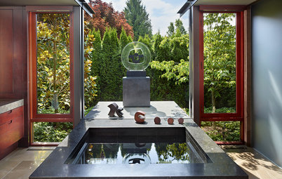
Selecting artwork for your home can be a labor of love. Whether it's an original painting or drawing, a mass-produced print or a wonderful photograph, your art helps to tell a story and define your style. I think art makes the greatest impression when it's surrounded by color.
You may be tempted to leave your walls white so that they don't take away from your masterpiece, but consider this: color brings out color, and in the case of black and white art, color brings out detail. If you've put careful thought into selecting and arranging your pieces, then it only makes sense to put the same amount of consideration into choosing a terrific background hue.
More color guides
The art display in this space is highlighted by a sizable lilac stripe. This color not only ties in with the room's furnishings, but it also helps to create a focal point by putting the emphasis on the art. This is a great alternative to painting an entire wall.
Paint Pick: Obil Lilac 6556 by Sherwin Williams
Paint Pick: Obil Lilac 6556 by Sherwin Williams
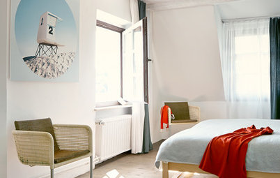
A sky blue wall makes a nice contrast against this mostly-white art piece. Both the art and wall color have an ethereal look, which gives this bedroom a serene and dreamy feel.
Paint Pick: Candid Blue 6953 by Sherwin Williams
Paint Pick: Candid Blue 6953 by Sherwin Williams
In this retro-inspired space, avocado green walls are the perfect complement to the artwork and accessories. The color is definitely a nod to the ‘60s and ‘70s.
Paint Pick: Sassy Green 6416 by Sherwin Williams
Paint Pick: Sassy Green 6416 by Sherwin Williams
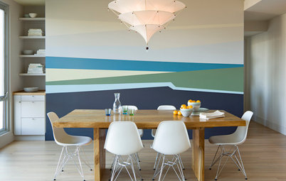
For a seamless look, select a wall color that will camouflage your frames. The pale periwinkle hue in this eating area allows the silver frames to blend right in, leaving the emphasis on each block of color.
Paint Pick: Mild Blue 6533 by Sherwin Williams
Paint Pick: Mild Blue 6533 by Sherwin Williams
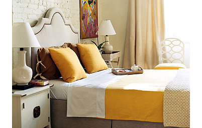
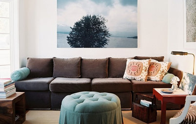
If your artwork has bright hues, don't think that your wall color must be equally vivid. Softer, muted paint colors will allow your piece to shine, while playing down the rest of the room.
Paint Pick: Honeywheat 179 by Benjamin Moore
Paint Pick: Honeywheat 179 by Benjamin Moore
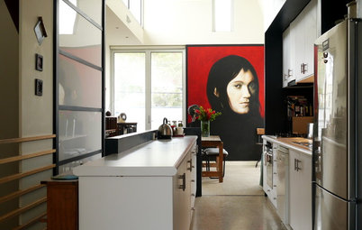
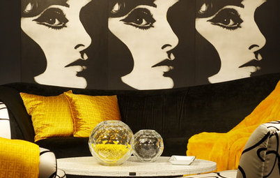
Here, a vibrant shade of coral is the background for artwork that features subdued colors. Contrasting color tones bring interest and balance to a room.
Paint Pick: Italiano Rose 2087-30 by Benjamin Moore
Paint Pick: Italiano Rose 2087-30 by Benjamin Moore
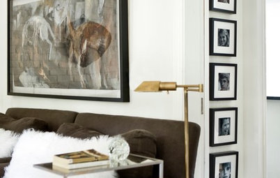
A display of photographs ties in with the white accents in this room. With so much white, a striking yellow wall color allows the artwork and furnishings to pop without overwhelming the space.
Paint Pick: Quilt Gold 6696 by Sherwin Williams
Paint Pick: Quilt Gold 6696 by Sherwin Williams
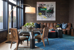
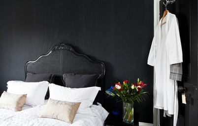
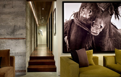
Black-and-white photographs stand out best against a deep wall color. This focal wall reinforces the room’s entire color scheme of black, white, gray and terra cotta.
Paint Pick: Sedona Clay 2174-30 by Benjamin Moore
Contact a pro for more paint picks
Next: More color guides
How to Find the Right Gray
A Gallery Wall for Every Personality
Paint Pick: Sedona Clay 2174-30 by Benjamin Moore
Contact a pro for more paint picks
Next: More color guides
How to Find the Right Gray
A Gallery Wall for Every Personality
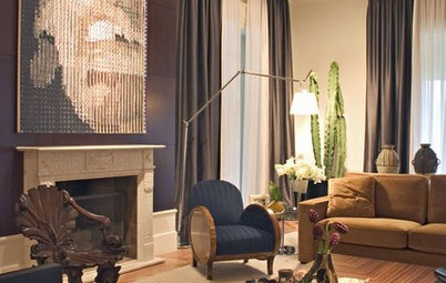

Paint Pick: Stonecutter 2135-20 by Benjamin Moore