


Decorating Guides
Design Lesson: Create Harmony Through Contrast
Mix lights and darks in any number of ways for dramatic effects and a polished design

There’s something very intriguing about opposites. In design, different elements often come together to create a dramatic effect. That can be scary for homeowners who want a look that’s polished and elegant. But contrast can be a vital part of achieving that elegance if it’s used correctly and with a purpose.
You can use contrast to prevent a room from looking too light, overly dark or painfully plain. There are many ways to work with opposing hues and tones, but a simple strategy is to focus on pairing light colors with dark finishes. You’ll be surprised at how these opposites can join in a wonderful harmony.
You can use contrast to prevent a room from looking too light, overly dark or painfully plain. There are many ways to work with opposing hues and tones, but a simple strategy is to focus on pairing light colors with dark finishes. You’ll be surprised at how these opposites can join in a wonderful harmony.
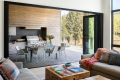
Dark cabinets and white counters. White kitchens are insanely popular these days. However, many homeowners want a kitchen that has a bit more coziness, yet still feels light and airy. In that case, the trick is to strike a perfect balance of light and dark tones. You can do this by combining stark white countertops with darker cabinets. Make sure that the space has plenty of lighting, and use a soft, earthy wall color to create a subtle warmth.
This paint color is Spanish Sand by Kelly-Moore.
This paint color is Spanish Sand by Kelly-Moore.
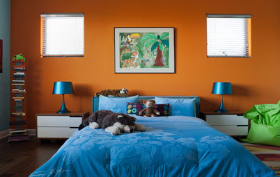
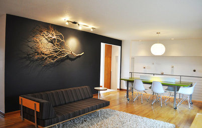
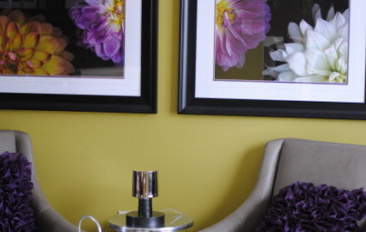
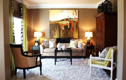
One vivid accent color. Even in neutral spaces, the combination of light tones and dark finishes always creates a stunning contrast. Therefore, even if you’re a color lover, you may hesitate to add your favorite hues to the mix for fear of overdoing it. If that’s your concern, use just one vivid accent color and distribute it equally around the space. You’ll satisfy your craving for color, and your room will look tasteful and refined.
A similar paint color to try is Shaker Beige by Benjamin Moore.
A similar paint color to try is Shaker Beige by Benjamin Moore.
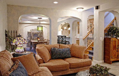
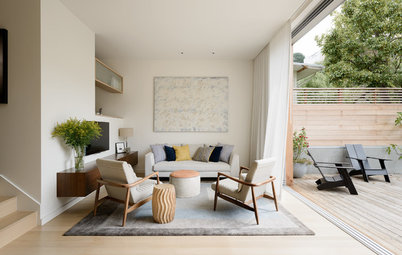
A repeating theme. Light and dark colors become twice as nice when you duplicate them. In this living room, two of the chairs mimic the overall contrast in the space. The room’s white millwork and espresso flooring are repeated in the chairs’ white upholstery and dark frames. This reinforces the room’s design and makes for a glamorous pair of chairs.
A similar paint color to try is Ultra Pure White from Behr.
A similar paint color to try is Ultra Pure White from Behr.
Warm woods and pale yellow. Pale yellow is one of my favorite colors to use in dining rooms. Even a very light yellow can exude a feeling of warmth. It’s also the perfect color to bring out the golden tones of darker wood furniture. With this combination of light and dark, you’ll have an inviting dining room where family and friends will want to linger long after the table is cleared.
This paint color is Friendly Yellow by Sherwin-Williams.
This paint color is Friendly Yellow by Sherwin-Williams.
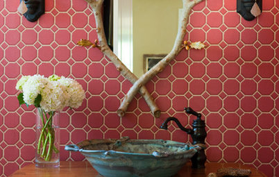
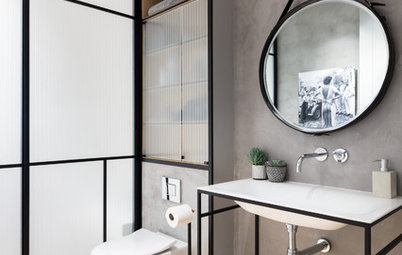
Light gray and dark bronze. Light gray bathrooms are very versatile spaces that can go from contemporary to classic with just a few changes. For a vintage look, install oil-rubbed bronze faucets, shower heads, hardware and fixtures. These darker elements will stand out against a light background and give your bathroom a genuine antique look.
This paint color is Heirloom Shade by Dunn-Edwards.
This paint color is Heirloom Shade by Dunn-Edwards.
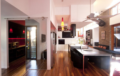
Two-tone features. This is a great example of how we can mix things up in a space by applying two different looks to one design element. Using a chocolate brown stain for some of the cabinets and a warm white hue for the others adds contrast without compromising the room’s harmonious flow.
A similar paint color to try is Pure White by Sherwin-Williams.
A similar paint color to try is Pure White by Sherwin-Williams.
If you’re fortunate enough to have a window in your stairwell, then why not maximize the natural light? This might be a good place to forgo color and opt for a coat of crisp white paint on the walls. Keep things interesting by giving the steps a two-tone treatment. Paint the risers white and use a deep espresso stain on the treads. Step by step, the contrast will look super chic.
A similar paint color to try is Dove White by Glidden.
Show us: Do you dabble in contrast? Please share your favorite example in the Comments.
More: Create Calm and Character With Light Colors
A similar paint color to try is Dove White by Glidden.
Show us: Do you dabble in contrast? Please share your favorite example in the Comments.
More: Create Calm and Character With Light Colors


This paint color is Polar Ice by Benjamin Moore.