


The Right Way to Test Paint Colors
Here are 5 key steps to take to ensure you're happy with your wall paint color
Erin Carlyle
May 26, 2016
Former Houzz Editorial Staff. Writing about the cost of renovation and what it takes to remodel. Former Forbes real estate reporter. Fascinated by cool homes, watching the bottom line.
Former Houzz Editorial Staff. Writing about the cost of renovation and what it takes... More
An interior designer or color consultant can offer tremendous value in helping you select the right paint color — or colors — for refreshing your home. But how do you choose once you’ve narrowed down to a handful of favorites? And how can you be sure that your top pick will really work in your home?
We spoke with five pros, including both painters and designers, who agreed that it’s important to test colors before you commit to painting an entire room (or home). But don’t go running for the sample boards just yet, because our pros say there’s a better way to vet potential paints. Read on to find out what it is.
We spoke with five pros, including both painters and designers, who agreed that it’s important to test colors before you commit to painting an entire room (or home). But don’t go running for the sample boards just yet, because our pros say there’s a better way to vet potential paints. Read on to find out what it is.
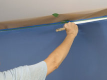
1. Paint Directly on the Wall
If you do a quick Internet search you may come across this image: Someone paints several sheets of paper or sample boards and hangs them on the wall to compare wall paint colors. But this isn’t the best way to do it.
This is true for interiors as well as exteriors: You’ll get the best sense of how the color will really look if you paint it directly on the wall. Each of the five pros we spoke with agreed. “If they use a board, I feel like it just doesn’t saturate the same way,” says interior designer Keith Wardlaw of Plus Modern Designs in Kansas City, Missouri.
Kelly Porter, an interior designer in the Washington, D.C., area, explains the problem with using boards: “The texture is really not representative. It’s not the same as what’s on your wall, and that can really affect the look,” she says.
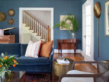
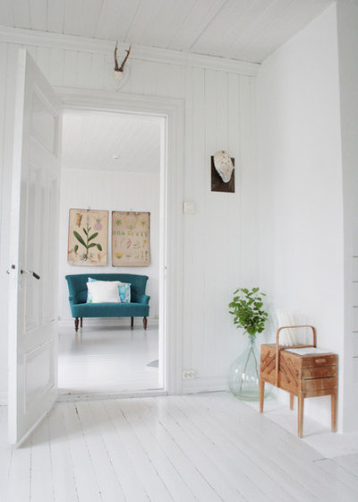
If you haven’t yet narrowed down your selection to just one color, Porter suggests painting your choices side by side on the wall to see the differences. For some, this can be overwhelming to the eye; if that’s you, make it easier by leaving some space between the samples. Also, keep in mind that the existing color of the wall will affect how the paint reads. Colors will appear darker against a light backdrop and lighter against a dark backdrop.
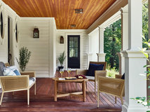
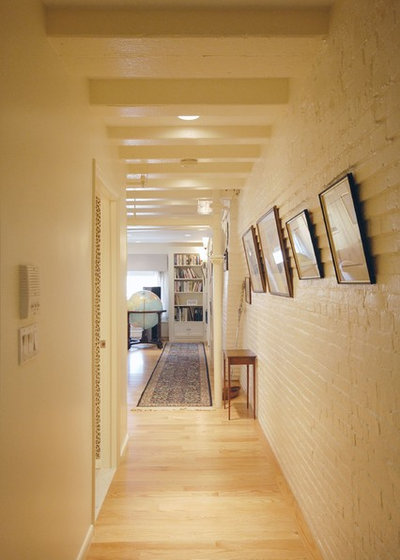
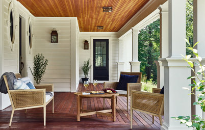
In this image, the wall colors are not samples, but an intentional two-toned look in white and moody green.
Find an interior designer to help you choose a paint color
If you do a quick Internet search you may come across this image: Someone paints several sheets of paper or sample boards and hangs them on the wall to compare wall paint colors. But this isn’t the best way to do it.
This is true for interiors as well as exteriors: You’ll get the best sense of how the color will really look if you paint it directly on the wall. Each of the five pros we spoke with agreed. “If they use a board, I feel like it just doesn’t saturate the same way,” says interior designer Keith Wardlaw of Plus Modern Designs in Kansas City, Missouri.
Kelly Porter, an interior designer in the Washington, D.C., area, explains the problem with using boards: “The texture is really not representative. It’s not the same as what’s on your wall, and that can really affect the look,” she says.
If you haven’t yet narrowed down your selection to just one color, Porter suggests painting your choices side by side on the wall to see the differences. For some, this can be overwhelming to the eye; if that’s you, make it easier by leaving some space between the samples. Also, keep in mind that the existing color of the wall will affect how the paint reads. Colors will appear darker against a light backdrop and lighter against a dark backdrop.
In this image, the wall colors are not samples, but an intentional two-toned look in white and moody green.
Find an interior designer to help you choose a paint color
Tip: If you’re hiring a paint company, see if it will provide free sample cans of the colors you’re considering. Many companies do. Remember, once you’ve had the paint tinted (mixed), you can’t get your money back. Even if you have to pay for them yourself, sample cans (typically $3 to $8) are well worth the expense.
Find professional painters near you
Find professional painters near you
2. Paint Two Coats
That’s the amount of coverage you’ll typically need on any wall. The second coat usually makes a big difference in the way the paint reads. Also, paint large swaths — at least 1 foot by 1 foot, and even larger is better. The 2-inch swatches won’t give you a good sense.
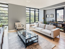
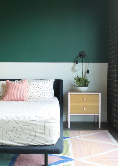
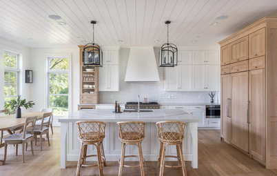
Here, in a white room with white floorboards, the designer used a plain white base.
That’s the amount of coverage you’ll typically need on any wall. The second coat usually makes a big difference in the way the paint reads. Also, paint large swaths — at least 1 foot by 1 foot, and even larger is better. The 2-inch swatches won’t give you a good sense.
Here, in a white room with white floorboards, the designer used a plain white base.

3. For Certain Rich Colors, Use a Primer
A small selection of deep paint colors can be created only in conjunction with specific primers. The paint deck will show which colors are in this category. (Pictured here are four by Sherwin-Williams, clockwise from top left: Lemon Twist, Hyper Blue, Daredevil, African Violet.)
For these specific colors, you probably won’t be able to get a sample size in the paint, though you may be able to in the primer, says J.T. Trainor, owner of Freshcoat Painting in the Phoenix metro area.
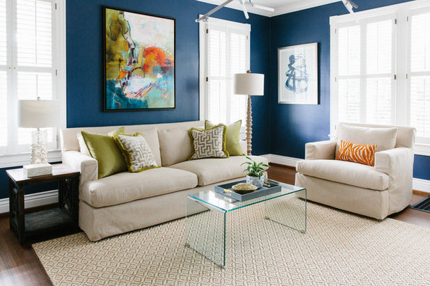
4. Paint Multiple Walls
The colors you’re testing will read differently depending on the amount of light that hits them. “We recommend you paint on a wall that doesn’t get direct sunlight and one that does,” Trainor says. In this photo, notice how much darker the gray on the right side of the room is than on the left.
The colors you’re testing will read differently depending on the amount of light that hits them. “We recommend you paint on a wall that doesn’t get direct sunlight and one that does,” Trainor says. In this photo, notice how much darker the gray on the right side of the room is than on the left.
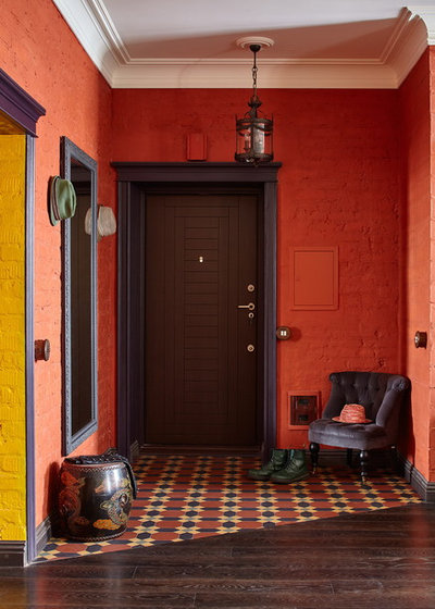
In the photo of the orange room, the color appears much deeper at the back wall, where it is in shadow, and less intense on the left and right walls, where more light hits.
Also, landscaping outside a window can color the light streaming through it and change how a paint looks on the wall as well. In the previous photo, where the green trees can be seen through the window, they’ve tinted the gray on the right side of the room a greener hue. See it, in the corner?
As you view the colors, make sure you consider what time of day you’ll most often be in the room. You want to like how the color looks at that time.
5. Place Lighting Before You Test
It’s simple, but true: It’s better to use the lighting that fits your needs than try to select your lighting to complement your paint colors. “You wouldn’t want to pick a lightbulb that looks good with your paint color, but you can’t read in the room,” says Jennifer Ott, a San Francisco-based color consultant and interior designer.
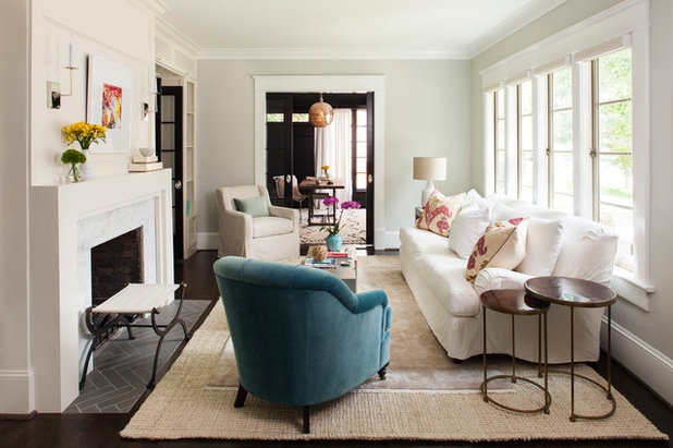
Here, the overhead lighting is casting a yellow glow throughout the room, warming the color of the off-white paint toward a pale shade of honey.
Make sure your lighting is in place as you’re considering colors. They may look quite different in bright bulbs that you prefer for nighttime use — or softer yellow-hued ones, if that’s what you’re going for — than they do during daylight hours. Having the right fixtures and bulbs in place can help you decide which shades will work for you.
If you’re not yet sure what lighting you prefer, you can use the time examining your samples to experiment. “Even changing out lightbulbs is a good thing to do,” says Carl Mattison, an interior designer in Atlanta. “Like any color in the world — just like your eyes or your hair or your skin tone — things will change in different light.”
Browse lighting in the Houzz Shop
It’s simple, but true: It’s better to use the lighting that fits your needs than try to select your lighting to complement your paint colors. “You wouldn’t want to pick a lightbulb that looks good with your paint color, but you can’t read in the room,” says Jennifer Ott, a San Francisco-based color consultant and interior designer.
Here, the overhead lighting is casting a yellow glow throughout the room, warming the color of the off-white paint toward a pale shade of honey.
Make sure your lighting is in place as you’re considering colors. They may look quite different in bright bulbs that you prefer for nighttime use — or softer yellow-hued ones, if that’s what you’re going for — than they do during daylight hours. Having the right fixtures and bulbs in place can help you decide which shades will work for you.
If you’re not yet sure what lighting you prefer, you can use the time examining your samples to experiment. “Even changing out lightbulbs is a good thing to do,” says Carl Mattison, an interior designer in Atlanta. “Like any color in the world — just like your eyes or your hair or your skin tone — things will change in different light.”
Browse lighting in the Houzz Shop
Here, the yellow light from the chandelier and sconces warms up the cooler white of the walls.
Vote: What’s the right way to test paint colors? Take our poll.
More on Houzz
Color Guide: How to Identify the Paint Shade You Want
Find pros
Shop for products and materials
Vote: What’s the right way to test paint colors? Take our poll.
More on Houzz
Color Guide: How to Identify the Paint Shade You Want
Find pros
Shop for products and materials


We believe that the transition of a house into a home is a sense of history and a piece of the future. It tells... Read More
What are you working on?
Related Products


Related Stories
Housekeeping
How to Clean Your Windows and Keep Them Streak-Free
Try these tips, tricks and tools to wash your windows so they’re crystal clear
Full Story
Housekeeping
Choose Your Own Spring Cleaning Plan
Instead of trying to do it all, pick one of these six cleaning approaches that’s right for you now
Full Story
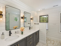
Bathroom Workbook
How to Remodel a Bathroom
Create a vision, make a budget, choose your style and materials, hire the right pros and get the project done
Full Story
Monthly Home Checklists
To-Dos: Your April Home Checklist
Kick spring cleaning into high gear, and troubleshoot cooling and irrigation systems for the warmer months ahead
Full Story
Trending Now
The 10 Most Popular Kitchens So Far in 2024
Get inspired by the warm neutral palettes, ample storage and inviting islands in these most-saved new photos on Houzz
Full Story
Kitchen Backsplashes
Where to Start and Stop Your Backsplash
By tidgboutique
Consider these designer tricks to work around cabinets, windows and other features for a finished look in your kitchen
Full Story
Kitchen Workbook
How to Remodel Your Kitchen
Follow these start-to-finish steps to achieve a successful kitchen remodel
Full Story
Decluttering
10 Decluttering Projects You Can Do in 15 Minutes or Less
Try these ideas to get organized at home one small step at a time
Full Story
Decorating Guides
7 Major Decorating Mistakes and How to Avoid Them
By tidgboutique
Gain confidence to start your interior design project with this advice from a professional designer
Full Story
Working With Pros
6 Reasons to Hire a Home Design Professional
Doing a construction project without an architect, a designer or a design-build pro can be a missed opportunity
Full Story
LS, don't try and read the undertone from a monitor. Different monitors display colors differently. Get a paint sample from BM, place it on top of a white sheet of paper then attempt read the undertone.
In & Out Color, Great advice! This is a mistake that many homeowners make. It's best to see physical color samples in person when making your final decisions for your space. Online photos are helpful to get you started but the colors are not reliable.
Mandi @ Dura
It would be very helpful to have more information about the colors