More Rooms


9 Ways to Get Your Room's Color Right
Get started on your own new look with ideas from 9 great 'color stories'

You know how when you walk in a room and it just feels right? There can be a number of reasons why this happens. One of the more important reasons is the color story of the room.
Color plays such an important role in the psychology of a space. It's not always about the specific color either, but about how the color is used. The human brain is very good at picking up inconsistency. And when when something is greatly incongruous, the brain doesn't always know how to process what it's detecting.
A strong and consistent color story goes a long way to how a space feels. and it's something relatively easy to do on your own. Pick one color or several and follow these tips to make your brain feel better.
To create a one-color scheme, start with a great neutral. This charcoal-gray room is a great backdrop for tennis-ball yellow. The warmth of the yellow-green plays (ha!) perfectly with the neutral gray tone, showing off the playfulness. I say "aces!"
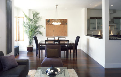
Work in layers of neutrals with splashes of color for a sophisticated palette. It's almost as if I took the playful nature of the prior picture, added some additional neutral tones and created a sleek and contemporary living room. The soft browns and taupe tones (cool tones) complement and show off the celery green highlights.
For a bold color story, use neutrals to tone down big swatches of your color. This one takes a little explanation. In the two previous examples, the neutral tones were used as the base color, with splashes of an accent color. This room flips that idea on its head.
The cheerful blue wall covering and accents are the real story here. The neutral headboard and crisp bed linens tame the blue-ness of the room into something cozy and inviting.
The cheerful blue wall covering and accents are the real story here. The neutral headboard and crisp bed linens tame the blue-ness of the room into something cozy and inviting.
Start with a statement and work your way out from there. This concept falls under one of my favorite sayings, "Go bold or go home." The lime green tile wall sets the stage for this bathroom. Small touches of green elsewhere carry the color throughout, enhancing the color story.
Use color to differentiate spaces. In this open floor plan, the sky blue dining chairs clearly coordinate, yet delineate this space as being different from the family room area. The kitchen is given its own color in the island pendant lights and countertops.
Notice the one color that's consistent throughout the three spaces is white. This keeps it modern and cohesive at the same time.
Notice the one color that's consistent throughout the three spaces is white. This keeps it modern and cohesive at the same time.
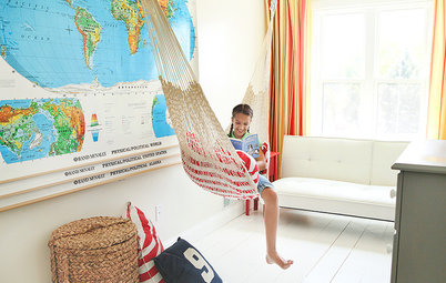
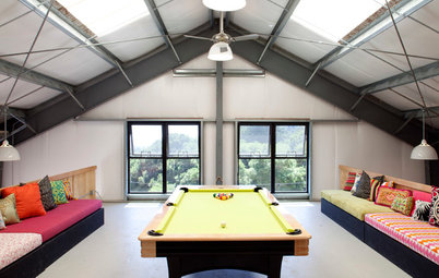
Feel free to go bold — just be consistent. What a great gift to your children: their own den. This bright and cheerful space is splashed with summery, happy colors. Two shades of blue, apple green and a sophisticated magenta tone are perfect for all the kids. The four colors are used in many ways all around the space, ensuring it's not too choppy.
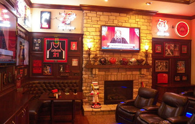
Reconsider a classic combination. Black and white is one of the most classic and sought after color pairings. In this highly graphic room, red touches are sprinkled throughout, making this room's color story strong and vibrant.
Consider the color of materials in your overall scheme. When we think of creating a color story, it usually comes from paint colors, artwork and fabrics. But the wealth of materials available in today's design world provides us with so many other colors that can play an important role. The warm-orange tones of the wood complement the wall color perfectly, bringing a serene fall-like feeling to this dining room.
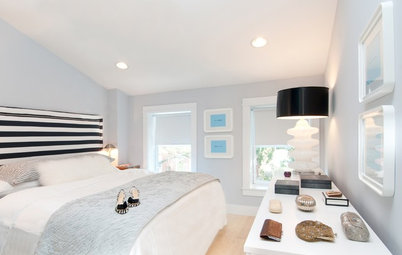
Use shades of the same color to create a softer color story. This sweet and sophisticated girl's room is bathed in a rose pink and highlighted with a deep magenta tone in accessories and lighting. The use of these two tones, mixed with white, creates a striking combination of the same color.
More:
How to Use the Color Wheel When Designing a Room
When to Use Cool and Warm Tones
Dare to Choose a More Colorful Neutral
How to Pick the Right Gray
More:
How to Use the Color Wheel When Designing a Room
When to Use Cool and Warm Tones
Dare to Choose a More Colorful Neutral
How to Pick the Right Gray