
Is Midnight Blue the New Black?
As bold as black but much more versatile, midnight blue is becoming a star

Somewhere between navy and indigo lies the ethereal blue of a starry sky. Midnight blue is a complex color with a hint of gray, purple, black and occasionally even a drop of teal. It provides the boldness of black with more complexity and warmth. Here are a dozen rooms with this moody shade, plus advice on how to use it best.
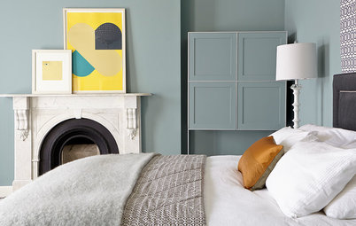
1. Midnight blue is a great color chameleon, changing hue in the light. Notice how the cabinetry on the left side looks so much more blue than its steely counterpart across the room? That’s because of the way the paint’s molecules are absorbing and reflecting the sunlight’s wavelengths: The cabinets on the right are reflecting more red and green wavelengths, while the cabinets on the left are reflecting more blue. Our perception of complex colors like midnight blue vary widely depending on light.
2. Are you an avowed lover of Scandinavian design? Midnight blue is still for you. Just use it as a glossy accent to add some sophisticated color that pops against your sleek whites without being overtly bright. Notice how the gloss of the subway tiles bounces light just as well as all the white surfaces. The same effect can be achieved with glaze over paint.
3. The glossy blue cabinets make a powerful statement while the lighter but still complex blue-gray wall behind them moderate the contrast against so much white.
Design tip: When you’re considering incorporating a bold, bright, dark or otherwise risky-feeling color into your room, layering in a medium tone can be a great way to ease the transition.
Design tip: When you’re considering incorporating a bold, bright, dark or otherwise risky-feeling color into your room, layering in a medium tone can be a great way to ease the transition.
4. Moving further down the spectrum of color, light and complexity, this kitchen wall owes its velvety richness to the interplay of gray and purple undertones with its midnight blue base. More than likely a custom color dreamed up by an artistic designer, it merges rusticity with chic.
5. Perfect for a bedroom, midnight blue mimics the night sky and pairs well with candlelight to create a soothing, sensual cocoon of color. Adding some metallic elements for the light to glint off of will catapult you starry-eyed into dreamland.
6. Don’t be afraid to double down on your blues. This bedroom’s walls verge on teal, an unexpected but endearing complement to the more indigo hues on the bed.
Leonardo da Vinci’s early study of optics taught us that the eye gravitates toward what is lightest, so if you want to draw forth your white bedding, darken your walls with this crowd-pleasing hue.
Leonardo da Vinci’s early study of optics taught us that the eye gravitates toward what is lightest, so if you want to draw forth your white bedding, darken your walls with this crowd-pleasing hue.
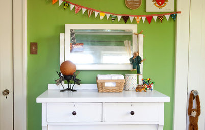
7. Though we tend to dream in pastel tones when it comes to designing nurseries, it can be refreshing to see parents raising their children among less age-specific palettes, opting instead for sophisticated rooms that they, themselves, might like to inhabit too. After all, new parents will be spending plenty of time in the nursery.
8. When designing a bathroom, it’s worth considering when you really intend to enjoy the space. Some like a bright, light-filled room to spur them into their morning routine, while others cherish their evening bath. Though we’re inundated with images of sunlit bathrooms in soothing spa blues and whites, which are perfect for a peaceful morning ritual, darker cave-like colors make a better backdrop for evening relaxation.
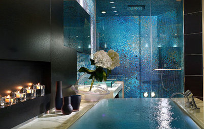
9. The blues of the ocean and the night sky take on an ethereal quality because our eyes have fewer cone cells specializing in blue, which means we don’t perceive blue’s edges as clearly as we do other colors. What this means from a design perspective is that diminishing edges altogether by wrapping a room entirely in blue will impart an almost mystical quality to a space, as we see in this alluring bathroom.
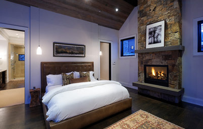
10. Here we see a rich, almost masculine space whose midnight blue feature wall provides a colorful frame for the fireplace. Bucking the trend toward expanding small rooms with light and bright paint, this especially dark accent keeps the nearly black floors feeling relevant and appropriate rather than heavy and out-of-place.
11. Even more than walls, the ceiling may well be the most perfect application for midnight blue. The name itself invites us to tilt our heads skyward for stargazing, and a ceiling painted in the color of a blackened sky can’t help but evoke the boundlessness of space.
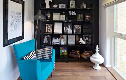
12. Good luck finding a color that midnight blue won’t play nicely with. Here we see it tying together charcoal gray with vanilla and multiple wood tones, a palette that can be tricky to unify. The coolness of the blue backdrop joins forces with the gray bookshelves to balance out the many other warm tones in the space, and the large painting above the desk is all the more vibrant for it.
More
The Case for In-Between Colors
How to Add Color if You’re Color Shy
More
The Case for In-Between Colors
How to Add Color if You’re Color Shy