


The Joy of Taking Risks in Design
Not interested in playing it safe? Then check out these 14 bold spaces
Jess McBride
May 10, 2016
Houzz Contributor. Custom decorating professional and content creator for the home design industry with a lifelong passion for color, pattern, and texture of every "stripe"
Houzz Contributor. Custom decorating professional and content creator for the home... More
Basic beige, boring beige, builder beige. As popular as neutrals are, they represent to many the safe, uninspired choice that goes with everything but rarely excites. Popular decorating wisdom recommends keeping your major investment pieces like sofas and cabinetry neutral, but sometimes it’s just plain fun to take a risk. Your brightly colored, richly patterned design choices may not appeal to everyone, but maybe they don’t have to. Here, we celebrate 14 original interiors that exhibit fearless decorating in all its glory.
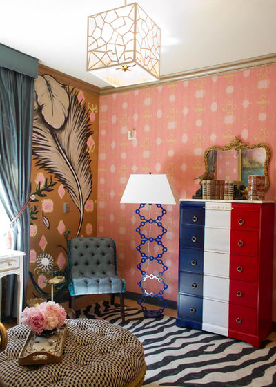
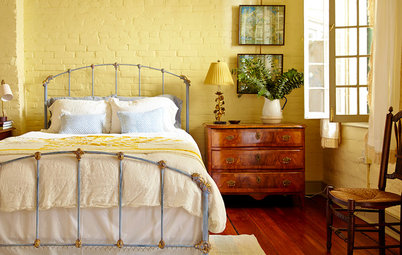
1. Be honest: How many people would ever consider juxtaposing two different wallpapers with four different fabrics, a zebra-print rug and a dresser painted like the French flag? Combining different shades and hues of a single color is a popular design move in monochromatic schemes, but it becomes bold and original when you layer two very different blues with two very different reds, and accent with a range of neutrals from taupe to black and white.
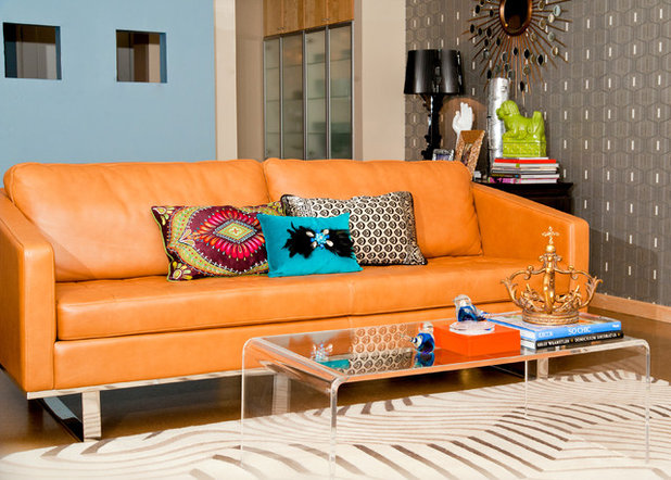
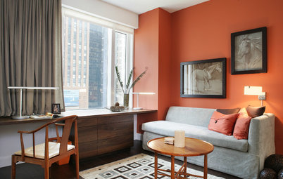
2. It stands to reason that a neutral sofa allows for the widest possible assortment of pillows, draperies and paint colors to satisfy a hunger for constant novelty in one’s decor, but if you’ve been a lifelong fan of orange, a pumpkin-colored leather sofa may be less of a risk to you than others.
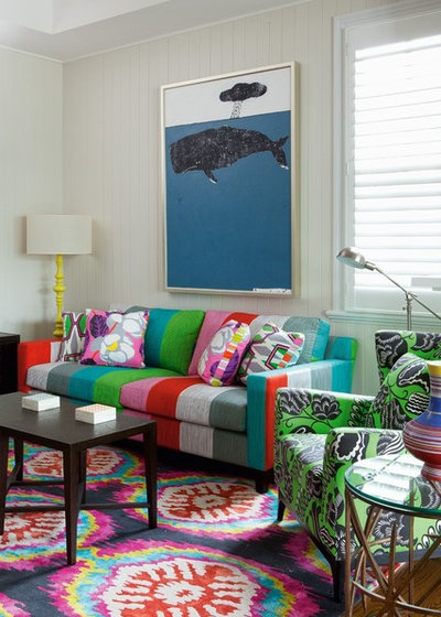
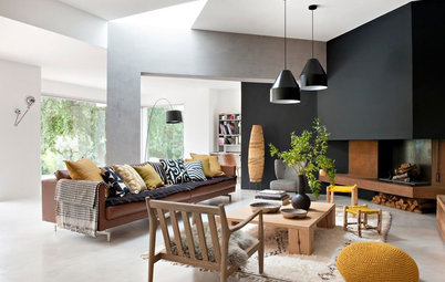
3. This artsy Australian homeowner is clearly drawn to bright, clear colors and isn’t afraid to mix them to create a one-of-a-kind living room. Though it’s bold, everything works: The colors of the sofa are captured perfectly in the chair and the rug, but nobody would dare accuse this room of matchiness. Meanwhile, the white walls, unadorned windows, and artwork with relatively simple forms and color-blocking keep the focus on the creative splendor at the bottom half of the room.
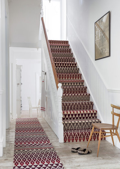
4. Stairs are an oft-overlooked place to take a chance with design. Much in the same way we use powder rooms as mini laboratories for wallpaper experiments, stairwells are small, contained spaces devoid of furniture and other elements that might compete with an unexpected floor or wall treatment.
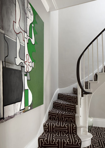
5. Here, we see the same approach combined with an intrepid choice of large-scale artwork.
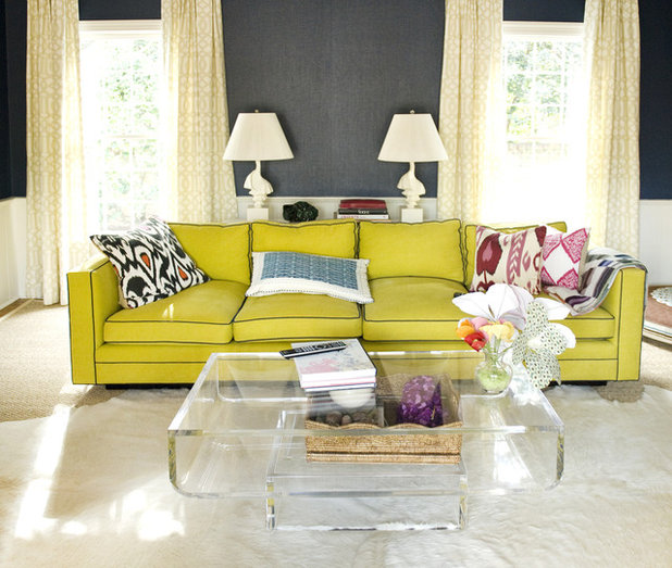
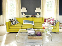
6. This space showcases some design tricks that temper the bold Key-lime sofa, whose impact is magnified by the contrast piping around the cushions and frame. A transparent coffee table lightens the visual load and keeps the focus on the statement-making sofa, while the rich, neutral wall color supports and grounds the boldness of the composition. The room would have lost a bit of its majesty if the designer had “chickened out” and specified solid draperies, but instead the subtle geometric pattern adds interest without distracting from the main event.
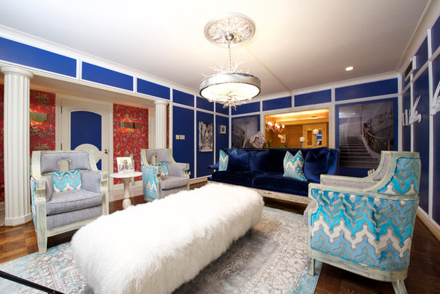
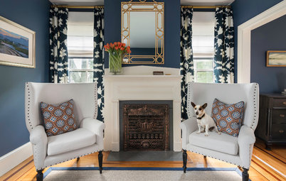
7. For a winning strategy, go full throttle with an expressive wall color, then find a knockout fabric that makes your heart beat a little faster and weave that throughout the room. You don’t need oodles of pattern to make a room sing: Sometimes the combination of a striking color and a single special pattern is enough.
Designer tip: If your chosen fabric feels like a bit too much for upholstery but you want the impact of a unique statement chair, consider upholstering only part of the piece: maybe just the back or frame or cushions.
Designer tip: If your chosen fabric feels like a bit too much for upholstery but you want the impact of a unique statement chair, consider upholstering only part of the piece: maybe just the back or frame or cushions.
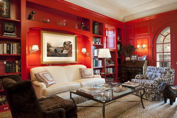
8. Sometimes the security of a neutral sofa is too hard to resist, and there’s no shame in that. Maybe you want a personalized, unique space but see no reason to part with perfectly good beige upholstery. Fun throw pillows are a given, but adding a trim will feel even bolder since you’re altering the sofa itself. Then layer in spicy red lacquered walls and an animal-print rug, and watch your room transform from a play-it-safe haven to a designer showcase.
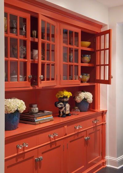
9. Yes, cabinetry is a significant expense and one of the highest-ticket items of a kitchen renovation, but paint is only paint. It can be changed relatively easily and affordably and can lend much-needed personality to rooms that tend to be rife with safe resale-minded tile and finish selections.
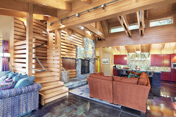
10. There’s nothing particularly radical about the living room in this lakeside cabin, nothing neon or avant-garde in sight, yet it clearly does not look like any joyless spec house you’ve seen time and again. Between the black polished concrete floors and the thoughtful mix of materials, it is clear that this design was tailored for the clients without compromise.
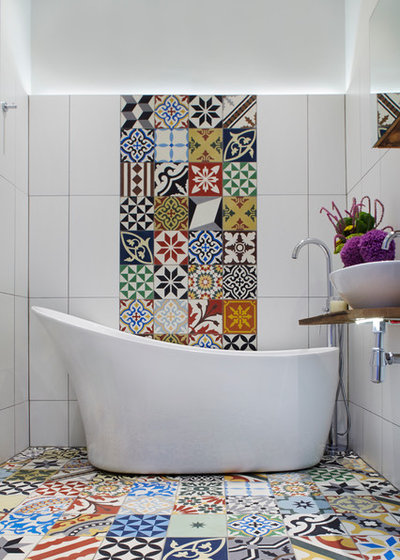
11. Always a logical place to take design risks, the bathroom affords the opportunity to create high-end, custom accents using extraordinary materials like these collected encaustic tiles. This bathroom does not assault the senses with a riot of color; instead, the large swaths of white allow each tile to stand out.
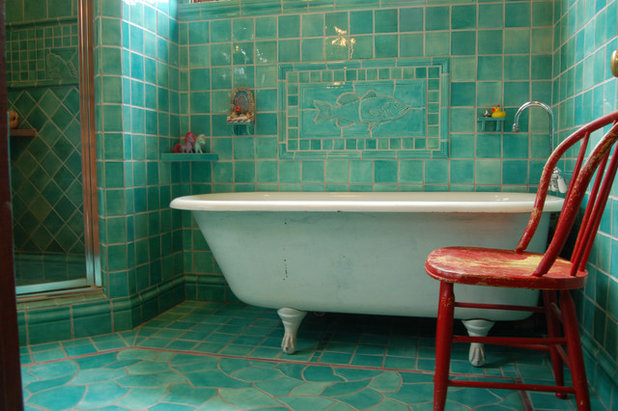
12. You’d have to love tropical green-blues to find your bliss in this watery bathroom, but if you do, there is probably no better tile choice for you. Wrapping a room in a single color creates a cohesiveness and simplicity that is pleasing no matter what the color, and in this bathroom, the effect is of being under the sea.
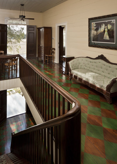
13. Painting is a favorite budget tactic for addressing wood floors that have seen better days. Especially in blank hallways where the floor can really make an impact, hiring a professional to stencil a design can transform a once purely functional stair landing into a creative conversation-starter.
Note: Painted floors require a bit more maintenance if you’d like to keep them looking pristine. If faded glory is your look, you’re in luck: Rubbed and chipped paint will create a patina on your floors in no time.
Note: Painted floors require a bit more maintenance if you’d like to keep them looking pristine. If faded glory is your look, you’re in luck: Rubbed and chipped paint will create a patina on your floors in no time.
14. You can still get an original, eclectic look without going wild on the expensive stuff: Try painting your doors and wood furniture and then repainting them when you get bored, or mount some colorful artwork that will occupy enough real estate on your wall to feel like a mural. When it comes to art and design, you’re less likely to regret an offbeat choice that makes your heart sing than a calculated compromise.
More
Case Study: The Fearless Approach to Bold Color
Go for the Bold: 14 Great Ideas for Patterned Upholstery
More
Case Study: The Fearless Approach to Bold Color
Go for the Bold: 14 Great Ideas for Patterned Upholstery
Scott Davidson founded Davidson Builders in 1998. Scott graduated from Michigan State with a BS in Construction... Read More
What are you working on?

Related Products

Our team is a small group of energetic individuals and talented professionals available to guide you through the... Read More
Related Stories
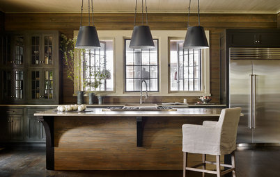
Kitchen Design
New This Week: How Dark Can Your Kitchen Go?
These 3 kitchens wow with dark cabinetry and drama
Full Story
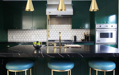
Kitchen Cabinets
These Jewel-Tone Kitchen Cabinets Really Shine
For a colorful but sophisticated look, paint your cabinets one of these dazzling hues
Full Story
Wall Treatments
Fall in Love With Lacquer
By Jess McBride
Explore 12 ways to add high-gloss drama to your home
Full Story
Color
Set the Mood: 4 Colors for a Cozy Bedroom
By Jennifer Ott
Look to warm hues for that snuggle-friendly feeling
Full Story
Most Popular
Falling for Color: 9 Ways With Pumpkin Orange
By Jennifer Ott
From racing stripes to accent walls, see how to work this vibrant hue into your home
Full Story
Color
Deep Wall Colors That Feel Extra Cozy in Fall
Wrap your rooms in richer or seasonal hues for a warm, comforting feeling this autumn
Full Story
Color
7 Inky Colors to Use Instead of Black
By tidgboutique
Is black too stark and dramatic for your taste? Try navy, charcoal, chocolate or another alternative for a deep, moody space with character
Full Story
Color
9 Dark Wall Colors to Suit Your Mood
By Becky Harris
Tired of light and airy? Try dark and moody for a change; you may be surprised by the moods these colors inspire
Full Story
Color
Best Uses for the Boho Blue Color of 2015
By Jennifer Ott
PPG Pittsburgh Paints’ Color of the Year is a bold bohemian blue best used in small doses
Full Story
I HAVE A NIGRAINE JUST LOOKING AT THE HODGE PODGE....AWFUL
Got photos of your place, 86redvette?
86redvette: I think I understand your point of view. At the age of 72 I started having dizzy spells followed by headaches and fuzzy vision. My first thought was mini-strokes, thankfully not the case. I have late onset atypical migraines combined with hereditary hearing issues. Change in diet was the prescription, and it works.
So, for me, the patterned stairs would be non-negotiable and some of these rooms are not for me, as are monochomatic rooms. My brain is allergic to certain commercial food ingredients and the antidote is bright walls with a brown or green floor and sky-mimicking ceiling.
Thus, as you can read in my earlier post, I pick and choose from the examples, a wall here, a rug there, that tile in smaller doses, etc. If you look through again, you may find a few elements that fit your tastes.