


A Makeup-Inspired Makeover for Your Home
Look to your favorite shades of lipstick, blush and eyeshadow for ideas to pretty up your pad
Jess McBride
June 9, 2016
Houzz Contributor. Custom decorating professional and content creator for the home design industry with a lifelong passion for color, pattern, and texture of every "stripe"
Houzz Contributor. Custom decorating professional and content creator for the home... More
When you’re stymied by coming up with your interior’s color scheme, try searching your makeup bag for inspiration. A bold fuchsia lipstick, bashful peach blush or edgy metallic eyeshadow can lead you to shades that shimmer with radiance, complement your coloring and make you feel right at home.
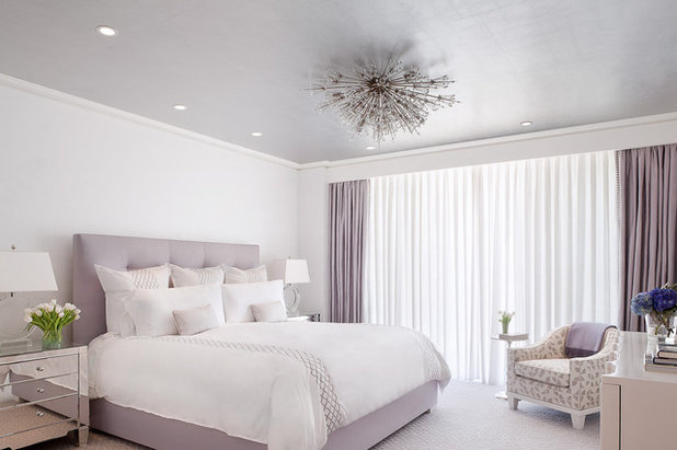
Simple and subtle. With makeup and interior design, a little goes a long way. Some say the key to applying makeup is making it look as if you’re not wearing any at all. The “naked look” is all about subtlety, letting a woman’s natural beauty shine. We could say the same about this tightly controlled lavender color scheme, in which every detail from the headboard to the ceiling is mutually enhancing and sticks faithfully to the theme.
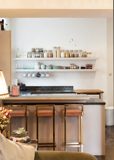
The makeup-inspired look can be duplicated in the kitchen just as easily as the bedroom. I see in this breakfast bar a fresh face beholding a palette of jars featuring subtle, grayed tints —like the eyeshadows that are a staple of the natural look. This kitchen needs no gimmicks, no “look at me” embellishments: It is perfectly confident in its simple elegance.
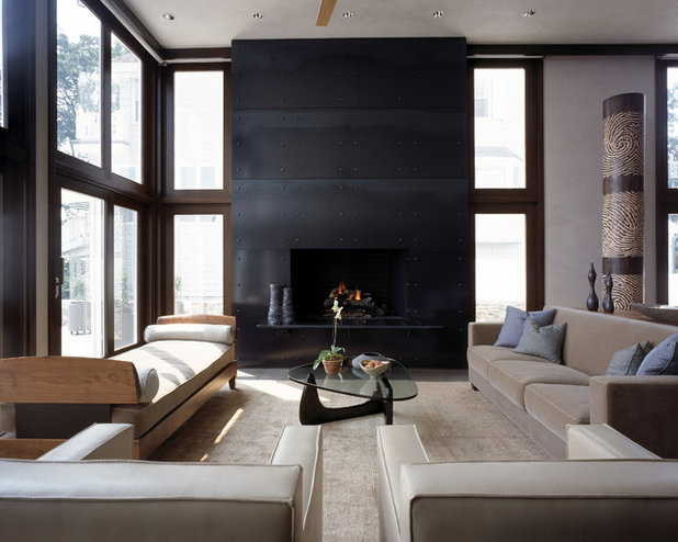
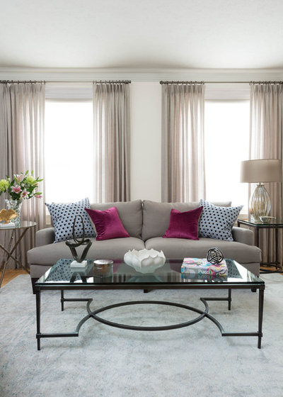
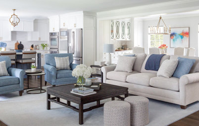
A nude palette fit for a drama queen has deep ebony accents and a few mysterious blue-gray throw pillows for intrigue.
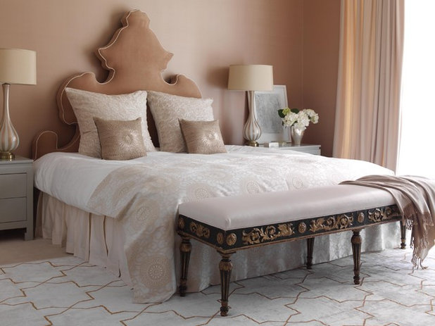
Pretty in pink. It is common knowledge that we tend to look our best in a pink room. Something about the way the color reflects on skin softens hard edges and seems to add the flushed glow of health. It is the reason women wear blush, nude heels and pink lip lacquer, and it’s also a solid argument for decking your bedroom or bathroom in barely-there pinks and corals.
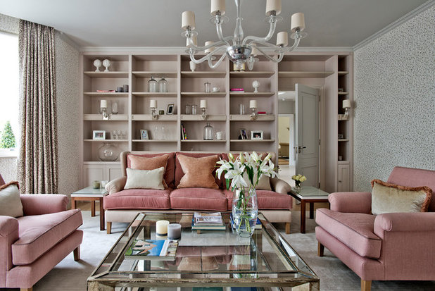
The bookcases here are painted in the most breathtaking of refined pinks, Pink Peppercorn by Dulux. Despite the trio of pink upholstered pieces, the room feels thoroughly adult and unexpectedly yet perfectly classic.
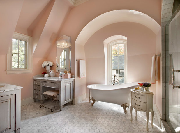
Who wouldn’t feel like a queen primping at leisure at this marvelous little vanity? Ladylike though it may be, let’s not forget that soft pink and peach make everyone look good, men as well as women.
Suggested paint colors to capture this look include Farrow & Ball’s Pink Ground and Benjamin Moore’s Warm Blush.
Suggested paint colors to capture this look include Farrow & Ball’s Pink Ground and Benjamin Moore’s Warm Blush.
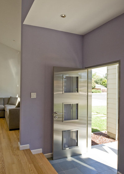
Purple passion. Purple is notoriously difficult to get right. Two tried-and-true tactics for using this color to boost your home’s glamour is to select a grayed-out version and pair it with metallics. Virtually any metallic will do since dusty lilacs are equally gorgeous with glinty steel and copper.
While purple can be gender-neutral, there’s no denying the girly glam at play in this room. Here we see how wood and metal bring this floaty aesthetic — with its gauzy sheers and fuzzy pillow — down to earth. The lilac and blush tones are sure to make you feel your best in this restful space.
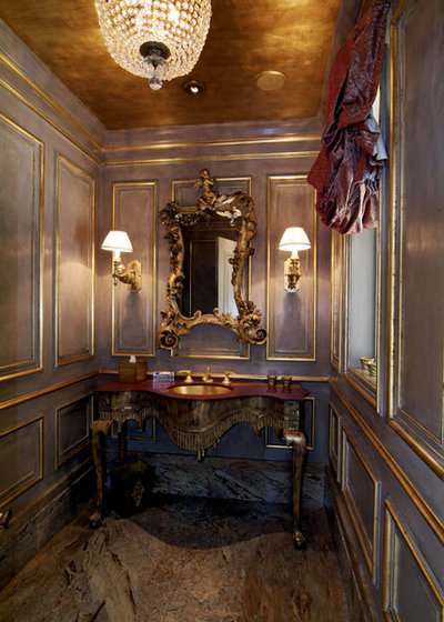
Shimmering metallics. Natural stones like marble and granite often contain the hues found in today’s most popular makeup palettes. The copper and golden tones in these floor tiles mirror the specialty ceiling finish and gilded trim, and both the lighting and wall color cast a regal aura over this stately Victorian powder room.
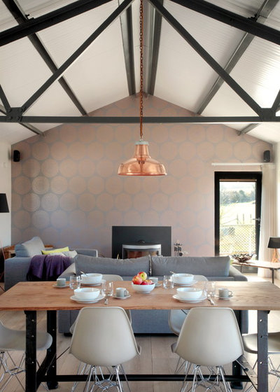
A metallic papered accent wall and copper light fixture take this room from plain to pizazz. Those two simple features tell the whole color story of the space, but they’re both relatively affordable and simple to replace should trends or the homeowners’ tastes shift.
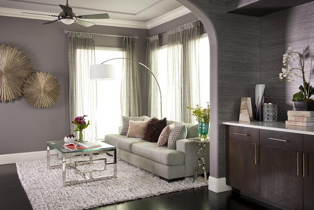
Here’s another exquisite example of using metal and wood tones as a neutral foil to the trickier pinks and peaches that most people are comfortable with only as accents. The gray tones down the sometimes oppressive cheeriness of pink, while the pink enlivens an otherwise neutral scheme. It’s rather like the way a bit of blush kicks our natural beauty up a notch.
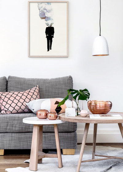
With rose gold and copper being the current hot trends, gilding every surface with these ultrawarm metallics may be overkill. Still, it’s a haute look for today that is worth sprinkling in as pillows and objets d’art.
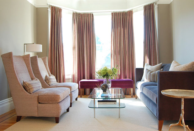
Pulling it all together. Thanks to Pantone’s designation of Rose Quartz and Serenity as its 2016 colors of the year, we’re finally opening our eyes to a grown-up way to combine pinks and purplish blues in the home. Saturated rather than pastel hues will keep the color combo from feeling too saccharine, and combining deep magenta with periwinkle blue will feel fresh for a long time. These colors have long been popular in Indian textiles, and it’s nice to see rich raspberry and blue violet finally making a splash in the U.S.
Zooming out on the space, we see more smoky tones blended with metallic and muted pink. We can imagine a confident uptown girl pausing at her favorite chair to step into her heels and glide on one last dash of pouty pink lip gloss on her way out the door.
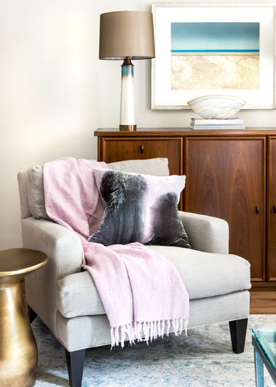
If your regimen tends toward a tinted moisturizer, a quick swipe of mascara and an eye-popping fuchsia lipstick, you’d probably enjoy the understated romance of this sitting room, which exudes softness without feeling overtly gendered.
More: Dreaming in Color: 8 Pretty-in-Pink Bedrooms
More: Dreaming in Color: 8 Pretty-in-Pink Bedrooms
Because every home deserves an amazing kitchen: A beautiful, welcoming and functional space that’s designed for... Read More

Related Products

Stylish, sophisticated living spaces only happen by design. Mary Shipley-Smith has over 20 years of residential... Read More
Related Stories
Organizing
How to Create a Joyful, Clutter-Free Home Office
Follow these steps to get rid of the paper piles and make room for beauty and better organization
Full Story
Remodeling Guides
15 Ways to Create Separation in an Open Floor Plan
By tidgboutique
Use these pro tips to minimize noise, delineate space and establish personal boundaries in an open layout
Full Story

White
Design Pros Share 10 Favorite Creamy White Paints
By Becky Harris
These off-white color choices include versatile tones, warming hues and pleasingly soft shades
Full Story
Entryways
4 Designer Tips for a Fashionable Entry
By tidgboutique
A pro shows how adding color, statement pieces and more to a foyer can set the right tone for the rest of the home
Full Story
Most Popular
7 Major Decorating Mistakes and How to Avoid Them
By tidgboutique
Gain confidence to start your interior design project with this advice from a professional designer
Full Story
Living Rooms
4 Must-Have Features for a Small Living Room
By tidgboutique
A designer shares important ways to live large in a tight space and make it look stylish
Full Story
Most Popular
7 Common Decorating Mistakes to Avoid
Pros share solutions to design problems they often find in people’s living spaces
Full Story
Most Popular
How to Decorate a Living Room
By tidgboutique
A designer offers tips for creating a comfortable space that reflects your style
Full Story
Budget Decorating
Where to Splurge and Where to Save When Decorating
By tidgboutique
See where it makes sense to invest in durable essentials and focal pieces, and where to economize on other things
Full Story
Lighting
Pro Tips for Lighting 10 Rooms and Outdoor Areas
Get professional advice for lighting your kitchen, bathroom, living room, office, patio and more
Full Story
Considering my colouring is in the redheaded fair skin range, I tend to go for muted browns and soft pinks. Funny how my home colour palette is similar; wood tones and shades of red/pinks.
Great article, Jess, and the accompanying photos are perfect examples of your points. I just love Pantone's colours of 2016, Rose Quartz & Serenity. Using such colours requires a lot more thought and consideration when pulling a room together than the boring beige on beige or grey on grey decorating styles of past years but if done right, the results can be amazing. Many of the rooms in the photos above exude such a sense of calmness & elegance.
You are right, Jess - it is a "grown-up" way to use colours in these palettes. I love pastels but drawing on the varying hues of make up ranges opens up a whole new outlook.