


Houzz Tour: Edwardian Flat Opens Up for More Light and Better Flow
Removing 7 walls and adding clerestory windows brighten this 1905 San Francisco home and propel it into modern times
Jennifer Quail
February 18, 2016
Houzz Contributor. Design writer, visual merchandiser and stylist. More than a decade of writing for print and online design publications has led to practical design, decoration and styling work. The combination keeps every day creative and colorful.
Houzz Contributor. Design writer, visual merchandiser and stylist. More than a decade... More
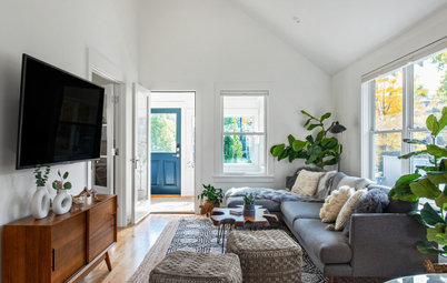
Coming home from a tech-industry job to an apartment whose interiors were stuck firmly in the past wasn’t working for this homeowner. Previous owners had removed much of the original architectural details of the 1905 Edwardian home but had left intact the long corridor layout and filled the space with colors and cabinetry that felt more at home in the 1980s. The homeowner hired interior designer Jeni Gamble for help, and she set to work removing walls to open and modernize the space and let light flow through from end to end.
Houzz at a Glance
Who lives here: A tech professional
Location: Mission District of San Francisco
Size: About 1,300 square feet (120.7 square meters); 2 bedrooms, 2 bathrooms
Once the homeowner and Gamble had settled on a new floor plan, the designer got to work knocking down seven interior walls and raising the ceiling by nearly 2 feet in the living area to give the apartment an open, loft-like feel.
She then reconfigured the space, taking it from a three-bedroom, one-bathroom layout to a two-bedroom, two-bath arrangement that created a larger living area better suited for entertaining. It also allowed light from sliding doors at one end to sweep through the home.
“We shared a vision for the space and agreed it needed to be opened and modernized,” the designer says. “We gutted the house, but it was guilt-free because we weren’t tearing out any Edwardian details.”
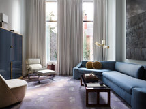
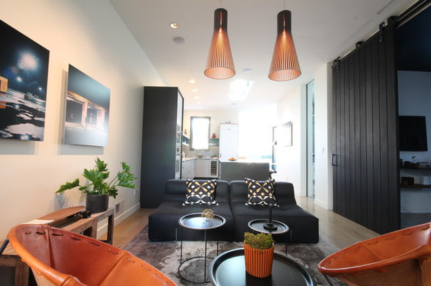
The decor fuses contemporary and textural elements. Gamble and the homeowner share an appreciation of the design of Ace Hotel Portland in Oregon — clean and modern yet warm and comfortable, not stark. The influence can be felt throughout the home, in which Gamble used the idea of a simple black and white color scheme as a base, adding details like area rugs, leather furnishings, natural wood and plant life to soften the feel of the space and create an inviting atmosphere.
Leather side chairs: Garza Marfa; barn door: custom; artwork: Marrow Gallery
Who lives here: A tech professional
Location: Mission District of San Francisco
Size: About 1,300 square feet (120.7 square meters); 2 bedrooms, 2 bathrooms
Once the homeowner and Gamble had settled on a new floor plan, the designer got to work knocking down seven interior walls and raising the ceiling by nearly 2 feet in the living area to give the apartment an open, loft-like feel.
She then reconfigured the space, taking it from a three-bedroom, one-bathroom layout to a two-bedroom, two-bath arrangement that created a larger living area better suited for entertaining. It also allowed light from sliding doors at one end to sweep through the home.
“We shared a vision for the space and agreed it needed to be opened and modernized,” the designer says. “We gutted the house, but it was guilt-free because we weren’t tearing out any Edwardian details.”
The decor fuses contemporary and textural elements. Gamble and the homeowner share an appreciation of the design of Ace Hotel Portland in Oregon — clean and modern yet warm and comfortable, not stark. The influence can be felt throughout the home, in which Gamble used the idea of a simple black and white color scheme as a base, adding details like area rugs, leather furnishings, natural wood and plant life to soften the feel of the space and create an inviting atmosphere.
Leather side chairs: Garza Marfa; barn door: custom; artwork: Marrow Gallery
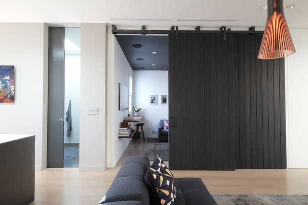
A custom barn door leads from the living room to a media room, previously a bedroom, that provides spillover space during parties and also acts as a third bedroom for guests when needed. “We kind of created a double living room here,” Gamble says.
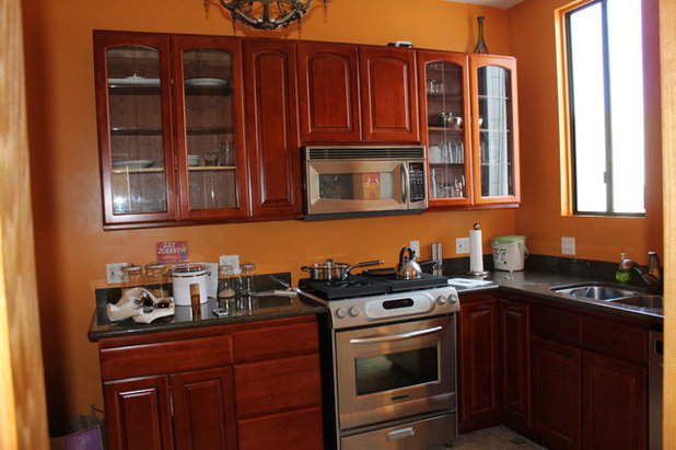
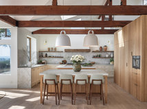
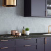
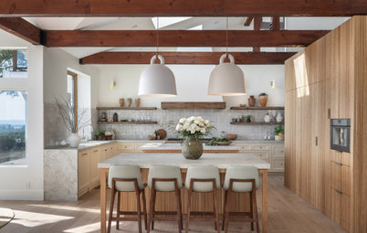
BEFORE: The existing kitchen was dark and closed in by two walls. Upper cabinetry made the space feel more crowded. Plus, the homeowner felt the cabinet style and wall colors belonged in another decade.
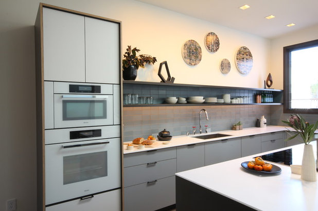
AFTER: Gamble removed walls to open the kitchen to the living area and created storage solutions that eliminated the need for upper cabinetry. A built-in refrigerator on one end and tall custom cabinetry with appliances on the other serve as bookends for the cabinets. The lighter palette makes the area feel more expansive.
Cabinets: Henrybuilt; countertops: Corian; artwork: Marrow Gallery
Cabinets: Henrybuilt; countertops: Corian; artwork: Marrow Gallery
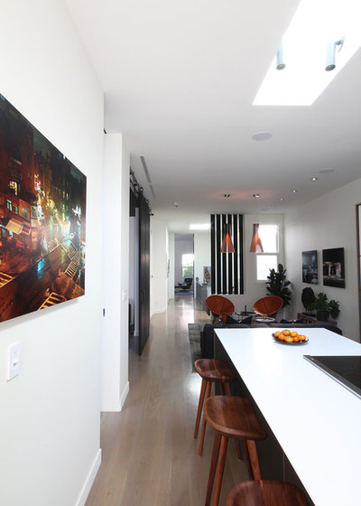
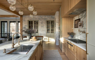
A long kitchen counter (shown at left in this split image) fills the space where a wall once stood and offers an extra seating area when the homeowner is entertaining.
The railing detail (shown at right) is one of the few Edwardian details the previous owners had left intact.
Counter stools: Design Within Reach; artwork: Marrow Gallery
The railing detail (shown at right) is one of the few Edwardian details the previous owners had left intact.
Counter stools: Design Within Reach; artwork: Marrow Gallery
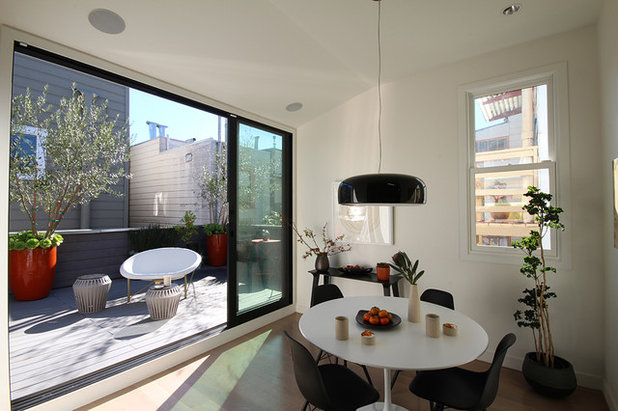
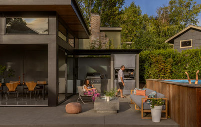
In reconfiguring the apartment layout, Gamble expanded an area that had previously served as a small sunroom. The move created space for a dining area adjacent to the kitchen with a beautiful view of the outdoor space.
Table and chairs: vintage; outdoor chair: Galanter & Jones
Table and chairs: vintage; outdoor chair: Galanter & Jones
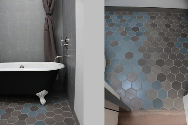
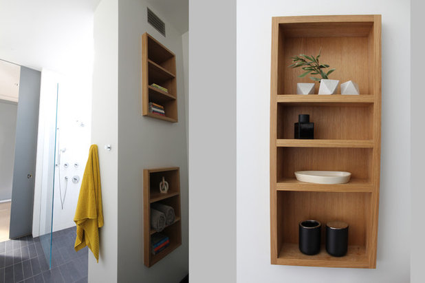
This split image of the guest bathroom shows a claw-foot tub that nods to the home’s Edwardian roots, while its black and white color scheme bridges it to modern times. The hexagonal floor tile depicts an abstract floral pattern.
Floor and wall tile: Heath Ceramics
Floor and wall tile: Heath Ceramics
The master bath (shown at left in this split image) and master bedroom continue the color palette that weaves through the apartment.
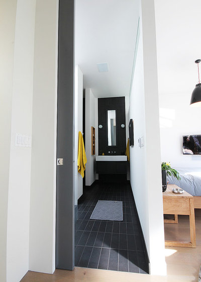
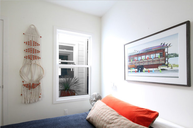
Clerestory windows, like those in the bedroom, were added throughout the apartment to carry light into darker spaces and contribute to the open feel.
“Privacy is an issue in this neighborhood because you have neighbors everywhere,” Gamble says. “We removed windows and added skylights and clerestory windows to add privacy and force the light to come in from above.”
Bed: Design Within Reach; side table and motorcycle print: homeowner’s own
The master bath exudes a peaceful Zen feeling. Gamble added a skylight in the shower to brighten the previously windowless space and bring the outdoors in. In total, six skylights were added throughout the apartment.
The contemporary guest room gains vintage appeal through its varied wall art.
Woven wall art: vintage; artwork over bed: Marrow Gallery
Woven wall art: vintage; artwork over bed: Marrow Gallery
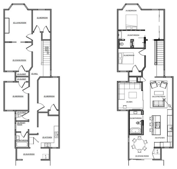
These floor plans show the previous layout on the left, and the reconfigured space on the right.
Browse more homes by style: Apartments | Barn Homes | Colorful Homes | Contemporary Homes | Eclectic Homes | Farmhouses | Floating Homes | Guesthouses | Homes Around the World | Lofts | Midcentury Homes | Modern Homes | Ranch Homes | Small Homes | Townhouses | Traditional Homes | Transitional Homes | Vacation Homes
Browse more homes by style: Apartments | Barn Homes | Colorful Homes | Contemporary Homes | Eclectic Homes | Farmhouses | Floating Homes | Guesthouses | Homes Around the World | Lofts | Midcentury Homes | Modern Homes | Ranch Homes | Small Homes | Townhouses | Traditional Homes | Transitional Homes | Vacation Homes
We are a small company, LLC located in the city of ohio in search of business contracts, commercial among others... Read More
What are you working on?
Related Products
We believe that the transition of a house into a home is a sense of history and a piece of the future. It tells... Read More
Related Stories
Contemporary Homes
Houzz Tour: Boston Pied-à-Terre Designed for Evenings
By Becky Harris
A designer found on Houzz infuses a condo with a sultry vibe inspired by supper clubs and luxe boutique hotels
Full Story
Guesthouses
Houzz Tour: Light-Filled 704-Square-Foot Modern Cottage
By Becky Harris
An architect and a designer create a light and airy feel, cozied up by layers of textures
Full Story
Outbuildings
Family Gatherings in Argentina Inspire a Pavilion and Guesthouse
By Becky Harris
A new yard adds room for hosting, swimming and bringing part of one homeowner’s culture to her family’s Seattle home
Full Story
Transitional Homes
Houzz Tour: Organic Style on an Avocado Ranch
By Becky Harris
A designer uses a soft neutral palette, handmade tile and reclaimed wood to update a 1980s contemporary home
Full Story
Transitional Homes
Houzz Tour: Elegant, Earthy Ranch House for an Empty-Nest Couple
Design styles, warm neutral colors and special details blend in a Minnesota ranch-style house with a finished basement
Full Story
Contemporary Homes
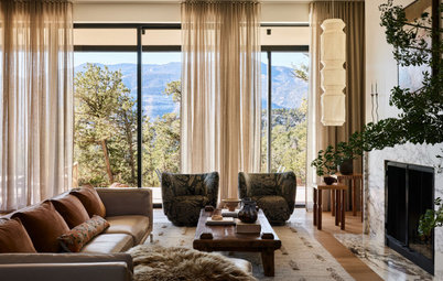
Houzz Tour: Colorado Forever Home Is a Family Affair
By Becky Harris
The mountain home was designed for gatherings and to make the most of views of Pikes Peak and surroundings
Full Story
Contemporary Homes
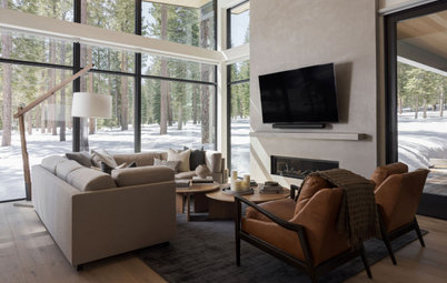
Houzz Tour: Open and Inviting Mountain Home Near Lake Tahoe
By Becky Harris
A designer creates a warmly minimalist California getaway that can stand up to snow and mud
Full Story
Homes Around the World
Houzz Tour: Period Home Gains Color and Character
By Kate Burt
Before-and-after photos show how a bold palette and restored features bring warmth and personality to this English house
Full Story
Modern Homes
Houzz Tour: New Home Gets a Midcentury Modern Makeover
By Julie Sheer
A designer in Boston reworks the kitchen and primary suite and adds style with furnishings, lighting and more
Full Story

Barn Homes
Houzz Tour: Old Barns Become an Airy, Modern-Rustic Home
A barn home in Devon, England, sits lightly on the land and offers simple, relaxing spaces for an extended family
Full Story
That's for the den/guest room.
A beautiful modern apartment. I also liked the white cabinets and white appliances in the kitchen for a cohesive feel. One lives in San Francisco to be a part of the city. The clerestory window is a perfect solution.
Reading from the top, down: Bedroom, bathroom, bedroom.
Quoting motupeg: "One lives in San Francisco to be a part of the city." You just need to be sure you are covered up enough so it doesn't matter if someone can see you through your window or glass door. I think that the indoor/outdoor aspect of the apartment is the best part of all.