


Room of the Day: A Period-Appropriate Kitchen for a Tricky Style
Restoring a kitchen in a Minnesota Foursquare uncovers secrets and captures the spirit of the original

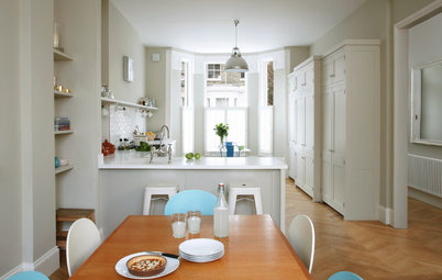
When renovating, you have to listen to your house. The kitchen in this historic home didn’t fit its 1894 vintage, yet at first glance, it was hard to define exactly what style it should be. “We struggled to define the exact style of this home,” says interior designer Shelly Lindstrom. “It’s a Foursquare, but it’s not Victorian or Craftsman — it’s kind of in between.” Although the clients and designer had great ideas, Lindstrom credits the home itself. “The house let us draw out the right style,” she says.
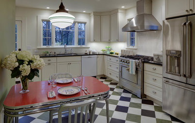
Lindstrom chose period-appropriate alder cabinetry and stained it dark to match the original millwork in other rooms of the house. The feet at the base of the simple Shaker-style cabinets lend the look of freestanding furniture that one would’ve seen in the late 19th century.
Lindstrom researched what it would cost for custom millwork to match the rest of the home, but it would’ve been a budget-buster. So she sought out stock pieces of molding that were close matches. Note how the trim on top of the cabinets matches the trim around the window. To match the existing floors in the rest of the house, Lindstrom chose birch with a clear coat. Lighting choices in seeded glass and iron also suit the period look.
The apron-front farmhouse sink is flanked by a trash pullout on one side and a dishwasher on the other, both disguised by cabinet fronts. The backsplash tile is custom-glazed, handmade 4-by-2-inch tile. It’s the kind of tile one would’ve seen in a Craftsman bungalow from the era.
Tile: Fireclay Tile; pendant light over sink: Steadman one-light mini pendant in Imperial bronze with clear seedy glass and vintage Edison bulb, Quoizel; sink: Whitehaven 36-inch single-bowl apron sink, Kohler; faucet: Cassidy pullout spray faucet, Delta
BEFORE: The kitchen was stuck in the 1980s, and the lack of an entry area meant that the island easily became a dumping ground.
BEFORE: The existing back door opened into the existing island, making for an awkward entry. (You can see this more clearly on the plans below.) The pantry wall on the right is the same as the pantry cabinet-coffee bar space that we’ll get to in a moment.
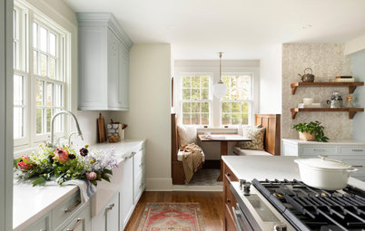
Lindstrom proportioned the island appropriately, and now there’s ample clearance around the back door. The hardworking island incorporates a microwave drawer, seating, and open and closed storage. The clients had once lived in a Craftsman bungalow and love the details that Lindstrom incorporated, such as mortise-and-tenon joints and tapered legs, which again give the island the look of furniture rather than cabinetry. Cypress-green paint lets it stand out as a centerpiece.
Island paint: Cypress Green, No. 509, Benjamin Moore; pendant lights: Piccolo one-light mini pendant in Western bronze with clear glass and vintage Edison bulb, Quoizel
Island paint: Cypress Green, No. 509, Benjamin Moore; pendant lights: Piccolo one-light mini pendant in Western bronze with clear glass and vintage Edison bulb, Quoizel
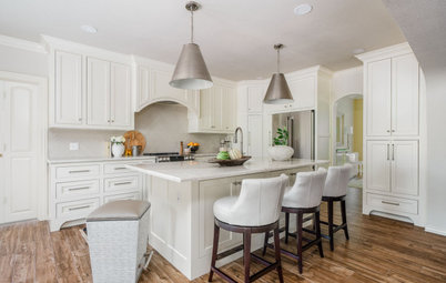
The new countertops are honed pearl-brown granite. Lindstrom chose it because it has the soft honed look and color of period-appropriate soapstone but can withstand more abuse. “The touches of brown in the granite also help to warm up the room,” she says.
Initially, the clients wanted double wall ovens. However, by choosing this range with two ovens, they were able to free up wall space for other things on their wish list.
Initially, the clients wanted double wall ovens. However, by choosing this range with two ovens, they were able to free up wall space for other things on their wish list.
This wall space allowed for a much-needed pantry cabinet and two openings into the den on either side. The designer designed the cabinet for the space, breaking up the scale and massing to keep it from looking too clunky. “I wanted it to look less like cabinetry and make it recall a hutch like you would have seen during the period,” she says. For example, the pieces on either side don’t extend to the ceiling, which gives it more dimension. The center portion answered the clients’ dream of having a coffee bar.
Another part of the renovation included creating a casual TV den, which is behind this wall. Two openings with transoms overhead lead to this space. “The transoms make the kitchen feel more connected to the rest of the house,” she says.
There’s something interesting about the wall behind this cabinet.
BEFORE: A portion of old chimney upstairs that didn’t extend to the basement had always puzzled the homeowners. They suspected that there might be a fireplace in the area below, but Lindstrom thought the wall was too narrow to contain one. “After a lot of debate, the homeowner then took a hammer to the wall, and she discovered a fireplace!” she says.
AFTER: While the chimney is no longer functional, the fireplace is a beautiful addition to the cozy den.
AFTER: The stairs to the basement run behind the eat-in banquette. Shelves in back of the banquette provide a little more elbow room on the narrow staircase. There’s also a new mudroom at the base of the stairs.
BEFORE: The wall with the large window in it blocked off those scary stairs, and the area in front was just an entry-adjacent hodgepodge.
AFTER: After improving the staircase, Lindstrom was able to replace that wall with a knee wall and banquette. By taking over the area and turning it into an eat-in area, she expanded the usable kitchen space from 187 square feet to 267 square feet. Now the kitchen enjoys the full view of the windows around the staircase.
Pendant light: Milan three-light drum pendant in buffed nickel with sateen white shade, DVI
Pendant light: Milan three-light drum pendant in buffed nickel with sateen white shade, DVI
AFTER: A subtle detail to note when comparing the “before” plan to the “after” plan is the staggering of some cabinets in the bottom-right corner of the kitchen, which helps lend that freestanding-furniture feel to the cabinetry.
Building design, plans and interior finishes: Fluidesign Studio
Builder: Anchor Builders
More
How to Design a Kitchen Island
Roots of Style: The Eclectic American Foursquare
Building design, plans and interior finishes: Fluidesign Studio
Builder: Anchor Builders
More
How to Design a Kitchen Island
Roots of Style: The Eclectic American Foursquare


Kitchen of the Day
Who lives here: A young family of four
Location: St. Paul, Minnesota
Size: 267 square feet (about 25 square meters)
Designer: Shelly Lindstrom of Fluidesign Studio
This family bought the house, lived in it for a few years and then rented it out while they lived for a time in California. Before they moved back to Minnesota, they wanted their kitchen renovation completed. With just a few in-person design consultations, they worked with Lindstrom via Skype, conference call and lots of detailed emails.
“These clients are both very visual, and that made the long-distance design process a lot easier,” Lindstrom says. Although the house had been altered over the years (and at one point converted into a duplex), the remaining original details provided strong clues for the direction of the renovation. For example, original moldings in other parts of the home inspired details she used in the kitchen.
In addition to creating a period-appropriate look, she was able to fix an awkward entry, improve a truly frightening staircase, add a cozy eat-in area and even unearth an existing fireplace that had been hidden in the wall for years.
Wall paint: Abingdon Putty, No. HC-99, Benjamin Moore; counter stools: Target