


4 New Neutrals for the New Year
So you're not resolved to go crazy with color in 2013. These refreshing on-trend neutrals can still broaden your rooms' color horizons

Could your house could use sprucing up in the new year? Consider changing out your go-to neutral hue with something livelier. The colors here pack more punch than the usual shades of gray, white and beige, but are toned down enough that they remain soft and subtle. Color trend forecasters are touting a variety of neutral hues as hot for 2013; take a look at my picks of the lot, along with images to give you inspiration.
1. Cool Khaki
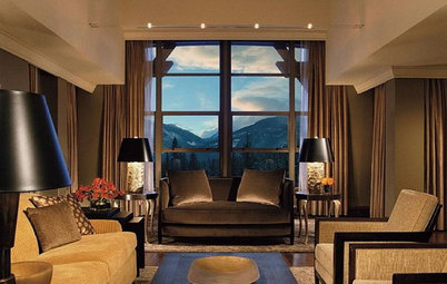
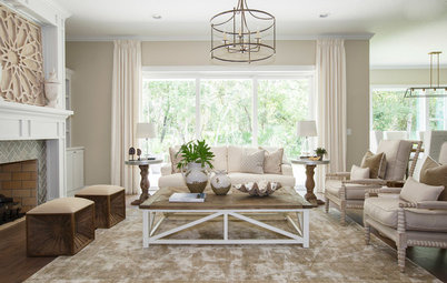
The various shades of khaki in this room create a light and elegant vibe. The cream, brown and watery blue accents are terrific additional splashes of color that pull everything together. It's a modern yet warm and inviting living space.
The various shades of khaki in this room create a light and elegant vibe. The cream, brown and watery blue accents are terrific additional splashes of color that pull everything together. It's a modern yet warm and inviting living space.
Who wouldn't want to soak in this bath for hours? When you have a large space, interesting architectural elements and a nice view out the window, you don't need to go wild with color. This dark khaki offers drama without being distracting.
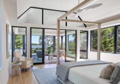
This handsome bedroom is decked out in a range of hues from white to dark khaki. It perfectly illustrates how soft and subtle color doesn't have to be dull or boring.
Here's another elegant bathroom. Because the palette is very restrained, the materials and their various textures stand out and shine.
Cool khaki paint picks. These soft, subtle hues pick up the warm, rich shades in a walnut wood floor nicely.
From left to right: Universal Khaki SW6150, from Sherwin-Williams; African Delta 159-4, from Mythic Paint; Pebble Stone 750D-4, from Behr; and Silver Fox 2108-50, from Benjamin Moore.
From left to right: Universal Khaki SW6150, from Sherwin-Williams; African Delta 159-4, from Mythic Paint; Pebble Stone 750D-4, from Behr; and Silver Fox 2108-50, from Benjamin Moore.
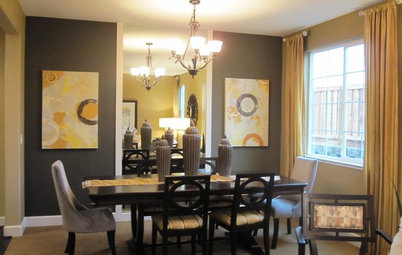
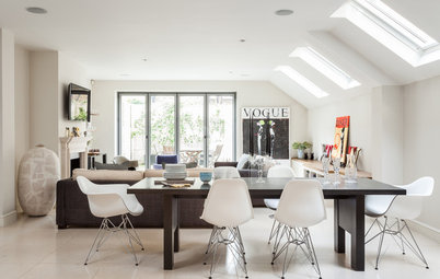
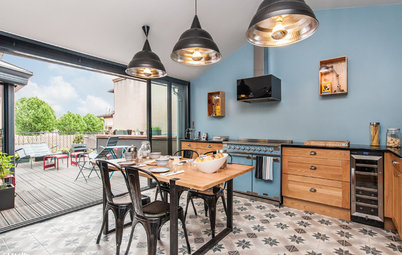
Various shades of taupe work well in an open-plan layout, as you can easily integrate a variety of spaces without resorting to one monolithic slab of color throughout.
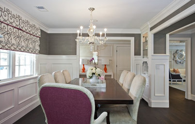
This bright white molding looks clean and crisp against the rich, dark wall color. The turquoise accent via the seating adds a nice dash of color in this elegant dining room.
Deep taupe paint picks. As neutrals, these colors work with any color floor, but if your particular space doesn't get much light, you might want to choose a light-colored flooring, such as maple.
From left to right: Bronzed Ivy GLN23, from Glidden; Urbane Bronze SW7048, from Sherwin-Williams; Fair Fieldstone KM3959-3, from Kelly-Moore; and Gargoyle 1546, from Benjamin Moore.
From left to right: Bronzed Ivy GLN23, from Glidden; Urbane Bronze SW7048, from Sherwin-Williams; Fair Fieldstone KM3959-3, from Kelly-Moore; and Gargoyle 1546, from Benjamin Moore.
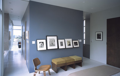
3. Gray-Violet
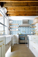
Purple becomes a neutral when it has plenty of gray added to tone it down. This kitchen clad in a grayish purple wall covering is simply stunning.
Purple becomes a neutral when it has plenty of gray added to tone it down. This kitchen clad in a grayish purple wall covering is simply stunning.
Another kitchen with an eye-catching backsplash. These purple cast-concrete tiles have some red in them, but they still read as neutral due to the gray undertones.
This elegant open loft features a relatively restrained color palette of whites, grays and purples. The small bits of purple warm up the predominantly white space, keeping it from feeling stark.
Steely purple paired with other cool neutral hues works exceptionally well with modern finish materials, as in this space.
Gray-Violet Paint Picks
These hues are elegant against an ebony-colored floor, such as Daltile's Timber Glen in Espresso.
From left to right: Mulberry Shadow 4003-4A, from Valspar; Purple Moon KM3085-2, from Kelly-Moore; Windswept Solitude 011-5, from Mythic Paint; and Violet Verbena 445-5, from Pittsburgh Paint.
These hues are elegant against an ebony-colored floor, such as Daltile's Timber Glen in Espresso.
From left to right: Mulberry Shadow 4003-4A, from Valspar; Purple Moon KM3085-2, from Kelly-Moore; Windswept Solitude 011-5, from Mythic Paint; and Violet Verbena 445-5, from Pittsburgh Paint.
If you opt for a darker version of the color, try painting a swath of wall and ceiling rather than the entire space. You'll get the drama without making the space look too dark and heavy.
When staining or painting cabinets, I like to pick a dark version of my chosen hue and then go with a much lighter shade of it on the walls and ceiling. You get contrasting colors that don't fight one another.
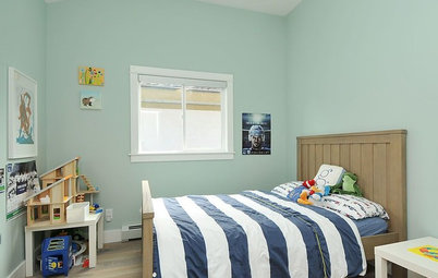
Bluish-green gray paint picks. Warm up these cool hues by pairing them with a light wood floor, such as beech.
From left to right: Confederate 27-21, from Pratt & Lambert; Water's Edge 1635, from Benjamin Moore; Sterling, from Serena & Lily; and Uncertain Gray SW6234, from Sherwin-Williams.
Tell us: What's your favorite go-to neutral hue?
From left to right: Confederate 27-21, from Pratt & Lambert; Water's Edge 1635, from Benjamin Moore; Sterling, from Serena & Lily; and Uncertain Gray SW6234, from Sherwin-Williams.
Tell us: What's your favorite go-to neutral hue?

1. A cool khaki that has a bit of green in it: Sea Haze 2137-50, from Benjamin Moore
2. An elegant deep taupe: Mink SW6004, from Sherwin-Williams
3. Pantone's pick, a light grayish purple: African Violet
4. A bluish-green gray: Twilight T13-6, from Behr