


4 Hot Color Trends to Consider for 2013
Bring some zing to your rooms for the new year, with high-energy shades that open the eyes and awaken the spirit

If your home is overdue for a makeover, consider injecting color as a way to freshen things up. Paint and colorful accessories are a quick and affordable way to spice up your home, and with the new year comes a new palette of exciting hues. That's not to say you should change your interior with each passing color trend, so pick hues you love and that you'll therefore want to keep around for a good long time. Here we round up some of the fun colors being touted for 2013, along with examples of how you can use them in your own space.
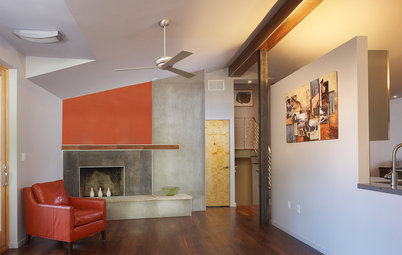
1. A Softer Orange
This orange is a bit tamer than superbold Tangerine Tango, Pantone's 2012 Color of the Year, but it still packs a nice punch. Use it for an accent wall in an otherwise light and neutral space.
This orange is a bit tamer than superbold Tangerine Tango, Pantone's 2012 Color of the Year, but it still packs a nice punch. Use it for an accent wall in an otherwise light and neutral space.
If you fall in love with a colorful material, such as this backsplash tile, try incorporating the color elsewhere in the room for balance.
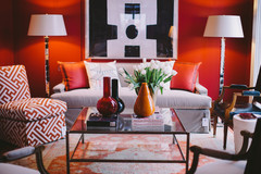
If you prefer keeping your walls light and white, you can still add color via furniture and accessories.
Intense orange walls can be a bit too bright for a bedroom, where you may want a more relaxed vibe, but smaller doses of the color via furniture and linens work well.
If you do opt to paint your bedroom walls orange, go with a softer, peachy hue — it's way more soothing than an electric orange.
Suggested Orange Paint Picks
If you like soft orange hues, here's a selection you can try in your own home. They would all pair well with warm white oak floors.
From left to right: Peachy Keen from Benjamin Moore, Sweet Melon from Valspar, Mesa Sunrise from Behr and Orient Blush from Pratt & Lambert.
If you like soft orange hues, here's a selection you can try in your own home. They would all pair well with warm white oak floors.
From left to right: Peachy Keen from Benjamin Moore, Sweet Melon from Valspar, Mesa Sunrise from Behr and Orient Blush from Pratt & Lambert.
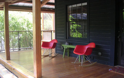
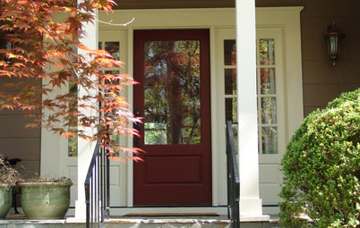
2. Poppy Red
Dramatic color will make dramatic architecture really stand out. This poppy red captures attention and contrasts nicely with the gorgeous view of the greenery beyond.
Dramatic color will make dramatic architecture really stand out. This poppy red captures attention and contrasts nicely with the gorgeous view of the greenery beyond.
This version has more pure red in it — a happy color that will be hot in 2013.
Don't neglect your outdoor spaces when it comes to color. This soft red-orange is gorgeous on this modern stucco home.
If you love this season's bright red orange but can't see it splashed all over your own walls, consider painting it onto an interesting piece of furniture.
Suggested Red Paint Picks
These reds look fantastic against a red oak floor, with its slightly pink cast.
From left to right: Strawberry Hills from Mythic Paint, Poppy from Benjamin Moore, Heartfelt from Sherwin-Williams and Salsa del Sol from Kelly-Moore.
These reds look fantastic against a red oak floor, with its slightly pink cast.
From left to right: Strawberry Hills from Mythic Paint, Poppy from Benjamin Moore, Heartfelt from Sherwin-Williams and Salsa del Sol from Kelly-Moore.
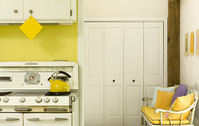
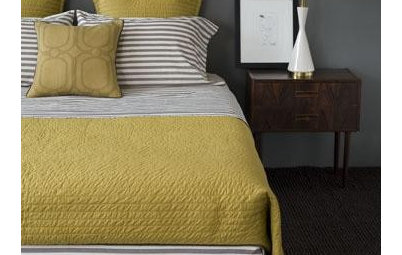
3. Lemon Yellow
Yellow tends to be a busy, high-energy color. It's best to use it in small doses or select a neutralized tone. This yellow has some cream in it and works well in this light and bright space.
Yellow tends to be a busy, high-energy color. It's best to use it in small doses or select a neutralized tone. This yellow has some cream in it and works well in this light and bright space.
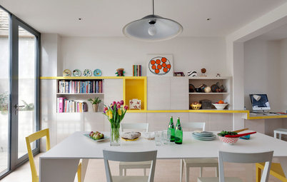
If you opt for zingier yellows, try sprinkling them in small bits around the room.
This yellow is darker and mellower, because it has some brown in it. Use it with dark gray and tan for a sophisticated palette.
Here's another toned-down deep yellow. If you want to use yellow in your bedroom, this is a good hue to work with. It's downright cozy here combined with all that gorgeous dark wood.
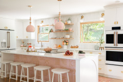
Here we have two of 2013's hot hues working together: lemon yellow in the bedding and raspberry on the chair. But because the bold hues are used sparingly and the walls and floor are kept neutral, they don't overwhelm.
Suggested Yellow Paint Picks
While not quite pastels, these yellows are soft enough to work as neutrals. They can look fantastic contrasted against a cool gray concrete or tile floor.
From left to right: Lemon Twist from Valspar, Lemon Sorbet from Benjamin Moore, Lemon Pound Cake from Behr and Lemon Leaf from Mythic Paint.
While not quite pastels, these yellows are soft enough to work as neutrals. They can look fantastic contrasted against a cool gray concrete or tile floor.
From left to right: Lemon Twist from Valspar, Lemon Sorbet from Benjamin Moore, Lemon Pound Cake from Behr and Lemon Leaf from Mythic Paint.
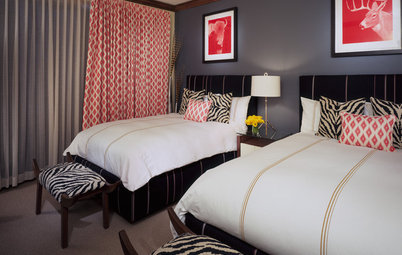
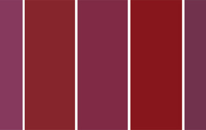
4. Bold Berry Pink
This room with deep raspberry walls is absolutely cozy, warm and elegant — the perfect space to retreat to on a wintery day.
This room with deep raspberry walls is absolutely cozy, warm and elegant — the perfect space to retreat to on a wintery day.
Pink bedrooms aren't just for little girls. These pinks are grown-up versions that can work in any space.
Suggested Pink Paint Picks
No saccharine-sweet pinks here. These pretty berry hues flatter your skin tone, stimulate your appetite and can be stress reducing. I like contrasting them with dark, cool-colored materials, such as a dark gray — almost black — porcelain tile.
From left to right: Raspberry Ice from Mythic Paint, Crushed Berries from Benjamin Moore, It's the Berries from Kelly-Moore and Feverish Pink from Sherwin-Williams.
Tell us: What are your favorite warm hues to decorate with?


Although Emerald was named Color of the Year, Pantone has forecast Lemon Zest, Poppy Red and Nectarine as hot colors for spring 2013. Peachy Keen and Lemon Sorbet are among Benjamin Moore's color picks for the year, and shown here is a selection of on-trend colors from Sherwin-Williams: June Day, Kumquat, Exuberant Pink and Gladiola.