Decorating Guides
Stripe It Rich With a Strié Finish
Let the striations of this traditional technique bring luxurious depth and richness to your walls, finishes and upholstery fabrics

With its streaky texture and barely there color variations, strié (a term from the French, pronounced stree-AY) is a perennially classic design technique. Although it originated as a way to evoke the look of thick, brushed-on paint tinged by years of wear, it has expanded to include silk and other fabrics, tile and wood finishes, wallpaper and more. It's become a favorite for its restrained yet rich visual appeal and its unfailing elegance.
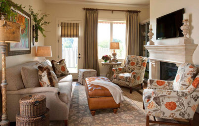
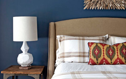
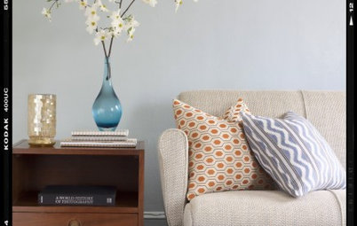
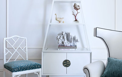
These spaces all showcase strié in its many forms.
These spaces all showcase strié in its many forms.
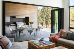
A strié wall treatment complements the undulating pattern in the artwork that graces this entryway. Between the two, the space needs no other embellishment to captivate guests.
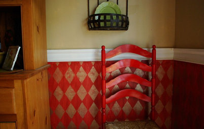
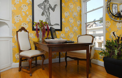
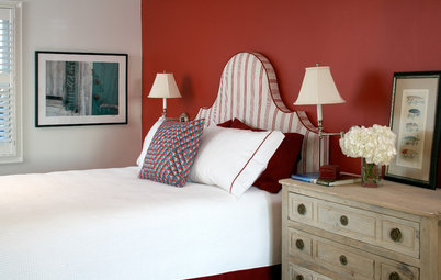
Although strié can create a timeworn effect on pale tones such as cream and gray, it also can go in the opposite direction on more upbeat hues. This hand-painted red wallpaper gets a hint of contemporary flourish with a tone-on-tone strié treatment.
Another way to get the strié look: Brush a sheer coat of paint or stain over wood. The unevenness of the color and the underlying grain combine for an appealing faded look, just right for a beach house, cottage or rustic cabin.
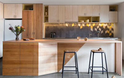
Strié doesn't have to be understated — a high-contrast version can yield a dramatic focal point, such as on this sleek kitchen island.
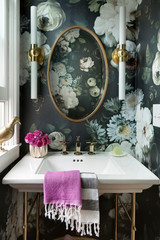
Tile with a strié look, somewhere between wood and stone in appearance, elevates this quietly neutral bath. The pattern gives the restrained palette a sense of energy and motion.
Strié can be a great way to tone down a hue that otherwise might be too bright for the room. A gray topcoat mutes this teal cabinet finish and provides a lovely weathered effect.
Blue strié velvet on a pair of fauteuils sustains the formality of this living space, which is awash in pattern and detail. A solid velvet would have looked too plain, especially coupled with the ornate pattern on the chair backs.
Here's a closer look at the velvet upholstery on the fauteuils. It's essentially two shades of blue, but the combed effect gives the impression of much greater color variation.
Are you a fan? Tell us why in the Comments!
Are you a fan? Tell us why in the Comments!