


Pantone Has Spoken: Rosy and Serene Are In for 2016
For the first time, the company chooses two hues as co-colors of the year
Jennifer Ott
December 3, 2015
San Francisco-based architectural color specialist and design writer. Jennifer's work has been featured in many print and online publications. Her recently-published book, "1000 Ideas for Color Schemes," is a beautifully illustrated and easy-to-navigate guide that takes the guesswork out of selecting the perfect color palette for your home or special event. For more information on Jennifer Ott Design, visit http://jenottdesign.com/.
San Francisco-based architectural color specialist and design writer. Jennifer's... More
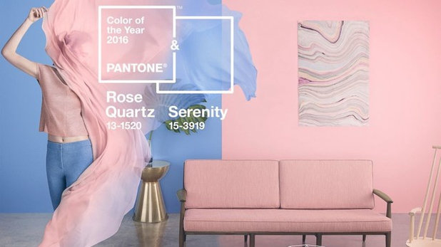
It’s another year and another controversial choice for color management company Pantone, which has released its picks for the top trending colors of 2016. It’s a pair of pastels that at first glance scream, “It’s a boy! And a girl!”
But the soft purplish-blue (Serenity) and nude-pink hues (Rose Quartz) represent a blending and blurring of gender lines, says Leatrice Eiseman, executive director of the Pantone Color Institute. “In many parts of the world we are experiencing a gender blur as it relates to fashion, which has in turn impacted color trends throughout all other areas of design,” Eiseman says. “This more unilateral approach to color is coinciding with societal movements toward gender equality and fluidity, the consumer’s increased comfort with using color as a form of expression, a generation that has less concern about being typecast or judged and an open exchange of digital information that has opened our eyes to different approaches to color usage.”
But the soft purplish-blue (Serenity) and nude-pink hues (Rose Quartz) represent a blending and blurring of gender lines, says Leatrice Eiseman, executive director of the Pantone Color Institute. “In many parts of the world we are experiencing a gender blur as it relates to fashion, which has in turn impacted color trends throughout all other areas of design,” Eiseman says. “This more unilateral approach to color is coinciding with societal movements toward gender equality and fluidity, the consumer’s increased comfort with using color as a form of expression, a generation that has less concern about being typecast or judged and an open exchange of digital information that has opened our eyes to different approaches to color usage.”
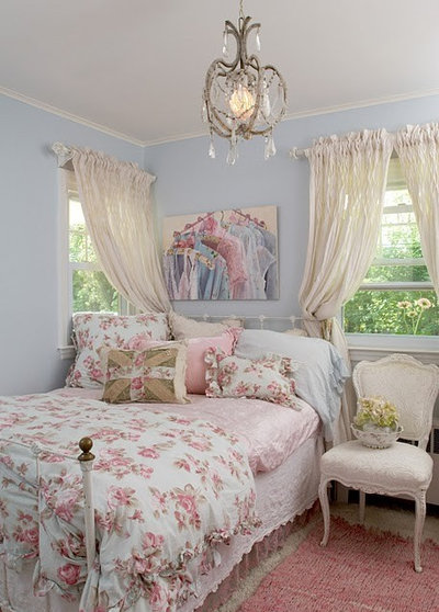
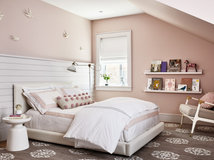
My first impression of this color combination was that it couldn’t possibly work beyond a children’s bedroom, but I was able to find some examples of one or both of the colors used in a more sophisticated setting.
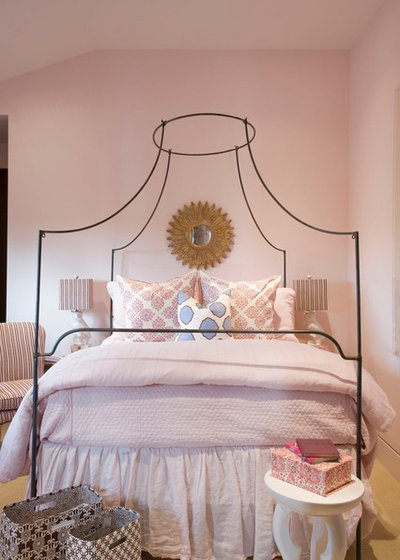
Rose Quartz has been described as a “nude pink,” meaning it’s less of a stereotypical “little girl pink” and more of a pale, toned-down blush of color. This softness gives it more flexibility in a home’s interior.
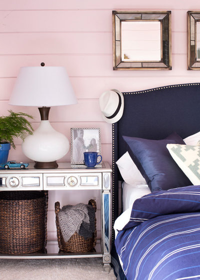
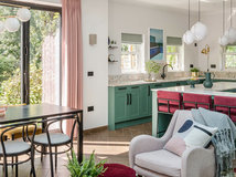
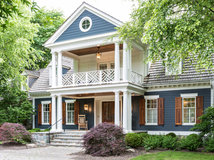
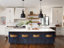
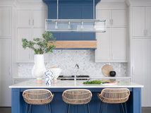
One way to add elegance and drama when working with a base of pastels is to bring in a deep, dark hue such as regal purple or a navy blue.
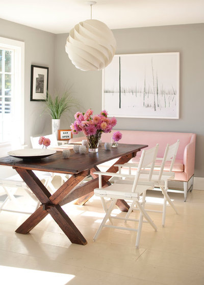
Or go for a modern vibe by bringing in shades of gray and cool whites. I like the contrast here between the clean lines and neutral hues with the fussier pinks.
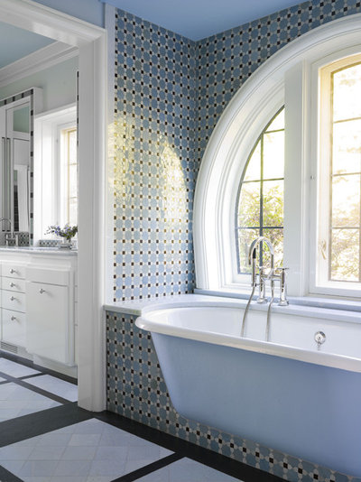
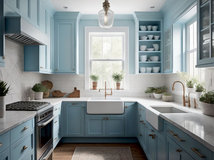
Serenity reminds me somewhat of a periwinkle blue — a soft blue with a hint of lavender. It lives up to its name as it imparts a soothing, serene feeling. I can see this hue working well in a bedroom or bathroom — spaces in which we want a calming ambience.
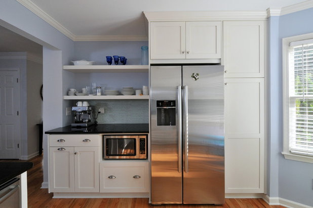
Blue is thought to be an appetite-suppressing color, making it a non-traditional color for a kitchen or dining room (unless you are on a diet, of course). But I like it for kitchens because it offers a cooling vibe in a space that can get overheated from cooking.
If you are digging this color combo but are leery about splashing it all over your walls or buying expensive furniture clad in either of the hues, think about bringing the colors into your home via artwork or decorative accessories. Try layering light and dark shades of the colors to make it more visually interesting.
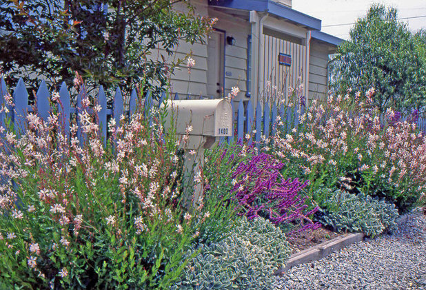
Of course you can always take these colors outside. When I showed this color combination to a friend she mentioned that it would make for a nice exterior palette for a home’s landscaping and accent colors.
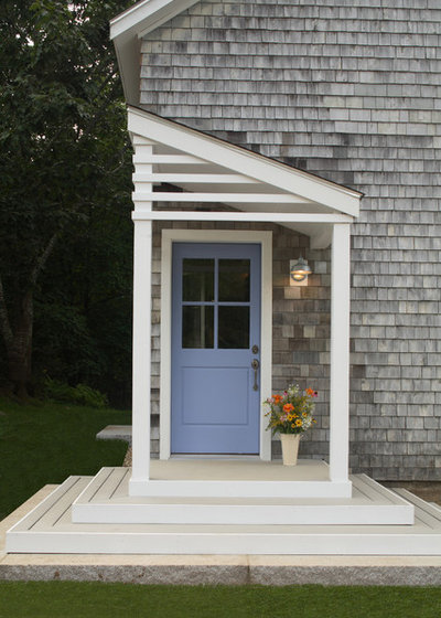
Personally, I prefer pastel hues in small doses, such as on the front door and paired with a more neutral color for the siding. This Serenity-esque door color is an unusual choice that looks fresh but also elegant.
Tell us: Love ‘em or hate ’em? What do you think of Pantone’s picks for color(s) of the year?
More: Color of the Year: Off-White Is On Trend for 2016
See more colors of years past
Tell us: Love ‘em or hate ’em? What do you think of Pantone’s picks for color(s) of the year?
More: Color of the Year: Off-White Is On Trend for 2016
See more colors of years past
We design, build and renovate in the most exquisite of fashions. Our team of revolutionaries is dedicated to... Read More
What are you working on?

Related Products

Dave Fox is a design/build remodeling firm with a customer focused process, an incredible staff and a close knit... Read More
Related Stories

Color
Pantone Picks a Peach for Its 2024 Color of the Year
By Jennifer Ott
See how to use this juicy hue to create calm yet flourishing spaces inside and outside the home
Full Story

Color
10 Paint Colors Ready to Take Over in 2024
By Jennifer Ott
Blue is huge, but dark hues and warm tones also find favor among major paint companies’ 2024 Color of the Year picks
Full Story
Color
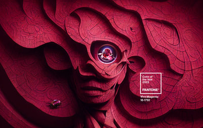
Pantone Chooses a Vibrant Magenta for 2023 Color of the Year
By Jennifer Ott
Viva Magenta is a bold, cool red hue meant to promote optimism and joy. See how to use it around your home
Full Story

Color
7 Paint Colors Set to Be Big in 2023
By Jennifer Ott
See the soft neutrals, warm pinks and deep blue-greens defining major paint companies’ 2023 Color of the Year choices
Full Story
Color
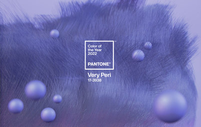
Pantone Picks a Periwinkle Blue for Its 2022 Color of the Year
By Jennifer Ott
Very Peri is an enchanting purple-blue hybrid chosen to represent courage and creativity. See how to use it in your home
Full Story
Most Popular
Green Is the Top Paint Color for 2022
By Jennifer Ott
Major paint companies reach a rare consensus, anointing various shades of green as their 2022 color of the year choices
Full Story
Landscape Design
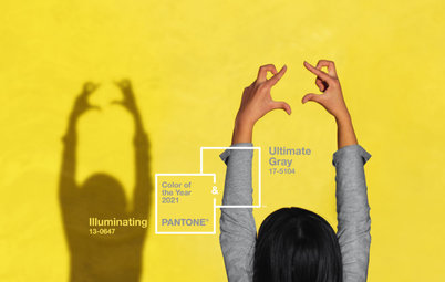
Pantone’s 2021 Color of the Year Looks Optimistic in Landscapes
See 9 ways to use Pantone’s pairing of Illuminating, a bright yellow, and Ultimate Gray in your outdoor space
Full Story
Color Palettes
Will These Soothing and Rich Paint Colors Define 2021?
By Jennifer Ott
Paint companies released their 2021 Color of the Year choices. See if soft teal, elegant brown or other shades suit you
Full Story

Houzz TV Live
An Editor and a Designer Discuss Pantone’s 2021 Color Pick
In this video, Mitchell Parker and Jennifer Ott show how you can use the bright and balanced color combo at home
Full Story
Color
Pantone Picks an Uplifting Combo for Its Color of the Year 2021
By Jennifer Ott
Hello, yellow! Good day, gray! See how to use the two colors predicted to be both hot and cool in the coming year
Full Story
I would highly recommend Ralph Lauren's 'Cameo Pink' or just 'Cameo', not sure which. I have it my bedroom and we both love it. I have a colorful oriental rug in my room and lots of other colors, so your right, it goes with everything. It is sexy, classy, romantic.
I just recently painted a bedroom using Benjamin Moore WhitewaterBay (OC70) (palest pink) and did the doors, trim trim work and one built in cabinet in Benjamin Moore Heaven 2118-70 (soft gray) and it looks stunning if I do say so myself.