


How to Do Neutrals With Attitude
Add a little edge to a neutral palette with pattern, texture, contrast — and a dash of color
Laura Wheat
December 28, 2015
Houzz UK Contributor. Freelance Journalist and interiors obsessive, newly ensconced in a handsome Edwardian semi on top of a hill.
Houzz UK Contributor. Freelance Journalist and interiors obsessive, newly ensconced... More
If your favorite paint hues are gray, “greige,” biscuit or polished pebble, chances are you’ve incorporated neutral tones into your home. We’re told that creating a palette using these neutral shades is terrifically easy — there’s less that could go wrong than when binging on brights. But play it too safe and your decor could end up going from beige to blah.
Or perhaps you’re not totally sold on the neutrals idea and long for a touch more contrast and a dash more color? Either way, read on for 10 tips to help rev up your neutrals while keeping things chic and serene.
Or perhaps you’re not totally sold on the neutrals idea and long for a touch more contrast and a dash more color? Either way, read on for 10 tips to help rev up your neutrals while keeping things chic and serene.
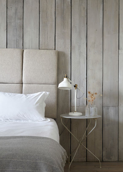
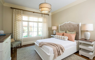
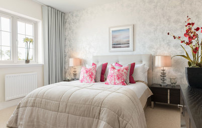
Triple the texture. The key to giving neutrals an edge is texture, texture and more texture. Soft, tonal colors blossom when combined in a way that creates visual interest: rough with smooth, matte with shiny. The contrast of wooden planks and a metal table and lamp with the soft bed makes this sleep space a winner.
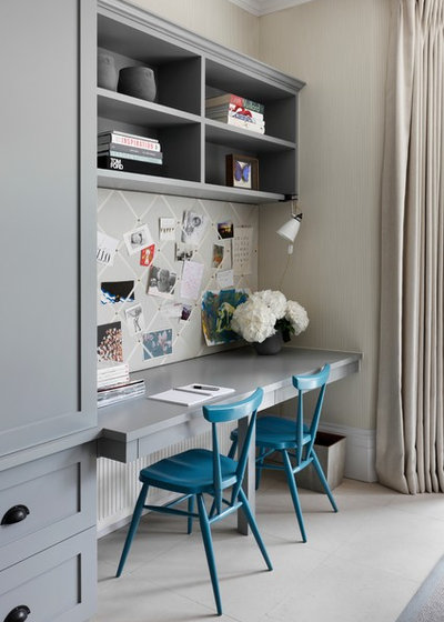
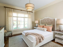
Become a color pro. There’s a lot going on in this neat study corner, but a soothing selection of neutral grays and beiges keeps things from becoming too busy. Cerulean blue chairs create a cool spot of color that energizes the office environment and perhaps even promotes creativity.
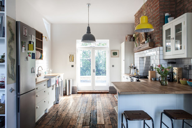
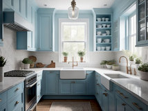
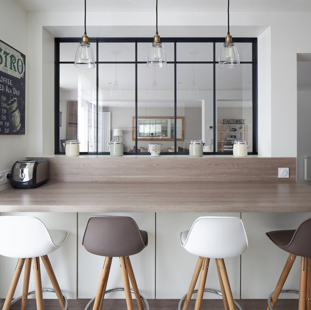
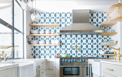
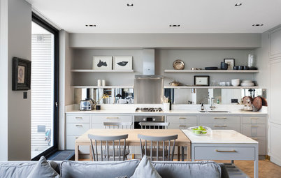
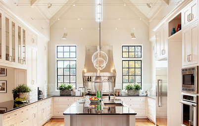
Avoid sterility. All-white spaces can appear rather clinical. One way to avoid this is to incorporate rough finishes, such as wood, concrete and brick, which all create the opposite effect. This kitchen has very little in the way of color but certainly packs a powerful design punch, thanks to these textured, industrial-inspired elements.
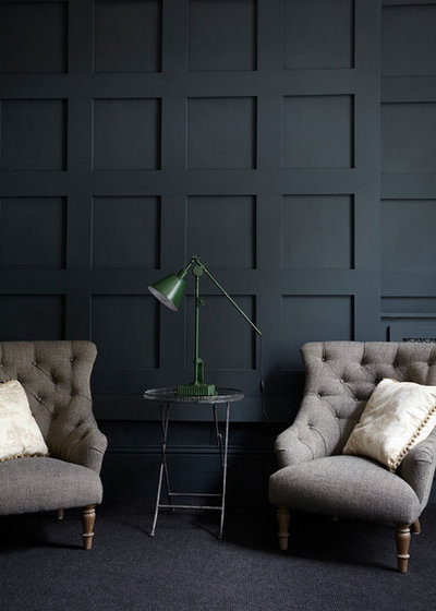
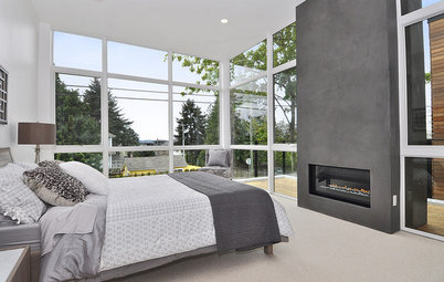
Look for light and shade. Neutral needn’t mean pale. Choose a highly saturated version of your favorite shade and use it to add dimension and depth, as with the stormy gray seen here, alongside lighter neutrals.
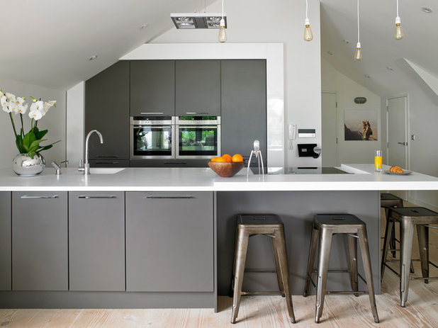
Go monochrome from floor to ceiling. Imbue your neutrals with extra impact by using one shade on both baseboards and walls. You can then use furniture and accessories to dial up the contrast as much or as little as you like.
Like dark walls? See 9 dark colors to suit your mood
Like dark walls? See 9 dark colors to suit your mood
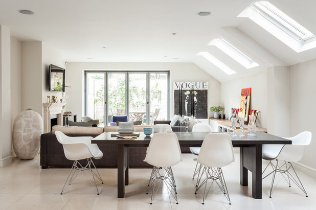
Learn about layering. For neutrals to work cohesively in a large, open-plan space, it’s a case of intertwining lots of similar colors, a few darker shades (in the same tone) and brights (sparingly). This low-key layering can be used for paint, furniture and accessories to create a soothing design that’s neither too loud nor boring.
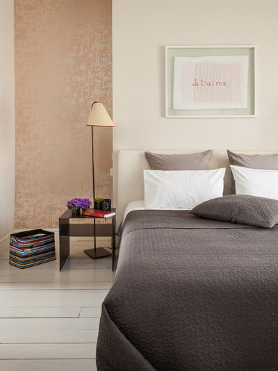
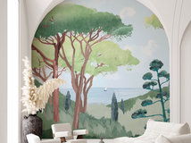
Step up the shine. Boost flat neutrals with a little metallic magic. Take your color cue from the existing decor, but choose metallic accessories in a complementary shade to introduce subtle sparkle. Alternatively, look to metallic wallpaper with a slight sheen and incorporate it on a feature wall, or in an alcove, as seen here.
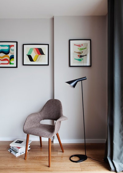
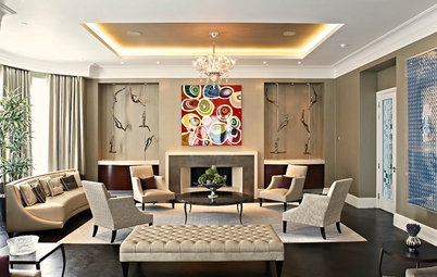
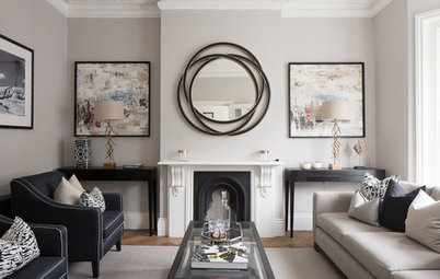
Get creative. It’s an obvious tip but one worth remembering: Well-chosen artwork has transformative powers. Set against a neutral gray backdrop, these abstract prints spring to life. The fact that the backgrounds of the images are a similar gray to the walls only enhances the effect.
Discover how art can jazz up the nursery
Discover how art can jazz up the nursery
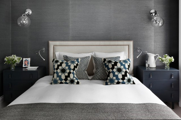
Pick out a pattern. There’s a lot to love in this super-stylish boudoir — from the textured silk wallpaper to the inky-blue bedside tables — but the geometric-print cushions are what steal the show.
Bold pattern can add instant attitude to a neutral room — but to keep the theme muted, choose a print that features one of the shades in the rest of your palette and gently builds on it.
Learn about the art of mixing patterns
Bold pattern can add instant attitude to a neutral room — but to keep the theme muted, choose a print that features one of the shades in the rest of your palette and gently builds on it.
Learn about the art of mixing patterns
Make mine a mocha. Indulge that coffee craving with a creamy palette of cappuccino shades. Brown may have fallen off the interior design radar in recent years, but it’s rapidly making a comeback, thanks to the popularity of everything nude and neutral. Pair it with white or cream for a tasty mocha swirl.
Tell us: How have you used neutrals in your home — and which look here is your favorite? Share your thoughts in the Comments.
More: Best Ways to Use the Neutral Green Color of 2015
Tell us: How have you used neutrals in your home — and which look here is your favorite? Share your thoughts in the Comments.
More: Best Ways to Use the Neutral Green Color of 2015
We design, build and renovate in the most exquisite of fashions. Our team of revolutionaries is dedicated to... Read More

Related Products

Related Stories
Kitchen Design
8 Ways to Jazz Up a Neutral Kitchen
By Neila Deen
See these creative ideas for giving a white, gray or otherwise neutral kitchen more personality
Full Story
Kitchen Design
10 Ways to Rev Up a Neutral Kitchen
By Laura Wheat
Texture, shine and paint tricks energize monochromatic cooking spaces
Full Story
Bedrooms
Creams and Champagnes Warm This Guest Room
By Becky Harris
The homeowners said, ‘No gray in this house,’ so in come golden-wheat, tan, beige and off-white shades
Full Story
Living Rooms
10 Design Ideas for a Neutral Living Room
Strike a balance between character and calm with these classy design ideas. How many are you already using?
Full Story
Most Popular
Rethinking Beige in a World Gone Gray
By Janet Dunn
Gray, the ‘it’ neutral of recent years, has left beige in the shade. But is it time to revisit this easy-on-the-eyes wall color?
Full Story
Color Palettes
How to Prevent Your Neutral Decor From Falling Flat
By Laura Wheat
Dodge the bullet of bland interiors with these tips for enhancing a neutral color scheme
Full Story
Color
How to Create Calm and Character With Light Colors
By Kelly Porter
Light paint and pale woods can feel rich and cozy too. Here are 7 design twists and colors to try
Full Story
Most Popular
What’s Your Neutral: Beige or Gray?
A designer shares 10 tips for using the neutral shade that works best for you
Full Story
Color
8 Great Color Palettes: Surprising Bedroom Neutrals
By Jennifer Ott
Peaceful plum, relaxing black and many shades of gray show an unpredictably neutral nature in the bedroom
Full Story
For adding TEXTURE and ATTITUDE, may I suggest art work such as
'Cancer' who is the zodiac personality who has Attitude! Text shows personality traits a Cancerian my exhibit. Try showing attitude with attitude. .. and a little humour.
"Cancer" as listed on Bluethumb at https://bluethumb.com.au/artworks/search/Lesley%20Taylor
On the same link at Bluethumb ... "There was a Young Lady who Lived in a Shoe" adds texture and pops of colour and was intended to have a dark, or neutral concrete wall as background. It is a large work 152.6cm (W) x 76.3cm (H)