


Houzz Tour: Smart Design Boosts Space in a Snug Apartment
Clever storage, luxe materials and a few design surprises bring big personality and style into a small space

With its airy feel, vintage furniture, smart storage and rich materials, this compact west London flat is a lesson in how to make a small space deliver on every front: aesthetics, practicality and even the wow factor.
The goal “was to make it feel bigger while also fitting everything in,” says Ebba Thott of Sigmar, who redesigned this apartment in a Victorian house. Working with a modest budget, Thott was careful about where she spent and saved, using inexpensive kitchen cabinets, for example, but adding a beautiful granite countertop and designer cabinet handles. She also wove in plenty of appealing texture, from wraparound tiling in the bathroom to high-gloss walls in the bedrooms. “Texture is so important in a small space,” she says, “because everything is close to you.”
The goal “was to make it feel bigger while also fitting everything in,” says Ebba Thott of Sigmar, who redesigned this apartment in a Victorian house. Working with a modest budget, Thott was careful about where she spent and saved, using inexpensive kitchen cabinets, for example, but adding a beautiful granite countertop and designer cabinet handles. She also wove in plenty of appealing texture, from wraparound tiling in the bathroom to high-gloss walls in the bedrooms. “Texture is so important in a small space,” she says, “because everything is close to you.”
The stairs leading from the entrance up to the flat turn at a small landing. “It has a massive window,” Thott says. She painted the window frame and staircase a dark gray. “The color emphasizes the size of the window,” she says. “Now when you look up from the entrance and see this little space with the chairs and the huge window, it has a certain wow factor, but also looks welcoming.” The little vintage wall-mounted desk was a clerk’s desk in the Houses of Parliament.
Chair: vintage Hoffman by Otto Wagner for Thonet
Chair: vintage Hoffman by Otto Wagner for Thonet
Well-designed storage was a priority to help the home function and feel ordered. “The only way to make a small flat look tidy is for everything to have a place,” Thott says. At the top of the stairs, she designed generous built-in cabinets that contain everything from golf clubs to coats to the vacuum cleaner.
“We played with the perception of depth here,” she says. The cabinets are just under 15 inches deep but look bigger. “You don’t need a [24-inch]-deep cabinet for efficient storage. You just have to be clever with the hanging systems you add.”
“We played with the perception of depth here,” she says. The cabinets are just under 15 inches deep but look bigger. “You don’t need a [24-inch]-deep cabinet for efficient storage. You just have to be clever with the hanging systems you add.”
The cabinet fronts are vintage lead window frames with a cloudy, thick glass. “I like to be able to see what’s stored. I like a home to look real and lived in,” Thott says. “If everything is really sleek and organized, it can feel a bit sterile. It’s nice to have discreet organized mess[es] behind those doors.”
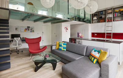
Clever storage built into an alcove discreetly houses the TV. “It’s also on an arm and can be pulled out,” Thott says. “This means you can watch it from anywhere in the space, which allows you freedom.”
A textural fabric wallcovering sits inside the painted wooden frames of the doors. “Everything should be touchable in a small flat, when it’s all so close,” Thott says. “There’s shape and texture here, which prevents the storage [from] looking too sleek and minimal.”
Panel wallcovering: Tweed 5453 in Edinburgh Grey, Phillip Jeffries
Inside, there’s lots of handy storage space. “We all have stuff,” Thott says. “Here, there is room for pens, files, folders, DVDs … stuff!”
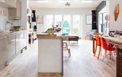
Thott chose a herringbone floor for the main living area. It’s engineered wood, which is less expensive than solid wood but has been carefully treated. “We bought the flooring untreated,” Thott says, “then added an active stain. Over two or three days, this gets darker and you can stop the process when you get the tone you want.”
This complex process produced a floor with a subtle variety in color, adding detail and interest underfoot. “It’s not an even color,” Thott says. “Each piece of wood varies slightly.” The floor was then sealed with a white diamond oil, which hardens the surface. “It’s to make it as hard as possible,” Thott says. “Engineered boards are not as hard-wearing as solid wood, but properly sealing them helps them sound and look good and become more durable.”
Her team purchased cabinets and then painted them and added horn handles. The granite countertop and backsplashes are other luxe touches. “It’s all about how much you can get away with spending or not spending,” Thott says. “If you buy a cheap kitchen and add a little bit of premium with good [countertops], for example, it’s still much cheaper than a [custom] kitchen but looks beautiful. You do need to add those nice touches in a small flat. A space like this needs a little bit extra.”
Thott went for thin granite countertops and matching backsplashes. “It’s a small kitchen, and it needed to look light, slim and sleek,” she says. The bronze range hood, custom-made for the extractor fan, is another luxe detail. “A splash of money like this is worth it for that feeling of a worked-through design,” Thott says.
Cabinets: B&Q; horn handles: Ochre; dining chairs: vintage Danish, Hovmand-Olsen
A vintage cabinet solved the issue of how to store the owner’s huge collection of glasses. “They need to be in a cupboard so they don’t get dusty, but we don’t have that many kitchen cupboards in here,” Thott says. “This vintage cabinet was the answer, and it adds a quirky element and personality.”
Open glass shelves alongside offer more practical storage, holding items the owner uses on a daily basis. “They tie in nicely with the cabinet, too,” Thott says.
Open glass shelves alongside offer more practical storage, holding items the owner uses on a daily basis. “They tie in nicely with the cabinet, too,” Thott says.
The flat originally had two bedrooms, but they were tiny. By slightly reconfiguring the space, Thott created a bedroom big enough for a king-size bed. “It was a controversial decision to go from a two-[bedroom] flat to a one-[bedroom],” she says.
The walls in the bedroom have been treated with nine coats of lacquer for a glossy, luxurious look. “The walls are extremely shiny,” Thott says. “You have to first banish all thoughts of Italian kitchens of the 1990s, and then just see how well this works. It bounces light off the floor and looks like water. It’s not easy or inexpensive to achieve this effect, but this is a really small room, and in a little space you can do this kind of thing. It adds the wow factor.”
Wall paint: Dove from the Damo paint collection, Sigmar
Wall paint: Dove from the Damo paint collection, Sigmar
A washing machine and drying cabinet have been incorporated into the walk-in closet. “It was just the best space for them,” Thott says. A luxurious carpet adds lots of texture at floor level.
Carpet: Montrachet woven jute in Azure Blue, Tim Page Carpets
Carpet: Montrachet woven jute in Azure Blue, Tim Page Carpets
Thott linked the bedroom to it by taking out a wall and installing French doors instead. Although the space is now a walk-in closet, “it could change its role … working as an office, a baby’s room or somewhere for guests,” Thott says. “That’s the way London living is going to go, I think. You may not be able to get the two-[bedroom] flat you want, so it’s about making space flexible and making it work for you.”
The doors are 18th-century vintage French designs. “They give this top-floor Victorian flat the feel of a loft,” Thott says.
Closet system: Tisettanta
The doors are 18th-century vintage French designs. “They give this top-floor Victorian flat the feel of a loft,” Thott says.
Closet system: Tisettanta
Despite its small size, the bathroom contains a shower and a bath. “We used the same small stone tiles in a brick shape on the floor and walls for a wraparound effect,” Thott says. “It’s a good way to make a space look refined.” There are cabinets behind all the mirrors. “There’s a ton of storage in here!” she says.
The plan shows how Thott has designed in plenty of storage so the small flat is open, airy and tidy. In the kitchen, Thott blocked off a window — it’s where the glassware cabinet now hangs. “It had a view of a wall that was less than [3 feet] away. It looked rather depressing and let no light in at all,” the designer says. “This allowed us to create a bigger, L-shaped kitchen.”
Browse more homes by style:
Apartments | Barn Homes | Colorful Homes | Contemporary Homes | Eclectic Homes | Farmhouses | Floating Homes | Guesthouses | Lofts | Midcentury Homes | Modern Homes | Ranch Homes | Small Homes | Townhouses | Traditional Homes | Transitional Homes | Vacation Homes
Browse more homes by style:
Apartments | Barn Homes | Colorful Homes | Contemporary Homes | Eclectic Homes | Farmhouses | Floating Homes | Guesthouses | Lofts | Midcentury Homes | Modern Homes | Ranch Homes | Small Homes | Townhouses | Traditional Homes | Transitional Homes | Vacation Homes


Who lives here: A single professional woman
Location: West London
Size: About 750 square feet (69.6 square meters); one bedroom, one bathroom
Designer: Ebba Thott of Sigmar
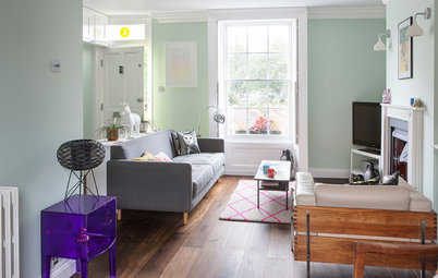
To increase the feeling of airiness in the flat, the team removed part of the ceiling over the living room and exposed the roof beams. “We painted the ceiling white to contrast against the gray walls,” Thott says. “It lifts the space in here.”
The living room is furnished with vintage pieces that suit its scale. “You should spend on things that fit the space and that you can take with you for your whole life,” Thott says. “So, nothing large and bulky.”
Wall paint: Sure Grey from the Damo paint collection, Sigmar; metal pendant light: vintage Henning Larsen; 1950s suede Swedish sofa and armchair and 1930s Italian floor lamp: Sigmar; lounge chair: vintage P40, Osvaldo Borsani; pillow: Holland & Sherry