


New This Week: 4 Kitchen Design Ideas You Might Not Have Thought Of
A table on wheels? Exterior siding on interior walls? Consider these unique ideas and more from projects recently uploaded to Houzz
Mitchell Parker
August 28, 2015
Houzz Editorial Staff. Home design journalist writing about cool spaces, innovative trends, breaking news, industry analysis and humor.
Houzz Editorial Staff. Home design journalist writing about cool spaces, innovative... More
There’s a reason granite countertops, white subway tile, Shaker cabinets and standard work triangles are so popular in modern kitchens: They work well and look great for many homeowners. But sometimes getting caught up in the typical can block you from thinking creatively about solving a personal design dilemma.
The following four projects — uploaded recently to Houzz by their respective designers — highlight unique design ideas that solved a personal need. Here, the designers dish on their plans of attack, “uh-oh” moments and more.
The following four projects — uploaded recently to Houzz by their respective designers — highlight unique design ideas that solved a personal need. Here, the designers dish on their plans of attack, “uh-oh” moments and more.
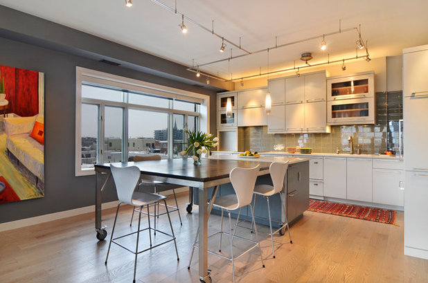
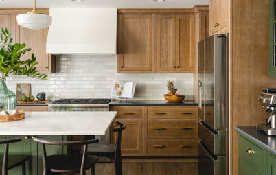
1. A Dining Table on Wheels
Designer: Beth Niemand of Niemand Interiors (also the homeowner)
Location: Old Town neighborhood of Chicago
Year built: In a condo building built in 2001
Size: 16 by 19 feet (4.8 by 5.7 meters)
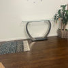
Homeowners’ request: “It’s inevitable during parties for people to gather in the kitchen around the island,” interior designer and homeowner Beth Niemand says. “I wanted to create a dining island that not only functioned as a place to hang out, but could seat at least eight people for a sit-down dinner. Looking through all the great photos on Houzz, I noticed an increasing number of islands that had tables connected to them, but I didn’t think a fixed table would work in the space. The lightbulb moment was realizing I could add wheels to the table.”
What wasn’t working: “This condo has an open floor plan, with the kitchen, dining and living spaces all in one large room. The original kitchen included a small island with a countertop overhang that allowed space for two small bar stools. Directly behind the stools was a traditional dining table that could seat six. The path between the bar stools and the dining chairs was too tight, and the space felt overcrowded and disjointed.”
Why the design works: “The room was too small for the dining room to feel like a separate, unique space, so combining the kitchen and dining table into one unified space made perfect sense from a visual perspective. As a result, everyone who visited after the remodel couldn’t believe how much bigger the space looked. The wheels on the table make it all possible. When the table is pushed against the island, it can seat six, and when rolled away from the island, it seats eight. The table is 67 inches by 67 inches [1.7 by 1.7 meters] and was constructed so the height is exactly the same height as the island.”
Plan of attack: “I started with the flooring selection, because we were remodeling two-thirds of the condo and the wood flooring goes throughout. I wanted a pale oak with grays, like pieces of driftwood. Grays and whites with gray undertones were the base of the design. The gray glass backsplash tile was the next choice, which led to the white countertop selection. This neutral color palette serves as a backdrop to a collection of colorful objects and art acquired on travels around the world.”
What goes on here: “Food prep, everyday dining and entertaining. The large table is wonderful for spreading out the Sunday paper and a great workspace for projects.”
Designer: Beth Niemand of Niemand Interiors (also the homeowner)
Location: Old Town neighborhood of Chicago
Year built: In a condo building built in 2001
Size: 16 by 19 feet (4.8 by 5.7 meters)
Homeowners’ request: “It’s inevitable during parties for people to gather in the kitchen around the island,” interior designer and homeowner Beth Niemand says. “I wanted to create a dining island that not only functioned as a place to hang out, but could seat at least eight people for a sit-down dinner. Looking through all the great photos on Houzz, I noticed an increasing number of islands that had tables connected to them, but I didn’t think a fixed table would work in the space. The lightbulb moment was realizing I could add wheels to the table.”
What wasn’t working: “This condo has an open floor plan, with the kitchen, dining and living spaces all in one large room. The original kitchen included a small island with a countertop overhang that allowed space for two small bar stools. Directly behind the stools was a traditional dining table that could seat six. The path between the bar stools and the dining chairs was too tight, and the space felt overcrowded and disjointed.”
Why the design works: “The room was too small for the dining room to feel like a separate, unique space, so combining the kitchen and dining table into one unified space made perfect sense from a visual perspective. As a result, everyone who visited after the remodel couldn’t believe how much bigger the space looked. The wheels on the table make it all possible. When the table is pushed against the island, it can seat six, and when rolled away from the island, it seats eight. The table is 67 inches by 67 inches [1.7 by 1.7 meters] and was constructed so the height is exactly the same height as the island.”
Plan of attack: “I started with the flooring selection, because we were remodeling two-thirds of the condo and the wood flooring goes throughout. I wanted a pale oak with grays, like pieces of driftwood. Grays and whites with gray undertones were the base of the design. The gray glass backsplash tile was the next choice, which led to the white countertop selection. This neutral color palette serves as a backdrop to a collection of colorful objects and art acquired on travels around the world.”
What goes on here: “Food prep, everyday dining and entertaining. The large table is wonderful for spreading out the Sunday paper and a great workspace for projects.”
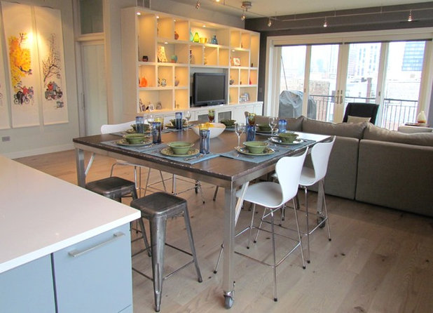
Designer secret: “An island that separates into two sections provides so much flexibility. Rolling the table away from the island keeps diners away from kitchen chaos. And eliminating the countertop overhang on the island makes it super functional during large parties. The entire island acts as a buffet area, and guests can circulate around all four sides without bumping into bar stools.”
“Uh-oh” moment: “All along I wanted to find a unique piece of reclaimed wood to use for the tabletop. As I found sources and received pricing, I realized I had two issues. First, the cost to find a piece or pieces of wood to shape into this large surface was much more expensive than I thought it would be. Second, I really wanted a wood color with gray undertones, and most reclaimed options were more red- and yellow-toned. I solved the problem by asking my cabinetmaker, Cabinets by Graber, to make the top for me. They worked with me to create a custom stain color and then distressed the wood to give it an industrial look that complements the stainless steel base, which was made by a local metal fabricator.”
Splurges and savings: “The Series 7 counter stools were a big splurge. I never imagined spending so much on stools, but I totally fell in love with them, and they’re so comfortable. The savings from not doing the reclaimed-wood tabletop helped me justify the stool decision.”
Take-away: “Sometimes we get into habits, like thinking an island must have an overhang for seating. Letting go of that idea opened up new creative possibilities, and the rolling table was the result. I duplicated the table idea for another client using a wood base and a quartz top, and it looks great as well.”
The nitty-gritty: Backsplash tile: Metro Glass in Dorian Gray, 4 by 8 inches and 1 inch by 8 inches, Ann Sacks; countertops: Yukon Blanco, Silestone; wall paint: Whale Gray 2134-40, Benjamin Moore; cabinets and tabletop: custom, Cabinets By Graber; perimeter cabinet paint: Intense White OC-51, Benjamin Moore; island cabinet paint: Whale Gray 2134-40, Benjamin Moore; counter stools: Fritz Hansen Series 7 in White Ash; stainless steel table base: Avenue Metal; runner: purchased on a trip to Marrakech, Morocco; Cue pendants: Tech Lighting; flooring: engineered red oak with Chateau stain, Mirage Floors
Budget: The custom rolling table was just under $4,000 — $2,000 for the wood top and $2,000 for the stainless steel base.
Team involved: Cabinets by Graber (cabinets and tabletop); Avenue Metal (metal fabrication)
See more of this kitchen
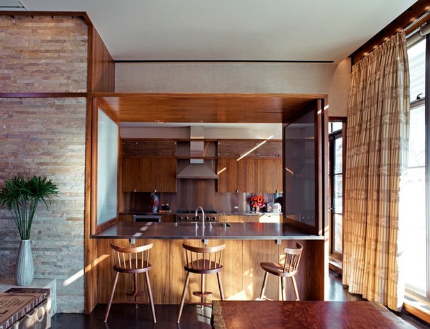
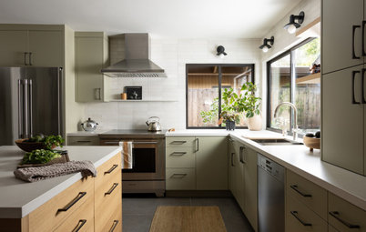
2. A Convertible Pass-Through
Designer: Edward Siegel of Cooper Robertson
Location: New York City
Year built: 2008
Size: A 250-square-foot (23.2-square-meter) kitchen in a 3,000-square-foot (278.7-square-meter) apartment
Homeowners’ request: “The owner requested a contemporary yet warm loft that would be used on a daily basis as a home office, for casual living and for frequent entertaining,” architect Edward Siegel says. “The pass-through counter bar allows the kitchen to be open to the living and dining room, and the operable glass and walnut grillage shutters can be closed for dinner parties.”
Plan of attack: “Designing a kitchen is all about making it work functionally first but then integrating that into the aesthetic concept. Opening the kitchen up to the rest of the apartment dictated that we use similar materials in the kitchen that we used elsewhere — walnut cabinetry and trim, and stainless steel countertops and equipment.”
Why the design works: “Our client had numerous programmatic requirements for the living and dining space: kitchen pass-through, fireplace, wet bar, coat and audiovisual equipment storage. We used simple walnut cabinetry and trim to integrate these requirements into the living and dining space, and this concept was continued into the kitchen design and throughout the rest of the loft.”
Who uses it: “The owners are a young married couple who have a casual lifestyle and entertain often. He owns an advertising company, and she’s an attorney. They run a charitable foundation, which contributes to numerous nonprofits, and are avid art collectors of emerging artists.”
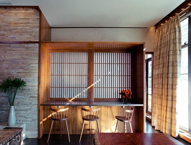
Designer secret: “In addition to the ceiling and undercabinet lighting, we turned the high upper cabinets into light boxes by facing them with a translucent resin and bamboo panels by 3form and backlighting them. Not only did we increase the storage with these cabinets, but the light-box effect wrapping the kitchen makes for a very unique environment.”
“Uh-oh” moment: “We didn’t have an ‘uh-oh’ moment, but to integrate custom wood stained trim and cabinet systems seamlessly into a large loft apartment requires a seasoned professional with skill and a keen eye for detail, and it is not inexpensive. Professional rigor must be continuously maintained throughout the project to successfully pull it off.”
Splurges and savings: “This project was not about one or the other. Our client wanted a beautiful loft but didn’t want it to be ridiculously expensive. There are cheaper materials than walnut stained cabinetry, but there are also much more expensive ones.”
The nitty-gritty: Cabinetry: custom walnut; countertops and backsplash: custom stainless steel; faucets: Tara, Dornbracht; stools: George Nakashima; range and range hood: Viking; undercabinet wine refrigerator: Sub-Zero; refrigerator: Northland; dishwasher: Bosch; resin and bamboo doors on high upper cabinets: 3form; flooring: white oak; walls: Venetian plaster; stone wall: quartzite
Team involved: Robert Silman Associates (structural engineers); Altieri Sebor Wieber (mechanical, electrical and plumbing engineers), de la Torre Design Studio (interior design); Cline Bettridge Bernstein (lighting), HiDef of Freehold (audiovisual); Peter Murdock (photographer)
See more of this home
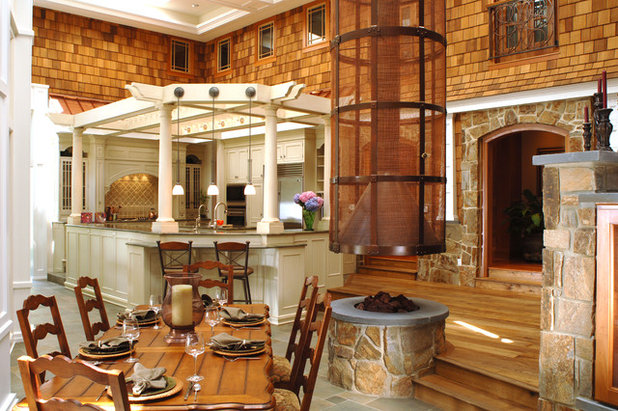
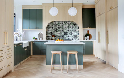
3. An Outdoors Kitchen — Inside
Designers: Martin Kimmel and Jim Bogrette of Kimmel Bogrette Architecture + Site
Location: Haddonfield, New Jersey
Year built: 2004
Size: About 1,000 square feet (92.9 square meters)
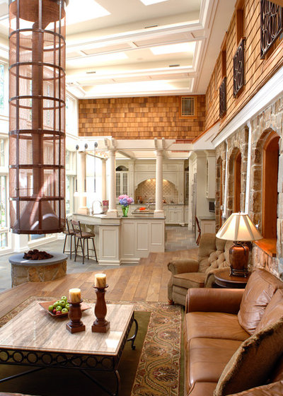
Homeowners’ request: “The homeowners wanted a house that fit in a fairly dense and developed area that felt as if it were connected to the outdoors like a rural lake house,” architect Jim Bogrette says. “The solution was to design an L-shaped house that provided potential for a private area on the inside, shielded from the exposure found on the corner lot. This space provided a perfect setting for an indoor ‘grand atrium,’ with the feel of an addition to the original house, hence the use of exterior materials in an indoor setting.
“The kitchen became an outdoor pergola, and the ‘campfire’ gathering area became our circular fireplace, all with 19-foot-high glass walls and high-quality millwork that connected it all.”
Plan of attack: “Once the outdoors-indoors concept was agreed upon, the idea to reinforce that image through generous use of natural materials — stone, cedar and wood — evolved organically and became intuitively right. The white columns and trellis demanded that the cabinets followed suit to create a singular experience.”
Why the design works: “Our approach worked because it allows the use of formal and traditional elements to create a space that is entirely informal, that responds to the informal and casual lifestyle that the homeowners and most clients prefer. This area of the home offers a very high indoor space, so we found a need to create intimacy, achieved by the careful placement of the kitchen pergola, fireplace gathering area and the two other areas used for dining, media and entertainment. Combined, the one large space is really four smaller unique spaces that blend together.”
Designers: Martin Kimmel and Jim Bogrette of Kimmel Bogrette Architecture + Site
Location: Haddonfield, New Jersey
Year built: 2004
Size: About 1,000 square feet (92.9 square meters)
Homeowners’ request: “The homeowners wanted a house that fit in a fairly dense and developed area that felt as if it were connected to the outdoors like a rural lake house,” architect Jim Bogrette says. “The solution was to design an L-shaped house that provided potential for a private area on the inside, shielded from the exposure found on the corner lot. This space provided a perfect setting for an indoor ‘grand atrium,’ with the feel of an addition to the original house, hence the use of exterior materials in an indoor setting.
“The kitchen became an outdoor pergola, and the ‘campfire’ gathering area became our circular fireplace, all with 19-foot-high glass walls and high-quality millwork that connected it all.”
Plan of attack: “Once the outdoors-indoors concept was agreed upon, the idea to reinforce that image through generous use of natural materials — stone, cedar and wood — evolved organically and became intuitively right. The white columns and trellis demanded that the cabinets followed suit to create a singular experience.”
Why the design works: “Our approach worked because it allows the use of formal and traditional elements to create a space that is entirely informal, that responds to the informal and casual lifestyle that the homeowners and most clients prefer. This area of the home offers a very high indoor space, so we found a need to create intimacy, achieved by the careful placement of the kitchen pergola, fireplace gathering area and the two other areas used for dining, media and entertainment. Combined, the one large space is really four smaller unique spaces that blend together.”
What wasn’t working: “The two homeowners had two dramatically different ideas of the setting and types of living spaces that they wanted. One wanted a remote natural setting, and the other a more populated and developed setting. The solution was to provide an interior space with a widely visible park-like view from the inside of the L-shaped home.”
Who uses it: “This space was designed for the gathering of the entire family of five. The intent was to be completely livable and serve all of the family’s needs, from the day-to-day to entertaining guests.”
Designer secret: “The power of glass and employing comfortable, warm and natural materials that are not trendy and will stand the test of time.”
“Uh-oh” moment: “At the onset of the project, it was clear that the two homeowners could not agree on the type and style of living space they wanted. By merging the outdoors with the indoors via this space, both desires were satisfied.”
Splurges and savings: “By combining the great room with the kitchen and fireplace gathering area, efficiencies were realized that allowed for features like the custom copper fireplace shroud and the reclaimed-wood floors.”
Team involved: John Shad Custom Builders; Joseph Barbato Associates (structural engineers); Charles Edward Interiors (interior decorator); Gerhard’s Appliances; Rudy Art Glass (specialty glass); Pella (windows); World Wide Stereo (audiovisual)
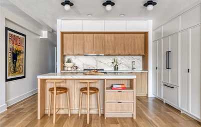
4. A Mix of Materials
Designer: John White of 510_Architects
Location: Richmond, Virginia
Year built: Early 1900s
Size: 450 square feet
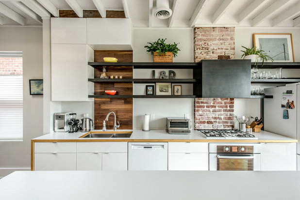
Homeowners’ request: “The property was a historic row house built in the early 1900s, and they wanted to accentuate the original building material — the bricks and old rough-cut joists — while giving the property a clean, open feel,” designer John White says.
Plan of attack: “We knew the overall palette — steel, wood, laminate; just not where and how much of each was going to be used. We figured this out through drawings [and] 3-D models, and some items were selected after the space started coming together. The cabinets are all from Ikea with custom surrounds and accents. The counters are plastic laminate with exposed plywood edges. The shelves and hood surround are custom steel. The wood pantry is shop-grade birch plywood with a clear finish. The sink backsplash is walnut.”
Why the design works: “We feel this space works because it is a good mix of stark, clean line elements mixed with warm materials and elements that make it feel like a house and not a museum.”
Designer: John White of 510_Architects
Location: Richmond, Virginia
Year built: Early 1900s
Size: 450 square feet
Homeowners’ request: “The property was a historic row house built in the early 1900s, and they wanted to accentuate the original building material — the bricks and old rough-cut joists — while giving the property a clean, open feel,” designer John White says.
Plan of attack: “We knew the overall palette — steel, wood, laminate; just not where and how much of each was going to be used. We figured this out through drawings [and] 3-D models, and some items were selected after the space started coming together. The cabinets are all from Ikea with custom surrounds and accents. The counters are plastic laminate with exposed plywood edges. The shelves and hood surround are custom steel. The wood pantry is shop-grade birch plywood with a clear finish. The sink backsplash is walnut.”
Why the design works: “We feel this space works because it is a good mix of stark, clean line elements mixed with warm materials and elements that make it feel like a house and not a museum.”
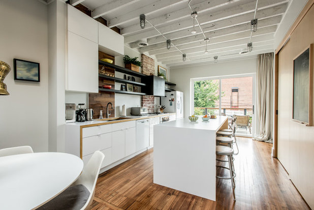
What wasn’t working: “Lack of light. We added an 8-foot-by-8-foot light element at the rear facade. There was also a large light monitor with two skylights added to the center of the space to bring daylight to the middle of the house. This is often a big challenge with row houses that only get light in the front and back. Without sufficient daylight, the project would not have the crisp glow that it achieved.”
Who uses it: “Family of three: husband, wife and daughter. They love music and Star Wars.”
“Uh-oh” moment: “The original floors had been covered with different surfaces and patches. The contractor painstakingly restored the floors to look almost new through multiple processes. The owners stayed calm and realized this would be a trial-and-error process, and the final product was worth it.”
Splurges and savings: “Most of the materials used are readily available, but they were just used and detailed in an atypical way. So in the end for the price of a low-midgrade renovation, they have a final product that looks like it was all custom and in a higher cost range.”
The nitty-gritty: Cabinets: Ikea; countertop: Wilsonart; appliances: Bosch; wood materials: Wurth Woodgroup; dining table: Knoll; steel shelves: custom
Team involved: Daniel Pavie Contracting (general contractor); Phil Bowne Photography
More: 4 Great Kitchens With Workhorse Islands


What are you working on?
Related Products

We design, build and renovate in the most exquisite of fashions. Our team of revolutionaries is dedicated to... Read More
Related Stories
New This Week
4 New Kitchens With Wonderful Wood Cabinets
Pros share how they used various wood species, styles, stains and details to create warm and welcoming kitchens
Full Story
Kitchen Backsplashes
30 Bold and Beautiful Range Backsplashes
Get ideas for eye-catching tile and stone backsplashes inside stove alcoves and behind cooktops
Full Story
Kitchen Design
7 Essential Features of a Well-Designed Kitchen
Make sure your new kitchen not only looks good but also functions beautifully
Full Story
Kitchen Workbook
How to Map Out Your Kitchen Remodel’s Scope of Work
Help prevent budget overruns by determining the extent of your project, and find pros to help you get the job done
Full Story
Kitchen Storage
Foolproof Storage Solutions for Corner Kitchen Cabinets
By tidgboutique
Consider Lazy Susans, pullouts and more to maximize storage
Full Story
Trending Now
The 10 Most Popular Kitchens So Far in 2024
Get inspired by the warm neutral palettes, ample storage and inviting islands in these most-saved new photos on Houzz
Full Story
Houzz TV
5 Trends for Kitchen and Bath Products in 2024
See fascinating new features for showers, tubs, faucets and more launched at the 2024 Kitchen and Bath Industry Show
Full Story
Kitchen Backsplashes
Where to Start and Stop Your Backsplash
By tidgboutique
Consider these designer tricks to work around cabinets, windows and other features for a finished look in your kitchen
Full Story
Kitchen Workbook
How to Find Your Kitchen Style
If you’re planning to remodel your kitchen, here’s how to find inspiration and start narrowing down your choices
Full Story
Kitchen Design
15 Stylish Kitchen Range Hood Ideas
Get ideas for hood shapes, sizes and looks that can elevate a kitchen’s design while ridding it of bad air and odors
Full Story
I think in my opinion, #3 is the most genius idea. Great article!
We built a timber frame home in the mountains of Western North Carolina 13 years ago. The kitchen in this home is completely open to the living space in the home, a 43 ft long room. I opted not to have a traditional island that had cabinets below in order to keep the kitchen feeling more open. We had an iron base made in Mexico, that took over 6 months to finally arrive but worth the weight, and put a slab of granite on it. The island is the center of our kitchen. Everyone congregates around it from the minute they walk into our home. I use it for preparing food, buffet for parties, and just about everything that revolves around the kitchen. We also had electric outlet installed at construction time so the island really does work out great. When we put in the new tile in the kitchen we had to move the island. It weighed in with the granite top at 1,000 pounds. We put furniture mover pads under the feet of the island and slid it into the adjoining room! Really surprised me how really easy it was to move. Wheels under an island are a great idea when you need to move it. I love the ideas that these kitchen present in these kitchens. Breaking the mold for standard kitchens we see over and over again. And while a kitchen must be functional it's nice to see new ideas that are actually functional and beautiful to look at as well
. I think Islands that are also useful like in these photos are here to stay. I always loved the idea of an island in a kitchen but many have cabinets built in making them impossible to sit at as a family or with group of friends. Open beneath works great in our kitchen. It can be used from all sides and ours seats 6 people comfortably and is the focal point of our kitchen