


Exterior Color of the Week: Rich, Fall-Friendly Reds
Look to the crimsons and burgundies of turning autumn leaves for a deep, captivating home color
Jennifer Ott
September 15, 2015
San Francisco-based architectural color specialist and design writer. Jennifer's work has been featured in many print and online publications. Her recently-published book, "1000 Ideas for Color Schemes," is a beautifully illustrated and easy-to-navigate guide that takes the guesswork out of selecting the perfect color palette for your home or special event. For more information on Jennifer Ott Design, visit http://jenottdesign.com/.
San Francisco-based architectural color specialist and design writer. Jennifer's... More
This week’s featured exterior color is inspired by the rich palette of fall, specifically the crimsons and burgundies found in leaves as they turn. These deep ruby-red hues also call to mind full-bodied red wines that we can dig out and enjoy once again now that the weather is finally turning cooler.
While not as loud as the previously featured bold orange colors, these reds still provide a healthy dose of drama on the exterior of a home, and they’re appropriate for a variety of architectural styles and geographical regions. Read on to see six stunning examples of rich red-hued homes, along with a sampling of paint color palettes to help coordinate siding and accent colors.
While not as loud as the previously featured bold orange colors, these reds still provide a healthy dose of drama on the exterior of a home, and they’re appropriate for a variety of architectural styles and geographical regions. Read on to see six stunning examples of rich red-hued homes, along with a sampling of paint color palettes to help coordinate siding and accent colors.
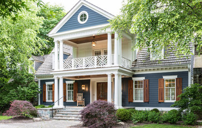
I wouldn’t care how frightful the weather outside was if I had this beautiful lake home to take shelter in. From the dark gray roof to the rich red and warm wood siding, the palette is elegant but with a nice rustic vibe. And despite the variety of materials used on the exterior, it doesn’t feel too busy, because the colors are all within the same warm, dark color family.
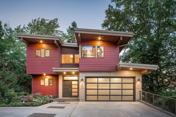
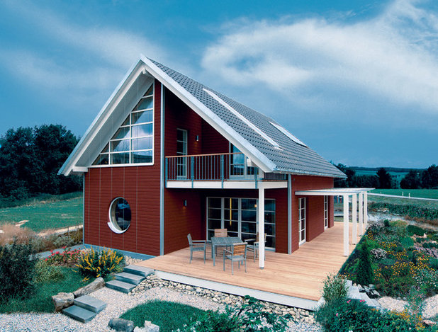
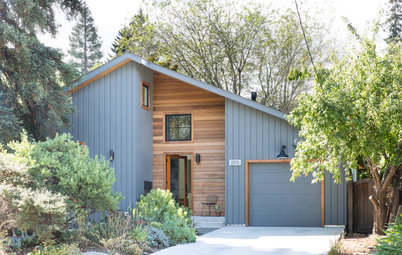
A gorgeous modern home deserves an equally fetching color scheme. As with the previous example, if you’re using two different siding materials, try using color to further differentiate them. It makes for a more interesting facade. Plus it allows you to use a smaller amount of a deep or dark hue that you might be hesitant to use top-to-bottom on the house.
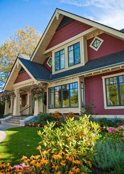
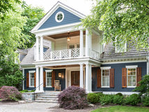
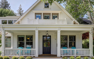
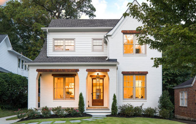
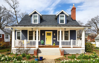
Our featured hue works well on just about any style of home. Whereas the previous example featured a modern house, you can see this more traditional home also looks great. The light gold trim is an excellent choice; a pure white trim would have been too jarring with the other colors in this palette.
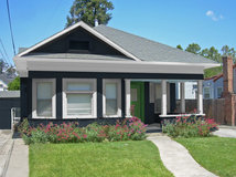
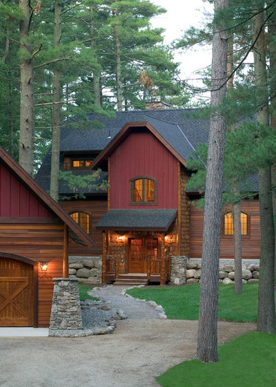
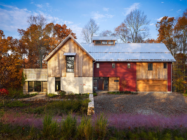
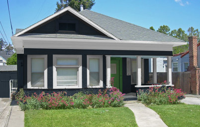
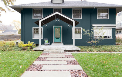
Having grown up in a rural Midwestern town, I fondly tend to associate red exteriors with the ubiquitous barns of my youth. And while the assertions vary widely as to why barns were traditionally painted red — from it being an economical paint color to wanting to mimic more expensive red brick to the dubious claim that red helps guide the cows home — we can likely all agree that red is a great choice for a modern take on a barn- or farmhouse-style home.
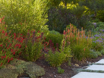
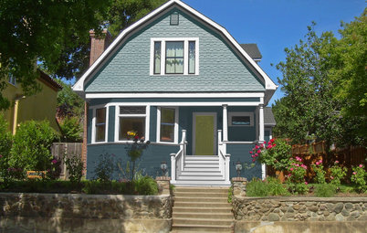
Red is not a wallflower kind of color, especially when used against a backdrop of greens. This is because red and green are opposite each other on the color wheel and therefore provide the most contrast to each other. If your house has an interesting form that you want to play up, paint it the complementary color of the surrounding landscape.
Learn more about complementary colors and the color wheel
Learn more about complementary colors and the color wheel
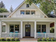
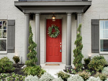
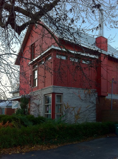
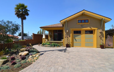
If you’re loving these rich red hues but are concerned about using them in large amounts on the exterior of your home, think about breaking them up. This is a look best pulled off on contemporary or rustic homes, but even a traditional home could add a red-hued gable or, at the very least, a ruby-red front door.
Try These Palettes
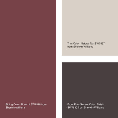
If you go with a deep, rich color for your siding, I’d recommend keeping the trim and accent colors very neutral, so as not to compete with the red.
Siding color: Borscht
Trim color: Natural Tan
Front door-accent color: Raisin
All from Sherwin-Williams
If you go with a deep, rich color for your siding, I’d recommend keeping the trim and accent colors very neutral, so as not to compete with the red.
Siding color: Borscht
Trim color: Natural Tan
Front door-accent color: Raisin
All from Sherwin-Williams
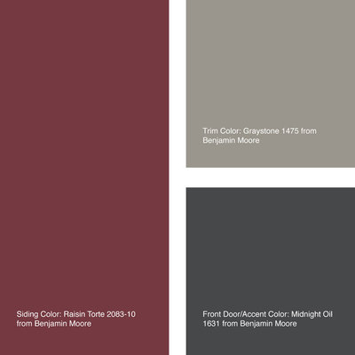
Siding color: Raisin Torte
Trim color: Graystone
Front door color: Midnight Oil
All from Benjamin Moore
See more exterior colors: Navy | Orange | Green | Gray
Trim color: Graystone
Front door color: Midnight Oil
All from Benjamin Moore
See more exterior colors: Navy | Orange | Green | Gray


As a full-service, family-owned remodeling company in New Albany, OH, we strive to bring our clients incredible... Read More
What are you working on?


Related Products

Related Stories
Exteriors
8 Beautiful Blue Paint Colors for Home Exteriors
Pros share the blue shades they used to complement the architecture of these remodeled and new-build homes
Full Story
Exteriors
8 Great Gray Paint Colors for Home Exteriors
Pros share the gray shades they used to complement the architecture of these remodeled and new-build homes
Full Story
Exteriors
10 Wonderful White Paint Colors for Home Exteriors
Pros share the white shades they used to complement the architecture of these remodeled and new-build homes
Full Story
Color Palettes
5 Exterior Palette Options for 1 Modest Bungalow
By Jennifer Ott
Bold and bright, or soft and subtle: See this home get a virtual color makeover
Full Story
Color Palettes
See How 5 Color Palettes Look on 1 Charming Exterior
By Jennifer Ott
We used photo-rendering software to visually transform this home to show the dramatic power of paint
Full Story
Exteriors
Should You Paint Your Brick House?
See if paint is a good option for your exterior, and learn about the steps professional painters take
Full Story
Color Palettes
Choosing Color: See This Home Try On 5 Exterior Paint Palettes
By Jennifer Ott
Dark and dramatic, or soft and neutral. See how paint color alone can change the look of a home
Full Story
Exteriors
View 1 Exterior With 4 Different Color Schemes
By Jennifer Ott
By playing with hues on the door, window sashes and exterior walls, you can dramatically change the look of your home
Full Story
Color
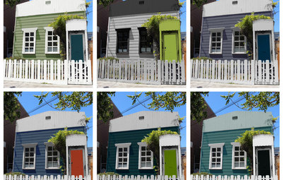
Choosing Color: 1 Cottage, 6 Striking New Color Schemes
By Jennifer Ott
See 6 color palettes for this sweet San Francisco home, vote for your favorite and then find out which one was chosen
Full Story
Exteriors
6 Awesome Home Exterior Transformations
Before-and-after photos show the power of paint, imagination and top-notch architects
Full Story
http://www.houzz.com/ideabooks/49885894/thumbs/our-crabby-apple-project
jalarse, I also have white vinyl windows and the Navajo trim that was on my red house when I bought it is too yellow, and more and more so with age. When I paint the exterior trim, my goal is to balance/blend with the vinyl windows without the trim looking too stark.
Looks like my color scheme is pretty similar. This is my most current photo but it all looks better this morning since I cleaned the porch yesterday. We have two porches the same side. I have one more row of boards to paint the brick color which is Sherwin Williams Super Deck. I love this stain. We can't use just regular paint on our house since the logs grow and shrink so regular paint cracks. My facia boards are peeling now after 4 seasons and the use of just a regular non-elastomoteric paint. My dilemma now is that we really need to do something with the underside of the porch roofs so I've been playing with color on SW's Colorizer app. We're going to stain the beams a darker shade but, since the tongue & groove is milled wood we already know that stain isn't going to stick. All of the milled wood has peeled in the 14 years since we built the home. I read about the sky blue on the underside of porches in New Orleans so am tempted to do the same but tried a pale green like the color I'm using on our vacation home up north and it looked rather interesting in the app.