


Room of the Day: Ranch House Refresh
An interior designer revamps a living room-family room
Mary Jo Bowling
August 10, 2015
Houzz Contributor; writer, reader, serial remodeler.
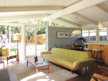
Florida interior designer Andrew Howard understands the good and bad points of a larger room. The positive is obvious — you have a lot of space. But there are negatives, too. Big rooms can be hard to furnish and make comfortable. The combined living room-dining room in this classic ranch house was spacious, but Howard says the 8-foot-high ceiling made the long room feel like a bowling alley. His goal was to define the areas and thereby make them livable. Once that was done, he came up with a genius idea for making the dated fireplace look fantastic, without even lifting a hammer.
Living-Dining Room at a Glance
Who lives here: A couple, 3 kids and 3 big dogs
Location: Ponte Vedra Beach, Florida
Size: 600 square feet (55.7 square meters)
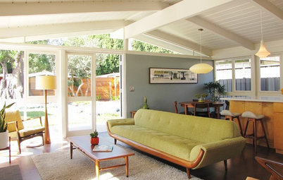
Howard started by defining the areas through seating and rugs, keeping the room from seeming overwhelming. To make the room feel (and look) better, he took out the flat ceiling. Now the ceiling line follows the roofline, going from 8 feet to 12 feet high. The ceiling also got a new look through tongue-and-groove paneling and beams. “If you have a larger room, it helps to have high ceilings,” Howard says. “The ceiling details add a lot of architectural interest in a room that really lacked that.”
The really bright idea is the fireplace treatment. Before, it was a flat surface composed of the weathered brick that was everyone’s favorite back in the late 1970s, when John Travolta was dancing across movie screens in Saturday Night Fever. For many people, taking it out would be a given. Howard had a different view.
“I understand the impulse to tear it out,” he says. “But I wanted to keep some of the character of the old house.” He notes that taking out the brick would have been hard on the bottom line and construction logistics.
Instead, he hired a decorative painter to paint the bricks. His inspiration was images of encaustic tile. “I didn’t want it to appear shiny and new, so I had the painter whitewash the pattern to weather it a bit,” he says. When asked about the difficulty of painting a pattern on brick, he says that “a lot of tape was involved.”
Who lives here: A couple, 3 kids and 3 big dogs
Location: Ponte Vedra Beach, Florida
Size: 600 square feet (55.7 square meters)
Howard started by defining the areas through seating and rugs, keeping the room from seeming overwhelming. To make the room feel (and look) better, he took out the flat ceiling. Now the ceiling line follows the roofline, going from 8 feet to 12 feet high. The ceiling also got a new look through tongue-and-groove paneling and beams. “If you have a larger room, it helps to have high ceilings,” Howard says. “The ceiling details add a lot of architectural interest in a room that really lacked that.”
The really bright idea is the fireplace treatment. Before, it was a flat surface composed of the weathered brick that was everyone’s favorite back in the late 1970s, when John Travolta was dancing across movie screens in Saturday Night Fever. For many people, taking it out would be a given. Howard had a different view.
“I understand the impulse to tear it out,” he says. “But I wanted to keep some of the character of the old house.” He notes that taking out the brick would have been hard on the bottom line and construction logistics.
Instead, he hired a decorative painter to paint the bricks. His inspiration was images of encaustic tile. “I didn’t want it to appear shiny and new, so I had the painter whitewash the pattern to weather it a bit,” he says. When asked about the difficulty of painting a pattern on brick, he says that “a lot of tape was involved.”
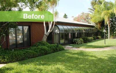
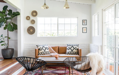
Before Photo
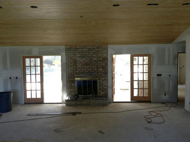
BEFORE: This in-process shot tells the fireplace story. “This is the focal point in the room,” Howard says. “We decided to make it an art piece.”
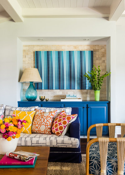
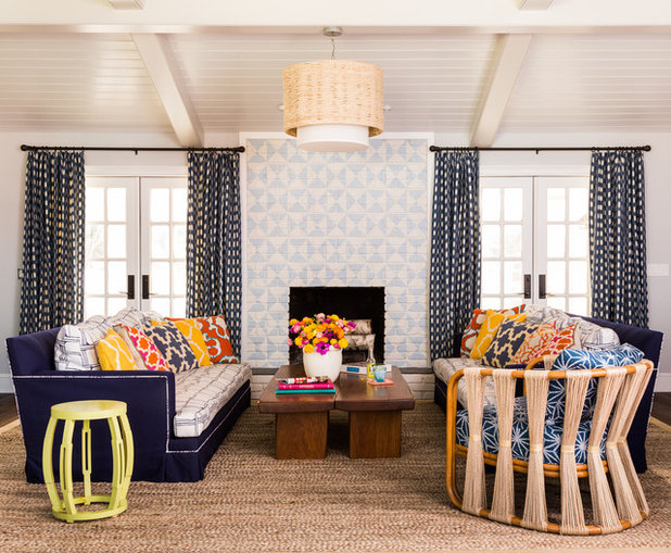
AFTER: Howard furnished the room with a pair of deep, oversized sofas that bookend the fireplace. He used two outdoor fabrics on the sofas, which illustrate his no-matching philosophy. “I like to vary the wood tones, colors and patterns in a room,” he says. “Besides, if I made the big sofas all navy blue, they would have looked like two big blocks sitting in the middle of the room.”
As for the vibrant pattern mix, Howard says he made it all work by varying the sizes and shapes for a rich, layered look.
The travertine tile-lined niche was an existing feature, and Howard considered it problematic. He made sense of it by turning it into a bar area, painting the cabinets blue and topping the tile with blue striped art.
The chair with the string back looks vintage, but it’s new. “I hate looking at the backs of upholstered pieces,” the designer says. “In this case, the back of the chair is as attractive as the front.”
Strings Attached lounge chair: Palecek
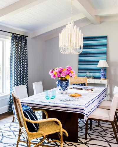
Despite his commitment to eclecticism, Howard says he feels that a room should have one curtain pattern. He tied the dining area and living area together with curtains that he describes as a gingham print mixed with an ikat pattern. “The checks are a little ‘fuzzy,’” he says.
The real goal of the room was ease and comfort. “This is a place where the whole family — kids, dogs, everybody — comes to lounge and relax,” Howard says. “Comfort and fun are key.”
See more Rooms of the Day
The real goal of the room was ease and comfort. “This is a place where the whole family — kids, dogs, everybody — comes to lounge and relax,” Howard says. “Comfort and fun are key.”
See more Rooms of the Day


What are you working on?

Related Products

Related Stories
Architecture
Ranch House Love: Inspiration From 13 Ranch Renovations
By Becky Harris
Kick-start a ranch remodel with tips based on lovingly renovated homes done up in all kinds of styles
Full Story
Architecture
10 Advantages of the Humble Ranch House
By Fred Albert
Boomer-friendly and not so big, the common ranch adapts to modern tastes for open plans, outdoor living and midcentury mojo
Full Story
Architecture
Personal Spaces: 10 Cool Updated Ranch Houses
Looking to bring your ranch-style home into the 21st century? Get inspired by what these homeowners have done
Full Story
Remodeling Guides
Follow a Ranch House Renovation From Start to Finish
Renovation Diary, Part 1: Join us on a home project in Florida for lessons for your own remodel — starting with finding the right house
Full Story
Houzz Tours
Houzz Tour: California Couple Expand Their Design Horizons
By Becky Harris
A designer helps these empty nesters transform a dated ranch house into a rustic-modern oasis
Full Story
Houzz Tours
New Layout and More Light for a Family’s 1940s Ranch House
By Becky Harris
A Los Angeles designer reconfigures a midcentury home and refreshes its decor
Full Story
Houzz Tours
A Riverside ‘Pod’ Home in Michigan Gets a New Look
By Erin Carlyle
A neutral palette plus pops of blue freshen up this unique home, while two hidden built-in beds add to its function
Full Story
Midcentury Homes
Houzz Tour: Atlanta Couple Update an Inherited Midcentury Home
By Becky Harris
A designer helps homeowners make Grandpa’s house their own with a vaulted ceiling, two-tone cabinets and more
Full Story
Houzz Tours
Houzz Tour: California Ranch Mixes Midcentury and Bohemian Styles
Modern furnishings blend with eclectic artwork and lush houseplants in this bright Los Angeles home
Full Story
Midcentury Homes
Houzz Tour: Midcentury Ranch Addition Blends In and Looks Outward
By Becky Harris
This New Jersey remodel respects the neighborhood, opens up the floor plan and nods to the homeowners’ heritage
Full Story
Thank you for saying something about the drapes and fireplace. It does look like wallpaper or like Grandma hung an old quilt up. I find it really hard to believe a family with 3 dogs and 3 kids lives there.
N247080...i Like them. And the cushions. Don't love the table side of the room and in photos (but I am sure not in real life) the flowers are a little overwhelming. It looks happy and welcoming, overall. That is kind of the point, right, that we take out what we like and let the owners live with a home they love?
Depending on how I move around my laptop screen, the room takes on different looks. Maybe that's what's happening when some look at the wall with the drapes. From a person who doesn't like seeing bricks painted, I have to admit that this looks nice and I don't see the clash with the drapes. Frankly, my eye is drawn to the sofas with their colorful pillows and the rest is just background. And why would people doubt that 3 kids and 3 dogs live there? Not everyone has a home that looks like a tornado hit it! This one looks comfy and inviting and, yes, one in which kids and dogs can reside.