


New This Week: 5 Farmhouse-Style Entryways We Want to Come Home To
Raw materials and a sense of calm make these farmhouse- and cottage-style foyers both practical and inviting
Mitchell Parker
July 24, 2015
Houzz Editorial Staff. Home design journalist writing about cool spaces, innovative trends, breaking news, industry analysis and humor.
Houzz Editorial Staff. Home design journalist writing about cool spaces, innovative... More
“We all must be farm animals in our past lives, because we all want to live in barns now,” says builder Matt Silva, who converted an 1800s barn in New Hampshire into a single-family home. While his animal theory leaves room for debate, he hits on a good point. Farmhouses and barns are so popular these days. But when most of our daily hours are consumed by incessant screen time, is it any wonder most of us prefer to come home to a calm, simple place a Luddite would be proud to call home?
With that in mind, we’ve pulled together five inviting farmhouse-style entryways and mudrooms — uploaded recently to Houzz by their respective designers and builders — and asked the professionals to share their plans of attack, “uh-oh” moments and more.
With that in mind, we’ve pulled together five inviting farmhouse-style entryways and mudrooms — uploaded recently to Houzz by their respective designers and builders — and asked the professionals to share their plans of attack, “uh-oh” moments and more.
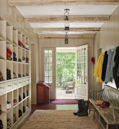
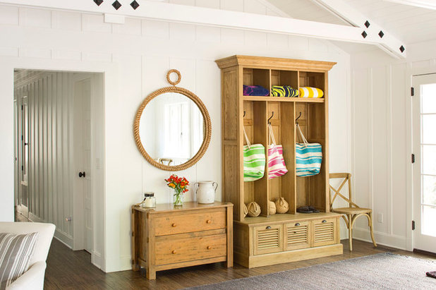
1. Storage for 6
Designers: Charles Haver and Stewart Skolnick of Haver & Skolnick Architects
Location: Litchfield County, Connecticut
Size: 225 square feet (20.9 square meters)
Year built: 2009
Homeowners’ request: “An informal country mudroom that would neatly accommodate the many boots, coats and hats of a very large and active family of six,” architect Charles Haver says.
Plan of attack: “Providing enough storage was key. We first inventoried the many shoes, sweatshirts etc. that were overflowing from their old mudroom.”
Why the design works: “We designed the custom cubbies to neatly organize the shoes and sweatshirts. Drawers were also provided for gloves and keys. Outlets were provided for phone recharging. Rows of Shaker pegs were added for coats and hats. After move-in, the homeowners requested additional storage for tennis racquets, baseball bats, balls and mitts. We found antique coffee bins to hold these items, and [they] provided a contrast to the built-ins.”
What goes on here: “The space serves as the main family entrance for the house and storage for all their outerwear.”
Who uses it: “The home is a country weekend retreat for a family of six.”
Designer secret: “The space is in an addition to an 18th-century farmhouse, so we wanted it to have an antique character. We introduced antique ceiling beams, lanterns, and used rough plaster for the ceiling.”
“Uh-oh” moment: “The budget would not allow for the stone floor which was originally planned. Instead, we introduced wide-board oak floors that have an antique character.”
Splurges and savings: “We offset the cost of the built-in cubbies by using an antique bench rather than a more expensive custom built-in.”
Take-away: “You can never have too much storage.”
The nitty-gritty: Paint: Brandon Beige 977, Benjamin Moore; ceiling: unpainted plaster, Imperial; floor: wide-board common-grade oak; rug: Dash & Albert; antique lanterns, bench, coffee bin: Charles Haver Antiques
Team involved: Churchill Builders (general contractor); DeStefano & Chamberlain (structural engineer)
See the rest of this house
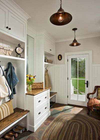
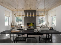
2. Multiple Zones
Designers: Brett Balzer of Balzer + Tuck Architecture and Jim Sasko of Teakwood Builders Inc.
Location: Saratoga Springs, New York
Size: 12 feet, 6 inches by 8 feet, 4 inches (3.8 by 2.5 meters)
Year built: 2011
Homeowners’ request: “They wanted an open-floor-plan vernacular farmhouse with timber features for a family home with ability to entertain,” architect Brett Balzer says.
Plan of attack: “Planning of the space was critical. Several sketches went back and forth. The mirror and drawers sit directly across from the garage entry-exit. This divided the space into two zones: kids and adults. Natural light, view and connectivity to the outdoors were critical to all spaces in the house, and the mudroom was no exception.
“The full-light French door answered the request for all of these criteria. The three-quarter-height painted wood wainscot takes the daily wear and tear better than painted gypsum wallboard, while keeping the space looking fresh and clean. Directly behind the photographer of this shot is the powder room, located in close proximity to the garage and outdoors while still hidden from the main living space.”
Why the design works: “Slate flooring offered both warmth and function for the family mudroom entrance, which is just off the garage. As [the home is for] a family of four in a farm setting in the Northeast, space was required for boots, coats and attire for all seasons. Upper cabinets hide the winter items in the warmer months. As stated above, the two zones — adults and kids — offer scale and function.”
What wasn’t working: “The initial plans had a window in lieu of the exterior door. The mudroom ‘deck’ and door were added, and now provide a daily path for the couple’s two girls to head to the rear yard.”
What goes on here: This space is “the proverbial catch-all for outdoor attire and a comfortable transition space from garage to living areas.”
Who uses it: “A family of four, including two working parents and two young girls, ages 8 and 5. The owner and his company, Teakwood Builders, built this home for his family.”
Designer secret: “The mix of woods, both painted and natural. The combination added warmth, with the natural wood benches hiding the dirt and scratches that would be more prominent if this surface were painted.”
“Uh-oh” moment: “Trying to connect the garage, a utilitarian space, to the main living areas where wood built-ins and details are woven throughout the design posed the challenging question of, what should the mudroom be? The answer was both. Going from hardwood flooring in the living area to slate flooring in the mudroom hides the inevitable dirt and scratches. Lighting was key throughout the home, and simple pendant fixtures in the mudroom added a bit of detail to help tie this room to the main living areas.”
Splurges and savings: “Bringing the overall square footage of the house down from the initial designs allowed for more millwork and detailing throughout the home. Quality of space over quantity of space was the theme of our design meetings. The mudroom was no exception, but all too often is.”
Take-away: “This house is continually referred to by [the] architect and builder as [having] a modern farmhouse aesthetic, now a term we use when describing to prospective clients the ability to offer a traditional-style home with cleaner lines and modern amenities.”
The nitty-gritty: Cabinets: Signature Cabinetry; lighting: Hinkley Lighting; hardware: Top Knobs Hardware; locksets: Emtek; doors: Pella Doors
See more of this home
3. Small and Simple
Designer: Jacque James of James & Co. Interiors
Location: Gallatin Valley, Montana
Size: 15 by 10 feet (4.5 by 3 meters)
Year built: 2013
Homeowners’ request: “This home is located on beautiful grasslands in Montana at the foot of a gorgeous mountain range,” designer Jacque James says. “The homeowners wanted small and simplistic, a true homestead feel without all the bulk of typical mountain designs. They really wanted function for the entry — muddy boots, wet dogs and lots of coats. I wanted some decor, so we fused the two and had a simple reclaimed and iron bench made by local artisans, and I found huge iron hooks for the wall.”
Plan of attack: “The entry originally wasn’t very interesting. There wasn’t anything to define the space. I used reclaimed beams to frame the space and fabulous reclaimed wide-plank black walnut for the walls. I wanted a statement piece, and the custom pendant did the trick.”
What goes on here: “It is a main entry of a small farmhouse. It opens directly into the great room and kitchen area.”
Designer secret: “The great light fixture really completed it. I went big with the scale of the fixture and worked hard on the custom glass for ambient effect.”
“Uh-oh” moment: “This house originally had a different type of material specified for the outside walls. I felt that it was not going to do justice to the home, so I went to the reclaimed-log yard with the homeowner, and we found spectacular old wood that really made the house sing. Once it was on, we couldn’t believe that anything else had been considered.”
Splurges and savings: “We saved some by deleting decorative beams in secondary spaces. It gave us the budget for the custom lighting throughout the house.”
Take-away: “Patience. And you may lose your whole construction team to a walleye fishing tournament on occasion.”
The nitty-gritty: “Everything was custom designed by me and built by local artisans.”
See more of this house
4. Casual Cottage
Designer: Kenneth Robert Vais of KennethRobertVais Atelier
Location: Carmel-by-the-Sea, California
Size: The entry is one corner of a great room, which is 27 by 22 feet (8.2 by 6.7 meters)
Year built: 1930s; remodeled in 2014
Homeowners’ request: “Casual seaside vacation cottage with superbly detailed and voluminous retro board and batten interior,” architect Kenneth Robert Vais says. “Also, an updated traditional board and batten exterior with particular design emphasis and detailing on deck and railings, atop a casual, unstructured seashore garden design.”
Plan of attack: “It was a remodel of a 1930s beach cottage that had received some unfortunate remodeling choices in the past. Our goals were to restore the original casual and intimate nature of the house, to improve and modernize the common-area floor plan substantially, and perfect the board and batten construction by focusing on each and every detail.
“The basic layout was not particularly challenging. The board and batten detailing, and really all interior or exterior carpentry, was particularly important, as poorly done board and batten construction creates visual ‘collisions’ and asymmetries that in sum create a cluttered and disharmonious look.
“The great room and entryway ceiling were vaulted, which created the opportunity for trusses. The chosen design was in some ways a tribute to architect Julia Morgan’s work at Asilomar state park and beach, which is nearby. To achieve the desired luminosity, a uniform white interior color was chosen, and a vanilla off-white for the exterior. Dark mullions and door frames were chosen to reduce visual clutter around openings in the walls and to contribute a certain crispness to the exterior elevations. Furniture selection and layout were largely determined prior to final electric work, so light placement could be optimized.”
Who uses it: “The home is used by a family with children ages 15 to 24. It is used by the family to reconnect in a relaxed environment apart from the busy routine, and also by the children or parents to entertain friends and family on weekend getaways.”
Designer secret: “Relentless attention to detail of all carpentry created a space which is highly detailed but ordered and serene.”
The nitty-gritty: Large cabinet: Shutter three-bin entry locker, Restoration Hardware; mirror: garage sale; small cabinet: garage sale
Team involved: Carmel Building and Design; AJS Builders
See the rest of this house
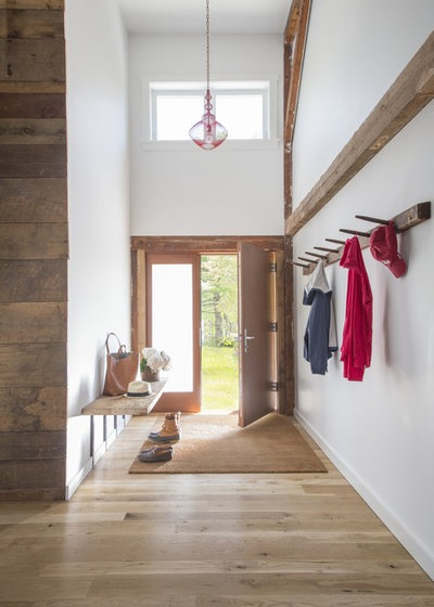
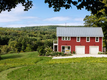
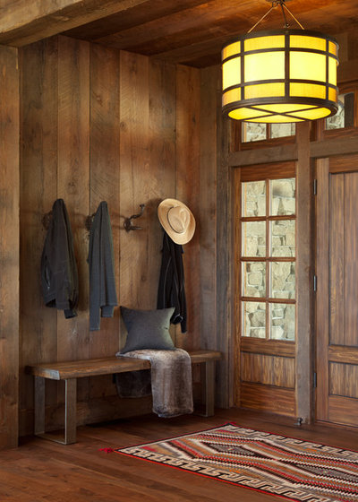
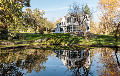
5. Bright and Bold Barn
Builder: Matt Silva of Futuro
Location: Seacoast, New Hampshire
Size: 8 by 11 feet (2.4 by 3.3 meters)
Year built: Early 1800s
Homeowners’ request: “The homeowners wanted to make sure that any new items that were added to the home had clean, straight lines to meet the contrast of reclaiming the old barn and making it a single-family residence,” builder Matt Silva says. “Throughout the house is a modern blend in every room, including a full soundproof music studio.”
Plan of attack: “The beginning discussions of the project were all directed towards what could be salvaged and repurposed in the barn, and what needed to be new. Special attention and time was dedicated prior to the project beginning to bring in experts from windows to flooring to work with what could be reused.
“We determined that the beam would be left in place with very little reconditioning, the existing barn board floors would be refinished and the character kept while working to match new flooring to it. Windows would be kept in place that provided the character and reminder of the home, and old barn boards found in the attic would be used for accent walls and furniture around the home, including the entryway.”
Why the design works: “Anytime we rescue a property that has such character, you like to have a way to walk through the house and tell a story. The pleasure of this is that some of the areas that might show a modern inconvenience were kept in place to make the home stay unique.”
What wasn’t working: “The homeowner really wanted to stay focused on sealing up the barn to become as energy-efficient as possible and then work on creating a new exterior with the money saved on energy use.”
Who uses it: “The homeowners are both in their late 40s. One is a landscape architect. The other is a data analyst. They are involved in the music and the arts with their family and have two children both college age.”
Designer secret: “We made sure to keep it simple and keep it small. The barn is so large and expansive the moment that you enter it, unlike most homes you see. We didn’t need to spend much time creating a cubby-filled mudroom to accomplish something functional that can’t be beat.”
“Uh-oh” moment: “You mean besides converting a 200-year-old barn into a home that beats the Energy Star standard for efficiency? Well, let’s just say that it takes a lot more closed-cell spray foam than you will ever imagine. On top of that comes how to create a home that has the ability to remain insulated and still has room to expand into the vast amount of still-unused space above the current second-floor living area.”
Take-away: “We all must be farm animals in our past lives, because we all want to live in barns now. All kidding aside, it was about how to keep that balance between modern and historical, and we found that not getting too ornate makes a big difference.”
The nitty-gritty: Many of the items were reclaimed, and all the materials were locally sourced.
Team involved: ZeroEnergy Design (architect of record); Little Harbor Window Co. (door)
See the rest of this house
New This Week features designs from projects most recently uploaded to Houzz. Have a great project? Here’s how to share your photos on Houzz.
Watch: Life, Love and Purpose Down on the Farm


We design, build and renovate in the most exquisite of fashions. Our team of revolutionaries is dedicated to... Read More
Related Products

We believe that the transition of a house into a home is a sense of history and a piece of the future. It tells... Read More
Related Stories

Houzz TV Favorites
Houzz TV: Life, Love and Purpose Down on the Farm
A Missouri native proves that you can go home again — and discover something entirely unexpected
Full Story
Houzz Tours
Houzz Tour: Side-by-Side Cottages Make a Charming Family Home
In Ojai, California, individual structures are transformed into a home with separate bunk and living spaces
Full Story
Barn Homes
Everything You Should Know About Barn Homes
View 35 barndominiums, barn conversions and barn-style homes across the U.S. and get the details on this enduring style
Full Story
Modern Homes
Houzz Tour: ‘Modern Ag’ House in California Wine Country
By Becky Harris
An architect gleans inspiration from local agricultural buildings in this light-filled home and future retreat
Full Story
Houzz Tours
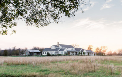
Houzz Tour: New Texas Country House With Timeless Touches
This antiques-filled home by a designer found on Houzz and others has love of family, fun and barbecue built right in
Full Story
Houzz Tours
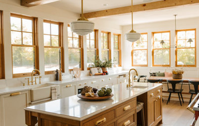
Houzz Tour: Warm, Woodsy and Welcoming Family Home
By Becky Harris
A kitchen designed for gatherings is the centerpiece of this new Minnesota house with European farmhouse vibes
Full Story
Houzz Tours
Houzz Tour: Industrial Modern Farmhouse Rises From the Ashes
By Becky Harris
A couple rebuild after a wildfire claims the Napa, California, home where they host family gatherings
Full Story
Houzz Tours
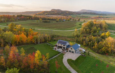
In Vermont, a Zero-Energy Modern Farmhouse-Style Home
By Becky Harris
Local agriarian buildings inspire a mix of styles in a home that produces as much energy as it uses
Full Story
Houzz Tours
Houzz Tour: A Rebuild Makes This Farmhouse’s Age Hard to Guess
By Becky Harris
After a devastating fire, a new design recaptures an 18th-century Massachusetts home’s charm and patina
Full Story
Vacation Homes
Houzz Tour: Rustic and Eclectic Styles Mix Down on the Range
A ranch house and a pair of guest cabins deep in Texas Hill Country evoke the Wild West with a modern twist
Full Story
Myriam Duke, your mudroom sounds wonderful. Do you have a photo you could share?
Any ideas for those of us with one-butt entries?
So how about the obvious...who couldn't get "practical" in a 14 x 14 ft space for an entry space.