


Color Guide: How to Work With Gold
It's OK to be a gold digger — this timeless color adds a rich glow to walls, furnishings and home decor that anyone would covet
Samantha Schoech
November 14, 2012
Houzz Contributor. I am a former magazine editor specializing in travel and design. I just completed my first remodel, turning my crumbling 1941 kitchen into a beauty of grays, whites and natural wood. If I could, I'd sleep on the countertop. That's how much I love it.
You can also read my parenting blog on Baby Center http://blogs.babycenter.com/author/sschoech/
Houzz Contributor. I am a former magazine editor specializing in travel and design.... More
All that glitters may not be gold. Oh, but when it is, it sure is pretty. Humans have had a thing for gold for millennia. Cleopatra wore it. So did the Greeks, a thousand years before her. The Aztecs, Mayas and Incas were also fans. San Francisco would still be a cow town if it weren't for gold.
It has always been a symbol of luxury, wealth and success. Gold cards, gold medals, gold standard — all of it meant to convey the best of the best. But in design it can be tricky. Done well, gold can add mellow shimmering warmth. It's timeless and elegant. Done badly, well, you've seen Liberace's house, right?
The trick is to choose the right tone — gold varies from bright yellow to a soft burnished hue that is much darker — the right place and the right combination.
It looks great with so many colors, but plum and turquoise are favorites. In Asian-influenced design red, black and gold often go together. In modern design it is often paired with bright white.
In the following photos, the use of gold varies a lot, but they all have something in common: the warm glow of gold that speaks to our ancient DNA. We are just wired to like it.
Gold on the Walls
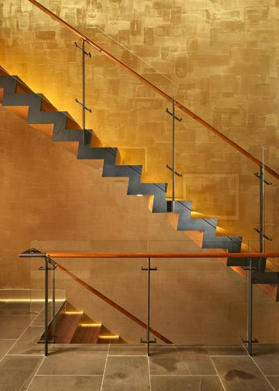
This gleaming stairwell looks like it’s been covered in gold leaf, but it’s really Venetian plaster lit with a very bright LED light. The effect is dramatic, but the lines and other materials keep it simple and elegant.
This gleaming stairwell looks like it’s been covered in gold leaf, but it’s really Venetian plaster lit with a very bright LED light. The effect is dramatic, but the lines and other materials keep it simple and elegant.
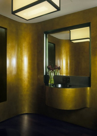
This much greener, darker gold tone was created with a bronze-tone plaster. It’s been burnished to a high shine and almost looks like lacquer.
A gold mother-of-pearl wall by Maya Romanoff. This looks like a place King Tut would have liked to hang out in. Stunning. See product info in the listings below.
McIntosh Poris Associates
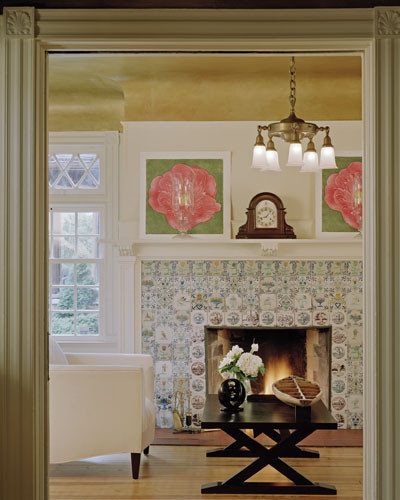
This gold ceiling keeps the all-white room from looking too cold and reflects a lovely warm glow back into the space.
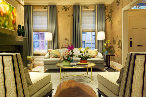
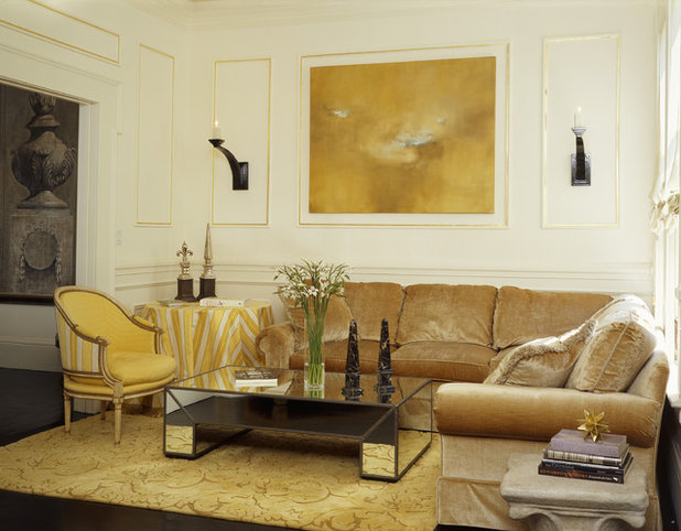
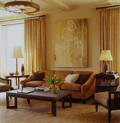
The flat gold color on these walls is enhanced by touches of metallic gold in the coffee table, chairs and drapes. It all comes off as very regal.
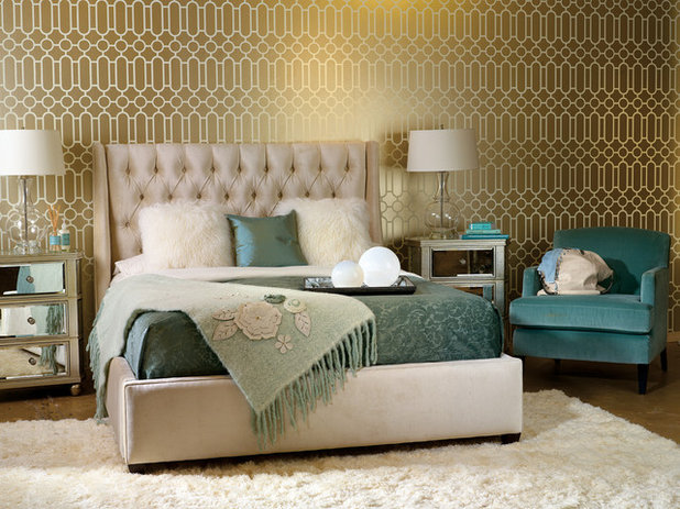
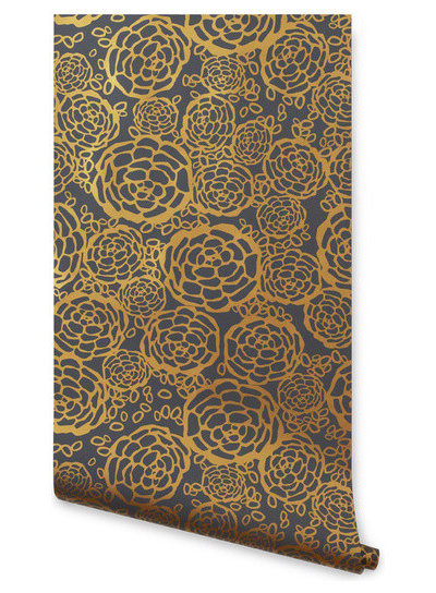
A gold wallpaper in a small, modern pattern. It’s pure Hollywood glamour, but it doesn’t tip into Vegas style because the tone is muted and it’s the only gold in the room. Note the gold and teal — always a lovely combo.
Refresh your walls with some new wallpaper
Refresh your walls with some new wallpaper
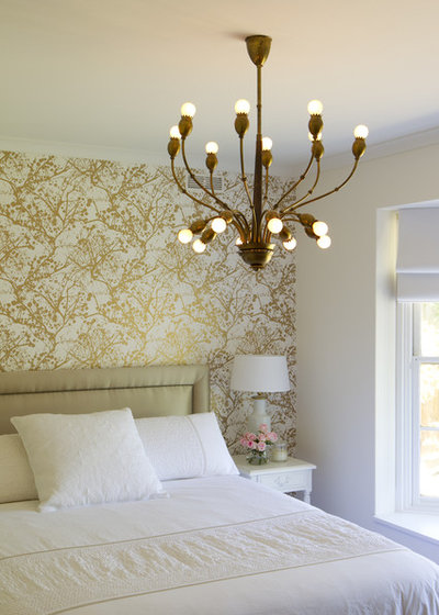
Another modern gold wallpaper. With almost everything else in the room kept simple and white, the design looks fresh and open, with just the right amount of shine.
Gold and White
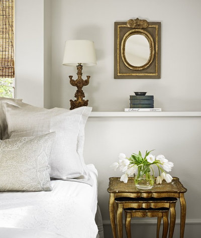
Is there anything more elegant than white and gold together? It has a simple luxury and perfect balance that works in every style. It works in this traditional room.
Is there anything more elegant than white and gold together? It has a simple luxury and perfect balance that works in every style. It works in this traditional room.
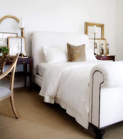
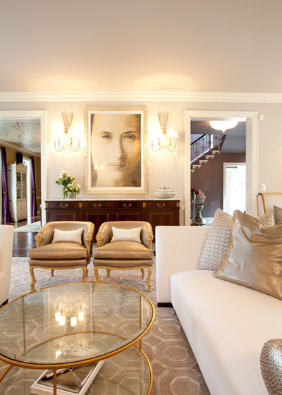
It works in this contemporary room. The small gold accents add warmth and richness to all that white.
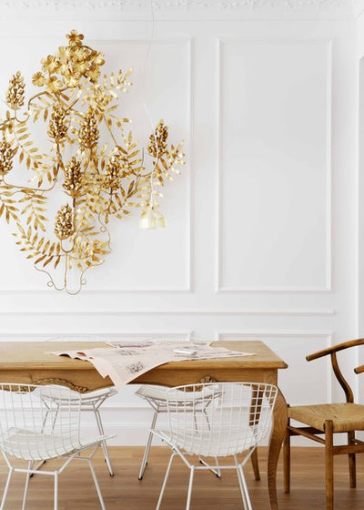
Modern rooms too. This ornate midcentury wall hanging might look awful over your grandparents’ brick fireplace and avocado-green carpet, but it adds glow and humor to a very simple space. It’s nice to see a room not taking itself too seriously.
Browse thousands of wall art designs for your space
Browse thousands of wall art designs for your space
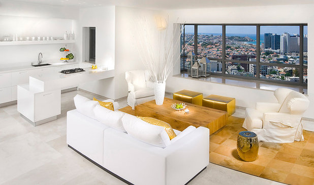
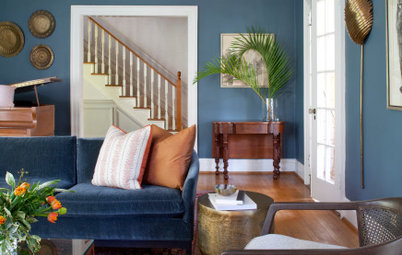
The two small gold benches add a touch of Miami glamour to this already supersleek room.
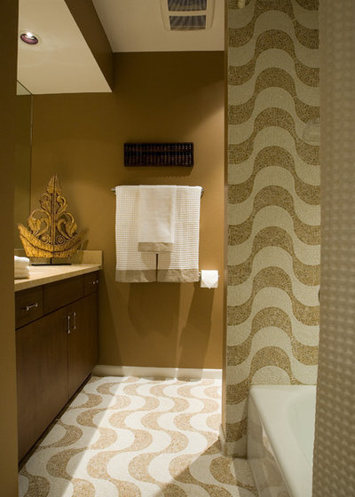
Gold in the Bathroom
These undulating tiles have a dark, mellow glow about them. It's understated luxury that is glamorous but still masculine.
These undulating tiles have a dark, mellow glow about them. It's understated luxury that is glamorous but still masculine.
Chronicle Books
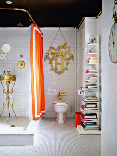
Gold fixtures are normally pure Graceland territory, but in this otherwise simple, modern bathroom they look lovely, irreverent and elegant. I love everything about this bathroom.
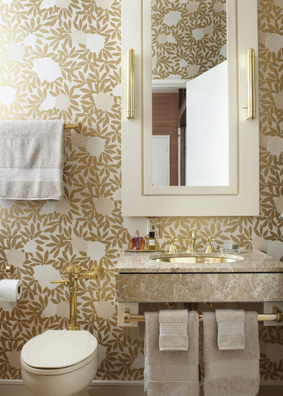
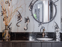
A small space is a great place for going bold with wallpaper. A large pattern in gold gives this bathroom warmth, texture and zing.
Decorating With Gold
Metallic golds mix well with flat gold tones. This room has a little of both. A creamy white makes a nice, warm backdrop and keeps the room bright.
Metallic golds mix well with flat gold tones. This room has a little of both. A creamy white makes a nice, warm backdrop and keeps the room bright.
More mixing of metallic and flat golds. It gives a room a very rich, Brahmin feel. There's nothing quite as sumptuous as gold velvet.

More gold velvet, this time in a modern setting. And check out how good it all looks with turquoise.
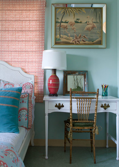
This gold screen with a soft glow is such a simple way to give this pastel room some oomph.
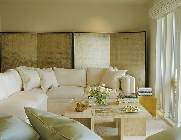
A few soft metallic accessories and fabrics make this room opulent and plush. Without them it would be just another cream-colored living room.
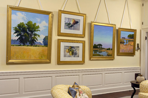
Gold leaf frames and plein air paintings are a classic combination, and they go in any type of room — from formal and traditional to modern and eclectic.
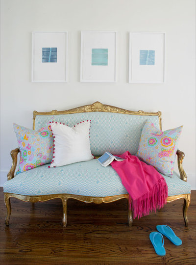
Eclectic design thrives on mixing eras, styles and colors. The ornate gold trim on this refurbished settee is both classic and modern.
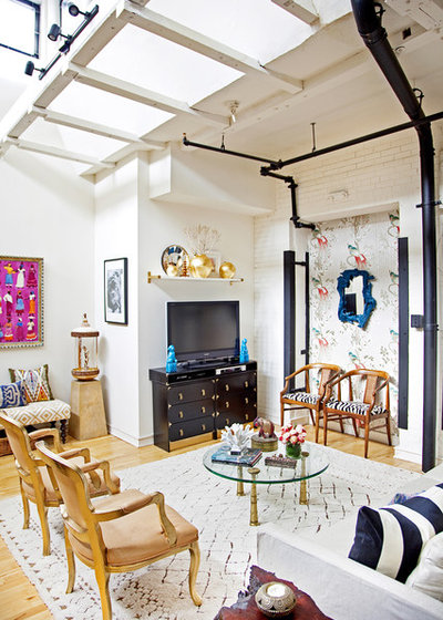
Just a dab will do you. Two glowing gold vases on the mantel look beautiful in this modern eclectic room.
Turquoise, pink and gold. Delish.
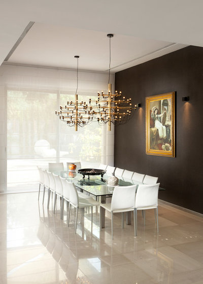
Modern, elegant and simple. Gold with black and white is a classic look that can go modern too.
Make a statement with a new gold chandelier
Make a statement with a new gold chandelier
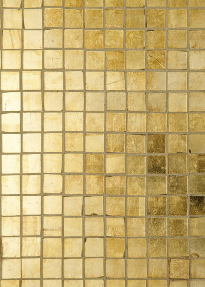
For some real metallic bling, go for bright gold tile.
Urban Outfitters
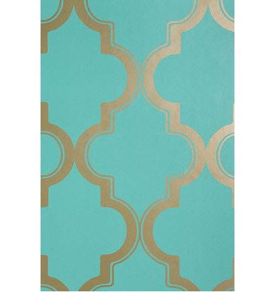
Gold and turquoise always look lovely together.
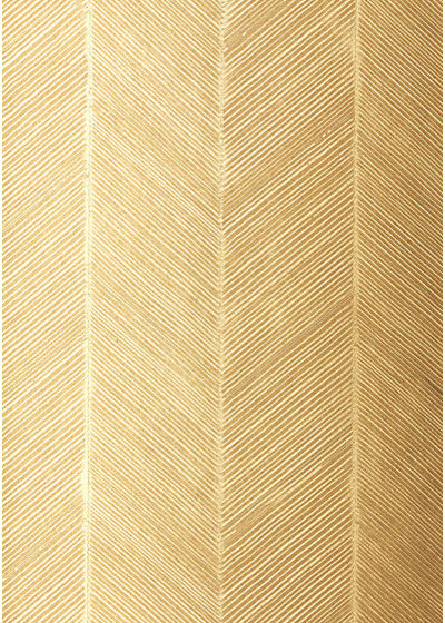
A chevon-patterned gold wallpaper.
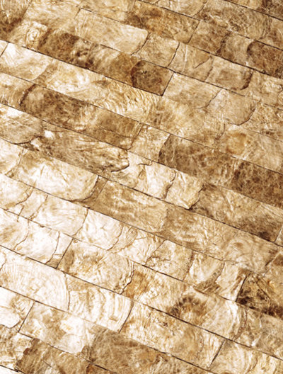
Maya Romanoff's mother-of-pearl wall tiles are the real deal. So much glow and texture.
Gold and navy wallpaper. Deep and elegant.
ArchiExpo
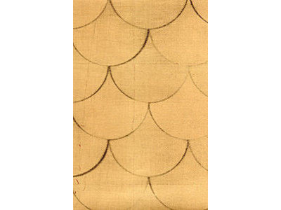
Shimmering hand-painted wallpaper with a scallop texture. Wow.

Nonmetallic gold tones vary from tan to straw to yellow. All with hints of brown.

Benjamin Moore
A bright but darker gold.

Benjamin Moore
Still lots of brown but a lot lighter.

Benjamin Moore
A very pale straw-colored gold tone.


KA Builders is a dedicated and innovative remodeling company based in the heart of your city. With our years of... Read More


Related Products
Related Stories

Decorating Guides
Design Pros Share 10 Favorite Creamy White Paints
By Becky Harris
These off-white color choices include versatile tones, warming hues and pleasingly soft shades
Full Story

Kitchen Countertops
What Kitchen Countertop Colors Should You Choose?
By tidgboutique
Consider these popular colors and styles to get the look you want — no matter what material you use
Full Story

Colors of the Year
Pantone Picks a Peach for Its 2024 Color of the Year
By Jennifer Ott
See how to use this juicy hue to create calm yet flourishing spaces inside and outside the home
Full Story

Decorating Guides
5 Ways Designers Are Working With Rich Warm Tones Right Now
By Becky Harris
Interior designers describe their strategies for using rich warm colors to create an inviting home
Full Story

Colors of the Year
10 Paint Colors Ready to Take Over in 2024
By Jennifer Ott
Blue is huge, but dark hues and warm tones also find favor among major paint companies’ 2024 Color of the Year picks
Full Story
Decorating Guides
How to Mix Colors and Make It Work
By tidgboutique
Don’t want to confine yourself to neutrals but lack the confidence to embrace colors? Check out this pro advice
Full Story

Events
7 Color Trends for 2024 at Maison & Objet
By Claire Tardy
New harmonies and unexpected pairings at the fall 2023 trade fair set the tone for next year’s interiors
Full Story

Decorating Guides
9 Ways to Layer Warm Neutral Colors for Comfortably Refined Rooms
By Becky Harris
Design pros share advice for building an inviting palette, introducing high contrast and mixing textures
Full Story

Decorating Guides
How to Create a Cohesive Color Flow Throughout Your Home
By Erin Carlyle
Designers share eight techniques for avoiding a choppy feeling in your spaces
Full Story

Decorating Guides
How to Get Your Ceiling Paint Color Right
By tidgboutique
Here’s how to tweak the shade of your ceiling paint to get the effect you want
Full Story
Dear Samantha, Thanks very much for including Jerry Jacobs Design, great article.
Best,
Jerry
Very good article....thanku so much