


Seven Tips for Creating Non-Boring Neutral Rooms
Neutrals are everywhere these days. Last week, the commenters on my ideabook about the top 20 photos on Houzz noticed just how much the Houzz community as a whole loves neutrals (even if individuals also love color).
Just after writing that ideabook, I got my June issue of Elle Decor in the mail. One of the letters to the editor took the magazine to task for an issue deemed "too colorful." The letter writer said she's a fan of neutrals and too much color gives her a headache.
Well, too much color doesn't give me a headache, but that doesn't mean that I can't appreciate the value of neutral spaces. Neutral done right, that is. Chain hotel rooms might be neutral, but they're neutral gone wrong - lacking personality all around.
Neutral doesn't have to mean boring, though. These seven tips provide a basis for creating neutral interiors that are interesting, cool, and personal:
Photos & Products
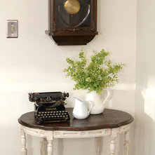
1. Inject Interesting Pieces.- Vintage elements - like this typewriter - are a great way to add some interest to a neutral room. I also love the legs on this table. It's little details that make a difference. Plus, it's smart to add bits of color via plants. They're still "neutral," but spice up the space.
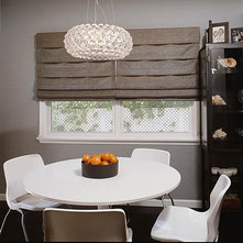
This light fixture is another great example of one interesting piece that makes a neutral room interesting. Plus, love those oranges!
2. Create a Beachy Vibe. Sometimes "neutral" just means "brown." That's not necessary. This space (one of the top 20 photos) uses navy to get to a beachy vibe that's neutral, but cool.
This room also has a great beachy vibe and demonstrates how one simple accessory with a simple but bold print - like that striped pillow - can make a room.
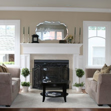
3. Focus on Shape. When the color palette is neutral, shapes take more of a front row seat. In this room, the graceful shape of the table and the mirror set the tone.
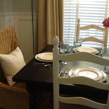
4. Get Tactile. Like shapes, texture becomes more important when the colors are neutral. I love this woven chair...
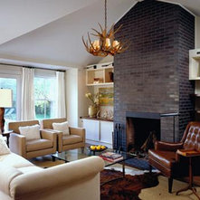
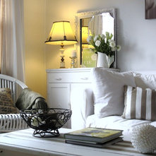
And I also love the multiple textures found in this room, from the rough, dark fireplace to the shiny, smooth leather of the chair.
5. Weather It. This is a favorite room of mine because I really like that weathered table. Weathered walls, floors and furniture are a trend from the top 20 photos that works well with neutrals, adding some history and interest to spaces.
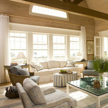
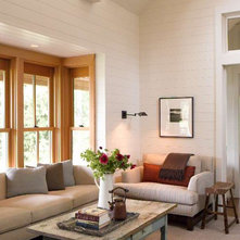
6. Don't Compete with a Great View. When big windows and a great view are the stars of the show, neutrals inside are a good idea. There's no need to compete with a fabulous outdoor space.

Another neutral. I am learning to use color, red, orange on walls tho. I strongly feel that when I choose major components of design, like sofas, loveseats, chairs, I can have fun with
Accent pillows and accessories. The sky is the limit. Add color, pattern and print to neutral!!!