


Houzz Tour: Basement Now a Light-Filled Family Living Space
Merging a house and a basement flat into one townhouse creates a spacious family home in London

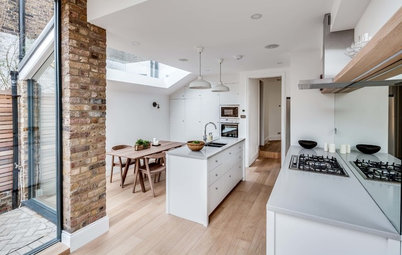
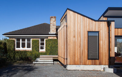
Living in a three-story Victorian house and renting out the basement flat made perfect sense when these London homeowners were just a couple. But as they embarked on family life, the idea of reclaiming the basement space to create one big townhouse took hold, and before they knew it they had enlisted the help of architect Felix von Bechtolsheim and interior designer Clare Gaskin to merge the properties and add on at the back too.
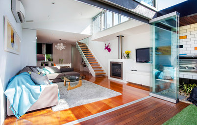
The designer and architect gave the back of the house a different feel from the front. “We wanted it light and contemporary,” Gaskin says. They particularly wanted to bring daylight into the lower floor (the former basement flat). They went for a large glass wall that spanned the lower and ground floors and created the spacious feel the couple wanted.
The designer and architect gave the back of the house a different feel from the front. “We wanted it light and contemporary,” Gaskin says. They particularly wanted to bring daylight into the lower floor (the former basement flat). They went for a large glass wall that spanned the lower and ground floors and created the spacious feel the couple wanted.
Gaskin custom designed the cabinetry. There are four bookcases in the room, all similar but with slightly varying depths. “They all have different purposes inside — some have internal suspension for hanging files; others have shelves,” she says. “We wanted to continue the symmetry of the bay window, and the couple needed storage for their paperwork.”
Gaskin painted the cabinets a slightly darker shade than the walls to define the bookcases and make them stand out as features. “Their style echoes traditional style in terms of fluting on the ends. I wanted it to look more like a period room, where [the cabinets] would be darker,” she says.
Wall paint: Slate II, bookcase paint: Slate V, both by Paint & Paper Library
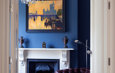
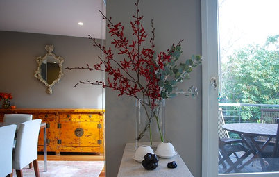
While the clients have contemporary taste, they had some traditional antique pieces they wanted to integrate. “It helped to bring their personalities through,” Gaskin says.
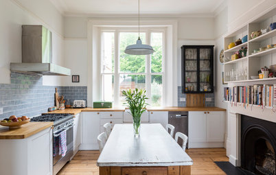
A staircase to the right leads up to the bedrooms; another slightly separate staircase connects to the open-plan kitchen, dining and living areas on the lower level.
A staircase to the right leads up to the bedrooms; another slightly separate staircase connects to the open-plan kitchen, dining and living areas on the lower level.
Extending the ground floor into a mezzanine gallery space gave it a contemporary and rather special feel. It also allowed light to flood both floors and created a nice interaction between the spaces.
There is another entrance on this floor, to the right beyond the coat hangers. Gaskin anticipated that this would be the entrance the family would typically use, so she created a hallway space with room for hanging coats.
Sideboard, dining table, chairs: Saga Dining Room by Christophe Delcourt, Roche Bobois
Gaskin worked closely with architect and friend von Bechtolsheim to design the lower level. “It was a discussion of how to balance and offset the different elements,” she says. “We wanted to let in as much light as possible without it being just a big glass wall.”
The wood paired with white has a cool edge while being warm and not too impersonal. The pendant light is by Secto. “I just love what they do with light — the interaction with the slatted style and what it does to the wall,” Gaskin says.
Pendant light: Secto, Skandium
The wood paired with white has a cool edge while being warm and not too impersonal. The pendant light is by Secto. “I just love what they do with light — the interaction with the slatted style and what it does to the wall,” Gaskin says.
Pendant light: Secto, Skandium
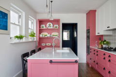
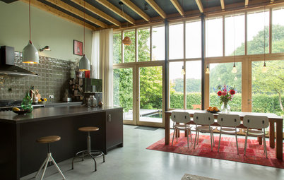
Kitchen company Eggersmann was responsible for the construction of the kitchen, in collaboration with the designer and architect.
“I was keen for them not to have an all-white kitchen,” Gaskin says. “I wanted to use walnut to warm it up and give it a bit of character, but all walnut can be quite heavy.” A mixture between the two proved to be the perfect compromise. The aesthetic is sleek and light but nicely balanced by the heavier island. It’s all about contrast. “The flat, smooth texture of the units with the natural grain of the wood gives the space a personality that suits these clients,” she says.
“I was keen for them not to have an all-white kitchen,” Gaskin says. “I wanted to use walnut to warm it up and give it a bit of character, but all walnut can be quite heavy.” A mixture between the two proved to be the perfect compromise. The aesthetic is sleek and light but nicely balanced by the heavier island. It’s all about contrast. “The flat, smooth texture of the units with the natural grain of the wood gives the space a personality that suits these clients,” she says.
A landscape gardener designed and planted the garden. “There’s a big wall at the back of the garden and, because we installed glass doors, we had to do something with the exterior wall to make it interesting,” Gaskin says. Painting it white and adding sculptural shrubs made for an attractive view.
Of the pendant lights above the kitchen island, Gaskin says, “I was really keen on those lights and showed her the different finishes. She said, “Why can’t we just have one of each?” And so they did.
Pendant lights: Tom Dixon; countertop: Divinity White, Diresco; cabinets: Eggersmann; refrigerator: Fisher & Paykel; extractor: Gutmann; sink: Franke; faucet: Dornbracht
Just beyond the kitchen area is the family room. Storage was key in here to enable the toys to be tidied up so it could also be used by the parents. “They wanted it to be fun and to work for both the parents and the children,” Gaskin says. “I wanted it to be fun, but not specifically kiddy, because I didn’t want to lock the space into their ages right now.”
Blind fabric: Christian Lacroix, Designers Guild; wall paint: Slate II, Paint & Paper Library
Blind fabric: Christian Lacroix, Designers Guild; wall paint: Slate II, Paint & Paper Library
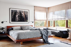
Up two flights of stairs is the master bedroom with an en suite, plus a guest room and another bathroom. The couple wanted to create a walk-in wardrobe space in the master bedroom, which was a challenge given the proportions of the room.
Gaskin and von Bechtolsheim designed and constructed a partition wall with hanging space on the other side. There was some apprehension about creating the wall division, as it would block off some of the light, but it was the only way to give the couple the storage they wanted and, in the end, it worked out nicely. “You don’t have to look at the clothes, and you don’t need big, bulky doors, which would have been a bit much in the space,” Gaskin says.
To keep light levels high, she chose metallic wallpaper, which reflects the light and gives the room a luxe hotel feel.
Wallpaper, blind fabric: Romo; inset border of blind fabric: Designers Guild
A tufted headboard gives the room a luxurious feel and complements the wallpaper. To one side is shelving, providing space for books and other trinkets. There are also two stand-alone wardrobes at the foot of the bed to give the couple additional storage space for any special items of clothing.
Bed: Feather & Black; pendant light: Graham & Green; reading lights: Tito, Cube Lighting
Bed: Feather & Black; pendant light: Graham & Green; reading lights: Tito, Cube Lighting
The couple wanted to re-create the luxury feel of chic hotel in the bathroom too, so continuity between the bedroom and bathroom was key. “They wanted a spot where they could really relax and have a long soak,” Gaskin says.
There’s no natural light in the bathroom when the door is shut; the shimmery tiles not only echo the bedroom wallpaper but also help to bounce light around. The glass mosaics add to the feeling of opulence.
Wall and floor tiles: Casamood; tub: Bette, QS Supplies; shower enclosure: The Shower Lab; fixtures: Hansgrohe; wall paint: Dimity, Farrow & Ball
Discover how to bring hotel style to your bathing space
For the guest bedroom on the same floor as the master suite, the couple wanted something quite practical that was both a little fun and not too specific. “It’s a really small space and, because of the structure of the room, there was one natural area where we installed shelving, which doubles as a bedside table,” Gaskin says. “We just wanted to add a bit of color without spending too much time or money on the space.”
Light: Graham & Green; blind and cushion fabric: Howard Hodgkin, Designers Guild; duvet cover: Ikea
Light: Graham & Green; blind and cushion fabric: Howard Hodgkin, Designers Guild; duvet cover: Ikea
The second bathroom on this floor is visible from the hallway as you enter the house on the upper ground floor. Gaskin realized the room would be seen frequently, as the door wouldn’t remain closed the entire time, so she wanted to do something bold. “It’s as if you have a bit of artwork on the wall,” she says. “I looked at some wallpaper with more color but thought it would be a bit much. I love this monochromatic print.”
Wallpaper: Cole & Son; toilet: Laufen; shower enclosure: Merlyn
Wallpaper: Cole & Son; toilet: Laufen; shower enclosure: Merlyn
Up a further flight of stairs are the two children’s bedrooms and a family bathroom. “The idea here is that the wall can be used as a little art gallery for the kids as they get older,” Gaskin says. It’s tucked away from the rest of the house, and the neutral color of the carpet and walls means the space can easily be updated as the kids get older.
Blind fabric: Linwood Fabrics & Wallpapers, TM Interiors
Blind fabric: Linwood Fabrics & Wallpapers, TM Interiors
For one of their children, the parents wanted to go with a pink scheme. They already had many of the pieces, such as the toys and bed, and decided to keep them. “We wanted there to be some continuity for the kids while the house went through the transformation,” Gaskin says.
Wall paint: Middleton Pink, Farrow & Ball; blind fabric: Sandberg
Wall paint: Middleton Pink, Farrow & Ball; blind fabric: Sandberg
In the second bedroom, Gaskin went for a blue scheme. “I picked a gray-blue that’s quite smart and works nicely with the light in the room,” she says. They kept most of the existing furniture.
Wall paint: Borrowed Light, Farrow & Ball; blind fabric: Schumacher
Wall paint: Borrowed Light, Farrow & Ball; blind fabric: Schumacher
For the family bathroom the children share, Gaskin had a little fun. The nautical wallpaper is whimsical without being over the top, and the electric-blue custom cabinetry injects some vigor into the space.
Wallpaper: Kaj by Sandberg, Jane Clayton; paint, color-matched to a blue radiator, Bisque; sink: Laufen
Browse more homes by style:
Small Homes | Colorful Homes | Eclectic Homes | Modern Homes | Contemporary Homes | Midcentury Homes | Ranch Homes | Traditional Homes | Barn Homes | Townhouses | Apartments | Lofts | Vacation Homes


Who lives here: A family of 4
Location: Bayswater, London
Size: 4 bedrooms, 3 bathrooms
A peaceful study adjoins the ground-floor sitting room. As one of the homeowners sometimes works from home, it was important for her to have an area she could shut off from the rest of the home. “This wasn’t a space where fun was a key part of the functionality,” Gaskin says.
Curtain fabric: Nina Campbell