


Color of the Week: Easter Lily
Lighten and brighten your home with a yellow-kissed white on the walls

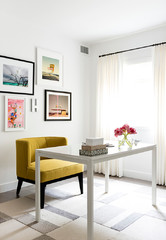
After featuring bold kelly green in the previous installment of this series, I figured I’d dial it down a bit this week with one of my favorite off-whites, Easter lily — an almost-white color that has the slightest hint of yellow. This subtle hue is a terrific alternative to pure white, which can look cold and institutional in certain spaces. Use it to add just a touch of warmth to a modern, minimalist space, or make it a neutral backdrop color in a more traditional home.
Immerse yourself in soft glowing color to help get your day started on the right foot. A toned-down color palette such as this one allows all of the interesting materials and fixtures to get a little attention. A bolder color on the wall could distract from the various charming elements that make up this lovely bathroom. I especially like this wall color paired with light- to medium-toned wood floors, which tend to have a bit of yellow in them that gets picked up by the wall color.
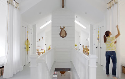
While this space has a nice, big skylight bringing in natural light, most attic rooms lack sufficient windows. Limited light combined with low, sloped ceilings can make these spaces feel cramped and cave-like. To counteract this I like to pump up the light by painting the walls and ceilings white or off-white. The soft and soothing palette here of whites, pale yellows and light wood tones is warm and mellow — perfect for getting a restful night’s sleep.
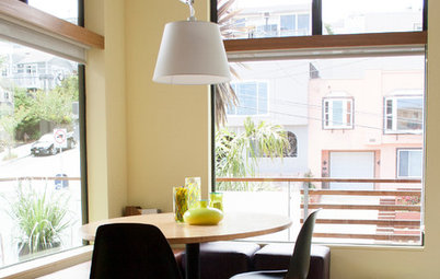
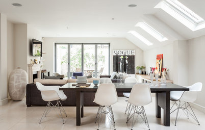
Our feature color appears almost white in a sun-flooded room, but here it offers the smallest bit of contrast against the pure white ceiling. The contrast allows the ceiling, with those nice exposed rafters, to stand out a bit more than if the walls and ceiling were painted the same color. The light yellow walls also offer a clean and nonclashing backdrop to the deeper blues used throughout the space.
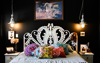
Here’s another bedroom with a pretty pale yellow and blue palette, this one with some bright turquoise accents. If you go with a mostly monochromatic palette, think about playing with texture to add visual interest. This room has nice textures thanks to the wood paneling on the walls and floor, as well as the textiles and decorative items.
Painted kitchen cabinets are all the rage these days, and I’m seeing an uptick in yellow cabinets in particular. A pale yellow hue is perfect for a rustic or traditional kitchen. Again, if you have light- to medium-toned wood floors, pick up a soft yellow shade from the wood. All of these warm tones also will help balance the coolness of stainless steel appliances.
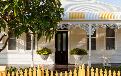
Take our featured hue outside for a clean, light, happy and bright porch. I don’t think this space would look as welcoming and cozy if it were clad in true white. The hint of yellow offers a nice counterpoint to the cool gray porch floor paint. This palette of gray, watery blue and soft yellow is very pretty and soothing.
Want to work in some other soft colors with Easter lily? Try pairing it with neutral greens, such as light sage or a soft, leafy green.
From left to right: Easter Lily, Dark Linen and Sweet Caroline, all from Benjamin Moore.
From left to right: Easter Lily, Dark Linen and Sweet Caroline, all from Benjamin Moore.
If you favor bolder greens, try using our featured pale yellow as the main color and then add zesty bits of lime green or chartreuse. If you use a third color, I suggest keeping it more neutral, like the grayish-greenish tan in the middle here.
From left to right: Golden City, Desdemona and Green Hornet, all from Mythic.
From left to right: Golden City, Desdemona and Green Hornet, all from Mythic.
Prefer a warmer palette? Pale yellows make a terrific backdrop for bolder oranges. I usually like to add a small bit of a cooler hue, such as a soft gray, for contrast.
From left to right: Powder Sand, Arizona and Silver Drop, all from Behr.
From left to right: Powder Sand, Arizona and Silver Drop, all from Behr.
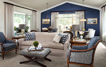
Here’s a more dramatic palette that would be elegant in a bedroom, living room or screened-in porch. Use the deep navy as a small accent only, unless the room is flooded with natural light.
From left to right: Roman Column, Tranquil Aqua and Naval, all from Sherwin-Williams.
Tell us: How have you used light yellows in your home?
More:
The Case for In-Between Colors
Colors of the Year: Look Back and Ahead for New Color Inspiration
From left to right: Roman Column, Tranquil Aqua and Naval, all from Sherwin-Williams.
Tell us: How have you used light yellows in your home?
More:
The Case for In-Between Colors
Colors of the Year: Look Back and Ahead for New Color Inspiration


Here are a few of my picks for Easter lily–inspired paint colors (left to right): Easter Lily from Benjamin Moore, Golden City from Mythic, Powder Sand from Behr and Roman Column from Sherwin-Williams.