Comments (42)
See 39 more comments

Susan
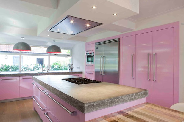
I agree, casacerro, and that room is a shock to the senses.
Like

refurbish

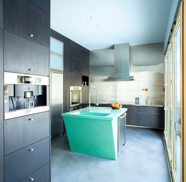
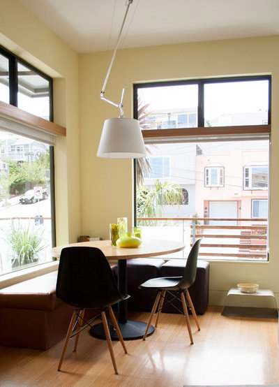
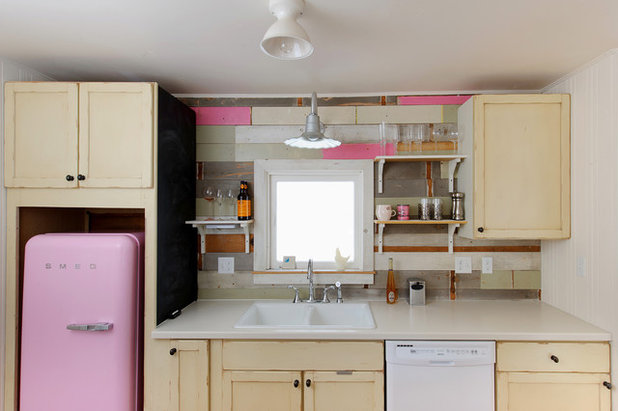
Thank you, @slab! That's actually my "after" picture, but I was going for something that belongs in a 1940's cottage, so your comment is appreciated! The pastel color I used is a very pale grey-blue. Here is a "before" shot...closed-in walls and cabinetry, dark colors, moldy appliances. I removed a wall between the kitchen and breakfast nook, replaced upper cabinets with open shelving, and created pantry space in the utility room (behind the camera). The new space feels more open and bright, and is very efficient and easy to clean.
1 Like

lizzysloves
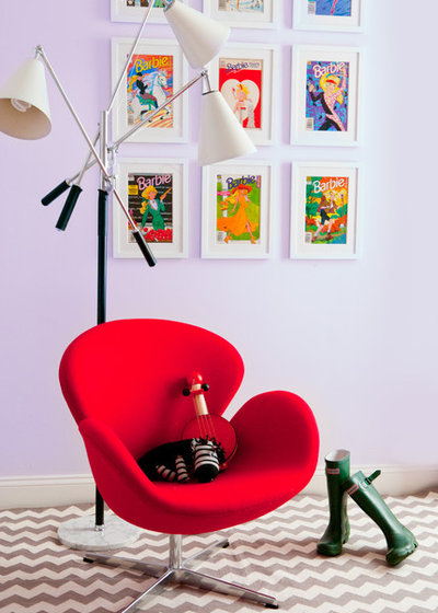
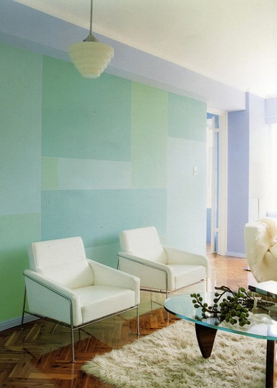
This is why I love being 60 - I can use pastels and I am at a point in my life that I don't care about what the in color is or era. I love pastels and I live close to the beach so pastels are in. I do agree about using a darker shade of the pastel color for balance.
1 Like