


How Merlot Can You Go? 8 Enticing Ways With Wine-Inspired Hues
Add warmth and drama to your home with these deepest shades of red
Jennifer Ott
September 17, 2014
San Francisco-based architectural color specialist and design writer. Jennifer's work has been featured in many print and online publications. Her recently-published book, "1000 Ideas for Color Schemes," is a beautifully illustrated and easy-to-navigate guide that takes the guesswork out of selecting the perfect color palette for your home or special event. For more information on Jennifer Ott Design, visit http://jenottdesign.com/.
San Francisco-based architectural color specialist and design writer. Jennifer's... More
Count me as a big fan of burgundy, whether I’m enjoying a glass of it with dinner or using it as an accent wall color. Decorating with shades of red wine can add drama, depth and a delicious cozy feeling to any room. But the hue can make a space appear somber, busy or even claustrophobic when overused or combined with too much visual clutter. So here are eight elegant examples of red-wine hues done right, along with suggestions for similar colors to try out in and on your own home.
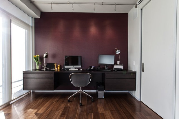
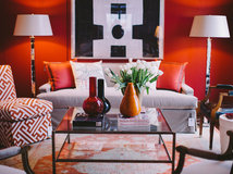
Reds are thought to excite and stimulate our senses, so a dollop of deep burgundy is a good choice for a home office. This is a very dark shade, but limiting it to a single small wall and pairing it with lots of white and natural light will keep it from feeling heavy and dreary. I also think it’s smart to limit the number of decorative elements in a room when using such an intense color on the wall. You don’t want your knickknacks to compete with a statement-making color.
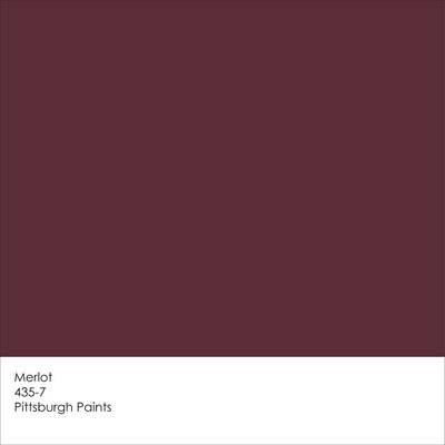
Get a similar hue with Merlot from Pittsburgh Paints.
Get a similar hue with Merlot from Pittsburgh Paints.
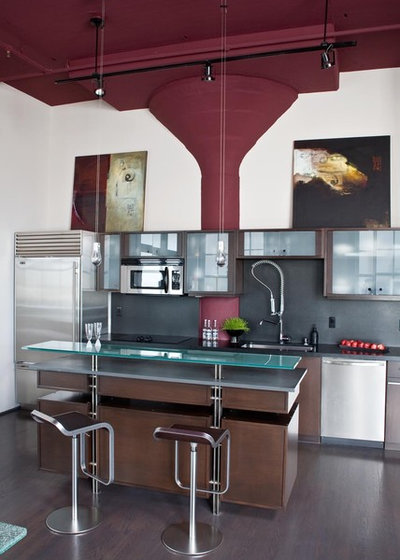
When paired with a lighter hue, such as white, these wine-inspired colors really stand out and catch our attention. Use them thoughtfully to enhance interesting forms and elements.
See when to use red in the kitchen
See when to use red in the kitchen
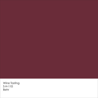
Get a similar look with Wine Tasting from Behr.
This deepest, darkest shade of burgundy reads almost as black, which coaxes it into working as a neutral hue. This is a dramatic alternative to the more expected neutral shades of white, gray and beige. As in the first example, and as was done here, limit the number of decorative accessories so that the few things you do choose to display really stand out.
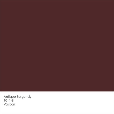
Get a similar look with Antique Burgundy from Valspar.
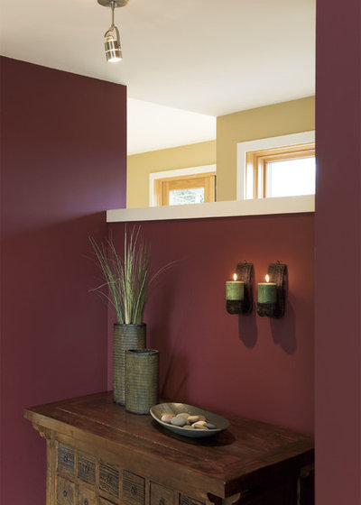
As gorgeous as this wall color is, it can be tough to pull off, because dark colors such as these tend to suck all the light out of a room. I suggest using it in small amounts or, if you’re painting the entire space, limit it to “occasional” spaces — rooms such as an entry area or powder room, where you tend to pass through briefly and not spend a large amount of time.
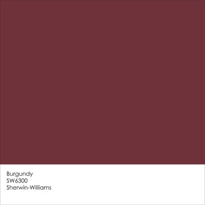
The paint color in the previous photo is Cheerful Cherry 8693 from Cloverdale Paint. You can get a similar look with Burgundy from Sherwin-Williams.
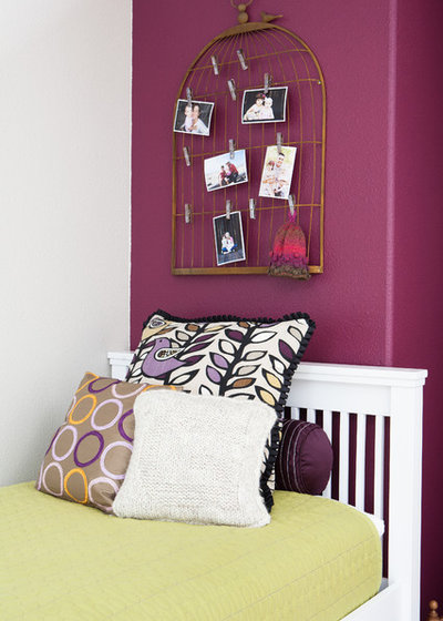
This pretty berry-wine shade is a nice alternative to pastel pink for a modern take on a little girl’s room. But this fetching hue is not just for little girls; I think it would also look fantastic on the headboard wall of a master bedroom, or used to visually lower a tall ceiling for a cozier and more intimate vibe.
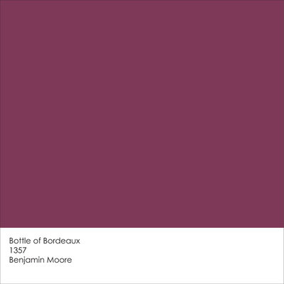
Get a similar look with Bottle of Bordeaux from Benjamin Moore.
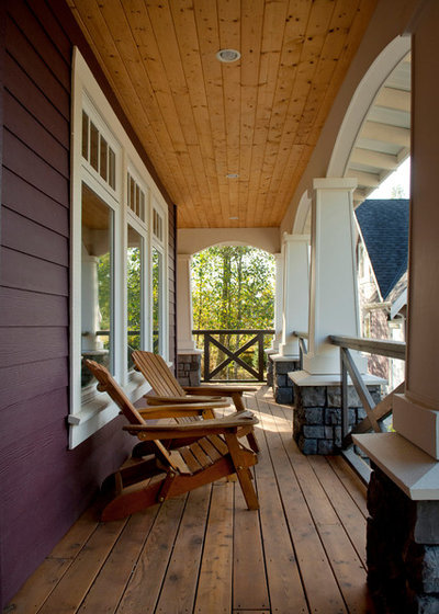
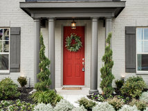
There’s no reason these beautiful shades must be limited to the interior of your home. Since darker burgundy hues work as neutrals, they are a nice alternative to the ubiquitous dark brown shades on the exterior of a house. Just keep in mind that dark colors absorb more heat than lighter hues, so this may not be the best choice if you live in a predominantly hot climate. If that’s the case, try out a red-wine hue on your front door or window and door trim instead.
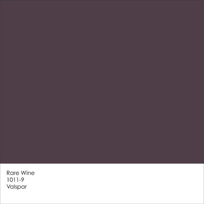
Get a similar look with Rare Wine from Valspar.
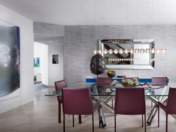
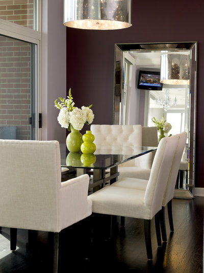
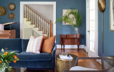
If your space lacks abundant natural light, or you just want to keep your rooms light and bright, make a place for red-wine hues via furniture or other decorative accessories instead. This room has a rather cool palette, but the wine-hued dining chairs add warmth and richness, preventing it from feeling too cold.
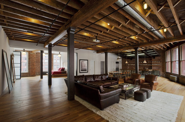
Deep red furniture and accessories make a handsome match for wood and brick finishes. This warm, rich palette is a smart choice in a cooler climate or an urban environment where the view outside the window might be a little heavy on concrete and asphalt.
More: Have You Heard the Hues? 15 Colors You May Not Know About
Tell us: Are you a fan of red-wine-inspired colors? We’d love to hear in the Comments how you’ve used them around your house.
More: Have You Heard the Hues? 15 Colors You May Not Know About
Tell us: Are you a fan of red-wine-inspired colors? We’d love to hear in the Comments how you’ve used them around your house.
Bella Casa, llc is a full service interior design firm that has been specializing in high end residential & light... Read More
What are you working on?
Related Products
Related Stories

Decorating Guides
Design Pros Share 10 Favorite Creamy White Paints
By Becky Harris
These off-white color choices include versatile tones, warming hues and pleasingly soft shades
Full Story

Kitchen Countertops
What Kitchen Countertop Colors Should You Choose?
By tidgboutique
Consider these popular colors and styles to get the look you want — no matter what material you use
Full Story

Colors of the Year
Pantone Picks a Peach for Its 2024 Color of the Year
By Jennifer Ott
See how to use this juicy hue to create calm yet flourishing spaces inside and outside the home
Full Story

Decorating Guides
5 Ways Designers Are Working With Rich Warm Tones Right Now
By Becky Harris
Interior designers describe their strategies for using rich warm colors to create an inviting home
Full Story

Colors of the Year
10 Paint Colors Ready to Take Over in 2024
By Jennifer Ott
Blue is huge, but dark hues and warm tones also find favor among major paint companies’ 2024 Color of the Year picks
Full Story
Decorating Guides
How to Mix Colors and Make It Work
By tidgboutique
Don’t want to confine yourself to neutrals but lack the confidence to embrace colors? Check out this pro advice
Full Story

Events
7 Color Trends for 2024 at Maison & Objet
By Claire Tardy
New harmonies and unexpected pairings at the fall 2023 trade fair set the tone for next year’s interiors
Full Story

Decorating Guides
9 Ways to Layer Warm Neutral Colors for Comfortably Refined Rooms
By Becky Harris
Design pros share advice for building an inviting palette, introducing high contrast and mixing textures
Full Story

Decorating Guides
How to Create a Cohesive Color Flow Throughout Your Home
By Erin Carlyle
Designers share eight techniques for avoiding a choppy feeling in your spaces
Full Story

Decorating Guides
How to Get Your Ceiling Paint Color Right
By tidgboutique
Here’s how to tweak the shade of your ceiling paint to get the effect you want
Full Story
Hey! Have you tried the merlot color by Sherwin Williams? I am thinking of using that for my master bedroom.