


Taupe: A Sophisticated Backdrop for Today
See Why Versatile, Stylish 'Greige' Continues to Warm Our Walls
Debbie Snider
April 1, 2011
Houzz Contributor.
Taupe, also know as "greige," is a stylish neutral color for today's interiors. Safe beige instantly becomes sophisticated taupe when mixed with gray. Although there are many variations of taupe, it is generally described as a warm gray. Whether your style is contemporary, mid-century modern or traditional, this versatile color makes a great backdrop for your home furnishings. Let's take a look.
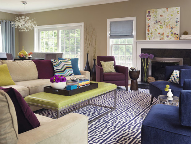
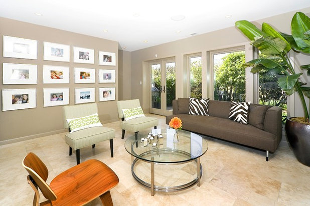
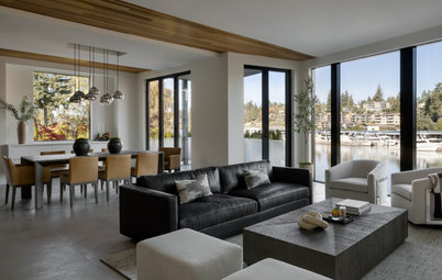
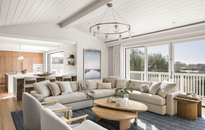
A warm taupe on the walls lets the blues, eggplant and chartreuse come alive in this colorful contemporary living room.
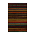
This color also works well with high-contrast patterns, like this Greek Key rug.
This color also works well with high-contrast patterns, like this Greek Key rug.
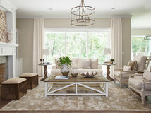
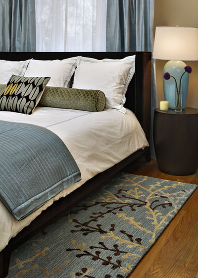
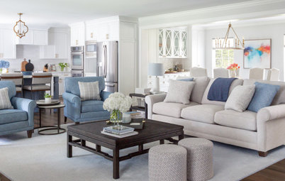
Here, it is soothing and elegant as part of a subdued palette of light taupe, blue-gray and cream.
Medium taupe is a great background color for this mid-century modern style home. The window casing (trim) and the baseboards have been painted the same color as the walls. Orange makes a striking accent color.
Ask a professional painter to weigh in on your color choice
Ask a professional painter to weigh in on your color choice
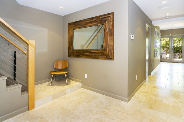
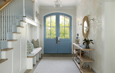
Here is the entry area in the same home. The white ceiling and light travertine floor tile brighten up the space. And don’t the warm wood tones look great against this color?
This paint: Designer Shelly Amoroso used Benjamin Moore Alexandria Beige #HC-77.
This paint: Designer Shelly Amoroso used Benjamin Moore Alexandria Beige #HC-77.
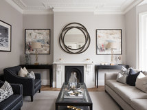
A deeper tone looks dramatic when paired with crisp white in this traditional style home. This is a very popular image on Houzz.
This paint: Here Amoroso used Benjamin Moore, Mesa Verde Tan #AC-33, flat latex paint.
This paint: Here Amoroso used Benjamin Moore, Mesa Verde Tan #AC-33, flat latex paint.
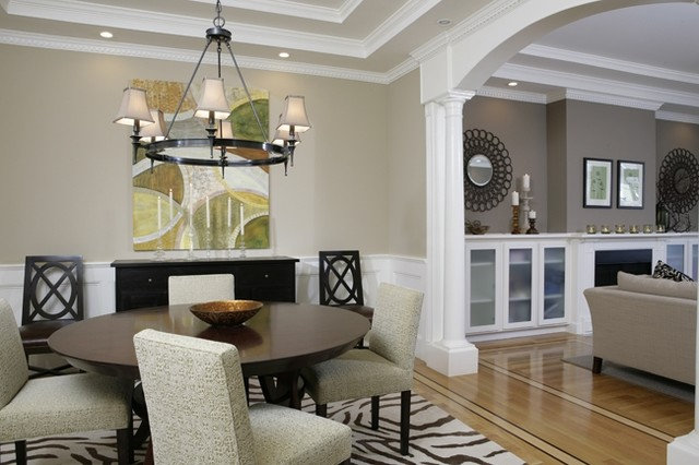
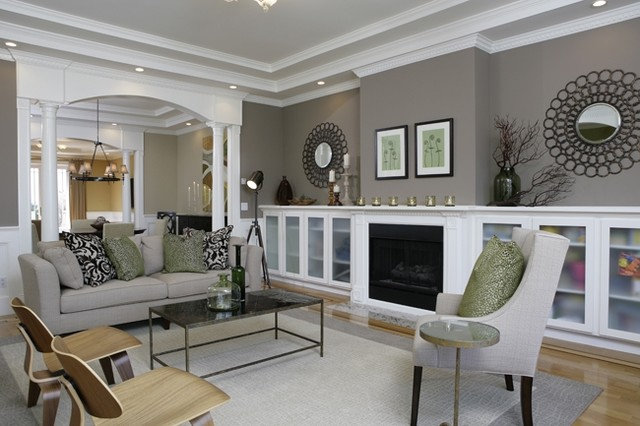
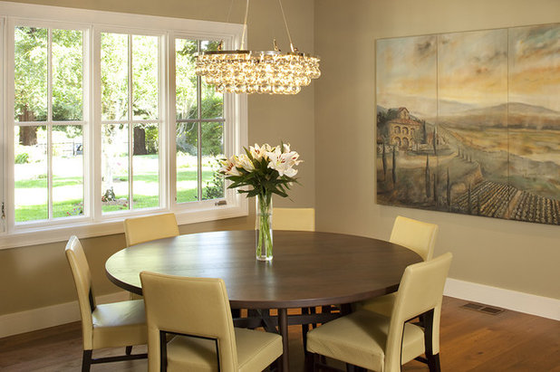
The dining room is painted a lighter coordinating tone. Dark accents like the black chandelier, high contrast animal pattern rug and espresso wood tones stand out and add to the drama.
This paint: Benjamin Moore, Bleeker Beige #HC-80, flat latex.
(Thanks to Shelly Amoroso for generously sharing her paint colors!)
This paint: Benjamin Moore, Bleeker Beige #HC-80, flat latex.
(Thanks to Shelly Amoroso for generously sharing her paint colors!)
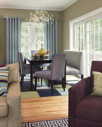
This is the dining area for image #1. Again, the quiet taupe lets the other colors sing, from the blue-gray draperies to the eggplant and light chartreuse carpet tiles. As seen here and in previous examples, taupe paired with white ceilings and trim provide a refreshing contrast.
Frame windows with colorful curtains
Frame windows with colorful curtains
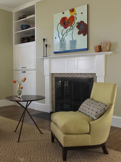
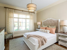
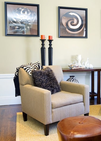
A butter yellow side chair and floral art are eye-catching against taupe.
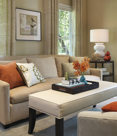
In this monochromatic living area, coral accents look divine.
If you are a fan of blue-gray and chocolate, consider putting taupe on your walls.
Or maybe, you want taupe to be the main color? (Another very popular image at Houzz.)
Here is a serene palette of taupe with butter yellow with a bit of blue-gray. It works nicely with the dark brown dining table.
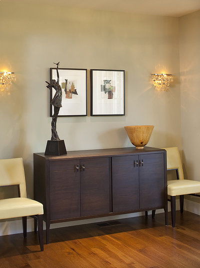
This is the other side of the room. Did you notice that these crystal sconces match that fabulous chandelier in the previous photo?
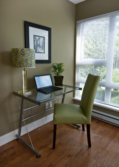
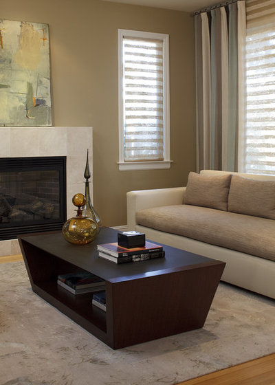
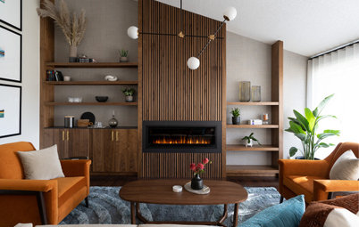
Taupe with a touch of olive invites you to sit down and surf the web or get a little work done.
A stylish vignette features a very pale taupe.
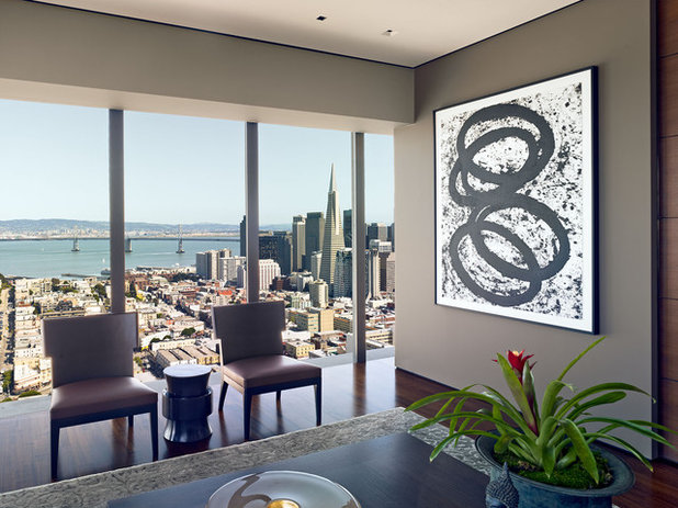
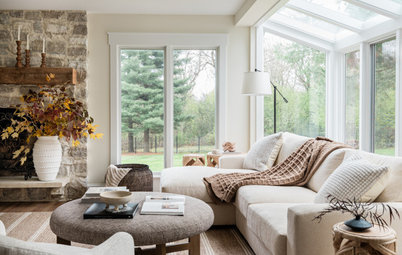
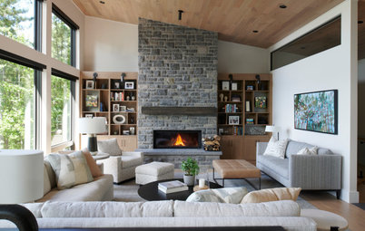
This dark taupe is worthy of framing a spectacular view and great art.
Did I convince you to try out this wonderful color?
Next: Browse more images of taupe in home design
Did I convince you to try out this wonderful color?
Next: Browse more images of taupe in home design
With over 8 years of experience serving the Columbus and surround area, Hoffman Exteriors, is your solution for... Read More
What are you working on?
Related Products
High Point Cabinets is a custom cabinet builder located between Apple Creek, Fredericksburg and Mt. Hope, Ohio,... Read More
Related Stories
Organizing
How to Create a Joyful, Clutter-Free Home Office
Follow these steps to get rid of the paper piles and make room for beauty and better organization
Full Story
Remodeling Guides
15 Ways to Create Separation in an Open Floor Plan
By tidgboutique
Use these pro tips to minimize noise, delineate space and establish personal boundaries in an open layout
Full Story

White
Design Pros Share 10 Favorite Creamy White Paints
By Becky Harris
These off-white color choices include versatile tones, warming hues and pleasingly soft shades
Full Story
Entryways
4 Designer Tips for a Fashionable Entry
By tidgboutique
A pro shows how adding color, statement pieces and more to a foyer can set the right tone for the rest of the home
Full Story
Most Popular
7 Major Decorating Mistakes and How to Avoid Them
By tidgboutique
Gain confidence to start your interior design project with this advice from a professional designer
Full Story
Living Rooms
4 Must-Have Features for a Small Living Room
By tidgboutique
A designer shares important ways to live large in a tight space and make it look stylish
Full Story
Most Popular
7 Common Decorating Mistakes to Avoid
Pros share solutions to design problems they often find in people’s living spaces
Full Story
Most Popular
How to Decorate a Living Room
By tidgboutique
A designer offers tips for creating a comfortable space that reflects your style
Full Story
Budget Decorating
Where to Splurge and Where to Save When Decorating
By tidgboutique
See where it makes sense to invest in durable essentials and focal pieces, and where to economize on other things
Full Story
Lighting
Pro Tips for Lighting 10 Rooms and Outdoor Areas
Get professional advice for lighting your kitchen, bathroom, living room, office, patio and more
Full Story
I'm looking for a shade of taupe that will go well with teal and turquoise. Any suggestions? Thanks!
What is the name and brand of the OLIVE TAUPE USED by Heather Kleim?
My walls are painted with Behr Parisian Taupe & Valspar Mesa Tumbleweed also. Started with the dining room doing 3 walls in Parisian Taupe & 1 wall in Mesa Tumbleweed. Fell in love with them. Painted the entry & hallway Parisian & the living-room Mesa Tumbleweed with trim in a soft white. I love how the colors change all the time with different light. No matter what I put in the rooms, the walls look great!