


Relax and Reflect in a Blue Landscape
Find sanctuary by introducing this well-loved hue outside
Frank Organ
November 7, 2014
Houzz Contributor. I have been involved all my working life with design, garden design, horticulture and garden retailing. Having worked as a buyer for a large garden centre in the south west of England for the last 8 years I have recently moved to Kent. My passion for small garden design and the lifestyle it brings has lead me to write about it on my blog, www.yardz.typepad.co.uk for the last thirteen years.
Houzz Contributor. I have been involved all my working life with design, garden design,... More
“Blue color is everlastingly appointed by the Deity to be a source of delight,” wrote Victorian art critic John Ruskin. And, indeed, surveys reveal blue to be among the most popular favorite colors. What makes it so well liked? Perhaps the range of shades available, from the deepest indigo through cyan to the blue-greens of turquoise and teal, attract us. In addition, blue is believed to have a soothing effect on the human mind, as it helps produce calming chemicals in the brain.
Let’s see how designers have used this popular shade outside, from planting schemes to accent colors or full blue-themed landscapes.
Let’s see how designers have used this popular shade outside, from planting schemes to accent colors or full blue-themed landscapes.
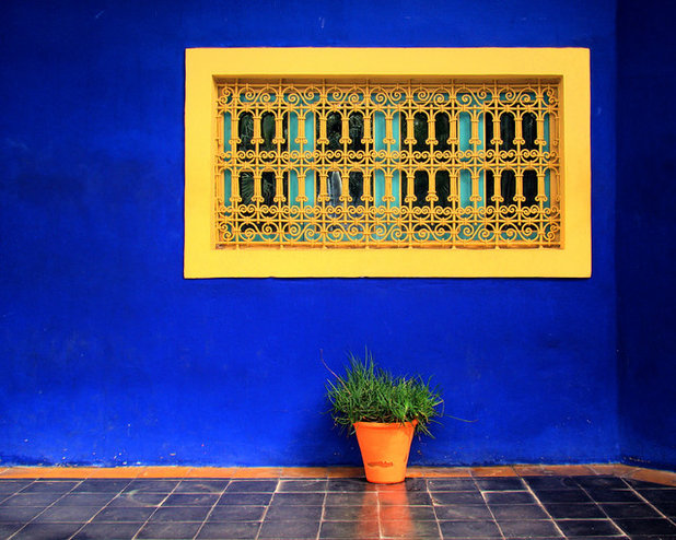
Anyone who has visited Jardin Majorelle, the 12-acre garden in Morocco famously restored by Yves Saint Laurent and Pierre Bergé, will know just how beautiful blue can be as the foundation of a garden’s design. Its original designer, Jacques Majorelle, used bright cobalt blue throughout the property’s gardens and buildings.
Photo by Uspn (Bjørn Christian Tørrissen)
Photo by Uspn (Bjørn Christian Tørrissen)
This blue wall dazzles under the clear blue sky without overpowering, becoming almost one with the sky beyond. Like green, blue is naturally restful to the eye, as both colors surround us in our natural landscape, contributing toward a feeling of tranquillity and well-being.
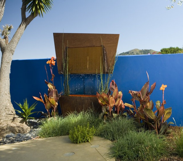
Opposites on the color spectrum always create dazzling combinations. Here the planting of the orange cannas against the blue wall makes both colors really zing.
Opposites on the color spectrum always create dazzling combinations. Here the planting of the orange cannas against the blue wall makes both colors really zing.
The use of this sumptuous wall as a backdrop for architectural plants seems to pay homage to the work of the Mexican architect Luis Barragán. Barragán loved using vivid colors, especially on the garden walls attached to his modernist houses, where he felt they accentuated the buildings’ natural surroundings. His use of bright cobalt blue on those walls is thought to represent the bright blue Mexican sky, and he drenched his houses in bold, unforgettable color.
See more of this Central California landscape design
See more of this Central California landscape design
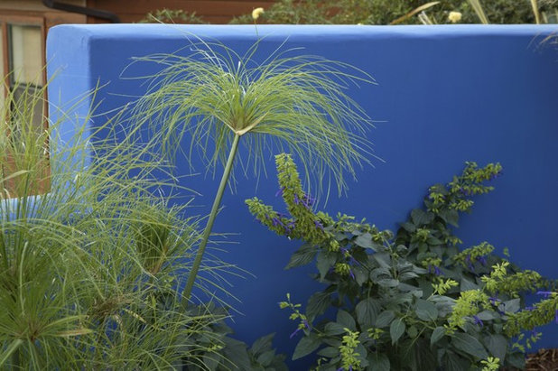
The tones of blue used in the softer light of more temperate gardens tend to not be so bold, with a preference for the darker shades of navy and ultramarine rather than the lighter tones of azure or sky blue. The matte finish of this powder-coated Cor-Ten steel wall creates an elegant backdrop for a variety of foliage colors, achieving a similar purpose as the bright cobalt wall in the previous photo.
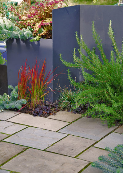
The deep red blades of Japanese blood grass (Imperata cylindrica ‘Rubra’) stand out against the muted blue of the wall. Blue is a receding color and tends not to pop against many other colors, except when it meets complementary colors like yellows and oranges.
The deep red blades of Japanese blood grass (Imperata cylindrica ‘Rubra’) stand out against the muted blue of the wall. Blue is a receding color and tends not to pop against many other colors, except when it meets complementary colors like yellows and oranges.
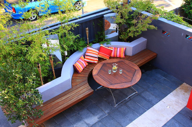
This blue garden is a cool escape from the world on the other side of the wall. The steel blue granite paving sets the foundation for the deep blue walls and sky-blue bench back. A fresh green Japanese maple (Acer sp) and bamboo hedge brighten the blue garden, interrupted only by the strong, warm colors of the cushions. This urban courtyard really is a rhapsody in blue.
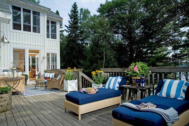
You may prefer to use blue as an accent color on furniture and accessories. With its link to sea and sky, blue engenders feelings of relaxation and tranquillity, making it the perfect choice for lounge spaces.
White has a special affinity for blue — just think of the blue and white willow-patterned delftware so loved by the rich and wealthy of the 17th century.
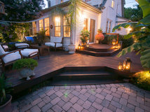
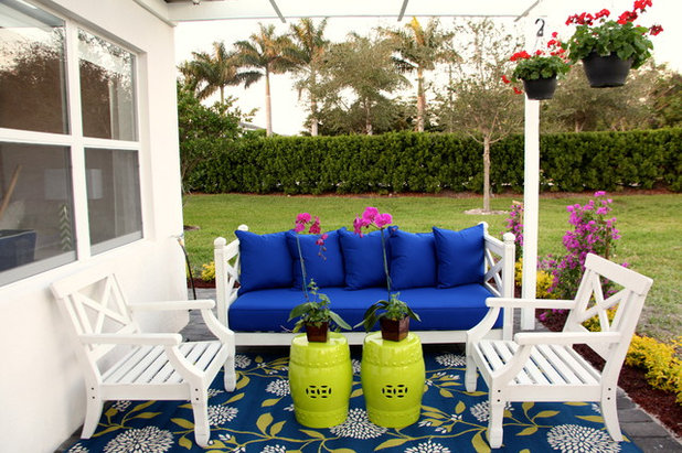
The color combination makes this patio feel fresh, aided by the yellow, one of blue’s complementary colors, seen both in the tables and the clever choice of rug, which draws all three colors together.
The color combination makes this patio feel fresh, aided by the yellow, one of blue’s complementary colors, seen both in the tables and the clever choice of rug, which draws all three colors together.
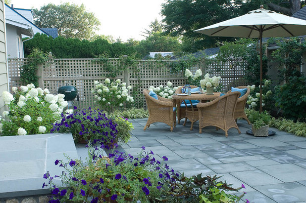
This garden is built around the use of blue, from the bluestone pavers to the deep ultramarine petunias to the table accessories. The touch of white in the hydrangeas, weathered gray fencing and crisp white table setting completes the effect.
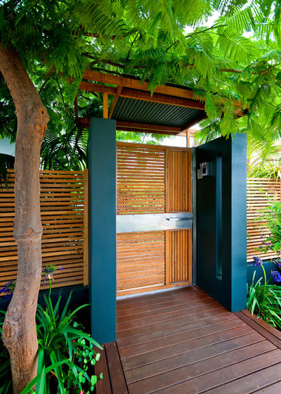
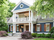
Use blue to highlight features like gates, obelisks, gazebos or, as here, a front entrance. Rather than having a blue door, the designer used the accent color in the side porch supports.
The blue-flowering agapanthus alongside the path and the orange wood stain accentuate the blue.
The blue-flowering agapanthus alongside the path and the orange wood stain accentuate the blue.
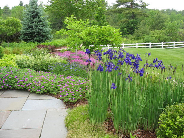
Blue plants can accent a border, break up a color scheme or highlight a garden feature. The deep blue of these clumps of Iris sibirica shows what a versatile color it can be. It could have overpowered the rest of the planting, yet we see how well it combines with the pastel colors it surrounds.
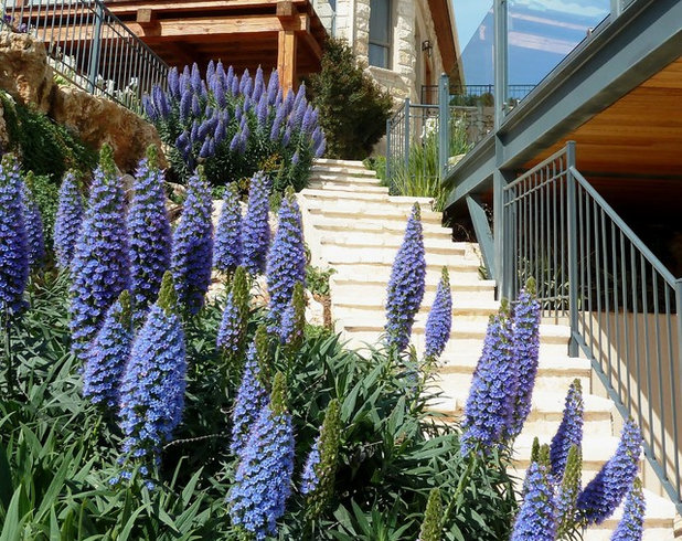
The flowers of Pride of Madeira (Echium candicans) are a true dusty blue and are emphasized by glaucous foliage. The groups of Echiums along the steps lead our eye along the path and exaggerate the staircase’s length.
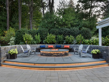
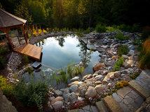
The planting would have been a strong feature in its own right, but here it harmonizes with the steel color of the railings and deck supports, creating a calming combination.
The planting would have been a strong feature in its own right, but here it harmonizes with the steel color of the railings and deck supports, creating a calming combination.
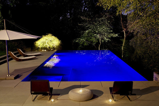
In his book Blue Mind, marine biologist Wallace J. Nichols writes how being close to or in water can improve both body and mind. So if we combine water with stress-relieving blue, as in this stunning lit pool at nighttime, will we lead happier lives?
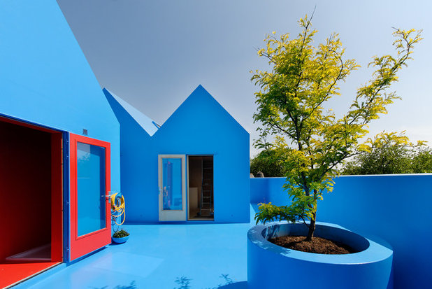
If using blue in our garden designs can soothe modern-day stresses, perhaps we should go all the way and surround ourselves with color. Didden Village is a development in Rotterdam, the Netherlands, built on top of existing houses. All the exterior elements of the buildings, including the roof gardens, are finished in a blue polyurethane coating. It might not be for everyone, but what a bold example of how to use this favored color.
Tell us: Do you use blue in the garden?
More: Explore the Houzz Landscape Design section
Tell us: Do you use blue in the garden?
More: Explore the Houzz Landscape Design section


Related Stories

Decorating Guides
Design Pros Share 10 Favorite Creamy White Paints
By Becky Harris
These off-white color choices include versatile tones, warming hues and pleasingly soft shades
Full Story

Kitchen Countertops
What Kitchen Countertop Colors Should You Choose?
By tidgboutique
Consider these popular colors and styles to get the look you want — no matter what material you use
Full Story

Colors of the Year
Pantone Picks a Peach for Its 2024 Color of the Year
By Jennifer Ott
See how to use this juicy hue to create calm yet flourishing spaces inside and outside the home
Full Story

Decorating Guides
5 Ways Designers Are Working With Rich Warm Tones Right Now
By Becky Harris
Interior designers describe their strategies for using rich warm colors to create an inviting home
Full Story

Colors of the Year
10 Paint Colors Ready to Take Over in 2024
By Jennifer Ott
Blue is huge, but dark hues and warm tones also find favor among major paint companies’ 2024 Color of the Year picks
Full Story
Decorating Guides
How to Mix Colors and Make It Work
By tidgboutique
Don’t want to confine yourself to neutrals but lack the confidence to embrace colors? Check out this pro advice
Full Story

Events
7 Color Trends for 2024 at Maison & Objet
By Claire Tardy
New harmonies and unexpected pairings at the fall 2023 trade fair set the tone for next year’s interiors
Full Story

Decorating Guides
9 Ways to Layer Warm Neutral Colors for Comfortably Refined Rooms
By Becky Harris
Design pros share advice for building an inviting palette, introducing high contrast and mixing textures
Full Story

Decorating Guides
How to Create a Cohesive Color Flow Throughout Your Home
By Erin Carlyle
Designers share eight techniques for avoiding a choppy feeling in your spaces
Full Story

Decorating Guides
How to Get Your Ceiling Paint Color Right
By tidgboutique
Here’s how to tweak the shade of your ceiling paint to get the effect you want
Full Story
Blue colour looks very cool and magnificent.
Last one is looks great having blue colour everywhere and a green tree stand in centre of that landscape makes different and attractive. Personally I like last one.