


Choosing Hues: Roll With the Color Wheel
See how an age-old tool can help you find the right paint
Paul Anater
March 1, 2011
I am a former designer, past Houzz contributor and current Marketing Director at The Reclamation Project, a reclaimed lumber flooring and furniture company in Pennsylvania.
I am a former designer, past Houzz contributor and current Marketing Director at... More
Designers use a color wheel to illustrate the colors of the visible spectrum. It's a simplified model, of course, and it's important not to interpret it too rigidly. However, using the color wheel can take some of the mystery out of selecting a color scheme for your home.
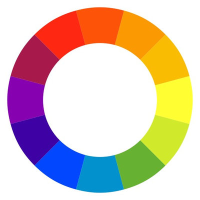
Here's a good example of a basic color wheel. It's a great tool to use to learn about the relationships among colors. When you see a color wheel, there are colors in opposite positions on it. Opposing colors are said to be complementary colors, because they work well together.
Complementary Colors
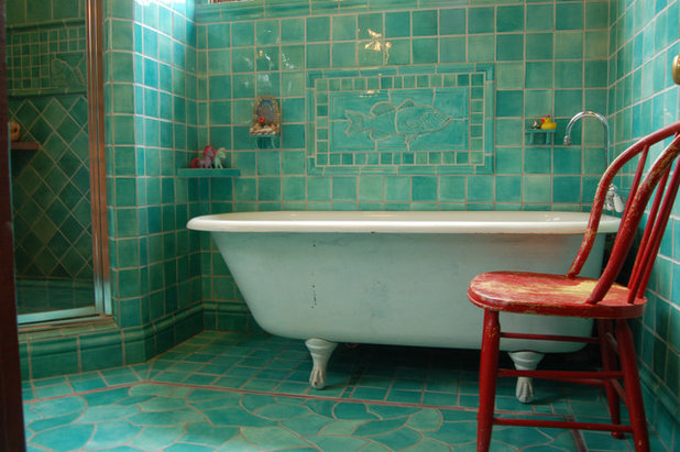
Red and green are opposite each other on the wheel, so they are complementary colors. Though they remind most people of Christmas, that needn't always be the case. This distressed chair and amazing tile wall certainly don't say "holiday" thanks to their complementary colors.
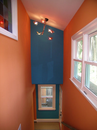
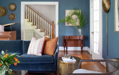
Orange and blue also are at opposite points. In using them, you'll have an instant complementary color scheme.
Red and green are opposite each other on the wheel, so they are complementary colors. Though they remind most people of Christmas, that needn't always be the case. This distressed chair and amazing tile wall certainly don't say "holiday" thanks to their complementary colors.
Orange and blue also are at opposite points. In using them, you'll have an instant complementary color scheme.
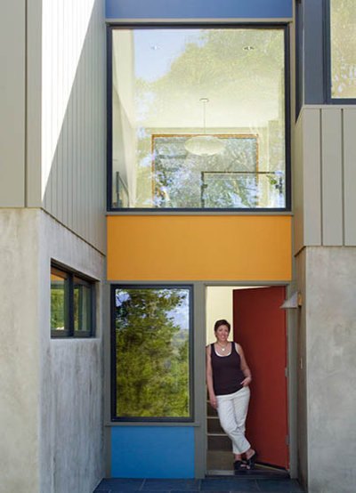
Triads
A color scheme that combines three colors equally spaced on a color wheel is called a triad.
The easiest triad is red, yellow and blue — the primary colors. In this case, the colors are working together on a modern facade to evoke the paintings of Piet Mondrian.
A color scheme that combines three colors equally spaced on a color wheel is called a triad.
The easiest triad is red, yellow and blue — the primary colors. In this case, the colors are working together on a modern facade to evoke the paintings of Piet Mondrian.
The triad needn't always be a nod to nonrepresentational, early-20th-century art. By tweaking the tones and shades of the individual colors, you can make whatever statement want while maintaining a classically balanced color scheme.
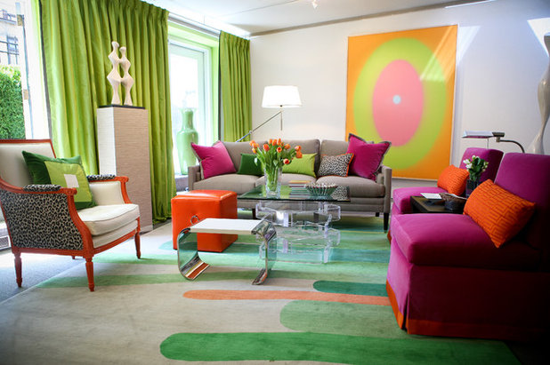
Split Complements
An interesting variation of the triad is the split complement. Put simply, a split complement takes a position on the color wheel, in this case green. Directly opposite green on the wheel is red. But if we veer to the right and to the left of green we get orange and purple. Green, orange and purple are a split complement.
An interesting variation of the triad is the split complement. Put simply, a split complement takes a position on the color wheel, in this case green. Directly opposite green on the wheel is red. But if we veer to the right and to the left of green we get orange and purple. Green, orange and purple are a split complement.
Purple, yellow and orange make another split complement, which is the basis of this room's color scheme.
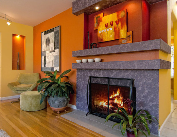
It's important not to get too hung up on the letter of these design rules; it's better to think of them as guidelines. Good design starts with the basics like the color wheel, then plays around from there. In the photo above, what started as a split complement veered off into something else when the designer added red above the fireplace. The red draws attention to the architecture above the fireplace, and it works perfectly.
It's important not to get too hung up on the letter of these design rules; it's better to think of them as guidelines. Good design starts with the basics like the color wheel, then plays around from there. In the photo above, what started as a split complement veered off into something else when the designer added red above the fireplace. The red draws attention to the architecture above the fireplace, and it works perfectly.
Analogous Colors
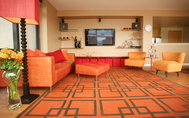
When you select a series of colors that sit next to one another on the color wheel, the resulting color scheme is said to be analogous. Yellow-orange, orange and red-orange are a simple, analogous color scheme that makes a statement that exceeds the sum of its parts.
When you select a series of colors that sit next to one another on the color wheel, the resulting color scheme is said to be analogous. Yellow-orange, orange and red-orange are a simple, analogous color scheme that makes a statement that exceeds the sum of its parts.
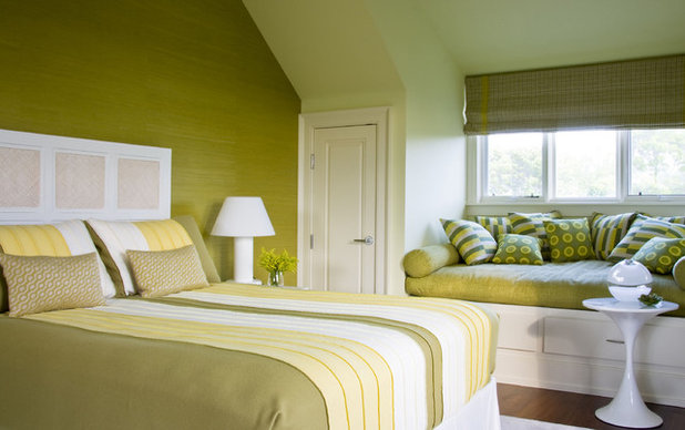
Yellow, yellow-green and green make up another analogous color scheme. Analogous color schemes tend to bring with them an instant sense of classical balance.
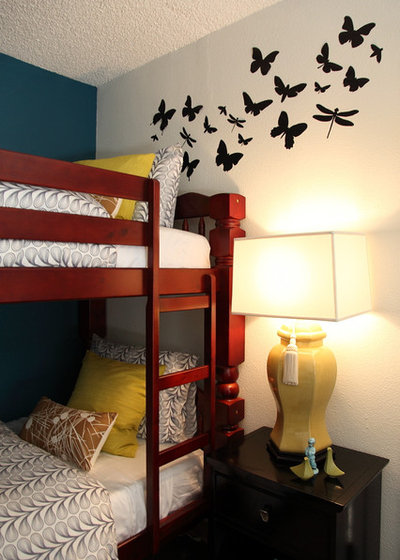
Monochromatic Colors
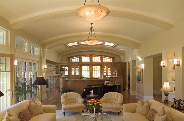
This is an example of a monochromatic, or tone-on-tone, color scheme. A monochromatic color scheme takes a single color, or hue, and runs through several of its tints, tones and shades.
This is an example of a monochromatic, or tone-on-tone, color scheme. A monochromatic color scheme takes a single color, or hue, and runs through several of its tints, tones and shades.
When a lot of people hear the word "monochromatic," a room such as this one is what springs to mind. But any color can be the basis of a monochromatic color scheme.
Paint manufacturers set up paint chips as monochromatic color schemes. An easy way to add interest to a room is to select several colors from the same chip card. Paint the ceiling one color, three walls a second color and then use the fourth wall as an accent wall by painting it a third color from the same card.
These five basic concepts are the start of any color plan, and though their interpretations vary widely, they make a foolproof fallback position if you're deciding on colors for the first time.
Tell us: Can you see using any of these schemes in your own home?
What are you working on?

Related Products

We are a top ranked remodeling company in North Columbus and Delaware, OH. We specialize in basements, bathrooms,... Read More
Related Stories

Decorating Guides
Design Pros Share 10 Favorite Creamy White Paints
By Becky Harris
These off-white color choices include versatile tones, warming hues and pleasingly soft shades
Full Story

Kitchen Countertops
What Kitchen Countertop Colors Should You Choose?
By tidgboutique
Consider these popular colors and styles to get the look you want — no matter what material you use
Full Story

Colors of the Year
Pantone Picks a Peach for Its 2024 Color of the Year
By Jennifer Ott
See how to use this juicy hue to create calm yet flourishing spaces inside and outside the home
Full Story

Decorating Guides
5 Ways Designers Are Working With Rich Warm Tones Right Now
By Becky Harris
Interior designers describe their strategies for using rich warm colors to create an inviting home
Full Story

Colors of the Year
10 Paint Colors Ready to Take Over in 2024
By Jennifer Ott
Blue is huge, but dark hues and warm tones also find favor among major paint companies’ 2024 Color of the Year picks
Full Story
Decorating Guides
How to Mix Colors and Make It Work
By tidgboutique
Don’t want to confine yourself to neutrals but lack the confidence to embrace colors? Check out this pro advice
Full Story

Events
7 Color Trends for 2024 at Maison & Objet
By Claire Tardy
New harmonies and unexpected pairings at the fall 2023 trade fair set the tone for next year’s interiors
Full Story

Decorating Guides
9 Ways to Layer Warm Neutral Colors for Comfortably Refined Rooms
By Becky Harris
Design pros share advice for building an inviting palette, introducing high contrast and mixing textures
Full Story

Decorating Guides
How to Create a Cohesive Color Flow Throughout Your Home
By Erin Carlyle
Designers share eight techniques for avoiding a choppy feeling in your spaces
Full Story

Decorating Guides
How to Get Your Ceiling Paint Color Right
By tidgboutique
Here’s how to tweak the shade of your ceiling paint to get the effect you want
Full Story
Well-explained article in general, but I think it's badly misleading to state "Opposing colors are said to be complementary colors, because
they work well together." It's actually the analogous colors -- the colors next to each
other on the color wheel -- which naturally 'work well together'.
In fact, rather than
working well together, complementary colors used together can be visually
jarring as each is the strongest contrast of
the other.
I'd also note that although
the color wheel shown is probably the most common, it’s too basic to be useful in trying to understand far more complex systems
like paint colors. Even a slightly more comprehensive color wheel will also
show 'tints' [any color + white], 'shades' [any color + black], and 'tones'
[any color + black and white]
which is where it starts to resemble a paint fan deck:
But to really start
to understand the dizzying number of paint colors out there, one needs to study another kind of color ‘wheel’
which incorporates a very necessary third dimension:
The reason I'm so partial to my Dulux Trade paint fan deck is that each color is numbered according to a system which provides hue, value, and chroma information -- rather than useless names like 'Foggy Morning' or 'Persian Persimmon'! It’s the
most foolproof way I know of to choose colors. Perhaps other manufacturers do
this too, of course (usually in professional
fan decks).
There’s also a great color wheel tool available at art supply
stores (below) and the online ColorHexa is a fabulous tool.
The complimentary colors as opposites, are are the highest vibrancy when used together. When mixed together as paints, as opposites, they create gray, or a shade of gray - varied anywhere between a very cool blue gray to a very warm gray, almost brown.