
Power to the Purple
Don't shrink away from violet hues — with the right balance, they can be a room's strongest asset

Purple is a tricky color to work with. As a Houzz user recently lamented, it's not easy to incorporate this hue into a space. Like pink, purple can easily cross the line into superfeminine with one wrong pillow or over-the-top paint. But using this bold hue is just a matter of balance. The right accessories, accent colors and applications can make this vibrant shade express the right tone for your home.
Rely on the royal combination of purple and gold. It's definitely not lacking in glamour, but the metallic element tones down purple's bold saturation. Look for fabrics or wallpapers that include both, or accessorize a purple room with gold accents. Combine it with other colors, like a complementary green, to create visual equilibrium.
Incorporating purple in the right doses with the right colors can make all the difference. In a room heavy with orange, a simple purple accent rug takes this space from monochromatic to chic.
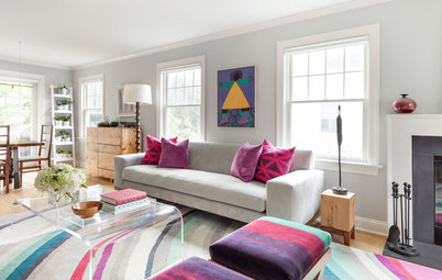
Bright purples have their place in the home, too. Because these shades tend to dominate spaces, try introducing them in small doses and pairing them with darker furnishings and colors, like the brown, green and neutrals in this living space.
See more on magenta for rooms
See more on magenta for rooms
Don’t shy away from purple walls — you just need to choose the right accessories. Turquoise furniture creates a secondary focal point in this playroom, toning down the surprising hue on the walls.
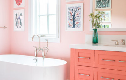
White walls and furniture feel crisp next to eggplant purple for a modern and sophisticated look.
An entire shelving unit in a pale shade of purple may seem kind of startling. But it works when paired with complementary yellow and natural wood floors.
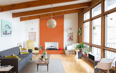
The oranges and yellows in wood grain play off purple, which lies in the opposite position on the color wheel.
The oranges and yellows in wood grain play off purple, which lies in the opposite position on the color wheel.
Certain prints have a neutralizing effect on purple. Consider pairing purple furnishings with a vintage kilim rug. The carpet's pattern steals some of the limelight from the bright purple, resulting in better balance overall.
Purple feels even more playful in unexpected applications, like trim. In this photo, the colors set one another off in a way that's subtle, balanced and unique.
Not ready to paint your walls purple yet? Try playing with smaller accents in complementary colors. These yellow lamps become eye-catching fixtures when topped with purple shades and still feel sophisticated.
Tell us: What are your secrets to using purple without going over the top?
Tell us: What are your secrets to using purple without going over the top?