


Kitchen of the Week: Warming Trend in a 1920s Georgian
Renovation creates a formal yet functional and relaxed hub for entertaining — and takes care of the insulation problem
Becky Harris
May 23, 2014
Houzz Contributor. Hi there! I live in a 1940s cottage in Atlanta that I'll describe as "collected."
I got into design via Landscape Architecture, which I studied at the University of Virginia.
Houzz Contributor. Hi there! I live in a 1940s cottage in Atlanta that I'll describe... More
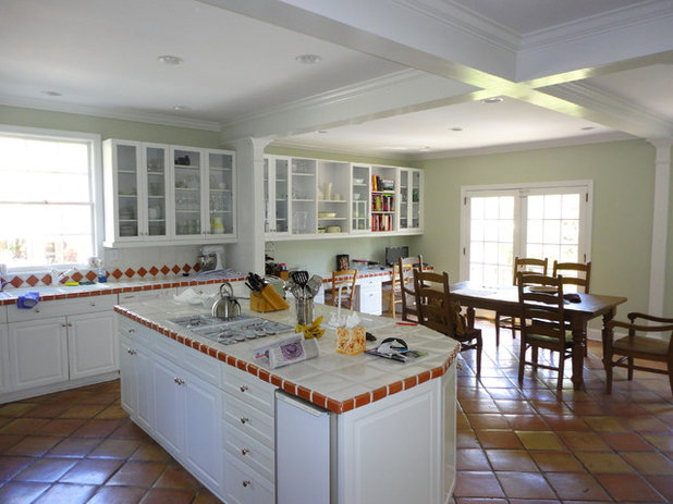
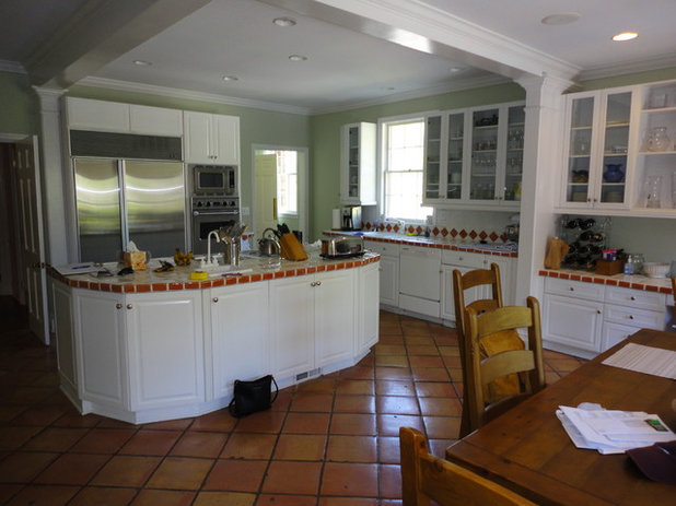
The previous kitchen in this 1920s Georgian house was cold. Not just chilly because of the expanse of tile on the countertops and floors, but downright drafty thanks to a poorly insulated addition on the back. While the layout worked adequately enough for this Atlanta family’s lifestyle, it wasn’t quite the entertainment hub the Manhattan transplants imagined. And its dated style didn’t fit with the more traditional style in the rest of the home.
“This is a very formal and symmetrically balanced 1920s house,” explains designer Courtney Rogers of Renewal Design-Build. “The kitchen needed a certain amount of formality while also encouraging relaxation.”
“This is a very formal and symmetrically balanced 1920s house,” explains designer Courtney Rogers of Renewal Design-Build. “The kitchen needed a certain amount of formality while also encouraging relaxation.”
Photography by Lee Grider Photography; photo styling by Shannon Gini
Kitchen at a Glance
Who lives here: A couple who had their first child just before construction started
Location: Ansley Park neighborhood of Atlanta, Georgia
Size: Approximately 500 square feet (46 square meters)
Generally the layout worked for the homeowners; it just needed some tweaks. They liked the eat-in area, the window over the sink and the island as a hub that included the cooktop. All of these elements were incorporated into the remodel.
The eat-in area along the back was an earlier addition that wasn’t properly insulated. There were also structural problems: The floor was as much as 5 inches off level.
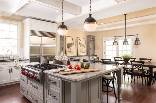
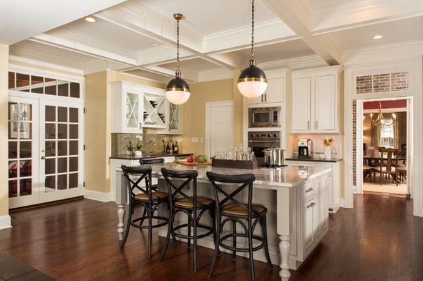
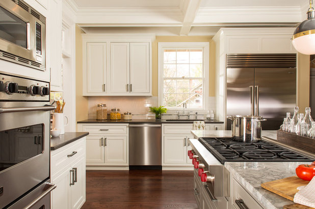
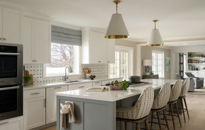
AFTER: The renovation created a tighter envelope along the back, with added insulation and air sealing. Ducts were relocated to increase energy efficiency. After leveling the floors, the design team added new wide-plank red oak floors, which flow with the rest of the flooring in the house.
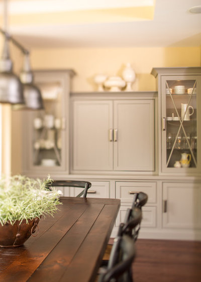
New butter-yellow walls warm up the space visually. “The clients chose a cooler gray palette for the cabinets and countertops, so the wall color brings in the warmth,” says Rogers.
The new island is larger and incorporates counter seating, so that others can keep the cook company. Coffers in the ceiling help make sense of the structural beams, which previously divided the room into odd quadrants that didn’t jibe with the layout at all.
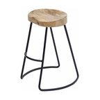
Stools and kitchen chairs: Arhaus; pendant lights: Hicks Pendants, Circa Lighting; marble countertop (on island): Super White; other countertops: Pietra Gray Caesarstone; range and downdraft: Wolf; refrigerator: Sub-Zero; faucet: Parq Bridge Faucet in Polished Chrome, Kohler; wall paint: Believable Buff, Sherwin-Williams; tray ceiling paint: Whole Wheat, Sherwin-Williams
New butter-yellow walls warm up the space visually. “The clients chose a cooler gray palette for the cabinets and countertops, so the wall color brings in the warmth,” says Rogers.
The new island is larger and incorporates counter seating, so that others can keep the cook company. Coffers in the ceiling help make sense of the structural beams, which previously divided the room into odd quadrants that didn’t jibe with the layout at all.
Stools and kitchen chairs: Arhaus; pendant lights: Hicks Pendants, Circa Lighting; marble countertop (on island): Super White; other countertops: Pietra Gray Caesarstone; range and downdraft: Wolf; refrigerator: Sub-Zero; faucet: Parq Bridge Faucet in Polished Chrome, Kohler; wall paint: Believable Buff, Sherwin-Williams; tray ceiling paint: Whole Wheat, Sherwin-Williams
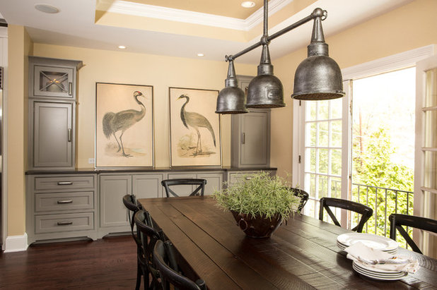
“The desk area was hogging up valuable space that they wanted to use for entertaining,” Rogers says. The designer replaced it with more storage and a countertop. A longer farm table was made, lending a more relaxed feeling to the space. The table will serve the growing family well for meals and homework.
Table: custom; light fixture: Contemporary Raleigh Old Silver Indoor/Outdoor Chandelier, Lamps Plus; chairs: Cadence Dining Chairs, Arhaus
Table: custom; light fixture: Contemporary Raleigh Old Silver Indoor/Outdoor Chandelier, Lamps Plus; chairs: Cadence Dining Chairs, Arhaus
From the first phase of planning, the couple envisioned watching SportsCenter with breakfast. The cabinet doors conceal a TV, in a spot previously occupied by an awkward broom closet.
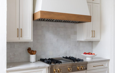
Overall the style was inspired by the home’s 1920s pedigree and the traditional style in the rest of the interior, which incorporates many antiques. “The kitchen feels new and fresh, but we used timeless colors and elements that also give it a traditional feel,” Rogers says. For example, the lighting nods to the 1920s, while the cabinet hardware is a mix of antique and industrial styles. The team also incorporated a mix of metals in the hardware, lighting and fixtures.
Overall the style was inspired by the home’s 1920s pedigree and the traditional style in the rest of the interior, which incorporates many antiques. “The kitchen feels new and fresh, but we used timeless colors and elements that also give it a traditional feel,” Rogers says. For example, the lighting nods to the 1920s, while the cabinet hardware is a mix of antique and industrial styles. The team also incorporated a mix of metals in the hardware, lighting and fixtures.
Here we see where the refrigerator and wall ovens were placed in the old layout, as well as the old opening to the pass-through and dining room (to the right of the appliance wall).
The designers were able to reuse the existing double wall oven and microwave, just moving them over a bit to incorporate more cabinets. The French doors on the far left lead to the den; the door to the left of the ovens leads to the central hallway; and the door on the far right leads to a new butler’s pantry and the dining room.
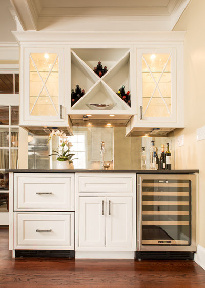
As big entertainers, the homeowners wanted a cocktail area that would greet guests as they entered the kitchen from the hallway or den. “They can come in here and grab a drink without having to weave through the main part of the kitchen,” Rogers says.
The drawers on the left are refrigerators for beer and other beverages, while the chiller on the right and racks overhead store the wine. Glassware is lit and displayed behind the glass cabinet doors. The backsplash is an antiqued mirror, inspired by a large antique mirror in another room.
Refrigerator drawers and under-counter wine refrigerator: U-Line; faucet: Blanco Meridian Bar Faucet in Polished Chrome
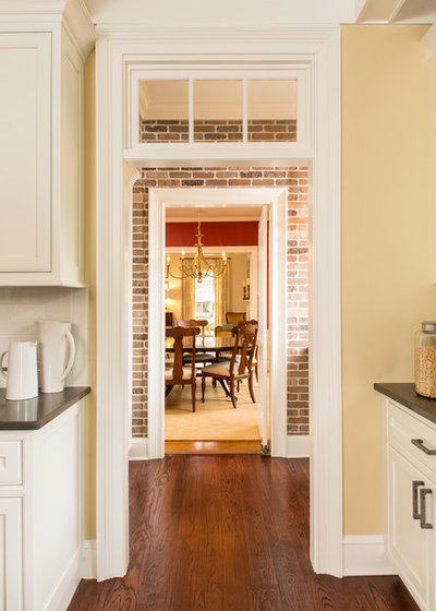
The new opening into the butler’s pantry mimics the French doors across the room, including the transom.
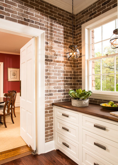
The new butler’s pantry replaced an awkward pass-through and badly organized walk-in pantry. The style befits the home’s age, with walnut countertops, pewter hardware and steampunk-style lanterns adding patina to the space.
Tip: You can save space by adding a brick veneer instead of real bricks. These pieces look like the real deal, but are only ¾ of an inch thick.
Lighting: Steampunk Indoor and Outdoor Hanging Lantern, Shades of Light
Tip: You can save space by adding a brick veneer instead of real bricks. These pieces look like the real deal, but are only ¾ of an inch thick.
Lighting: Steampunk Indoor and Outdoor Hanging Lantern, Shades of Light
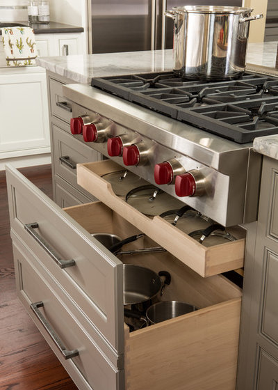
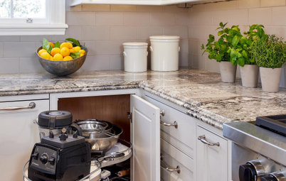
Clever storage solutions include this deceptively deep drawer for pots and pans.
The new kitchen balances old and new, incorporating formal elements with a relaxed vibe. It will serve this growing family for years to come.
Team: Courtney Rogers, Project Designer; Heather Shuster, Project Development Director; Mark Franco, Project Manager; Jon Cauthen, Renovation Consultant
See more Kitchens of the Week


Related Stories
New This Week
4 New Kitchens With Wonderful Wood Cabinets
Pros share how they used various wood species, styles, stains and details to create warm and welcoming kitchens
Full Story
Kitchen Backsplashes
30 Bold and Beautiful Range Backsplashes
Get ideas for eye-catching tile and stone backsplashes inside stove alcoves and behind cooktops
Full Story
Kitchen Design
7 Essential Features of a Well-Designed Kitchen
Make sure your new kitchen not only looks good but also functions beautifully
Full Story
Kitchen Workbook
How to Map Out Your Kitchen Remodel’s Scope of Work
Help prevent budget overruns by determining the extent of your project, and find pros to help you get the job done
Full Story
Kitchen Storage
Foolproof Storage Solutions for Corner Kitchen Cabinets
By tidgboutique
Consider Lazy Susans, pullouts and more to maximize storage
Full Story
Trending Now
The 10 Most Popular Kitchens So Far in 2024
Get inspired by the warm neutral palettes, ample storage and inviting islands in these most-saved new photos on Houzz
Full Story
Houzz TV
5 Trends for Kitchen and Bath Products in 2024
See fascinating new features for showers, tubs, faucets and more launched at the 2024 Kitchen and Bath Industry Show
Full Story
Kitchen Backsplashes
Where to Start and Stop Your Backsplash
By tidgboutique
Consider these designer tricks to work around cabinets, windows and other features for a finished look in your kitchen
Full Story
Kitchen Workbook
How to Find Your Kitchen Style
If you’re planning to remodel your kitchen, here’s how to find inspiration and start narrowing down your choices
Full Story
Kitchen Design
15 Stylish Kitchen Range Hood Ideas
Get ideas for hood shapes, sizes and looks that can elevate a kitchen’s design while ridding it of bad air and odors
Full Story
It comes from one of their older color wheels but can still be made up.
It looks fabulous with SW Dover White a nice warm white.
This is the perfect yellow that is does not scream "yellow" and gets warmer with evening light.
Can you tell I really like the color of SW Buttery?
I hope this helps for those of you asking about the wall color.
What is the gray paint color on the island?