Splashes of Red

Using red in decor takes courage, but it can pay off in a big bold way. You don't have to go completely Diana Vreeland/Billy Baldwin "garden in hell", but you can look to her fabulous red room for inspiration and take a touch here and there.
Red works so well with so many colors. For me, I love touches of red with touches of turquoise. Seeing it with black and white always reminds me of Duran Duran's John Taylor, because back when I was 12 and I bought every copy of "Bop" and "Tiger Beat" with his picture in it, they listed black, white and red as his favorite color combination. Did I just say that out loud?
Red is also fantastic when it's the only color in a sea of white. It's perfect with other primary colors. When paired with purple, we're right back into Jane Fonda's workout video (some of my most stylish friends have been using purple and red lately, so I think it's about to make a huge mainstream comeback as a combo). When paired with brown, it's creates a feel of exotic spice. With blue and white, it's nautical chic and in many countries, downright patriotic.
Whatever color you decide to pair with red, I don't really think you can go wrong. Just think of it as paprika:
"I’m a great believer in vulgarity- if it’s got vitality. A little bad taste is like a nice splash of paprika. We all need a splash of bad taste- it’s hearty, it’s healthy, it’s physical. I think we could use more of it. No taste is what I’m against.” - Diana Vreeland
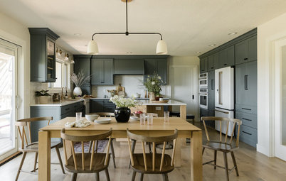
Whoever designed this kitchen understands the paprika principle.
Here we're seeing the exotic spice side of red.
Red tones in the rug and light fixture add warmth to this room.
Red closet doors completely change the mood of this bedroom.
These tiles are so glossy, sleek and bold.
A sculptural red vase is the only piece allowed that's out of the strict black, white and yellow palette here.
I don't even know what this is, but I admit I am intrigued.
I wonder if I love glossy red on furniture because it reminds me of glossy red nail polish? It's so sexy!
Red livens up a sea of neutrals here. Each red element grabs our attention.
This is so fabulous I can't even stand it.
Sharon Portnoy has mastered the art of putting in pops of primary colors.
She adds an unexpected bit of red in the kitchen.
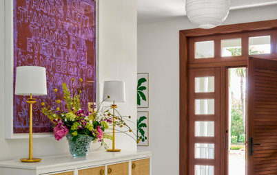
Here red and purple are a cheerful surprise.
My friend Richard recently painted this old dresser purple and added a red frame on top (I don't know what is going on with the masked bust, but that's his grandma with Burt Reynolds in the photo back in her wild days - how awesome is that?).