Houzz Tours

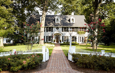
Houzz Tour: See a Traditional Home for Modern Life
Rambling Renovators are a Match Made in Design Heaven

A 1950s semi-detached home that hadn't be renovated since the '80s (think pink carpet, cat dander and some questionable hand-painted murals) might sound a little off-putting to some newlyweds. Not Jennifer Flores and her husband. One of their first dates was to a condo showroom. When they were planning their wedding, they registered for power tools. He's an architect, she's passionate about design, and in their Toronto home they saw potential that they were excited to tease out together.
As they move from room to room, they seem only to see what could be there, rather than what already is there – and they make it a reality without spending lavishly on contractors or high-end furnishings. Jennifer diligently chronicles their renovation progress – which has been advancing more or less steadily since they purchased the home in 2007 – on her blog, Rambling Renovators.
As they move from room to room, they seem only to see what could be there, rather than what already is there – and they make it a reality without spending lavishly on contractors or high-end furnishings. Jennifer diligently chronicles their renovation progress – which has been advancing more or less steadily since they purchased the home in 2007 – on her blog, Rambling Renovators.
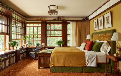
"We like architectural details and a sense of history," Flores says. The master bedroom used to have a floral wallpaper border and a bump-out in the wall; Flores and her husband framed it out and then added paneling and trim. The photo over the headboard is a vintage marching-band photo that she bought at an antique fair.
They purchased the bedroom's Roost Lotus Flower chandelier on EBay. The drapes were custom made by Tonic Living, in a fabric called Sweet William in Teal.
Flores is of Filipino descent, and she lived for four years in the Philippines as an adult. "My heritage definitely informs my sense of home," she says. "I would always come back home [to Canada]." Swing-arm sconces from Pottery Barn flank the bed.
Flores had always wanted a window seat, and her daughter Chloe's nursery was just the spot. Those aren't actual built-ins flanking the window. They installed IKEA cabinets on either side, added the pretty mesh over the radiator, and finished it with a soft seat cushion with two bolsters.
Flores bought her glider off Craigslist and had cushions made for it. The fabric is called Devin, in a colorway called Film Noir, which she purchased at Designer Fabrics Online. She found the wall decals on Etsy. The picture rails include some books from Flores' husband's childhood and a photo of the Eiffel Tower they snapped on their honeymoon.
Instead of purchasing a separate changing table and dresser, Flores outfitted a wide IKEA dresser with a changing pad. The chandelier is from Costco.
The nursery also includes guest sleeping accommodations. Flores mounted doilies that were hand-crocheted by her husband's grandmother on fabric-wrapped foam core and hung it over the bed.
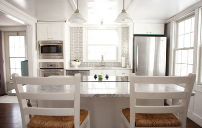
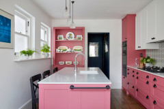
"We demolished the kitchen down to the studs," says Flores, "and then we made the space look bigger by moving large appliances farther from the entrance, to open it up visually."
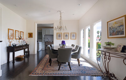
They kept the galley layout and opted not to open the room to the dining room. "We like traditional room separation, and having a formal dining space," Flores says. A mainly white palette keeps the space feeling bright.
The Shaker-style cabinets, glass-fronted doors and pendant lights created a traditional aesthetic; they mixed in a little pop of modern style with more pronounced hardware.
"We wanted the home to feel traditional, but for a modern lifestyle," Flores says. "The dining room has a little bit of formality." It was actually the very first room they renovated, starting with adding the wainscoting.
They didn't intend for the dining room to have a pronounced retro feel; Flores just picked the wallpaper because she liked the pattern (it's called Tobago, by Arte Wallpapers). She already had the dining set.
"We always spend a lot of time thinking about function and layout," Flores says. The kitchen has semi-custom cabinetry; the space shown here used to house a pantry that was nonfunctional, she says.
Cabinetry and a kitchen countertop from IKEA turned the office into a highly functional space. Black-and-white curtains that span the wall are used to create the illusion of symmetry despite the off-center window.
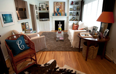
Throughout the home, eclectic groupings of photos and artwork on the walls become miniature galleries that add loads of personality and warmth.
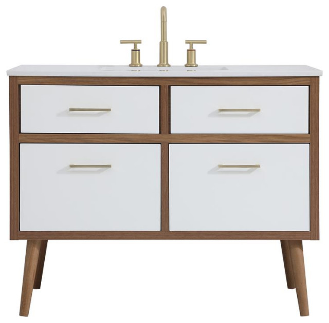
This compact bathroom used to feature carpeting and a blue-and-green mural halfway up the wall, in the style of a Monet painting. Flores and her husband replaced the mural with white subway tiles and installed a marble- and moonstone-tile floor. They kept the budget within bounds by leaving all the plumbing in place.
The bridge faucet has a cool, retro feel. The vanity has a small footprint, but still manages to include room for storage with a drawer beneath.
An intricate pattern in the heated floor gives the bathroom a high-end designer feel.
To help the room feel as open as possible, they installed a door with a frosted glass window in it, and then finished it with a vintage-style sign.
More Houzz Tours:
Soho Loft Shows the Warm Side of Modern
Tour more amazing homes
More Houzz Tours:
Soho Loft Shows the Warm Side of Modern
Tour more amazing homes