Houzz Tours

Houzz Tour: Creating Flow for a Family Apartment
Light, Texture, Accents and Glass Partitions Create Beauty and Function

A few years back, this Manhattan apartment underwent a renovation that erased most of the charming factory details of the loft-like space. It did not meet the owners' needs (they had two young boys) and they were unhappy with the aesthetics as well. All of the raw features of the space such as exposed brick had been covered up with drywall, a long narrow hallway created claustrophobia-inducing spaces, storage space was very limited, the kitchen and lighting were not pleasing, and the flow was simply not working.
Enter interior designer Valerie Pasquiou. With her eye for color, texture, lighting and flow, the space was transformed into a functional and beautiful home that let in the light, provided separate yet open spaces, had ample storage, just the right amounts of eye-catching colors and plenty of moves that celebrated the history of the building. Most importantly, the newly-renovated space suited the family's fun personalities to a T.
Enter interior designer Valerie Pasquiou. With her eye for color, texture, lighting and flow, the space was transformed into a functional and beautiful home that let in the light, provided separate yet open spaces, had ample storage, just the right amounts of eye-catching colors and plenty of moves that celebrated the history of the building. Most importantly, the newly-renovated space suited the family's fun personalities to a T.
One area covered with this striking wallpaper is plenty. Valerie advises, "if a space is small, keep the overall color palette in a light scheme and bring in color accents such as one wallpapered wall." By the way, this wallpaper is called "Elysian Fields" and Valerie found it at Flavor Paper in nearby Brooklyn.
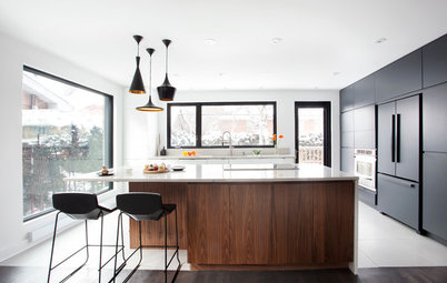
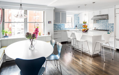
The kitchen was opened up to the rest of the home and contains a small hidden desk area for the kids where they have their own Mac. (This keeps them away from Mom's.) In fact, it's so concealed, you cannot figure out where it is from this picture; pocket doors hide it and it's on the left side.
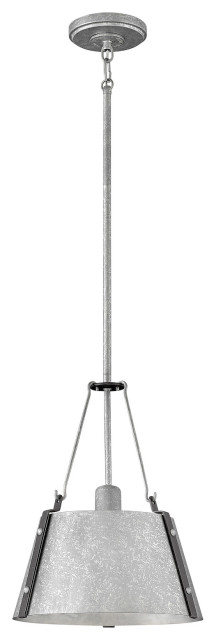
The light fixtures are by Lindsey Adelman. The Mademoiselle chairs are by Kartell and are covered in Missoni fabric.
The light fixtures are by Lindsey Adelman. The Mademoiselle chairs are by Kartell and are covered in Missoni fabric.
Valerie knows that light is very important, and this large window in the kitchen brings in a great deal of natural light. She also used a mix of open shelving, cabinetry with solid doors and glass fronts (near the ceiling) to keep the kitchen looking open and bright.
The house was childproofed by choosing durable materials and a base of neutral colors that weren't too light (i.e. they don't show dirt and spills). Punches of brighter colors were brought in via the red dining chairs, a few accent pillows and the Missoni fabric on the kitchen chairs.
Valerie loves to juxtapose materials that at first do not seem compatible. She plays with matte finishes versus glossy finishes and sleek elements versus rough ones. The strategy continues throughout this entire space and helps to tie everything together. Likewise, colors do the same; note the well-placed red accents — they help tie all of the spaces together.
"When you design a space and you work with an interesting and inspiring volume such as this one, it is key to choose materials that don't necessarily seem compatible at first but that can eventually tie in. On this project, I wanted to play with the rawness of the existing materials, such as the brick walls and steel structural brackets." She then contrasted these materials with "sleek and pure elements, such as the colored glass that separates the office from the living room."
As for furniture, Valerie advises, "study your space very well and spend some time living in it before choosing furnishings. This will insure that it is well thought out and not overdone."
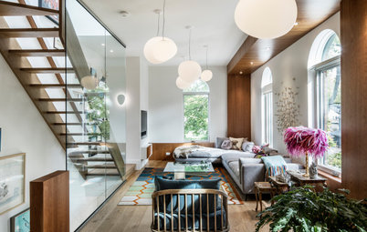
This long cabinet provides a lot of storage in a sleek way and connects the living room space to the study space. The transparency of the glass divider does the same.
This long cabinet provides a lot of storage in a sleek way and connects the living room space to the study space. The transparency of the glass divider does the same.
Speaking of the divider, the glass is slightly mirrored on one side, which lets the light through while letting the parents have some privacy in the home office. At the same time, it keeps the space from feeling cramped or too separate.
This is the view back into the family room from the home office side. Depending on the lighting scheme and time of day, the glass takes on different hues.
This is the view back into the family room from the home office side. Depending on the lighting scheme and time of day, the glass takes on different hues.
"The reflection helped us 'push the walls' and give a sense of a larger room. The end result is that the kids love it so much that they look at themselves dancing on the coffee table!" Said coffee table is made of hard white oak, so it can take it!
Similarly, glass doors in the bathroom help extend the space visually and make it feel as large as possible. The walls are Italian limestone provided by the owner, whose family runs a major stone resale business.
Again, the one accent wall strategy works well in a tight bedroom, and a few accent pillows punch up the light colored bedscape palette. Extra storage is cleverly provided in a nook that is aligned with the windows — no floorspace-hogging bulky bookcase required.
The wallpaper is from Elli Popp in London.
Thanks so much to Valerie for taking the time to share this spectacular apartment with us! See more of Valerie's Work on Houzz
The wallpaper is from Elli Popp in London.
Thanks so much to Valerie for taking the time to share this spectacular apartment with us! See more of Valerie's Work on Houzz