Artsy: Inspired by Great Painters

Every time I visit a museum, I find myself overwhelmed with inspiration. Unfortunately, I'm not much of a painter and I'm an even worse sculptor, so I don't have much of an opportunity to put that inspiration to work.
But that doesn't mean it has to go to waste. In fact, great art is a fantastic place to find home design inspiration. The best artists and the best rooms have a lot in common: a great handle on color, light and balance to start.
Below are some great-looking spaces that share key qualities with amazing artists:
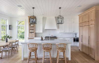
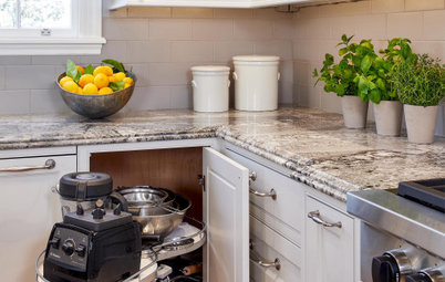
Johannes Vermeer. Vermeer, most famous for his Girl with a Pearl Earring, was a master of natural light. Like his paintings, this room makes the most of light coming from a specific source, using it to illuminate colors that are both saturated and muted at the same time. It's a quiet room, but one that seems to have a lot of history.
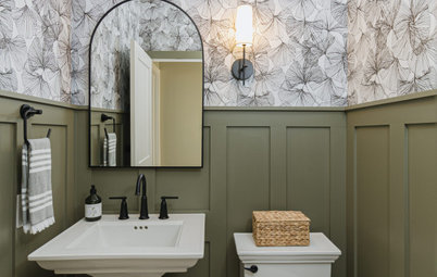
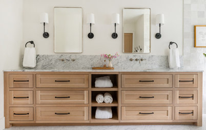
Jean-Honore Fragonard. A champion of the Rococo style, Fragonard's paintings are full of pastels and fussy detail. Honestly, they're usually too much for me - too girly and too prissy. This room, though, captures the best of Fragonard's intentions - it's full of small details and feminine touches, but it stops short of the frippery that drives me crazy.
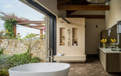
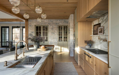
Jacques-Louis David. David's famous painting, Death of Marat, is one of the best examples of classicism out there (and it involves a bathtub). This vignette evokes a similar feeling as the painting. The room's use of traditional elements, like the claw foot tub, as well as its neutral (but powerful) colors and its incredible sense of balance combine to make it a great, living example of classicism.
Claude Monet. Monet's paintings of his famous gardens at Giverny are some of my favorite Impressionist works. This landscape captures some of the feelings of those paintings. The gardens are beautiful, not overly planned, and home to multiple shades of the same color.
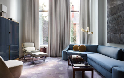
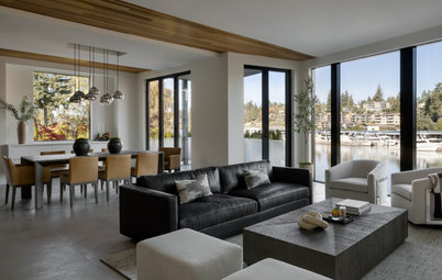
Franz Kline. Franz Kline's black and white abstract expressionist paintings are both stark and full of emotion at the same time. This room, with its dominant use of black and white, is similar - it's neutral, but dramatic. The key to both the paintings and the room is a clear balance between the two colors. Too much of one and the energy evaporates.
Mark Rothko. Rothko's color field paintings are some of my favorites. I look sit in a gallery staring at them for hours. While at first glance, they look simple, in reality they're not at all. I love their intensity and their layered use of color.
This bathroom evokes a similar feeling in me. The yellow is intense and the space is small. It's bright and fun but somehow, thanks to the saturation of color, could also inspire contemplation.
This bathroom evokes a similar feeling in me. The yellow is intense and the space is small. It's bright and fun but somehow, thanks to the saturation of color, could also inspire contemplation.
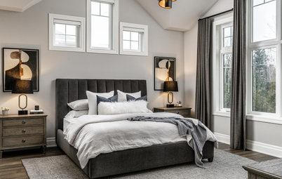
Richard Diebenkorn. In the 1960's, Diebenkorn painted his "Ocean Park" series - paintings inspired by his Santa Monica home. The paintings were abstract, but with some structure (not expressionist) and dominated by muted colors - just like the ones in this room.
The combination of these colors and tons of natural light (also implied in Diebenkorn's work) is perfect for a playroom. No matter how cluttered this space gets, it will retain a bit of serenity.
The combination of these colors and tons of natural light (also implied in Diebenkorn's work) is perfect for a playroom. No matter how cluttered this space gets, it will retain a bit of serenity.
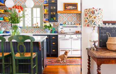
Andy Warhol. Warhol - famous for 15 minutes, obsessed with celebrity, in love with in-your-face imagery. This room is obviously an homage to his oft-referenced, repetitive, bright style.
Warhol's work is so well-known, actually, that referencing it in home design almost feels unoriginal. In this case, though, I like the space for its natural light and stark white walls. They temper the bright color and intensity of repetition, so the space as a whole feels balanced.
Warhol's work is so well-known, actually, that referencing it in home design almost feels unoriginal. In this case, though, I like the space for its natural light and stark white walls. They temper the bright color and intensity of repetition, so the space as a whole feels balanced.