How 5 Spring 2010 Fashion Trends Work in the Home

Over the weekend, as I was browsing through the March 2010 issue of In Style magazine, I couldn't help but notice that a lot of this season's trends work equally well on the body or in the home. OK, so "formal shorts" don't easily translate to decorating, but trends about color and texture switch from one to the other with ease.
The magazine included one feature that showed six trends on the runway, then in "real life" clothes (the kind that real people can wear - and afford). Formal shorts were, in fact, one of those trends (as an aside: I wore them in the late '80s and I'm pretty sure I'm not picking them up again this time around). But the other five were great inspiration for the home:
The magazine included one feature that showed six trends on the runway, then in "real life" clothes (the kind that real people can wear - and afford). Formal shorts were, in fact, one of those trends (as an aside: I wore them in the late '80s and I'm pretty sure I'm not picking them up again this time around). But the other five were great inspiration for the home:
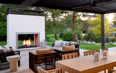
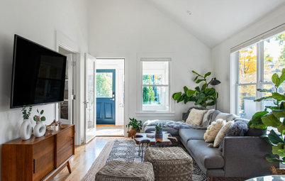
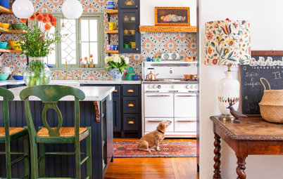
1. Prints everywhere. A lot of this season's runway looks are, well, busy. They include multiple prints in bright colors. The overall effect is happy and bubbly - though it's important to balance the prints with solids so they don't make you dizzy.
The room above is dominated by the floral bedspread, while in this room, prints are used as accents. Both are great, especially when the colors are bright and intense.
2. Soft. I love this trend because it's about color - soft pastels and creamy tones...
but it's also about texture. In Style showed a Jason Wu dress that looked an awful lot like a shag rug with a ribbon tied around the waist (in a good way). The color of this Ligne-Roset sofa might not be "soft" in the traditional sense, but the shapes and textures in the space certainly are.
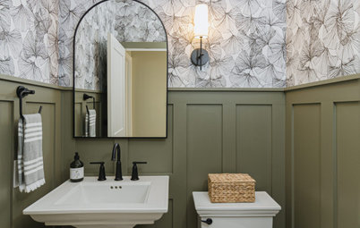
3. Gray-to-silver. Magazines are always excited about day-to-night transitions, so it's no surprise that they've latched on to the silver and gray runway looks. For "daytime" (or, in the home, spaces that get everyday use), matte gray works nicely paired with simple white and bright red accents. It's smart and stylish.
The magazine suggests silver for night - and I'd suggest silver for rooms that need a sophisticated edge, and maybe even rooms that get more use at night or during parties than they do during the day. This bathroom would make a nice powder room just off an entertaining space.
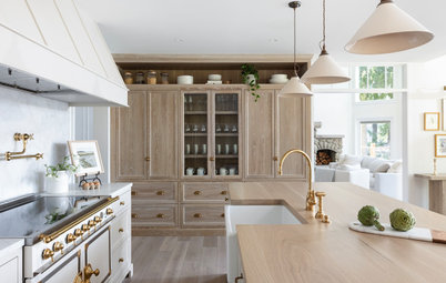
4. Trekker. I almost hesitate to include this trend in the list because I've read so much about it ("trekker" is In Style code for "global") that I'm starting to get sick of it. But it's a legitimate design trend...and it is a good look in the home, especially when the souvenirs that offer the global vibe are real.
5. Peep show. Apparently, this season, we can expect people to go the full Madonna, with lace peeking out and exposed thigh-highs (note: I do not actually expect to see this look in my hometown). While it's not really that practical in the "real world," it does have some interesting design implications. Soft textures and sheer fabrics make for a sexy space...
And so do interesting textures and shiny surfaces that evoke lace and satin. In fact, "peep show" might be a whole lot more appropriate in the home than on the street.