Pantone's Spring Colors Invigorate Rooms
Brightness and energy infuse Pantone's top colors for spring 2012, empowering walls, furniture, accessories and more

For years Pantone has been leading the way for color trends, releasing the sought-after shades that designers follow as they develop new products in various industries. Pantone's spring 2012 colors — from playful pastels to vibrant brights — encompass everything from light, breezy aesthetics to contemporary classics. According to Leatrice Eiseman, executive director of the Pantone Color Institute, "Consumers look to spring for renewed energy, optimism and a promise of a brighter day.”
In the spirit of that remark, particularly optimism and bright days, let’s take a journey through the classic rainbow, reinvented with Pantone's take on the season’s top color trends.
In the spirit of that remark, particularly optimism and bright days, let’s take a journey through the classic rainbow, reinvented with Pantone's take on the season’s top color trends.
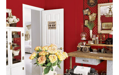
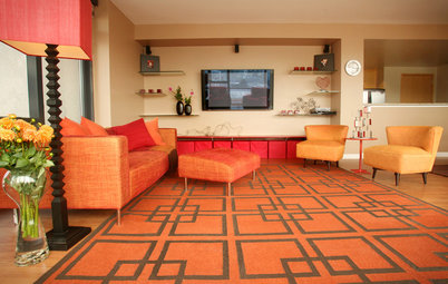
Red = Pantone's Cabaret. This season, red delivers with a punch. It’s more rosy and sensual, and truthfully feels more fuchsia or magenta. Because it’s such a strong color, consider adding it into your home through accents, such as these chairs. Even the smallest doses will catch the eye.
According to Pantone, Cabaret is best paired with colors of similar nature, such as oranges, for an ultrabold vibrant look.
Orange = Pantone's Tangerine Tango. Pantone's Color of the Year for 2012, Tangerine Tango is predicted to stay hot through fall. According to Pantone, it's meant to “provide the energy boost we need to recharge and move forward,” while also feeling a bit “exotic, but in a very friendly, nonthreatening way.”
Consider picking up some paint in this red-orange hue and adding a spark of unexpected color with a small but seductive accent wall.
Consider picking up some paint in this red-orange hue and adding a spark of unexpected color with a small but seductive accent wall.
Like Cabaret, Tangerine Tango demands attention. If a wall is too over the top for you, work it in through small doses and balance it with this season’s top gray shade, Driftwood.
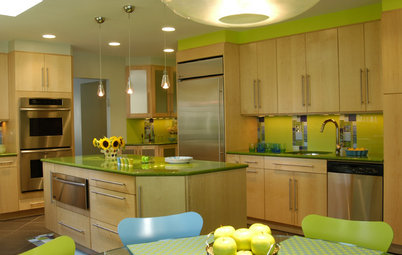
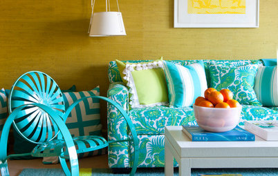
Yellow = Pantone's Solar Power. Solar Power is a warm, cheery yellow meant to fill a room with energy. It’s predicted that the color will be most on trend mixed with blues.
Energize your kitchen with a Solar Power yellow countertop. It will always feel as if the sun is shining in.
Or mix it among neutrals. Alongside Driftwood, the gray neutral for the season, Pantone developed Starfish, a more beige neutral. This deeper beige has elements of pistachio in it, much like the rug seen in this photo.
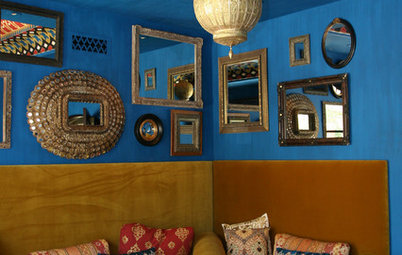
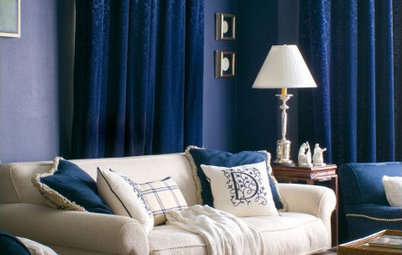
Indigo = Pantone's Sodalite Blue. Sodalite Blue is a bit of a marriage between cobalt and midnight blue, and is meant to calm the space. It also blends with all the season’s top colors: a stool in a color much like Margarita pops against these deep blue drawers.
Again, you can balance the blue with neutrals. Warm your bedroom with Sodalite Blue walls neutralized with Starfish linens. A hint of Tangerine Tango will give it just the personality it needs.
Violet = Pantone's Bellflower. This season’s purple is best described as an edgy lavender. As you can see, it makes a statement as a wall color that is both fresh and modern.
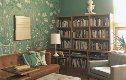
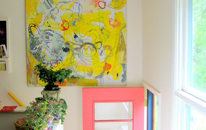
To round out the color trends, we’re going to add one more color to our rainbow: pink. Pink this season is seen in a Pantone color called Sweet Lilac. Like its namesake, it’s very soft and romantic. It’s predicted to work best with shades of green and blue, which can easily be pulled in through artwork, as seen in this example.
Or neutralize Sweet Lilac with Driftwood gray. This look combines masculine elements with the feminine, mixing the best of both worlds.
More:
Tangerine Tango: Four Ways to Use Pantone's Color of the Year
More:
Tangerine Tango: Four Ways to Use Pantone's Color of the Year